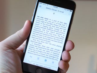
Amazon's Kindle app gets a new font and better layouts for easier reading

The latest update to Amazon's Kindle app is all about making reading easier. To that end, the app offers a new page layout system designed for all screens, as well as better word spacing, which combines with hyphenation for decreased eye strain. Amazon has also added Bookerly, a new exclusive font designed for reading on screens.
Check out the list below for all of the changes in Kindle 4.9:
Faster Reading, Less Eye Strain: Hyphenation plus smoother word spacing result in faster reading with less eye strain. Improved character placement increases word recognition speed at any font size.Beautiful Page Layout: Drop caps, text, and images that automatically adapt to always look great no matter what your screen or font size. Print-like layout dynamically adjusts for any combination of screen size and font setting.Large Fonts, Without Compromises: Enjoy reading with larger font sizes without compromising your reading experience. Page layout and margins automatically adapt to look great with even the largest font sizes.Bookerly - The Font for Readers: Bookerly is a new Kindle exclusive font designed for reading on digital screens. Warm and contemporary, Bookerly is inspired by the artistry of the best fonts in modern print books but is hand-crafted for optimal readability at any screen size. Bookerly is available on most Kindle books.
You can download the update now from the App Store.
- Free - Download Now
Master your iPhone in minutes
iMore offers spot-on advice and guidance from our team of experts, with decades of Apple device experience to lean on. Learn more with iMore!
Joseph Keller is the former Editor in Chief of iMore. An Apple user for almost 20 years, he spends his time learning the ins and outs of iOS and macOS, always finding ways of getting the most out of his iPhone, iPad, Apple Watch, and Mac.
Most Popular


