The evolution of the social media icon

"Started from the bottom now we're here." While Mister Drake may be talking about his rapping career, the statement can also be applied to the evolution of the social media app icons we see and tap on every day.
Whether it be big players like Twitter, Facebook, Instagram, or Snapchat, or more obscure apps like Ello, Slinger, Beme, or Keek, every social media platform has their own colors, fonts, style, feel, and flair—let's call it the mise-en-scène of the online social world.
When you log into Snapchat, you expect the bright yellow of the icon, the black screen as your camera loads, and the little bright red, purple, or baby blue icons in both lower corners. When you tap on Twitter, you wait for the vivid blue screen with the white bird, the simple scrolling timeline littered with the people you follow, and the easy pull-to-refresh features. You recognize the feel, the colors, the people you engage with, and the style of the app that you've decided to give all of your time to.
That's why, when Instagram changed its logos this past week, many of its 300 million monthly users lost their collective minds.
Gone is the detailed camera logo and in its place is something minimalist and flat with a bright pink, purple, and yellow gradient background, along with a white outline overtop of the previous camera design. Coupled with this, Instagram updated its 3 other apps to be more uniform and color coordinated:
From the Instagram blog:
We've made improvements to how the Instagram app looks on the inside as well. The simpler design puts more focus on your photos and videos without changing how you navigate the app.
This is true: The white background makes images, whether they're black or white or covered in colorful filters, pop out, and with more than 80 million photos being shared every day, standing out against the rest is the key to getting noticed.
Master your iPhone in minutes
iMore offers spot-on advice and guidance from our team of experts, with decades of Apple device experience to lean on. Learn more with iMore!
Yet some have compared the new logo to a sloppy rip-off of a retro PowerPoint slide design, while others say the heart icon used to indicate likes, now a lighter shade of red, makes them "uncomfortable".
Instagram isn't the first social app to change its icon, though. We survived those. We'll survive this. Here's a look back!

When Facebook first launched in 2005, it looked and felt like MySpace 2.0. It wasn't even called Facebook, it was The Facebook [in square brackets like 'dis], and the icon/logo was actually super weird – it was a pixilated image of a man's face.
For the longest time, everyone thought it was Facebook founder Mark Zuckerberg himself, but it was actually an image of Al Pacino that was designed by Zuckerberg's classmate Andrew McCollum.
In 2005, The Facebook became Facebook, and Al Pacino disappeared (we miss you every day, Al), and four years later in 2009, Facebook debuted their first 'official' icon. This launched the era of the cleaner, more minimalist look that we're so used to today.
The lowercase white f, shifted slightly to the right within the blue background, became a social media staple, and the only things that have changed since are the rounded corners, or blue accents within the icon.

Twitter had no logo at first, just a typeset version of the name. Then Twitterrific, the original third-party Twitter app, created a bird for its logo—Ollie—and Twitter was fast to follow.
The company's first cut was a thin little cartoon bird facing left, and his name was Larry (named after Larry Bird, the Hall of Fame Basketball star. Get it?! Larry the Bird, Larry Bird. Hi.lar.i.ous).
Larry was switched around to face right, his legs were removed, but his design was still quite simple. Another version of Larry shows the bird looking like it popped straight out of a kid's cartoon: Larry has giant eyes with a raised eyebrow, a little smile to his beak, spindly black legs, and a tuft of feathers on his head. But Larry wasn't done changing quite yet.
Yet again, he was redesigned with a more minimalistic feel. All of his features disappeared and instead, a solid blue bird with his wings outstretched became the face of Twitter. The second most recent logo was almost the exact same as the current one, but the wings had one less feather, the tuft of feathers on his head were removed, and the cartoony feel was gone completely.
The bird was also drawn facing slightly upwards, as if Larry was ready to fly into the Twitterverse as we speak– er, tweet.

After the internet lost their minds this week because of Instagram's icon change, people demanded for Instagram to change their logo back to 'the original one'. But did you know that Instagram's original logo looked nothing like the one that just got replaced?
Insta's original logo looked like a knock-off Polaroid camera. The icon was on a transparent white background without the border, so it quite literally resembled a camera floating on your home screen. A rainbow stripe ran down the front (some believe to represent the various colored filters available through the app), and three buttons plus a flash and viewfinder were detailed on the front of the camera.
But Instagram CEO, co-founder, and original icon designer, Kevin Systrom, said the logo changed when they realized the old icon had nothing to do with the app. That's when designer and photographer Cole Rise designed a new one in the fall of 2010.
Inspired by the Bell & Howell camera from the 1950s, Rise said he designed the second most recent logo in around 45 minutes. After a few little touch ups and cleaning, the final version of Rise's icon was officially official in 2011 (Rise even designed the "back" of the Instagram icon, which can be seen above).
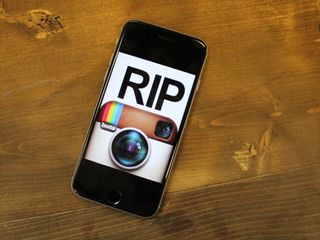
Now fast-forward to Wednesday, May 11th; Instagram reveals their new minimalist, pink/purple/yellow logo, the internet reacts wildly, memes are made, GIFs are GIF'd, and Instagrammers bid farewell to their original-but-not-really-the-original Insatgram design they once knew and loved.
RIP, original-but-not-really-the-original Instagram logo, 2010 – 2016.
Your favorite social icon?
Now that we've had a chance to look back, what was your favorite social icon?
Cella writes for iMore on social and photography. She's a true crime enthusiast, bestselling horror author, lipstick collector, buzzkill, and Sicilian. Follow her on Twitter and Instagram: @hellorousseau

Apple's major iPhone AI upgrade could have no cloud processing — initial wave of iOS 18 features "will work entirely on device"

Apple boots popular GameBoy emulator ‘knock-off’ from its iPhone App Store — Furious developer of the original decries Apple's App Review process

Want better iPhone photo quality without taking up lots of storage? You’re not using your 48MP camera properly unless you use this HEIF Max tip
Most Popular


