Apple pushes out new, card-based iOS 6 App Store search interface

Back at WWDC 2012, Apple promised a new look to the on-device App Store and iTunes Store in iOS 6. Details have been sketchy since then, but changes to the search algorithm, and rumors of Apple integrating their recent Chomp acquisition have persisted. Now Carlos Henandez posts that Apple has pushed out just such a Chomp-inspired update to iOS 6 beta testers.
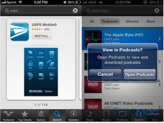
Now, when searching within the iOS 6 App Store, you reported sly a card for each search result (below). You can swipe horizontally, right or left, through the cards. This is in stark contrast to the vertical list view that's used now to display search results under iOS 5.

9to5Mac also reports that Genius and Purchased features have been turned back on, which hadn't worked previously under the beta iOS 6 software.
Looking at the images, while the new card-style search layout is appealing from a visual standpoint, I'm wary about how functional it will be in real life use. It's more interactive but less visually dense. Instead of long list of apps on one screen, you now see only one app per screen. Instead of being able to quickly tap the seventh app on the first screen, for example, you'd now have to swipe through to the seventh screen to get to that app.
The current list view is just as easy to scroll through, and much more efficient in presenting apps.
The fundamental problem with the App Store has never been presentation but discovery. A fancy, full screen card does very little to help discovery. The current iteration of the App Store under iOS 5 worked fine for browsing. Unlike iTunes on a Windows or Mac PC, when mobile speed and efficiency are far more important than leisurely browsing through a slow, card-like view of apps.
Instead of a smooth experience that allowed you to find what I was looking for quickly, the new version, if indeed it survives to the release version, seems slower if anything. More like CoverFlow in the music app, but unescapable even by switching back to portrait mode.
Master your iPhone in minutes
iMore offers spot-on advice and guidance from our team of experts, with decades of Apple device experience to lean on. Learn more with iMore!
What do you think of the new single-app-per-page view? Amazing, unboring refresh to the iOS interface, change-for-change's sake, or a setp backward?
Source: Carlos Henandez, 9to5Mac
iMore senior editor from 2011 to 2015.
Most Popular


