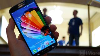
Samsung design video: High on lifestyle companionship, low on rationale for cheap plastics

Apple typically accompanies the announcement of a new iPhone 5 with a video showcasing their design and manufacturing processes. Samsung has now done something similar for their just-released Galaxy S4. So how do the two videos compare, and what, if anything, do they tell us about the respective companies and phones?
Before we get to the videos, it's worthwhile taking a quick look at how Apple and Samsung handle the devices in general. Here's Apple's phone product logo, which uses a single typeface, compared to Samsung's, which uses different typefaces for both Galaxy and 4, and a highly stylized S in between:

In Samsung's video, which includes the now oft-repeated "Life Companion" tag line, they start off with a quick series of initially unidentified people (we later find out they're UX -- user experience -- designers), who set the stage for a) wanting to go deeper into people's lives, b) be more evolutionary than radically different, c) be like nothing anyone has ever seen before, and d) change people's lives for the better. (Note: the video is in Korean with English subtitles, so there could be cultural differences and contexts that are lost in translation.)
Apple's video, which is actually more of a general product video that also touches on design, begins with Jony Ive, senior vice president of industrial design, who sets up a) the phone as the most-used object in people's lives, b) how seriously Apple takes that relationship, and c) how Apple's goal is not to make something new but something much better.
Samsung's video includes people set in more realistic environments, and a ton of b-roll showing stars, cityscapes, and other dramatic visuals. Apple's video sets everyone on backgrounds of pure white, and b-roll consists exclusively of shots of the iPhone itself, the technology inside it, and the equipment used to manufacture it.
Samsung's UX designers go on to describe how the phone has evolved from information system to life companion, and how they began to think about how they could use it to offer more meaningful value. They showcase features like the eye-tracking page scrolling and video pausing, and the on-hover contextual popups. And they call out the automatic photo album generation.
Apple's Jony Ive explains their decision to increase the screen size to 4-inches by making it taller but not wider (the old one-handed-ease-of-use argument). Bob Mansfield, senior vice-president (of technology) explains some of the new hardware features like LTE and the Apple A6, and Lightning connector. Scott Forstall, former vice president of iOS, then goes over iOS 6 software features like Maps, Panorama photos, Siri enhancements like sports and restaurant reservations, Facebook integration, and FaceTime over celular.
Master your iPhone in minutes
iMore offers spot-on advice and guidance from our team of experts, with decades of Apple device experience to lean on. Learn more with iMore!
Samsung's Hyoungshin Park, product designer, explains that while the Galaxy S3 had more nature-centric design cues, the Galaxy S4 was meant to be more "rationale" in approach (that has to be a translation glitch, right?) and with more emotional CMF (?). Jongbo Jung, product designer, then describes the GS4 as a precious gem glittering in the dark or stars sparkling in the night sky. They paid attention to the smallest detail and refined it to perfection. They wanted to find the perfect line.
Apple returns to Jonny Ive, who talks not only about the very nearly insane precision of the manufacturing process, but about how the iPhone feels in your hand, and the importance of the materials they use -- glass and aluminum.
Samsung says nothing about the feeling or importance of their plastics. They do repeat the importance of making people's lives better. Mihnyouk Lee, vice president of product design, says Samsung believes they can create something new and valuable.
Apple's Jony Ive says they began the iPhone 5 with a design they loved, but to implement it, it took everything they'd learned to date. Simple, clear, truly extraordinary.
Samsung ends with: Life Companion, for a richer, simpler, fuller life.
Apple ends with: Apple logo.
Samsung's video does make Apple's look clinical, almost sterile at times, but the simplicity Apple brings to every element makes Samsung look undisciplined, almost unrefined.
What's most interesting is that two companies with such different styles and products are both sitting atop the smartphone space right now.
Via: Android Central

Rene Ritchie is one of the most respected Apple analysts in the business, reaching a combined audience of over 40 million readers a month. His YouTube channel, Vector, has over 90 thousand subscribers and 14 million views and his podcasts, including Debug, have been downloaded over 20 million times. He also regularly co-hosts MacBreak Weekly for the TWiT network and co-hosted CES Live! and Talk Mobile. Based in Montreal, Rene is a former director of product marketing, web developer, and graphic designer. He's authored several books and appeared on numerous television and radio segments to discuss Apple and the technology industry. When not working, he likes to cook, grapple, and spend time with his friends and family.
Most Popular


