Todo 7 for iOS review: A brand new look and a great new experience

Todo by Appigo is one of the most popular task apps available for not only iOS, but for Mac as well. And for good reason, Todo is a productivity powerhouse. The OS X version of Todo made our list of best todo apps for Mac. I've been patiently waiting for Todo 7 to arrive for both iPhone and iPad. That day has finally come and it's brought a completely redesigned interface, a menu system that just flows better, and so much more.

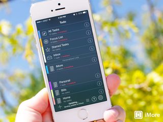
For current Todo users, don't worry, you aren't going to be thrown for a loop if you decided to purchase the new version of Todo. It's familiar enough that you will instantly know what you're supposed to be doing. For me, I've found it's the little details of Todo 7 that make it that much better than its predecessor. For instance, the one peeve I've always had with it is how overwhelming it can be do new users who aren't familiar with the different kinds of tasks and actions. In Todo 7, icons have been simplified and just seem to be more self explanatory than they were in previous versions. There's not so much to look at all in one go.

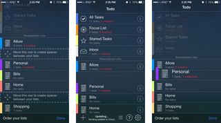
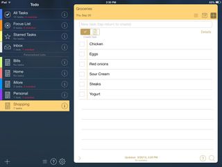
The main view of Todo 7 is the same as the old version layout wise. You've got your Inbox, Focus List, and more on the top with your lists underneath that. You can add spacers in between lists in order to create a better visual division between your created lists as well. You can change icons to suit what you'd like for your created lists as well as the color of the tab. Tapping into any list will show you the tasks that you have inside that list. Again, the same as you would have done in older versions of Todo.

This is where things start to change a bit. Instead of having navigational tabs along to top to go back and forward, you can tap anywhere on the top of the inside of a list to go back a single menu. The tab colors you choose will flow through to each tab and inside each one. It creates a nice visual change as you tap your way through Todo 7. The only thing I wish Appigo would have taken advantage of that they haven't yet are the swipe gestures of iOS 7. To be able to swipe sideways to flip through menus would have made the experience even better.

The good
- The updated interface is a huge improvement over the old version visually and functionally
- The same feature set Todo users know and love, bundled in a much easier to use package that won't scare off first time users
- Holding down on any task or item brings up the quick menu that lets you move tasks, assign due dates, add contexts, and more
The bad
- Sadly, swipe gestures to move between menus don't seem to be supported
- The "+" sign on the main menu adds a list where I wish it would be a quick-add for a task instead, or pull down on the main menu to add a task would have been an option
The bottom line
If you already use Todo and you like the look and feel of iOS 7, you'll love Todo 7. It's got all the same features you know and love about Todo in an updated and refreshed interface. If you don't like iOS 7, you may want to stick to the older version of Todo for now.
One of my biggest complaints about Todo for iOS has always been that many icons and options were present in cramped spaces such as the task entry screen that weren't explained well. Todo 7 solves a lot of these problems by either making options more obvious or moving them completely so menus aren't as cluttered. For those contemplating a new todo app, you have no reason to be scared of Todo for iOS anymore.
- $4.99 - Download Now
Master your iPhone in minutes
iMore offers spot-on advice and guidance from our team of experts, with decades of Apple device experience to lean on. Learn more with iMore!
iMore senior editor from 2011 to 2015.

Make a free X account before it's too late — Elon Musk says charging new users "is the only way to curb the relentless onslaught of bots"

This iPhone setting will significantly improve your smartphone's battery life — prevent power-hungry apps without losing access to notifications

People can't even enjoy sleep anymore — Pokèmon Sleep littered with cheaters as popular sleep tracking app's developer calls for players to ‘enjoy the app according to the rules’
Most Popular


