A look at the history of mobile multitasking and how Apple could implement better fast app switching in iOS 6
At Macworld 2007 Steve Jobs showed off mobile Safari's Page switching interface, but despite the operating system as a whole crying out for similar treatment, to this day Pages haven't expanded beyond Safari. At the iOS 4 event in the spring of 2010, the iPhone added limited 3rd party multitasking and a fast app switcher interface, but rather than Pages or even an Exposé-esque grid interface, it locked to the Dock.
And as far as showing currently open apps, making those apps as visually distinguishable as possible, and making them as fast as possible to switch between, that's where iOS has remained. Even on the iPad's far larger screen.
Is it time for something more?
Options for and iOS 6 fast app switching

The most obvious options for iOS 6 fast app switching are:
- Keep the current fast app switching interface
- Change to the now-common Pages/Cards-style interface
- Change to am Exposé/grid-style interface
- Change to something else that's better
Keeping the current fast app switcher
Keeping the fast app switcher does nothing to move the platform or mobile interface forward. For good or for ill, it keeps Apple and iOS exactly where they are today, even as the rest of the industry is providing more informationally and experientially rich app-switching interfaces.
Apple might well prefer this option. It's familiar to existing users, which is a feature, and it's more or less hidden away unless you go looking for it. That keeps things simple for casual users, but accessible for power users.
Changing to a Pages/Cards-style interface
Changing to a Pages/Cards interface loses some of the immediate recognizability of icons, but gains the additional information density of thumbnails. It brings Apple and iOS up to par with most of the rest of the mobile platforms, but does nothing to leapfrog them.
Apple could claim they're merely extending Safari Pages, and use that claim to try and sidestep charges they're copying webOS and others (especially if they don't do Stacks, though Apple really didn't seem to care about charges they copied Android for Notification Center).
Since it would work like Safari Pages, it would be consistent on the iPhone (though not iPad). However, Apple eschewed that before in favor of keeping consistent with the Dock. wWuld they go back to it now? Where would the current media control widgets go if they did?

Changing to an Exposé/grid-style interface
Changing to an Exposé/grid interface is similar to changing to a Pages/Cards interface, though it would initially fit more thumbnails onto a single screen than a horizontally scrolling list does. (However, it would still require scrolling to see subsequent screens of additional thumbnails.) The more thumbnails per screen, the easier it is to switch between them but the harder it is to get any useful, glance-able information from them. Red X icons for closing apps could be persistent, like in Pages, or could require the thumbnails to be putty in "jiggly" mode first, which could also enable re-arrangement.
Apple would get pretty much the same benefits, and face the same drawbacks, of Cards/Pages. They chose not to go this way for app switching before iOS 4 even hit beta, however, and in iPad Safari, they abandoned the grid view for tabs. So, again, would they revisit it now?

Aping Exposé's successor on OS X, Mission Control, is more problematic. Relatively few iOS apps have multiple windows, like Safari, making the stacks less necessary. Keeping the regular, app launcher Dock around also doesn't seem to be an optimal for a switcher interface (and going to the fast app switcher would be redundant).

Changing to something better
Changing to something better than Pages or Exposé is a huge interface challenge. Those metaphors have become standards because they work, and they make sense. Concept videos and prototype devices like the First Else, and interfaces for movies like Iron Man are one thing. Nailing real world usage for hundreds of millions of users is quite another.
Apple does, however, have some of the best mobile interface designers on the planet, and a track record of coming up with great design solutions. It would have to really be better than the current fast app switcher, provide more information, recognizability, and accessibility, and work great with one hand (especially if they go to a larger, 4-inch, 16:9 screen as current rumors suggest). Could Apple do it? Should they?
Desktop precedents

Over the years, desktop operating systems have evolved various ways of handling multitasking, app switching interfaces. OS X on the Mac alone has gone through various incarnations of the NeXT-derived Dock (including lights beneath open apps, and Stacks for folders), Exposé and Mission Control, and the Windows-derived CMD + Tab.

Mobile operating systems are both more recent and far more resource constrained than the desktop -- less power, less processor, less screen real-estate. So, mobile has evolved different methods of showing, identifying, and switching apps.
While these things all existed well before the iPhone, highly visual, design-centric interfaces were far less common. I'm sure someone will tell me Symbian had the best multi-object mobile interface imaginable back in 1812. Or Maemo/Meego. Or some Windows Mobile launcher. For the purposes of this post, however, we're going to start in 2007 and work our way forward through current, popular operating systems.
iOS Safari Pages

The original iPhone had excellent multitasking -- it could fade music out to take a call, keep the call going while loading web sites or email, and fade music back in without missing a beat. However, only certain specific apps could run in the background, and due to their nature, and since there were no App Store apps back then, no fast app switching interface was needed.
Even in 2007 however, Safari did have to deal with multiple objects -- websites.
Desktop Safari has tabs, but Apple chose not to use them on the much, much smaller 320x480 iPhone screen. The Music (previously iPod) app has CoverFlow in landscape mode, like Desktop iTunes. Apple also chose not to use that interface for mobile Safari.
Instead they went with Pages.
A horizontal list of visually identifiable thumbnails with text labels on top, Pages are easy to switch between through scrolling and tapping. (It's possible this type of interface was used on a mobile device prior to the iPhone, but I'm not familiar with one if so.)

Tapping the Pages button in Safari invokes the Pages interface. While the order of Pages can't be re-arranged, tapping the red X icon at the top left of a Page closes the Page.
When Apple introduced the App Store with iOS 2 (then iPhone OS 2) in 2008, they didn't allow any 3rd party background tasks, and so still didn't need any lists, visualization, or fast switching. (And wouldn't until iOS 4 in 2010.)
webOS Cards (and Stacks)

Just because Apple hadn't yet pulled the trigger on multitasking doesn't mean mobile multi-object interfaces stood still, or that the Pages metaphor remained limited to the web rather than the OS.
The original Palm Pre and its webOS operating system debuted at CES 2009 and was shown off by former Apple executive, Jon Rubenstein. It was the most impressive mobile product introduction since the iPhone in 2007, in part because Palm seemed to specifically target things the iPhone wouldn't, or couldn't yet do. One of those was 3rd party multitasking, and the way they handled it was by making Apple's Safari Pages metaphor system-wide.
Called Cards, the early implementations showed one app or window (e.g. a website or email) in very similar fashion to Safari Pages. Instead of tapping a button, however, a less discoverable but more elegant swipe gesture "shrank" the current window into a Card and switched to the horizontally scrollable thumbnail view. You could also, very naturally, touch and flick a Card away to close an app or window.

In the original version, you could even shrink the cards down smaller to see more open apps and windows at one time. (Greater immediate information density.)
It worked wonderfully.
Palm later expanded the Cards visualization beyond what Apple did with Safari Pages by introducing Stacks in webOS 2.0.
Stacks allow you to group Cards together into sets of similar apps by type, task, or any other way you like. Stacks slightly reduces visibility (because apps or windows can be harder to see if they're tucked underneath other apps or windows), but increase speed because the distance between apps you commonly use together can be made much smaller.
In short, it works even more wonderfully. (Especially scaled up on the TouchPad running webOS 3.x)

iOS fast app switcher

Apple enabled limited background tasks for App Store apps in 2010. They added APIs for streaming audio, location, and voice-over-IP (VoIP) so Pandora, TomTom, and Skype, among others, could stay active even when you switched out of them and into other apps. They didn't add a persistent internet connectivity API, sadly, but did give a few minutes grace period for internet apps to finish activities, like uploading pictures, before they suspended. Mostly, instead of apps relaunching from scratch every time they opened, Apple let them set state on exist, and return to state on resume, so perceptively they never seemed to close.
To manage all this, Apple didn't go with the Pages or Cards interface. They went for something decidedly different.
The iPad version of Safari, which debuted in the spring of 2010, didn't use a horizontally scrolling set of thumbnails at all. Instead, thanks to the larger screen, iPad Safari showed website thumbnails all at once in a grid view. The grid didn't last long, however, and when iOS 5 was released in the fall of 2011, it was replaced by a tab interface, similar to desktop Safari.

Pages stayed in Safari on the iPhone, however, but still wouldn't expand OS-wide. Apple did, apparently, experiment with something like the original iPad grid, or the OS X Exposé interface, in iOS 4 but ultimately decided against it.
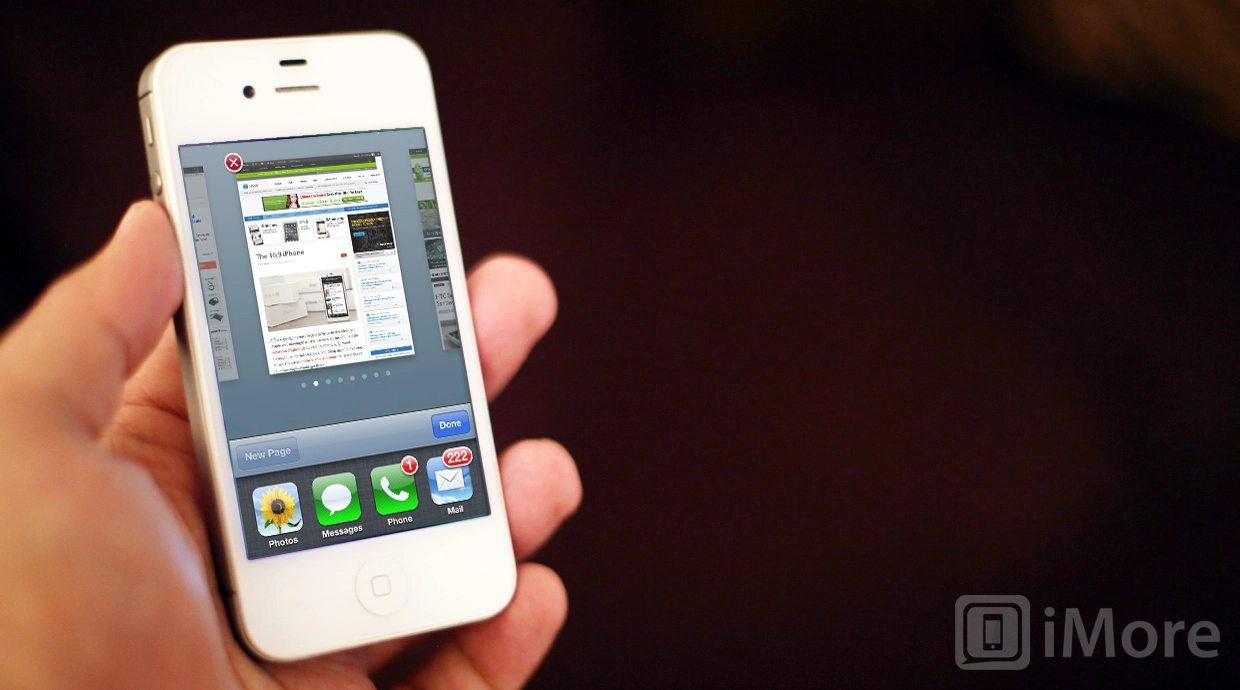
Instead, to show open apps, to make them more visually identifiable, and to enable faster switching between them, Apple went back to the Dock. Or rather, went behind it.
With a double click of the Home button, the active screen fades and lifts up, revealing a background Dock, and showing open apps as a horizontally scrollable set of app icons in reverse chronological order. Tap an app and, with a carousel-like flourish, the current app swings around to the back and the selected one swing to the front.

This configuration shows more apps and makes each app more immediately identifiable than Safari Pages. Four apps is more than the one central Page, and the two Page edges on either side. Also, icons are typically faster to differentiate than thumbnails. Their information density is lower, however, so while you can tell which app it is, there's nothing to show what state the app is in. (In iOS, with the exception of Calendar, all the icons are static as well, further lowering information density.)
If the tasks you are doing are chronologically proximate, the switching is fast (e.g going back and forth between the same two apps). Otherwise you need to swipe horizontally through a potentially long list of apps to get to the one you want, which in some cases can be slower than using the regular Home screen app launcher.
When in fast app switcher mode, roughly 80% of the iPhone screen (and more of the iPad screen) is not used. Similar to the Alt/CMD + Tab desktop interface, this puts the focus on the task of app switching, but comes at the expense of waste screen space that could be put to better use (for example, like it is in Mission Control on OS X).
Apps in the fast app switcher can't be re-arranged, but by tapping and holding, they will go into "jiggly" mode and can be closed by tapping the X icon at the top left.

With iOS 4.3, Apple also experimented with gesture-based fast app switching on the iPad, and made it official in iOS 5.
With gesture-only interfaces, while switching can be fast (though also constrained to reverse chronological order), it offers no visualization what-so-ever. You can only tell which apps are open by swiping through them all. (Which is likely why Apple also added gestures to bring up the existing fast app switcher and Home screen app launcher interfaces as well.)
And so app switching remains today, more CMD + Tab than Exposé or Mission Control, more identifiable than informational, more a utility than an experience.
Android incarnations

Google's Android mobile operating system embraced 3rd party background processes and task switching early on in its development. Between Android versions, and original device manufacturer (ODM) interface layers like HTC's Sense, Motorola's Blur, and Samsung's TouchWiz, there have been quite a few different implementations.
The current version, the one used in Android 4.x Ice Cream Sandwich, was spearheaded by Matias Duarte, formerly lead designer of webOS at Palm. So, it's no coincidence Android has taken a webOS-like approach to app switching -- albeit at a 90 degree angle. (You scroll vertically instead of horizontally.)

Because Android has ODM interfaces, and 3rd party launchers, and a custom ROM community, if you don't like Google or anyone else's version of task switching, you can choose another device, or sometimes another implementation for your existing device.
BlackBerry PlayBook OS cards

BlackBerry's PlayBook OS borrowed heavily from Palm's OS-wide Card implementation of Apple's Safari-bound Pages interface as well. It was first seen in late 2010 and released in Spring 2011.

The 7-inch screen, larger than a phone but smaller than a 9.7-inch tablet, combined with the real-time nature of the QNX underpinnings, makes for similarly wonderful visualization. Because of that, it has all the advantages of webOS' card metaphor.
Windows Phone 7.5 Mango cards

Microsoft's original smartphone operating system, Windows Mobile, had robust multitasking but an antiquated user interface. Windows Phone launched in late 2010 with the elegant, "digitally authentic" Metro interface, but initially lacked 3rd-party multitasking. That changed with Windows Phone 7.5 Mango in the summer of 2011, which re-introducted a much more limited multitasking to Microsoft's mobile phone platform.

However, while many elements of Metro were fresh and different from other mobile operating systems, Microsoft chose to go with a highly constrained version of the now very familiar, almost commonplace Pages/Cards, horizontally scrolling thumbnail metaphor for fast app switching.
BlackBerry 10 grid

BlackBerry 10, expected to ship in the fall of 2012, doesn't keep the card metaphor of the PlayBook but switches to a grid view for app thumbnails. You get to see 4 at first, and can swipe down to 4 more. You can also swipe immediately into the app launcher, or notifications and messages, thanks to the gesture-centric user experience.

It's a very slick implementation, with the goal of optimizing one-handed ease of use on larger touchscreen phones.
Additional resources

