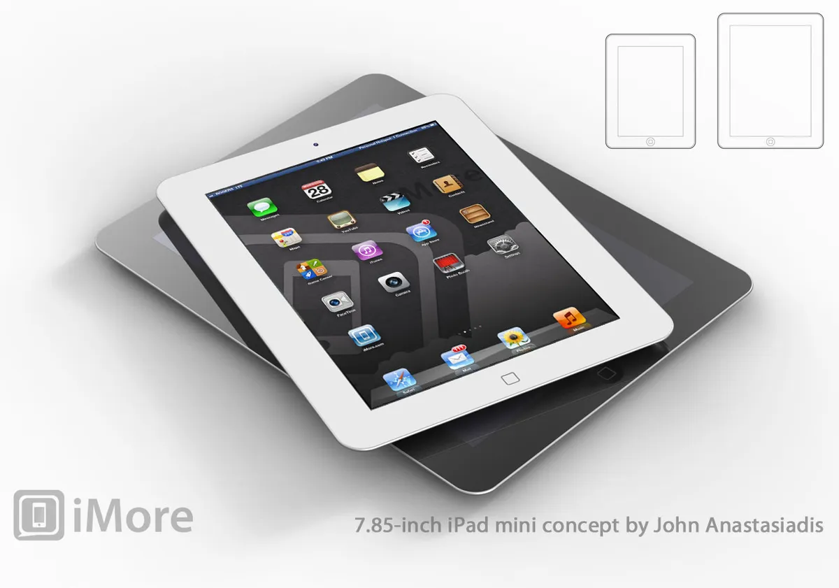
There's been a lot of discussion surrounding why Apple would release an iPad mini, but maybe even more concerning how Apple would go about implementing it. iMore originally heard back in May that the so-called iPad mini would be almost identical to the current 9.7-inch iPad, simply shrunk down to a 7.x-inch form factor. (I'm using 7.x-inch in lieu of a specific size since we haven't heard a specific size yet, but AppAdvice's A.T Faust III made a great case for 7.85 inches, so feel free to substitute that in.)
Some people, designers and end-users alike, feel the iPad interface won't scale down elegantly -- that touch targets will be too small and interface elements will feel too cramped. I've had the same concerns.
With that in mind, it's worthwhile considering the different 7.x-inch options Apple might choose to implement, and the benefits and compromises inherent with each.
Note: Joel Bernstein of Cast Irony did a lot of the heavy number lifting on this subject already. Rather than repeat it here, just go read his article first.
Interface realities

The original iPhone had a 320x480 pixel and point resolution, for a density of 163 ppi. The original iPad had a 768x1024 pixel and point resolution, for a density of 132 ppi. When Apple went to Retina displays, they doubled the pixels vertically and horizontally (@2x), but left the point resolution the same. In other words, where older iPhones and iPads had 1 pixel per point, and new Retina iPhones and iPads have 4 pixels per point.

This means the pixel density of the Retina iPhone jumped to 326 ppi and the Retina iPad jumped to 264 ppi, yet the point size, however, remained the same. That's why the physical size of buttons, sliders, and other default (UIKit) interface elements did not change from non-Retina to Retina devices -- they simply looked sharper.
The reason Apple stuck to @2x is that other, rather than arbitrary scaling factors, is that it allowed existing @1x apps to run without appearing blurry (due to pixel scaling interpolation) or shrinking beyond useful size on the already small 3.5-inch iPhone screen (due to physical scaling). @1x apps on @2x displays may look decidedly low-res, but all their pixels fall exactly on the point grid.
(To better understand the complexities that come with non @2x scaling factors, see Marc Edwards' explanation on Bjango.com.)

When Apple introduced the iPad, however, they didn't scale the iPhone interface. They created a new screen size, screen resolution, and aspect ratio, and used a lower pixel density. Because big tablets are generally held further away than small phones, the difference in pixel density isn't readily apparent to the naked eye.
Having a lower point density, however, does make a difference when it comes to usability -- interface elements are slightly bigger on the iPad than on the iPhone.
There's an important reason for this -- accuracy decreases over distance.
The iPhone is small enough that it can generally be used one handed, and small enough that even when a finger is displaced, it's a short, incredibly easy-to-judge distance. The odds of missing even a smaller button are low.
The iPad is big enough that it cannot generally be used one handed, and big enough that when a finger is displaced, it's a longer, not always as easy-to-judge distance. The odds of hitting a bigger button are higher.
The 9.7-inch iPad has considerably more screen space than the 3.5-inch iPhone, and Apple wisely leveraged it with bigger interface elements to increase usability.
(That's especially important for children, seniors, and people who have found pre-iOS computing devices intimidating or inaccessible, and might be in a higher stress state to begin with when faced with interface elements.)
Apple's 7.x-inch options
Given the above, there are several ways Apple could go about producing a 7.x-inch iPad mini, including scaling the iPhone interface up, creating a new interface size, and scaling the iPad interface down.
Scaling up from iPhone
Instead of scaling the iPad iOS interface down from 9.7- to fit 7.x-inches, Apple could theoretically scale up the iPhone iOS interface from 3.5- to 7.x-inches. Gabe Glick on MacStories.net has gone over some ideas in this vein already.
In order to be a proper, scaled-up iPhone, a 7.x-inch iPad would have to have the same screen pixel and point size as the iPhone, and the same aspect ratio. That would mean 640x960 pixels at a 3:2 aspect ratio, which at 7.85-inches pixels works out to 137ppi. That might sound similar to the original iPad's 132 ppi, but the original iPhone was 163ppi and that's what the 3.5-inch iPhone interface was designed for. (Apple redesigned the interface for the 132 ppi iPad.) Scaling up would mean really big interface elements. Really big.

If, instead of stretching 640x960 to fit 7.x-inches, Apple instead kept the pixel size the same and simply added more pixels to reach 7.x-inches, or did some combination of scaling up and adding pixels, they'd run into a few problems.
"Design once, deploy everywhere" is every bit the joke today that "write once, run everywhere" was a decade ago. It doesn't work. Pixel-perfect designers will always want pixel perfect design. Excellence isn't "free".
Given that reality, technologies like Auto Layout and HTML5 might make apps and interfaces more resilient to scaling, but they don't and won't make them bullet proof or let them automagically swell or cramp to fit any arbitrary screen size.
Apple does have some non-@1x or @2x scaling options on the Retina MacBook Pro, but they're not set as default, and either way, a mouse-driven interface used at a greater distance than a mobile device is far more forgiving of stretching and spacing. Apple went with @2x (pixel doubling) on the iPhone and iPad for a reason.
There have been a variety of 7.x-sized Android tablets on the market for a long time now, and many of them simply have run scaled up phone-sized versions of Android apps, to deleterious effect.
Apple CEO Tim Cook pointed that out at the iPad 3 event, calling the Android apps "blown up" or "stretched out" phone apps. (Circa March, 2012 Android Twitter app on the top, Loren Brichter's Twitter for iPad below.)

Increasing the size of iPhone interface elements and/or the amount of white space between them doesn't lead to good looking, great working apps. It doesn't properly leverage the increase in screen size. And it seems to be of limited benefit to the platform.
Introducing a new interface size
When Apple introduced the iPad in 2010, they didn't simply scale up the 3.5-inch iPhone iOS interface. They created a new interface for iOS that better utilized the 9.7-inch, 768x1024 at 132 ppi iPad size.

Apple did provide the ability to run iPhone apps boxed or in fuzzy-double-chunky 2x size, but that very fuzzy-double-chunkiness put considerable pressure on developers to create either iPad-specific apps, or iPad-specific interfaces combined into a universal app.
If a 7.x-inch iPad brings with it an entirely new screen size , for example, 1152x1536, than this approach might make sense. Rather than having blurry @1.5x iPad apps, a new interface that keeps pixels on the grid, and somehow exists between the single column view of the iPhone interface and the double/multiple column view of the iPad interface, could well be a better alternative.
Likewise, if Apple changes the aspect ration, neither cropping nor letter- or pillar-boxing existing apps is a good long-term solution.
Either way, separate apps mean separate downloads and potentially separate purchases for users, and triple-packed universal binaries mean larger download sizes and larger storage requirements for users, even if they only have one of the device sizes to run the app on.
Since current universal apps already have to support both @1x (for iPhone 3GS and iPad 2, both still on the market), and @2x (for iPhone 4, iPhone 4S, and the new, gigantic iPad) assets for both interfaces, the file sizes are big to begin with.
A third screen size would mean apps and interfaces specifically designed to look and work great at 3.5-inches, 9.7-inches, and 7.x-inches. But it would also mean having to buy Angry Birds, Angry Birds HD, and Angry Birds 7 (or whatever developers come up with as classification), or having to download Infinity Blade 3 at a whopping 2+ GB.
And if an initial iPad mini isn't Retina, it will be one day. adding @1x and @2x assets will make an already bloated universal binary even more so.
Universal binaries are often too big for the 50MB 3G/4G download limit as it is, how many more would be pushed over the limit to support a unique 7-inch interface?
Multiple screen sizes increases complexity and overhead for developers and users alike. This solution might provide the best apps, but at considerable opportunity cost.
Scaling down from iPad
As mentioned, this is the solution iMore originally heard Apple was going with. Essentially, iOS 6 as it's running on the current iPad would simply run, scaled down, on the 7.x-inch iPad. Pixel size would be the same the 9.7-inch iPad, 1024x768. (Getting 2048x1536 down to 7.x-inches for around $200 may not be doable until future generations.)
Pixel density would be around the same as the original 3.5-inch iPhone, 163 ppi. (Or 326, the same as the iPhone 4 and iPhone 4S, if and when it goes Retina.) Quite the coincidence, as noted by Daring Fireball's John Gruber.

Everything would then simply stay the same. Buttons and touch targets would be smaller, but not unusably so. The "slack" that currently exists between 3.5-inch iPhone interface elements and 9.7-inch iPad elements would just disappear, and you'd have the same basic iPad look with the same basic iPhone feel.
A 7.85-inch iPad would still require two hands to use, but the shorter distances would allow slightly better accuracy, again equalizing out the slightly smaller interface elements and touch targets.
Keeping the current iPad interface and scaling it down would mean developers and users could run the same iPad apps they do today. Universal binary sizes could likewise remain the same, since no new interface sizes or asset sizes would be necessary. White space wouldn't increase, so the visual density of apps would remain the same.
It's the simplest solution, and those are the ones Apple typically implements.
How other platforms have handled 7.x-inch form factors

Other tablet vendors have had 7.x-inch form factors on the market for a while, and different platforms have handled the interface size and usability challenges differently.
Android
The original Samsung Galaxy Tab had a 7-inch screen and ran Android 2.2 Froyo. While Samsung made optimized versions of contacts, calendars, email, reading, and music apps for the 7-inch screen, in general, apps ran very much in the model of the "stretched out" or "blown up" smartphone interface on a tablet Apple CEO Tim Cook referred to at the iPad 3 event.
Amazon forked Android to create the 7-inch Amazon Kindle Fire, which runs a proprietary interface designed to facilitate buying and consuming content from the various Amazon stores. That focus allows for a big, bold look that's easy to use as intended.
Perhaps not satisfied with their own Android 3.0 Honeycomb efforts, or the efforts of their partners' tables, including updated Samsung tabs and the HTC Flyer, Google has just released their own Google Nexus 7 tablet. It runs the latest Android 4.1 Jellybean operating system.
On Google+, Dianne Hackborn shared a lot of insight into how the Nexus 7 handles interface scaling. Here's a brief excerpt:
Some people have commented that the UI on the Nexus 7 isn't a scaled down version of the 10" UI. This is somewhat true. It is also not just the phone UI shown on a larger display. Various parts of the system and applications will use one or the other UI (or even a mix) depending on what works best. For example parts of the system UI (status bar and navigation bar, settings) use the phone layout since they too compact in 600dp of width. Other apps use the tablet UI or even a mix -- for example Gmail uses the tablet UI in the conversation list, but the message screen is either a single pane like a phone or dual-pane like a tablet depending on whether the screen is currently portrait or landscape.

BlackBerry
The BlackBerry PlayBook launched a completely new platform for RIM, and that meant they didn't even try to scale the existing BlackBerryOS interface to tablet scale. Instead, they started fresh and they made a purpose-built -- if clearly webOS influenced -- interface entirely for the 7-inch form factor.
According to Kevin Michaluk of CrackBerry.com, the 7-inch scale was usable but cramped.
From a user experience standpoint, I'm less sold on the BlackBerry Tablet OS than I'd like to be. Part of this is due more to the size of the PlayBook's display than anything else - at 600 pixels tall when held in landscape you just don't have a lot of pixels to work within the web browser, or in apps where the keyboard is displayed which takes up half the screen. It doesn't kill the experience, but it certainly makes the experience less enjoyable than it would be if you had a larger display. And while it took a little getting used to, I personally enjoy the gesture-based navigation. But I'm a 30-year old wannabe techy (who acts like he's 19 most of the time). My main concern here is that between the bezel gestures and multi-tasking homescreen there's a lot going on. It's a bit "gadgety" for lack of a better word. One of the reasons Apple's iOS products are so successful is that people of all ages, literally from 2 to 92, can figure them out quickly with little frustration.

For BlackBerry 10, their upcoming new smartphone platform, RIM will now be facing a similar challenge -- scaling down and re-imagining the 7-inch PlayBook experience to run on a 4.x-inch or smaller BlackBerrys.
webOS
Sadly, the 7-inch webOS tablet, called the TouchPad Go, was never released. It was manufactured, however, and some of the units did make their way into the hands of webOS enthusiasts. Interestingly, the TouchPad Go took exactly the same path to 7-inches that iMore heard Apple is taking -- they shrank their existing 768x1024, 9.7-inch TouchPad screen down to a 768x1024 7-inch screen, and took the existing interface down with it. The pixels were smaller, so everything from buttons to touch targets were simply smaller.
According to Derek Kessler of webOS Nation, there was little to no loss of usability, though the original Touchpad felt more natural in portrait orientation while the Go felt more natural in landscape.
With webOS not altered in any way for the seven-inch screen, all of the touch targets are smaller on the Go (like the screen they're approximately half the size in area, dimensionally about ¾ the size). For everything we tested this didn't prove to be a major problem. The only place where the smaller screen size coupled with no changes proved to be an issue was with the keyboard, where the XS setting for key height was laughably small (approximately a quarter inch tall). Thankfully, webOS 3.0 still packs the adjustable size keyboard, and where we tend to use the S on a ten-inch TouchPad we find M more comfortable on the Go.The seven-inch screen was no hindrance to use, with every app functioning as expected and working just fine at the smaller size. The higher pixel density, while welcome, wasn't really that noticeable in practice. What is noticeable is how much smaller text is. Even in landscape orientation we found that we often had to zoom into easily read text on most websites.
And it's interesting to note that shrinking 768x1024 down to 7-inches is slightly smaller than the rumored 7.85-inches Apple is rumored to be considering.

Conclusion
If you've ever watched an Apple engineer "test" an app -- by which I mean grab a device and start rapidly putting it through every permutation of interactivity imaginable, trying to break the experience in every way possible -- you know that it'll be a challenge for anything truly unusable to exit Apple. Of course there will be disagreement over the degree of usability, and the compromises Apple takes to get there, but that's always the case.
When rumors of the original iPad first started to circulate there was endless debate about how Apple could implement the multitouch keyboard. It had to be a fan. No, a circle. No, a fanning circle! But when the iPad debuted in 2010, it was just a keyboard, not dissimilar to the iPhone keyboard before it. Later, Apple added a split keyboard. That's Apple's modus operandi.
If and when Apple decides to bring the 7.x-inch iPad mini to market, they'll more than likely do it the same way they do most things -- in the simplest manner possible.
Additional resources