Parts of iOS 7 shown off by Apple during the WWDC Keynote{.nofollow} and on Apple.com{.nofollow} look like we're still seeing the design briefs or wireframes rather than the final assets. Palettes have been chosen, elements have been put in place, but so far it looks like iOS 7 hasn't been given the level of polish we've come to expect from Apple, even during the beta stage. From icons to interface elements to typography, we seem to be getting a very rare glimpse at a very early work-in-progress, and something that still needs of a second coat of design paint.

Given the realities of iOS 7's development, that makes a certain amount of sense. Whether or not Tim Cook's change in leadership led to a rapid change in direction, whether or not Jony Ive's desire to shake things up led to the marketing design department taking the lead, rather than human interactive department, whether or not iOS 7 is really more of a late stage alpha than an early stage beta, it's absolutely the most audacious interface transformation we've ever seen from Apple, and that type of evolution isn't easy, and certainly not at this pace.
Yet beyond the level of finish, there are certain things that seem... off. For all the amazing new work Apple has put into removing textures, amping up the skeumorphism, and opening up the design potential, and almost entirely objectifying and gamifying the new interface model, certain fundamental elements of design seem missing, and that's generating a lot of feedback from professionals and enthusiasts alike.
Apple mentioned clarity, deference, and depth as the key tenenets of the iOS 7 interface. Deference and depth seem deftly handled. Clarity, however, still seems to be a challenge.
Take contrast, for example. A good rule of thumb is that you should be able to hold something away at a distance and still be able to make out all the important elements. Light vs dark, or vice-versa, is the easiest way to ensure that, but so are textured vs. untextured, focused vs. unfocused, and more. iOS traditionally has done that very well. iOS 7, however, includes a lot of light, flat elements on equally light or flat saturated backgrounds, greatly reducing contrast and usability.
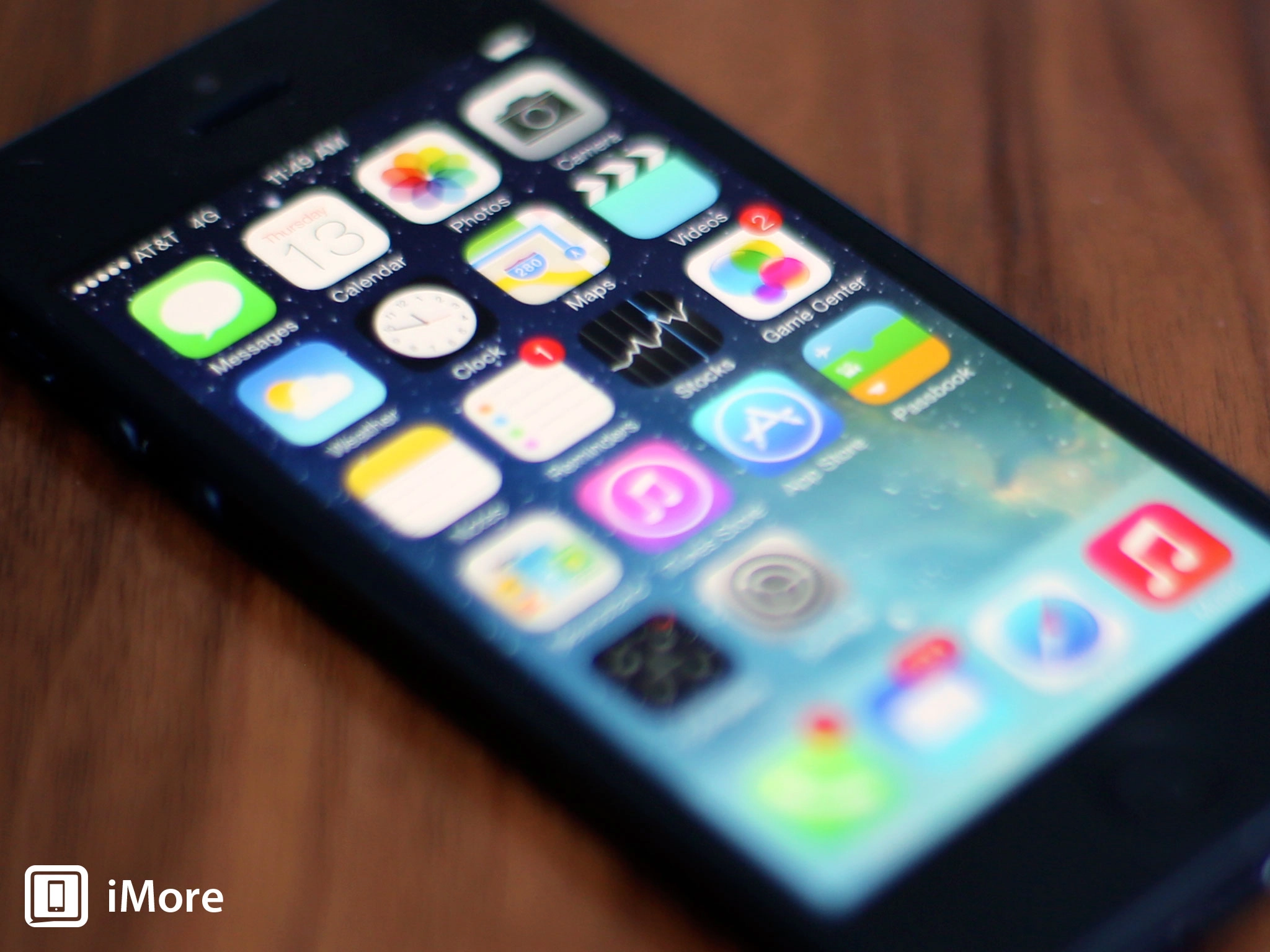
Proportion is another problem area. The grid that's being used doesn't have enough gravity. It should be incredibly difficult for objects to reach towards edges, and almost impossible as a whole. The Safari icon, however, gets its entire circumfrance uncomfortably close to the border. There's a reason why the Apple logo doesn't go from sleeve to sleeve on company t-shirts, or from edge to edge on the top of a Mac Mini.

Just like serif typefaces that need to be visually, not mechanically, aligned to grids, iOS 7 icons need to be visually weighted in their space. (Neven Mrgan explains this brilliantly on his Tumblr.)
Consistency is also an issue. Gradients currently go in different directions, which can confuse the eye and draw attention towards them, rather than the icons, glyphs, and content upon them. (Louie Mantia shared some ideas on normalizing the palette, gradient direction, and icon waiting on Dribbble.)
The typeface, Helvetica Neue Ultrathin, works for small amounts of text set very, very large, but becomes far less legible when used for general interface text. Especially now when un-styled text is being used in lieu of buttons. Perhaps, as Sebastiaan de With has suggested, it's time for a custom typeface optimized for the digital era. If not that, then at least enough weight at each size to be legible at a glance and at a distance.
All of this hampers clarity. Just look at the lock screen, with arrows up and down, Control Center and Camera to drag up, swipe to unlock in text, and only one horizontal direction to go. It's the embodiment of the clash between new and old. Of something unfinished and not yet clear. (And yes, I'll pile on the new signal status indicators as well.)
Apple is almost certainly aware of the issues, of course, of the many of the articles, shots, tweets. Hopefully none of this is news to them; it's the stuff they're already discussing internally and working hard on even as we kvetch and complain.
The architecture -- the springs and struts and planes and movements -- all seem solid. If those were wrong or broken, it would be cause for far greater concern. If Apple hadn't refrained from showing off several iOS apps, not to mention the entire iPad version of iOS, if Apple had given the indication iOS 7 was locked and loaded, it would be cause for far greater concern.
As it is, what we've seen of iOS 7 so far feels more like a sign of just how hard everyone at Apple is working and how fast they're racing towards their fall finish line.
Visual design is where Apple lives, however. They've always had among best and the brightest visual designers on the planet (say what you want about leather or felt, they were rendered beautifully). Hopefully those designers are already hard at work tweaking the palettes, adjusting the grids, evening out the gradients and glyphs, and making the typography shine.
Hopefully they're already hard at work on the polish they do so well, and are already nailing iOS 7's second coat of paint.

