iOS 7 is turbulence. It's change. That scares some people, and makes others hungry. It divides sentiment and reaction, and creates as much fear and noise as it does thoughtful analysis and future thinking. That iOS 7 in its current form had to be realized in under 8 months, that it involved designers at Apple outside the usual human interactive team, and that the beta came in so hot the iPad version wasn't even ready, adds to the turbulence, and to the uneasy feeling that we're still in the midst of change rather than comfortably through it.
Beta 1 has only just been released, and we'll be digging into everything that's been publicly shown off about iOS 7 very soon, but I wanted to share some thoughts to two specific things right now:
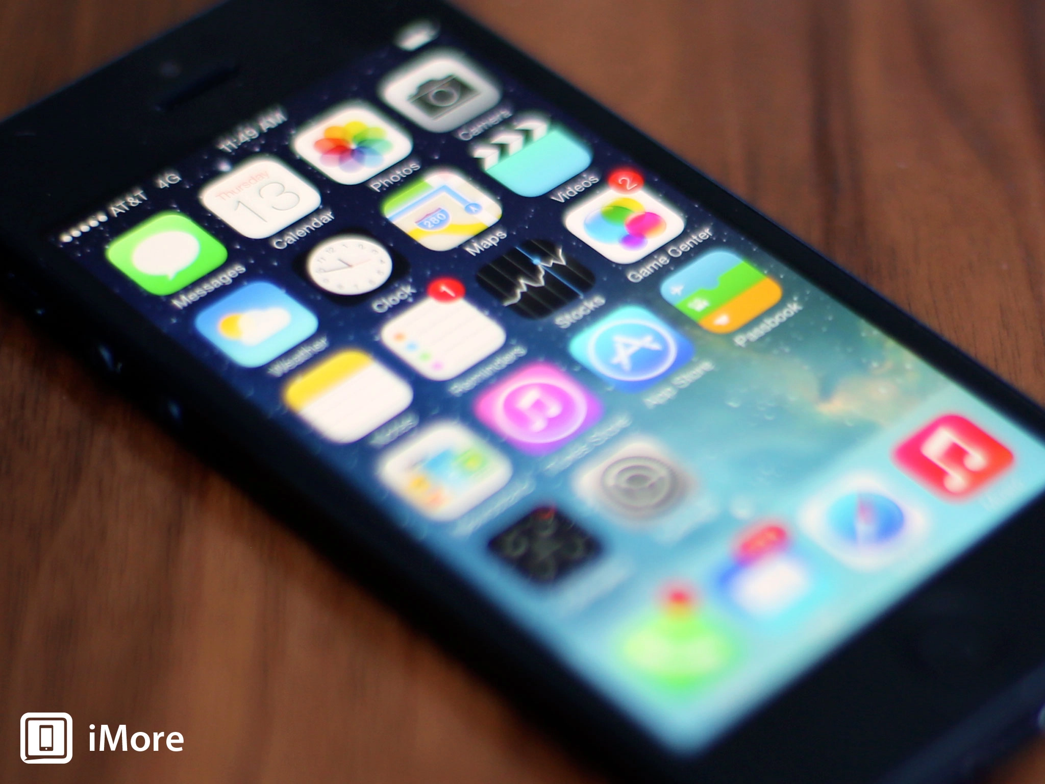
iOS 7 is alive. It moves and "breathes" through dimensional layers.
First, this is the most skeumorphic version of iOS that's ever shipped. Jony Ive and teams might have removed almost -- though not entirely -- all of the textures like stitched leather and green felt, but they amped up the physicality considerably. iOS 7 is alive. It moves and "breathes" through dimensional layers. It turns and folds and bounces and does all sorts of other delightful, skeuomorphic things. Safari tabs are a rolodex you can flip through. Multitasking has cards you can throw away. Notification Center is a surface you can slam down and watch ricochet.
Article continues belowJust like the original iOS used OpenGL and other game-like technologies to make the smoothest animations ever seen on a mobile interface -- and back Apple up into a mobile gaming empire -- iOS 7 includes physics and effects that take the gamification of user experience to a completely new level. It's a virtual collection of objects that can be directly manipulated -- played with and discovered -- by a person's finger, by acceleration and rotation, or by other elements of the system. It's what Apple calls "depth. It's brilliant -- if unfinished -- and very much the beginnings of that "something next".
Second, the iOS 7 design language is liberating. Apple calls it "deference" and intends it to get out the way. That lets content shine, but it also lets designers shine. Previous versions of iOS layered bars -- status and menu and tab and more -- onto designs. It constrained and covered. iOS 7 lifts that off. It pulls away and overlays.
Initially, like with any new design language, we'll get a lot of apps that try to look like Apple's -- the UIKit or Metro or built-for-BB10 apps. That'll quickly give way to designers who take all the space and frameworks and run with them, and make things, beautiful and hideous things, that are new and exciting and not like anything we've seen before.
iOS is now an object inside and out, one that exists to drive focus to the content, media or app or both, but still and always delight to the user.
Again, iOS 7 has only just gone into its first very early beta. There's a lot that can still be fixed and polished and hopefully will. The new grid is great, but things like the Safari icon fill up too much of it (imagine an Apple t-shirt with a logo on it 3-feet wide). As much as they've nailed the depth and deference, they need to follow through on the clarity. It needs a couple more rounds of interactive polish. That, however, like a thousand other details can and hopefully will be brushed in during the beta process. Still, the broad strokes are there.
iOS is now an object inside and out, one that exists to drive focus to the content, media or app, or both, but still and always delight to the user. It's just taken it all to a much more visceral level.
It's scary, but it's the future.

