One of the most obvious and important physical changes rumored for the new iPhone is a bigger, 4-inch display with a taller, 16:9 aspect ratio that uses thinner in-cell technology. While the 2010 iPhone 4 saw Apple double the pixel density of the iPhone display from 320x480 to 640x960, the physical size and 3:2 aspect ratio stayed the same. If the iPhone 5 is introduced on September 12 with a bigger 640x1136 screen, as we believe it will, for the first time that Apple will have changed the physical size and aspect ratio of an iPhone display.
Likely due to a desire to differentiate themselves from the iPhone, and the need to fit a much bigger battery into their phones to feed early, power-hungry LTE chips, Apple's competitors began growing their screens to 3.8, 4, 4.3, 4.5, 4.8 and even larger sizes. Some of them are so big compared to the iPhone's traditional 3.5-inch screen that they look like you could hollow them out and use them as a case.
But some people liked the bigger screens. So that led to a choice -- iPhone at 3.5-inches, or a non-iPhone with a bigger screen. And while record amounts of people kept choosing the iPhone, just as many, if not more, started choosing the bigger not-iPhone. By going to a 4-inch screen, Apple gets back some of those people who would have bought the iPhone over the non-iPhone if only the iPhone had a bigger screen. Since 4-inches, especially the way Apple's doing it, isn't radically, un-pockatably bigger than the current iPhone, they probably won't lose any of the people who prefer smaller phones either. Apple gets the best of both worlds -- a bigger screen that increases the iPhone's addressable market.
At the same time, Apple has continuously worked to simplify their hardware, to remove visual clutter, and to make their devices as distraction free as possible. Just you, the screen, and your apps. A bigger screen with less bezel top and bottom better accomplishes that goal as well.
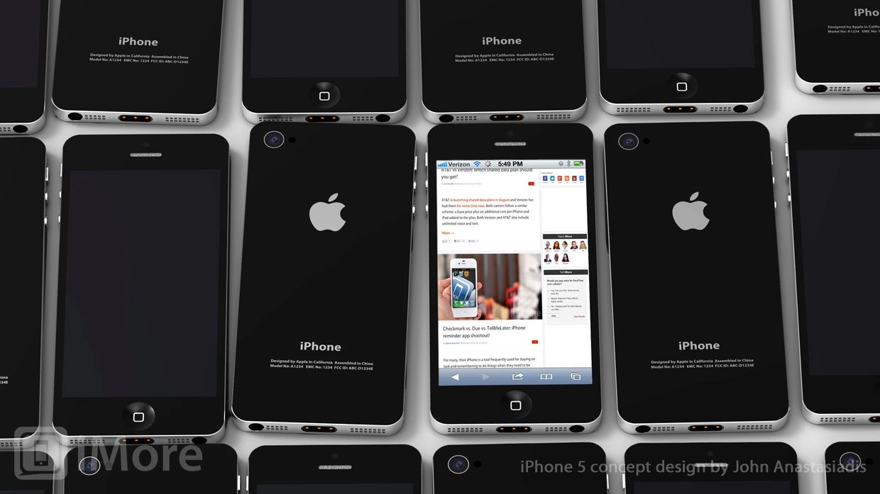
Why Apple is going to 4-inches at a new, 16:9 aspect ratio is a more interesting question. Apple could have simply scaled up the current 640x960 display from 3.5- to 4-inches. But it would have dropped the current 326 ppi density down to 288 and that might have been a deal-breaker in the post-Retina display world. Apple could have increased the pixels both horizontally and vertically. Here are some examples and mockups of different ways Apple could have gone to 4-inches.

Instead, Apple is keeping the pixel density at 326 ppi and the width in portrait mode at 640px, but increasing the height to 1136px. That allows them to keep the iPhone 5 the same width as the iPhone 4 and iPhone 4S, and simply increase the hight. But instead of increasing the height of the device to the same degree as the height of the screen, they're removing part of the top and bottom bezel. So you have a bigger, 4-inch screen, in a phone that's not any wider, and only slightly taller, than the iPhone 4 and iPhone 4S. You have a bigger screen in a device that's still pocketable, and for many, still easy to use one-handed.
To make the iPhone 5 display thinner, Apple is reportedly turning to in-cell technology. This allows Apple to combine the touch sensor into the LCD display, turning what was previously 2 discreet layers, into a single layer that's 0.5mm thinner. That might not sound like a lot, but when you consider the iPhone 4S is only 9.3mm to begin with, it's significant.
What it means for current apps is another story. Apple's built-in apps will no doubt be updated in time for the event. The Home screen will have an additional row of icons. Mail will show an extra message. Contacts will show an extra person. Maps will show more area. Camera will show a widescreen view. Video will better fit most modern, 16:9 TV shows, and movies shot at great than 16:9 will require less letter-boxing.
Some iOS 5 interface elements already look awkward in landscape orientation, but Apple is changing the way things like Share Sheets look, and that should improve landscape presentation for all devices. Even the landscape keyboard will probably get resized and re-spaced to be as okay as ever at 16:9.
Here are some examples and mockups of how apps and interface elements could look on a 16:9 display (scroll down past the dedicated system area mockups).

For third party App Store apps, everything compiled against the existing iOS 5 SDK will likely be displayed letter-boxed (in portrait) or pillar-boxed (in landscape). In other words, black bars would occupy the extra 176 pixels of the new display. So you would essentially see on an iPhone 5 what you see on an iPhone 4S today.
As developers update to support iOS 6 on the iPhone 5, apps that are list-based (UITableView) or grid-based (UICollectView) could add an extra list or grid row and be on their way. Apps that have more flexible layouts (AutoLayout) could take their relative positions regardless of 16:9 or 3:2 display. Games that use OpenGL could fill the right amount of screen on either device, though interface elements would have to be adjusted. Apps or games with a ton of custom, carefully placed interface elements will have to be redone, and redone in a way that lets them properly fill the screen, regardless of which screen they have to fill.
If iOS 6 goes gold master (GM) on September 12, the way previous versions have gone GM at previous events, some developers might be fast enough to update and have their apps 16:9 ready for the expected September 21 launch day.
Here's a video MacRumors put together to show how it could work.
iOS has always been about the apps, not the chrome around the box. That makes the display the ultimate expression of the device. The iPhone 5 will not only have a higher aspect ratio, it'll have a higher display to bezel ratio than ever before.
The bottom line is the iPhone 5 doesn't really have a bigger display, it has more display, and that's an important difference. You're not going to be getting bigger pixels or bigger content, you're going to be getting more pixels and more content.