
When Apple bought NeXT, it was in recognition that the Mac of that time was approaching the end of its technological relevancy. The operating system that had helped start a personal computing revolution had become old and outdated, and NeXTStep offered a new foundation and new beginning that Apple could build on for decades to come. And that became OS X, which became macOS.
But no stack reaches to infinity, and even though NeXStep powered everything from the Intel transition to the advent of the iPhone, it too has gotten old. So, what's Apple to do? Look around for a next NeXT? There isn't one. At least, nothing as practical and pragmatic that could power Apple for the next two decades.

So, instead of building an entirely new bridge as part of a multi-year transition, Apple is spending those same years replacing key components of its existing bridge. Pillar by pillar, cable by cable, section by section.
APFS, the Apple File System, is replacing HFS+. Metal, the Apple graphics layer, is replacing OpenGL and subsuming a host of other graphics and animation frameworks. The launch daemon. The windowing server. One after another, legacy code and technical debt is being rewritten and paid down. And with very few exceptions — cue discover daemon flashbacks — they're making everything that was old about the Mac new again.
Month by month, year by year, the changes are harder to see. But, in a few years, we're going to look up and back and notice that we're suddenly on a very new, very fast bridge, without ever having to go through a full rip-and-replace cycle. In the age of modern, mature operating systems, that's not just responsible — it's remarkable.
And it's continuing this year with macOS Mojave (10.14 if you're keeping track). It's got some crowd-pleasing new candy for us all to look at, and some features often considered to be pro but Apple is trying to make beneficial for everyone. Under the hood, though, Mojave is serving as a testbed for one the biggest evolutions ever to come to Apple's desktop operating system — support for what were originally mobile apps.
Yeah.
macOS Mojave Compatibility
macOS Mojave is a free update for:
- MacBook (Early 2015 or later)
- MacBook Air (Mid 2012 or later)
- MacBook Pro (Mid 2012 or later)
- Mac mini (Late 2012 or later)
- iMac (Late 2012 or later)
- iMac Pro (2017)
- Mac Pro (Late 2013, plus mid-2010 and mid-2012 models with recommended Metal-capable graphics card)
macOS Mojave Automatic Updates
macOS Mojave includes a new Software Updates panel in System Preferences. If you use iOS, you'll immediately recognize the design language. It looks just like Software Update on iPhone and iPad.

Where, for the last little while, you've had to go to the Mac App Store to get your updates on, this now puts it in its own space, and in a far more intuitive and consistent space.
You can go there to check for updates or apply updates. You can also set it to update automatically, so you don't have to worry about checking or applying updates ever again.
If you're doing mission-critical work on your Mac, you probably want to leave it on manual so you can check feedback on updates before you apply your own. Otherwise, set it and forget it.
How to download and install the macOS Mojave
macOS Mojave Dark Mode
Sure, we act like it's all the nerdy, niche features that we love the most. But announce Dark Mode and we cheer like it's the second coming of emoji. Because we're human and we want to have fun and look good doing it. And that's what Dark Mode is really all about.
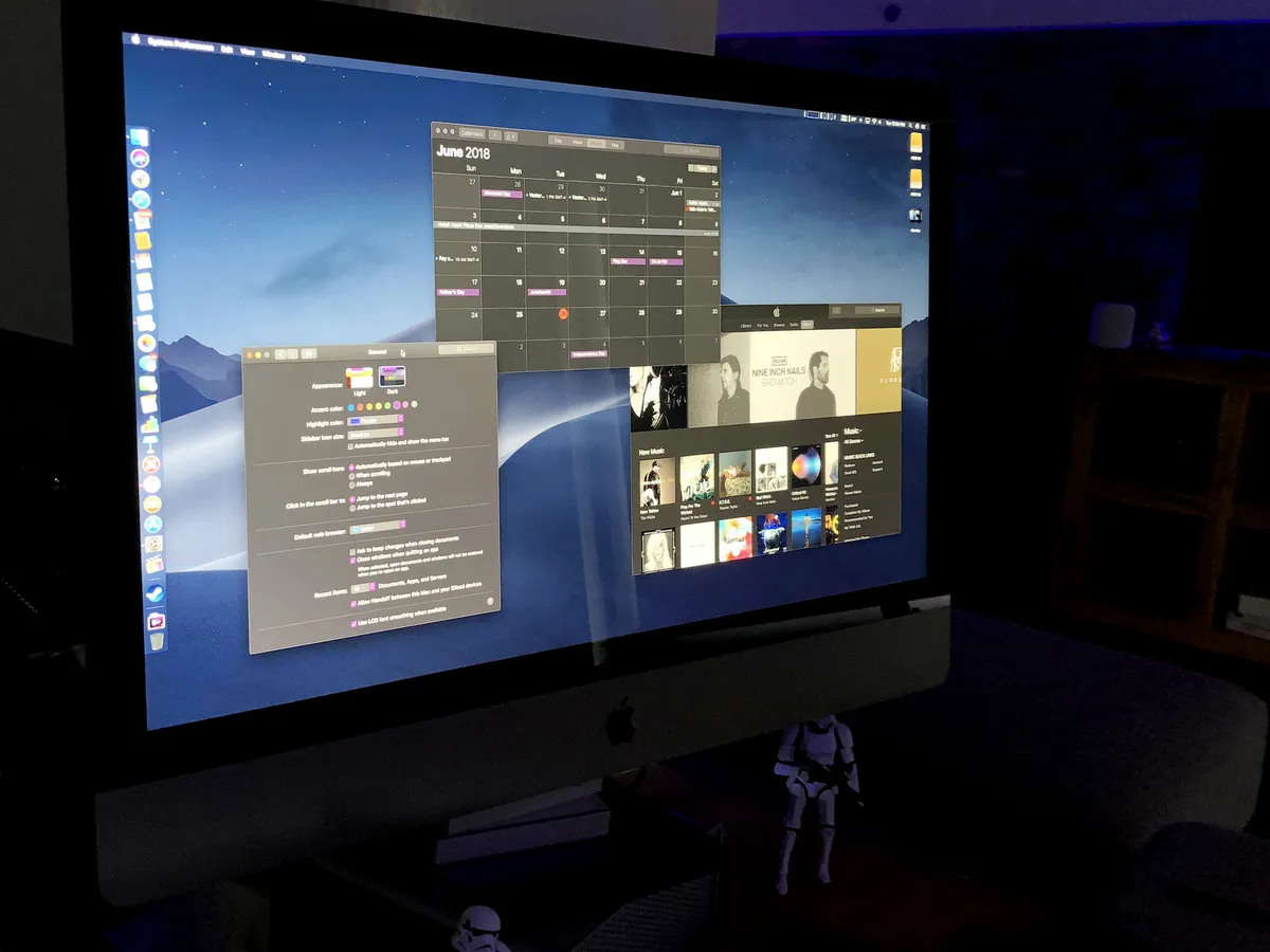
The goal of the new Dark Mode interface appearance is to let the cruft fade away and the content pop. Like, POP. Previously, this was the realm of pro apps and exclusive to creative pros. But, just as the definition of pro has widened over the years, so has the understanding of the value a proper Dark Mode brings.
It can reduce the type of glare that sometimes contributes towards eyestrain and the light pollution that can contribute to your being hit in the head by a pillow when working on the sofa or in bed. It can also help you focus, whether it's on content you're creating, editing, or consuming, or the tasks you're trying to get done.
It works because Dark Mode on Mojave is enveloping. Dark Menubar. Dark Dock. Dark apps and sidebars. Dark buttons and backgrounds. But it's also deliberately consistent with "Light Mode", so you can switch back and forth without it feeling disruptive.

Developers can even specify different colors and appearances for Dark vs. Light interfaces in asset catalogs. So, for example, a lighter sky blue banner for Light Mode but a navy blue banner for Dark Mode. That way, apps look cohesive no matter which mode you're in.
That the modes are so easy to switch between is especially great. While I love Dark Mode for some pro apps and late night use, I find it a tad overbearing and even gloomy if I sit in it all day. My eyes and my moon need light! This way, whenever I have the slightest urge to switch, I just switch and go on about my business.
I particularly like that aspect because, while I love Dark Mode for some pro apps and late night use, I find it a tad overbearing and even gloomy if I sit in it all day. I need my light! So, the ability to switch easily makes both modes better.
To coincide with Dark Mode, Apple has added new accent colors as well, and they work for both Dark and Light. Joining the venerable blue and graphite are red, orange, yellow, green, purple, and pink. It might seem like a small thing, but being able to highlight your interfaces with your favorite colors doesn't just make controls pop, it makes you pop.

Some of what Apple has done with Dark Mode is obvious: When you click a button, instead of it getting darker, it gets brighter. Some is not so obvious: The effect that indicates buttons are grouped together, instead of looking recessed, looks backlit.
Windows, on the other hand, to maintain a consistent depth effect, have drop shadows in Dark Mode just like they do in Light. (Though Dark Mode gets a rim stroke to go along with a stronger rim shader to keep it looking nice and crisp.)
Also, Dark Mode isn't just dark-as-in-desaturated. In order to prevent clashes, the system samples what's behind a window, including the system wallpaper. Then, it subtly tints the window — and controls because of their slight translucency — based on the average colors, and mixes that with a base gray, so that the color temperature of the window matches the rest of the environment and your wallpaper. It's a dynamic process that updates as you move windows around, so all the elements on your screen always feel part of a cohesive whole.
(If you hate the idea of tinting, you can pick the graphite accent "color", which forces no tinting at all.)
Vibrancy, which is what Apple calls the bright, saturation boosted, translucent effect applied to things like app sidebars, is also optimized in Dark Mode to maintain legibility. Basically, gray background elements take the place of white so that the contrast stays high, even in lower opacity levels.
Glyphs, or the monochrome icons used throughout interfaces, have also been adjusted so that they maintain weight legibility on dark backgrounds. Often, they've been redrawn to replace outlines with solid forms and details with knockouts.

It all results in a Dark Mode that's rich and polished — something that Smart Invert Colors on iOS, for example, doesn't really achieve.
For end users, the interface is the app. It's what we spend all our time staring at and/or interacting with. Change some plumbing deep in the foundations of an app, and maybe some of us will notice. Change the appearance, and most of us can't miss it.
That's why how interface looks is so incredibly important, especially when it's at the system level. Get it right and we'll love you. Get it wrong and we'll come for you.
macOS Mojave got Dark Mode right. It's simple but sophisticated, fresh and even a little futuristic.
macOS Mojave Desktop & Stacks
To showcase both the new Dark Mode and the established Light Mode, Apple has also added Dynamic Desktops to Mojave. Well, one Dynamic Desktop at least so far. It's an image of the Mojave Desert, of course, but it slowly changes from morning to afternoon to night as the sun rises and sets.

The effect works so well, I hope Apple adds more Dynamic Wallpapers to the mix. Actually, I hope Apple lets designers and developers make third-party dynamic wallpapers — for both macOS and iOS. If we can have sticker apps, why can't we have wallpaper apps, right?
It just makes the whole system feel so much more fluid and alive.
To make sure you can see that system, Apple is also adding Desktop Stacks.
Confession: I'm one of those people who dumps almost everything onto the desktop and then, when it feels too cluttered, drags it all into Downloads, and leaves it buried there until system cleaning or failure requires or ordains its removal. (I do snap them into an orderly grid — I'm not a chaos monster.)
So, for me, the idea of something that automagically creates some kind of balance between the desktop dump and folder-em-and-forget-em holds a lot of appeal.
Just hit Finder > View > Use Stacks and all your files race into neat little piles. By default, they're sorted by type. You can change that to date added, modified, created, or last opened, or have them stacked by tag instead.

Once you have stacks turned on, any new file you fling at the desktop will curve instead into a stack as though it's caught in a gravity well. Try as you might — and it's fun to try! — you just won't be able to mess up your desktop again.
When you want to see what's in a stack, place the mouse pointer over it and then scrub through with a two finger swipe or click to Expose the entire contents.
That it's broadly consistent with how stacks have worked in the Dock for years is a huge plus. There's nothing better than when expected behavior meets expectations.
When I first started using Stacks in the beta, I worried if having some order to the chaos just meant I'd escalate the chaos — dump even more stuff on my desktop. The answer turned out to be yes. But since I don't see it, I don't really care. And that's a win.
macOS Mojave Finder
Finder has a new Gallery View that feels like Cover Flow finally graduated college and got a job. It's big, it's bold, but it's also serious. You get to see the current document, image, or video center stage, while the rest of your files sit in the front row, waiting for their turn.
I often bounce between Finder modes trying to get the best combination of visibility, density, and performance — pick 2, I know! — but Gallery really does strike a good balance.

At first, I was frustrated that when I flipped from List view to Gallery, the on-deck wouldn't keep the same sorting order. For example, if I had List sorted by date added, and I flipped to Gallery, the on-deck would be sorted by name. I tried setting the Finder sort option, and it didn't help. Eventually, after clicking everything, I figured out I had to click on the on-deck itself and choose the specific sort order there. I'd prefer the sort order stay with last selected, universally, but I can see how others would want hard sorts per state. You may not be able to make everyone happy here, but making how it works more apparent would benefit everyone.
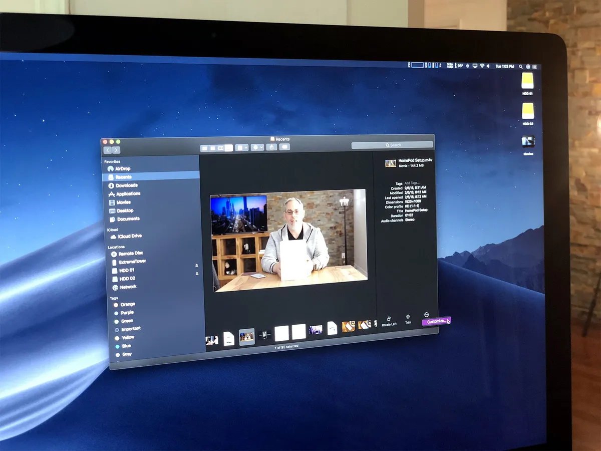
There's a new full metadata preview panel, built right in. It's most valuable with photos, where you can see all the EXIF data you want, any time you want.
The new quick actions panel is much the same. You can rotate, crop, or annotate an image, trim audio and video, build PDFs, and even create custom automations. It's contextual, so the exact options you get depend on the type of file(s) you've selected. But, it means you can do a bunch of common tasks, right from the Finder, without having to open a single app. And since you can multi-select, the same applies to simple batch jobs as well, like rotating a bunch of images all at once.
You can create your own custom actions in Automator and assign them to Quick Actions. That way, any routine task you perform like file conversion or watermarking is always available at a click.
(You can't create Siri Shortcuts — the brand new voice activated actions and automations debuting this year with iOS 12. When it comes to new features that aren't cross-platform dependent, the primacy of iOS means the Mac typically gets them a year or several later — see News, Voice Memos, Stocks, and Home, below.)

Quick Actions work in Quick Look as well. Introduced in OS X Leopard back in 2017, Quick Look lets you tap the space bar to preview a wide range of file types. Now, you can act on them at the same time.
It may not seem like a big difference, but there's something about freeing a file from the finder, especially an image, video, or PDF, and seeing it on its own, that makes it not just bigger but more graspable. And that makes quick actions in Quick Look even more useful.
macOS Mojave Screenshots
Instant Markup, especially for screenshots, was one of the biggest sleeper hits of iOS 11, released last year. This year, it comes to macOS Mojave, and in a very Mac-like way.
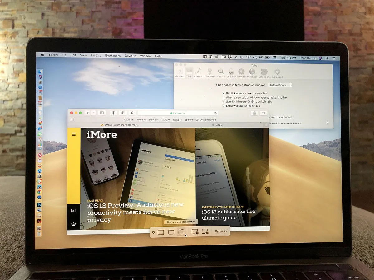
The original screenshot keyboard shortcuts are still there but they're joined now by a new one: Shift-Command-5. It brings up a toolbar with options to capture the entire screen, capture a window, capture a selection, record the entire window, and record a selection.
Previously, there were no universal keyboard shortcuts for screen recording. You had to launch QuickTime first (or your favorite third-party app) and then start a screen recording. So, having screen recording just a few keystrokes and clicks away is a terrific increase in convenience.
With a catch: Screen recording from the toolbar is video only. If you want to capture audio as well, you have to run back to QuickTime or another app.

Through the Options dropdown, you can choose to have your screenshots or screen recordings saved to the Desktop or to your Documents folder, sent to Messages or Mail, opened in Preview, or stored in the Clipboard for easy pasting into whichever app you like.
But this is like iOS 11, remember? So, by default, your screenshots and recordings will also float at the bottom right of your screen so you can immediately mark them up or share them. And, because the Mac is the Mac, you can also drag and drop the floating screenshot into any app you like.
You can also simply swipe it away to save it to your default location.
I sometimes find the floating screenshots, first on iOS, now on macOS as well, to be annoying. Like something stuck to my screen obscuring what's behind them until I swat them away. Other times, I find them indispensable to my sharing-based workflows.
Since macOS can't read minds — yet! — I'll settle for the screens being there when I need them.
macOS Mojave Continuity Camera
If you asked me what I most wanted to see in terms of Continuity in macOS Mojave, I would have told you … Handoff for media so I could get up, walk away, and have my music and movies seamlessly switch to my iPhone or iPad. But then, if you'd shown me Continuity Camera, I would have told you … cool, but where in the blue blazes is Handoff for media?

Continuity was introduced in iOS 8 and OS X Yosemite back in 2014 and, along with the simultaneously released Extensibility, helped set the stage for the modern multi-device, cross-app ecosystem.
Basically, it let you transfer everything from activity state within apps to cellular networking and telephony between your iPhone, iPad, Mac, Apple Watch, and Apple TV, quickly and securely, based on your Apple ID and your proximity.
Handoff let you start typing out a message on your iPhone, for example, but immediately finish it up on your Mac, without you having to save, open, or scroll, at all. Continuity Clipboard, introduced later, let you copy something on one device and paste it on another in a way that still feels like magic.
Continuity Camera is the latest addition to the lineup and lets you take pictures with the better, more mobile camera on your iPhone but have them show up immediately on your Mac.
Sure, Continuity has let you AirDrop photos from iPhone to Mac for years, but this is different. This isn't initiating photos from your iPhone. It's initiating them from your Mac.
That may not sound like a big deal. You can take a photo with the FaceTime camera on your Mac, right? Ugh. That's not a great camera and, on the 12-inch MacBook, it's downright terrible.
Well, you can always just pick up your iPhone and take a photo, right? Sure, but not as conveniently and not with as few steps.

Humans aren't great at switching contexts. We're too prone to distraction. And even when we maintain focus, switching back and forth still takes time and introduces complexity.
With Continuity Camera, you're on your Mac, you select Continuity Camera from the contextual menu, your iPhone lights up, you take the shot, you tap to use it, it goes straight to your Mac, and you just keep on working. No AirDrop or Photo sync and fetch needed.
It's particularly useful for when you want to scan documents onto your Mac. Now, I'm just waiting for someone to figure out how I can use it to pull iOS screenshots directly into articles I'm working on in our CMS on the Mac.
That'd be so cool it would almost make me forget about the glaring lack of Handoff for media apps. But not really.
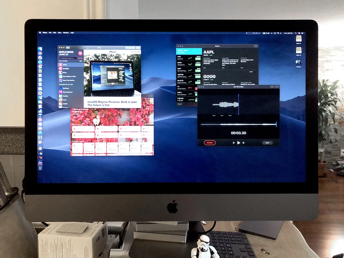
macOS Mojave News, Stocks, Voice Memos & Home
Stocks was part of iOS 1 (iPhone OS 1). Voice Memos was part of iOS 3 (iPhone OS 3). News and Home, iOS 10. With Mojave, all of them are finally coming to the Mac.
That they are coming is good. Amazing, actually. How they're coming, for now, is a hot mess. But, eventually, it could be one of the best things to ever happen to the Mac.
News on Mac is part of what's needed to make the service truly an OS-level service. For some reason, Apple is struggling with News in a way it never did with Music or Photos. Those all launched on both iOS and Mac at the same time (throw in tvOS and watchOS as well), and in hundreds of countries all at once.
News only launched on iOS and only in the U.S., the U.K., and Australia. And it's stayed stuck that way ever since. Which is brutal for a service that feels every bit as deserving of true system-wide, cross-platform, international integration as News.
Mac is a small step forward. As UIKit apps go, it's the best done. You can even two-finger swipe between stories. (You can also space bar to page down, and use the up and down arrow to scroll — but the left and right arrows don't navigate between stories the way the gestures do.)
But Apple needs to do more to make News a proper, international service. Otherwise, none of this matters, not to most of the world at least. And that's a damn shame.

Stocks is... stocks with a sidebar and business news. While News opens stories in the News app Stocks, at least for me, pushes everything into Safari. That could be a result of me trying to use it in Canada, or it could be working as designed. Neither of those two possibilities are good.

Voice Memos is nice to have on Mac. You could always fire up QuickTime or an audio editing app and record but basic voice recording was never their focus and it showed. You could and can still get a third party voice recorder, often with better and more convenient features, but there's something to be said for having a built-in baseline that's ready and waiting even before you think you might need it.
The best part, though, is that Voice Memos syncs over iCloud now, so all your recordings are always available on all your Apple devices. While moving them from iOS to macOS has gotten considerably less painful over the years, nothing beats not having to manually move them at all. (Now we just need Continuity Microphone, right?)

Home is also on Mac now, and I'm as happy to have it as I am frustrated with how long it took and how it turned out. When we got Siri on Mac we didn't get HomeKit support to go with it. When we got Hey, Siri on the 2018 MacBook Pro, we still didn't have HomeKit on Mac except in beta.
That meant that, while I'm all-in on HomeKit, for the last few years, I've had to reach for an iPad or iPhone and hold down the Power button to control it — yes, like an animal.
Mojave fixes most of that. There's HomeKit support now and a Home app to go with it. But the app is kind of awkward. The main page works ok. You can't use the space bar or arrow keys to scroll, though.
The Rooms page is a little weird. You can two-finger swipe between rooms, if you persist long enough to get past the super-aggressive bounce-back physics and animation. It gets glitchy again all the time, though. (I thought it simply didn't work at first but after several attempts managed to get it "unstuck" like the rings of Nidavellir.) No arrow key support here either, alas.
There is a weird button you can also click to get a weird drop-down for the rooms. That makes switching much more discoverable. Groups and zones remain as undiscoverable as they do on iOS. You have to dig into the room and then the accessory settings to even begin to find that stuff. Which is a shame, because it's great.
I forgive most of those UI sins because the Automation Page is super clean and usable. It's basically the iPad page, but it's solid.

I know I sound like the parent yelling about the messy room just as the kids start cleaning it up, but Mac customers are people too and addressing longstanding gaps in functionality is one thing — addressing the issues that cause longstanding gaps in functionality is another, far more important thing.
Apple needs to do both and, starting with Mojave, it is. Sure, it's awkward and painful right now, but I'm hoping that's just growing pains.
All of these apps, News, Stocks, Voice Memos and Home look like the iPad versions wrapped in Mac-specific interface elements and mouse and pointer support. And that's exactly what they are. Some for better. Some, so far, for worse.
When Apple first began planning the App Store for iPhone, there was some internal debate over whether the company should use the existing Mac frameworks of AppKit or the increasingly popular web frameworks of WebKit.
Apple ultimate decided it needed to do something new and created UIKit.
For the last decade, AppKit has advanced considerably. But, thanks to the popularity of iPhone and the iOS App Store, UIKit has exploded.
Because of everything Apple's done over the years with AutoLayout, size classes, and app bundles, making iPad versions of iPhone apps has been relatively easy. tvOS versions, even.
Not so with the Mac. If a developer of a popular iOS app wanted to bring it to the Mac, large parts of it had to be ported from UIKit to AppKit. Even if the developer was Apple.
That's why many developers of popular iOS apps didn't bother. Even Apple.
In many cases, it wasn't because they didn't want to. They simply lacked the resources necessary to move the apps over given how much work they felt they still had to do to maintain their success on iOS. Yes, still including Apple.
The good thing about problems Apple has to solve for itself is that it typically solves them for developers as well. And they have, even if the solution has been obvious to some and terrifying to others for years:
UIKit on the Mac.
Apple is positioning it as another option for developers, alongside AppKit, WebKit, and the graphics engines often used by games and some design apps. (And, yeah, the horrible Electron — localized Chrome tab — apps that are the new Adobe Air or Java apps.)
It's part of a multi-year project that's being worked on by many teams within Apple, and should result in pushing not just Mac Apps but all Apple apps forward.
Because iOS and macOS share common foundations, sliding UIKit apps in alongside AppKit apps, it's not like starting from scratch. But, because iOS and macOS share very different user interface paradigms, a lot of work still has to be done.
Apple is going to make that easier by moving key UIKit frameworks to the Mac, and adapting them for trackpad/mouse and pointer control, Mac interface conversions like the window-controlling traffic lights, scroll bars and resizing, and the Mac versions of copy and paste and drag and drop.
That where News, Stocks, Voice Memos, and Home fit back into this. Apple is using them to dog-food the first phase of this project.
They're all iPad apps that have been brought to the Mac with "very few code changes", according to Apple. To be clear. They need more changes but mostly in interface — in figuring out the new language and how to best translate into it.
But even now, in alpha form, they're way better and more resource efficient than Electron apps — hi, Slack! — and feel better than progressive web apps, which still feels like something being pushed on the market to serve program manager and not engineering or customer needs.
They're not great Mac apps yet. Maybe that'll change over the course of the year. Or maybe what we consider to be traditional Mac feel will change, just as it did when we transitioned from Classic to Carbon to Cocoa. And there'll be just as much grumbling and hot-taking along the way, I'm sure.
The Mac has to keep evolving, though, and Mac apps along with it. It's been doing it for going on two decades already and it'll keep on doing it, hopefully for many more.
Again, it's going to take a couple of years to get through it but the Mac app ecosystem should end up all the more vibrant because of it.
Phase II starts in 2018 when Developers are going to get a chance to start working with it.
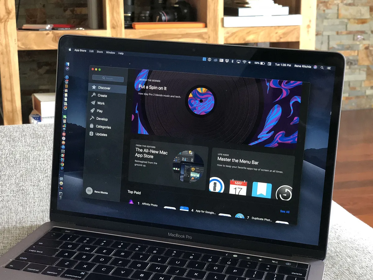
macOS Mojave Mac App Store
I love the Mac App Store. It makes it incredibly easy to download and re-download apps to any Mac I'm using or reviewing, without having to worry about malware, adware, or bloatware.
Historically, though, it's had a few problems.
First, Apple essentially created it and then abandoned it. Unlike the iOS App Store, which saw steady iteration since launch, the Mac App Store was untouched going all the way back to the era of the Big Cats.
Second, Mac apps are different than iOS apps, and not all Mac apps are allowed into the Mac App Store, including and especially ones that don't fit into Apple's sandboxed security model. That meant you still had to go outside the MAS to get some of your apps, sabotaging the convenience.
With Mojave, Apple is addressing quite a bit of both of those problems.
It starts with a complete redesign. It's in the same spirit of last year's iOS App Store redesign but not the exact same style.
Instead of a few, generic tabs along the bottom, it has categories down the side. The first is Discover, which serves the same purpose as the Today tab on iOS.
For consistency's sake, I'd have preferred it be called Today, but there simply isn't enough content going through the Mac App Store as there is the iOS App Store, and so the pace will be weekly, not daily. (And calling it "This Week" would be … awkward.)
Discover is filled with the same great editorial curation, including spotlights, interviews, lists, and tips and tricks, and brilliant graphic design as Today, though. That's what matters. Also, top charts live here now, if those are still your jam.
The other tabs are Create, Work, Play, Develop, Categories (for everything else), and Updates.

Product pages are more like iOS now. There are previews now, which give a much better impression of an app than stills. You can see if apps have been chosen by the editorial team, and ratings and reviews are now easier to see and get to. (And Mac developers are getting the same Ratings & Reviews API that iOS enjoys, so they can respectfully ask for your feedback in their apps.)
As far as I can tell, there's still no way to gift apps from the Mac App Store, which is really frustrating since I've been waiting years to give away my favorite Mac apps. So there's still work here to be done. But, progress!
Speaking of which, there are also some changes going on under the hood with how sandboxing handles root requests, for example, which will allow apps like BBEdit and Transmit back into the Mac App Store. There's still more that needs to happen here, which is why Coda isn't returning yet, but hopefully, it's just the beginning of making sandboxing really work for most apps.
Still, it's a huge leap forward already and the new MAS looks great. Now, all Apple needs is a ton more Mac apps to fill it.
Oh, wait … see above!
macOS Mojave Security & Privacy
Apple believes your personal, private data should remain personal and private to you. Not because you're doing anything wrong or you have anything to hide, but because it's yours and no company has any right just to take it, even if the method of taking it is wrapped up in "free" services.

Some would argue it's easy for Apple to say because its business doesn't depend on data exploitation, or that services are a historical weakness of the company, which makes them a clever strategic target.
Whatever. As a customer, I'm happy to have the option not to have to pay for everything with invaluable personal data that I can never take back.
To help protect privacy in macOS Mojave, Apple is now requiring apps, including its own, to ask explicit permission to use the camera or microphone. (Apps have had to do this on iOS for a while, but Mac is doing some much-needed catch-up here now.)
Apple is also providing the same protection to the Mail database, Messages history, Safari data, Time Machine and iTunes device backups, frequent locations and routines, and system cookies.
Now, this has led to some concern that macOS Mojave is turning into Windows Vista, specifically, these new permission panels are Apple's equivalent to Microsoft's Universal Access Controls (UAC) nightmare of a generation past.
I'm sensitive to that because as much as you want to give users control you don't want to burden them. At best, it's annoying. At worst, it causes the kind of rush-to-click dialog fatigue that's antithetical to the very security it's meant to improve.
Personally, I haven't found the new requestors to be overwhelming. I may be used to most of them from iOS, or I may not do the same sorts of tasks that others are doing who hit into it more frequently, but they make sense to me.
I have found the Finder permission requester to be opaque and potentially confusing. And, at least during the beta, it popped up in some unusual and frustrating places.
Overall, I think the process is better and expect it'll be fine-tuned over time.
Intelligent Tracking Prevention, which debuted last year, used machine learning to try and prevent cross-site tracking. Now, it can also block the share, like, and comment buttons that social networks like Facebook and Twitter use to track you across the web.
Yes, Apple's "shutting them down."
ITP will also try to prevent "fingerprinting" — where companies try to track you based on the configuration of your device — by presenting a simplified, much harder to track configuration. It also removes support for legacy plugins that could be used for tracking.
Like with iOS, Apple is beefing up iCloud Keychain's ability to generate new, strong, unique passwords. Because the Mac is a far more open system than iOS, Apple is only offering this inside Safari on the Mac for now (and not inside apps as well, like on iOS.) But, it syncs with all your devices and still offers such good basic password management that there's no excuse not to start taking better care of your personal security.

To wit, the system will also flag re-used passwords and make it as easy as possible for you to replace them with a new, unique, strong password. To help make getting to them easier, Apple has also added "Hey Siri, show me my passwords" so you can go straight to your account list. You can even ask for specific passwords, for example, "Hey, Siri, show me my Amazon password".
If your Mac is setup with SMS relay, it can also offer to AutoFill any SMS security tokens sent your way (if you have a TouchBar, SMS codes will also show up right there for you to tap and enter.)
macOS Mojave Accessibility
Dark Mode is going to be great for anyone suffering from light sensitivity. (Though inverting colors on the Light Mode is still the best thing to do if you want everything, including content backgrounds, to be darkened.) It also supports reduced transparency and increased contrast for anyone who wants greater legibility.
The Accessibility Keyboard has been improved with support for adding custom toolbars, custom resizing for any aspect ratio, better typing suggestions, automatic spacing after punctuation marks, and automatic capitalization for the first word in a new sentence (think iOS keyboard).
You can configure accessibility options for the Login Window right in System Preferences > Users & Groups, and there's a new preference for Platform Switching using Switch Control.
Once again, kudos to Apple for not only making sure Accessibility is a consideration for every new product, but for every update to existing products.
macOS Mojave Miscellany
Mail now has a dedicated Emoji button, because emoji! Also, suggested mailboxes help prompt you to clean out new messages from your inbox based on how you sorted previous messages.
Safari finally has Favicon support, after choosing not to implement the old, low-res, .ico files of the past and them never getting back on track until now. This should have been in the lede. I know. Bad Rene.
In addition to HomeKit support for all your connected accessories, Siri in macOS Mojave can play Find my iPhone alerts, answer questions about celebrities, food, and motorsports, and search for your photo memories and even get your passwords for you. I've complained several times here about how long it sometimes takes new iOS features to come to the Mac, so it's great to see basic Siri functionality staying in parity here.
Core ML 2 is 20% faster for on-device processing, thanks to batch predictions. And model sizes can be reduced up to 75% thanks to quantization.
Core ML is getting Create ML, which makes building machine learning models easier and faster, even for non-experts. It supports VIsion and Computer Learning, and can work locally on your Mac so you don't need a dedicated server.
New system languages in Mojave include English (UK), English (Australia), French (Canada), and Traditional Chinese (Hong Kong). There are also new dictionaries for Arabic and English, Hindi and English, and Hebrew and English, and a new English thesaurus for synonyms and antonyms.
China-specific features include Traditional Chinese names for apps and features, restaurant names in Simplified Chinese, Chinese holidays for Siri, auto-punctuation for Simplified Chinese in Dictation, the word-of-the-day screen saver has been localized to both Simplified and Traditional Chinese, and Maps will now show the most popular dishes at restaurants for your Hak Jiu Gai Mein dining pleasure!
Japan-specific features include improved keyboard input. Specifically, Apple's made it easier to integrate English and Roman-character words into your typing, with spelling support.
India-features include the above-mentioned dictionary, local festivals in Calendar and Siri, high-quality Hindi dictation, and improved Hindi terminology.
macOS Mojave Conclusion
This year, as I watched the WWDC keynote and, as all the new iOS features flashed past, I found myself saying "finally… finally…. FINALLY!" a lot. iOS is over a decade old but it still feels like there's so many functionality gaps left to fill.
It's not that the Mac doesn't have those. As much as iOS is still catching up to some of the core computing functionality macOS has had since the very beginning, iOS is evolving so fast the Mac often gets left behind.
That's one of the things Apple is addressing with Mojave, including adding much-needed support for HomeKit.
The other thing Apple is doing is continuing the Mac's years-long march into the future. And that's non-trvial for an operating system fast approaching two decades, with NeXT-derived architecture beneath it that's older still, never mind the primordial UNIX foundations underlying all of it.
There's nothing wrong with being old, of course. Of being tried, tested, and proven true. But nothing of the past can ever truly anticipate all the needs of the future. So, it's the job of the present to keep evolving, maintaining the strength of what still works but replacing what'll carry us no further.
It's way smarter and less disruptive than waiting and hoping you can one day rip it all down and replace it with something new.
It still causes some pain: A lot of what people have been complaining about over the last few years hasn't been the result of Apple laying on new features but replacing core parts of the foundation.
Previously, it's been about the system itself. Now, for the next couple of years, it's going to be about the apps that run on it as well.
Yeah, we still need the new Mac Pro and an answer about the Mac mini and MacBook Air (perhaps we'll see those sooner rather than later). But when you look at the sheer scope of work Apple continues to pour into macOS year after year, occasional stumbles and all, it's impossible to doubt the company's commitment to and love for the Mac.
You need look no further than macOS Mojave.

