Album art has never been perfectly centered on the iPhone or iPod touch Lock screens. It's been placed immediately on top of the slide-to-unlock bar. Because of the 3:2 aspect ratio of previous iPhone and iPod touch devices, however, and because the top of the album art and the reflection beneath it peak through the translucent time and slide-to-unlock bars, the visual weighting was close enough to appear centered and thus, balanced. Not so with the iPhone 5 and its 16:9 aspect ratio. Now the bottom alignment of album art lookes decidedly bottom heavy. Worse, there's a big black gap between the top of the album art and the bottom of the time bar.

The advantage of bottom aligning album artwork on the 16:9 display is that none of it is obscured by the name of the song, and even when you double-click the Home button to bring up the music controls, very little is obscured.
I'm sure Apple went through every permutation of this and came up with the best compromise they could, but as a mental exercise it's interesting to explore what the other options might be. Placing the album art dead center wouldn't work, for example. There'd still be an empty black space between the top of the art and the bottom of the time bar.
Butting the album art up immediately beneath the time bar, however, and filling the resulting empty space on the bottom with the traditional translucent reflection. The weighting would then be close enough to once again appear visually centered. When the Home button double-click brings up the controls, more of the top of the album art would be obscured again, but with a small tweak it wouldn't be terrible, and still better than it currently is on 3:2 devices.
Here are samples of how album art currently looks on the iPhone 4S and the iPhone 5 (left and center), along with a mockup of how it would look if fixed as described above (right).

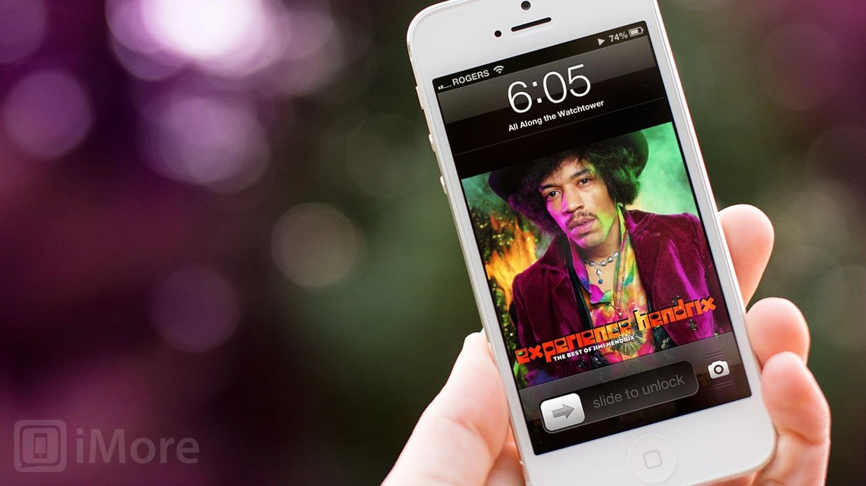
For context, here's the hero pic for this article beside what it would look like with the proposed fix in place.

I hope Apple considers implementing this in iOS 6.something (and yes, I'll file a radar.)
Because, damn.
Update 1: As a number of people have pointed out, the current 16:9 bottom alignment on the Lock screen allows for a seamless transition if you slide-to-unlock straight into the Music app. For me, however, that just means the Music app needs fixing too. Because the the disadvantage is, "Oh god, my eyes, my eyes..."
So here's a quick mock of for that. It's by no means ideal, as it would create immense usability problems -- namely, accidental taps. That to me just show many simultaneous on-screen controls are jammed into the Music app screen. Maybe allow for some of the less commonly used to start off hidden, and be revealed with a tap, and have list view as a double tap?

Update 2: Apple's own Podcasts app centers album art perfectly.

