Twitterrific is the Star Trek of iOS. Not only is it the original, but more than any other app, it has proven its ability to re-invent and re-invigorate itself, over and over again, from one generation to the next. From the Jailbreak days before the App Store to now, post Twitter API crackdowns, post-iPhone 5 and iPad mini, the Iconfactory, and with the team of Sean Heber, David Lanham, Craig Hockenberry, Gedeon Maheux, Tyler Anderson, and Cheryl Culling have continually moved Twitterrific forward while never losing what made it great to begin with. Old and yet new, simple and yet deep, Twitterrific 5 is startlingly beautiful and viciously fast, and represents nothing more or less than a re-imagining of the app and the genre.
(We have a full interview with Gedeon Maheux and David Lanham, with a behind-the-scene look at the making of Twitterrific 5 on this week's episode of Iterate so make sure you check it out!)
The new look is incredibly clean. The themes are white as day and black as night, the text incredibly crisp, and the interface filled with space and color. There are no gradients, no parallax, and almost no chrome to speak of. It'a authentically, proudly digital. A lot of that has to do with designer David Lanham, who began work on the look even before Iconfactory decided to go ahead with the new version of the app. In a very real way, Lanham painted it into existence, and it shows.
Article continues belowWhen you launch Twitterrific 5 you're prompted to grant permission for it to use your Twitter accounts, and then for you to add an account or accounts to Twitterrific 5. It's done simply and elegantly. And then you're in the app.
Twitterrific has always been about reading Twitter, and Twitterrific 5 is all about reading. Period. Everything else gets out of your way, and content is treated as the star.
Well, almost. Twitterrific's iconic Ollie, the bright blue bird responsible for even Twitter's own avian branding, has become the most delightful pull-to-refresh animation to date. Pull down and an egg breaks open, Ollie appears, flaps his wings to bring in fresh content, and then spins and pops out. It's outstanding. And addicting.
Here's the Ollie-to-refresh.

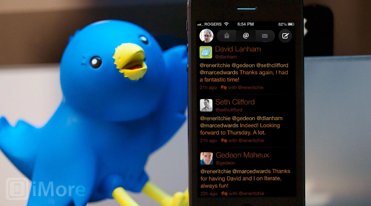
If and when you can bring yourself to stop playing with Ollie, you'll be in the timeline. As tradition demands, it's a unified timeline, which means the tweets of the people you follow, all your @mentions, and all your direct messages (DMs) are all sorted together in chronological order. Some people love this. Others don't. The Iconfactory recognizes that and, for the first time you can disable the unified timeline in settings (see below). Other timeline tabs here include @mentions and DMs, separate and distinct, just as you'd expect.
In the timeline, avatars are shown in roundrects, with usernames beside them and @names smaller and just beneath the usernames. Beneath that is the content of the tweet, brighter, and the time beneath that. Tap a tweet and the time is instantly replaced with reply, retweet, favorite, and more actions. Tap the more icon and you get a set of options including show discussion, translate tweet, email tweet, and retweet with comment.
Tap an avatar and you're taken to the person's profile page. All the stats are there, but if you dig deeper into followers or following, instead of the usual table view with avatars on the left and details on the right, you get a collection view of of avatars in a grid, with details below them.

If you're more into gestures than buttons, you can nudge the tweet from left to right to immediately switch to reply mode. Awesomely, the complete tweet you're replying to is show in tiny, low contrast type beneath the reply space, so you can immediately refer back to it You can also nudge from right to left to immediately switch to conversation view. In conversation view, you can choose between two tabs at the top, the default thread view, or an alternate replies view.

Instead of a hamburger button and basement, you get your own mugshot top left and tapping it takes you to an options screen where, aside from seeing your lists, you can switch from the tweets view to your favorites or to search. Search gives you the option of searching for keywords in either tweets, or in usernames.

At the bottom you can access accounts, change formatting, and adjust you preferences. Accounts lets you add other @usernames you might own. Formatting is something you usually find in ereaders, not Twitter apps, and certainly not in a Twitter app from a company with the generational taste of the Iconfactory. But here's the thing, Gedeon Maheux says they were inspired by iBooks and by the reading experiences that have flourished on iOS since Twitterrific first launched, and they've embraced the idea of options, if carefully selected, eminently tasteful ones. Formatting choices include several fonts, from the default Helvitica to Proxima Nova, Signika, Museo Slab, and Calluna. You can also select avatar size, between small and large, and increase or decrease the font size and line spacing. Lastly, you can choose between the dark (black) and light (white) theme, and adjust its brightness right there, right then. (I keep it on the dark theme. Black on a black-on-black iPhone or iPad mini is just fantastic looking.)

Preferences let you choose between sync services, including iCloud and Manton Reese's Tweet Marker, and sync behavior, including none, show marker, and scroll to marker. You can also turn sounds off and on, and turn the unified timeline on or off (off means no @mentions from people you don't follow, and no DMs, in your main timeline). You can set the dark theme to automatically turn on at night (based on time, Apple doesn't allow developers to tap into the ambient light sensor yet). And you can clear bookmarking logins.

There's also a help button which tells you all about Twitterrific's new gesture support. In addition to the Ollie-to-refresh, and the swipe-to-reply, swipe-to-view-conversation gestures, you can hide the status bar by pushing up with two fingers, and show it again by pulling down with two fingers. (And by some Hockenberry-ian magic, scroll-to-top still works even when the status bar is hidden. Brilliant.)
To attach the latest photo from Camera Roll, tap and hold the camera icon. To clear all text, tap and hold the counter. To switch accounts, tap and hold your mugshot at the top left. To get more options, tap and hold tweets, links, and avatars.

That's the brilliance of Twitterrific 5, and why it strikes the best balance of any version to date. It presents all the basic features clearly and obviously, with buttons and spatial mapping and all the bells and whistles new users not only expect, but really need. Yet for advanced users, tons of shortcuts and edge features are tucked neatly away in gestures and pref sheets.
Twitterrific 5 doesn't have all the features of some other Twitter clients. There are no mute filters. There are no push notification support... yet. Gedeon Maheux says the Iconfactory has architected for it, and is certainly open to it, and they'll listen to feedback from Twitterrific 5 users and use that to help determine their priorities for Twitterrific 5 going forward. It's a true tabula rasa approach, and just like when Apple re-inevents their software, they're starting with the core and will build from that going forward.
For some people that'll be a deal breaker. For others, it'll just means another app will handle Twitter push, and perhaps Twitter triage, and Twitterrific will be the go-to reader for when tweets over time are more important than tweets right now.
Speaking of right now, however.. Twitterrific 5 is fast. It's Star Wars blast door crashing closed an inch behind your head fast. It's action at the speed of smash cut fast. I don't know how much that has to do with a lot of the interface being produced programmatically -- according to David Latham, aside from the avatars and button icons, almost all of it is done in code -- and how much is fiendishly clever coding, but it's one of the fastest apps I've had the joy of using. It's so fast, I enjoy using it just to experience the speed.
I enjoy using it period.
It's Twitterrific, the Next Generation. Again. It has everything that made the original great, torn down to its essence, and built back up for today's iOS devices and iOS device users. It remains the best reading experience on Twitter, and in that regard, Twitterrific 5 is better even than its predecessors.
Note: Twitterrific 5 has been redesigned and recoded from pixel to bit, and as such -- and because Apple doesn't allow upgrade pricing -- it's being offered as a completely new app (not an update). However, the Icon Factory is offering Twitterrific 5 at 50% off at launch, so in effect, everyone who acts fast gets heavily discounted upgrade pricing. Also, just like every other third-party Twitter app, Twitterrific faces user token limits as well, which means they can only ever sell a limited amount of copies. That creates scarcity, and eventually scarcity increases prices. In other words, third-party Twitter apps will only get more expensive over time, as tokens run out. If you enjoy using Twitterrific, want to support the developers so they can afford to keep working on it and making it even better, and secure your tokens for posterity, grab it now.
- $2.99 on sale - Download now

