What would the Mac look like with Helvetica Neue as the new OS X system font?
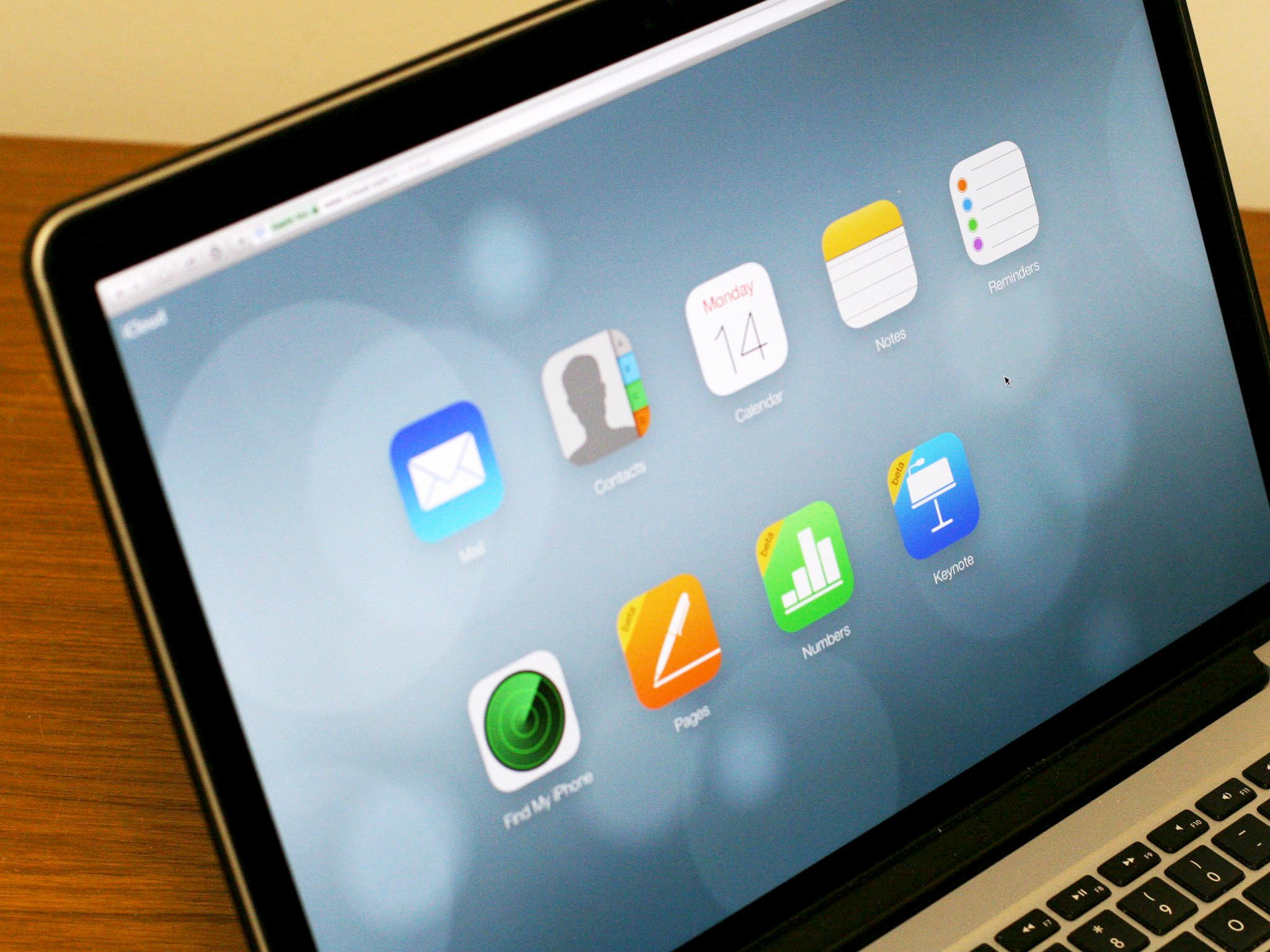
OS X 10.10, code-named Syrah, us currently sprinting its way towards developer beta for WWDC 2014, which kicks off June 2. Syrah is rumored to be getting a Jony Ive-led interface refresh this year, like iOS 7 got last year. That makes a lot of sense, since part of the opportunity cost of iOS 7 getting all that attention was that there wasn't much left for OS X Mavericks. It shipped with a few rough edges, like stitched leather, shaved off but others, like green felt, remaining. 2014 should see a reversal of those fortunes, with iOS 8 getting refined but Syrah getting a more significant visual upgrade. But how far will it go? Craig Hockenberry writing on his blog, Furbo.org

There's no doubt in my mind that Apple is going to overhaul the look of Mac OS X in the next version. As more and more apps bridge the gap between the desktop and mobile, the lack of consistent branding and design across platforms is becoming a problem.I fully expect to see flatter user interfaces, squircle icons, a new Dock, and Helvetica Neue as the system font.

Hockenberry's is not an uncommon sentiment. Apple's desire to bring iOS "back to the Mac" is what resulted in not only the aforementioned stitched leather and green felt finding their way to OS X, but also universal naming conventions for built-in apps and even the concept of an App Store. While both remain distinct platforms that require distinct functionality, the usability overlap between the two remains huge.

However, Hockenberry being Hockenberry he's taken it a step further and written a tool that "swizzles the NSFont class methods to return a different system font". With it you can see what apps designed with the current OS X system font in mind, Lucida Grande, look like in a Helvetica Neue world.

You can find more information on it, and access the tool, via the link below. Check it out and then let me know — can you see the OS X system font changing this June?

Source: furbo.org

Rene Ritchie
Contributor

Rene Ritchie is one of the most respected Apple analysts in the business, reaching a combined audience of over 40 million readers a month. His YouTube channel, Vector, has over 90 thousand subscribers and 14 million views and his podcasts, including Debug, have been downloaded over 20 million times. He also regularly co-hosts MacBreak Weekly for the TWiT network and co-hosted CES Live! and Talk Mobile. Based in Montreal, Rene is a former director of product marketing, web developer, and graphic designer. He's authored several books and appeared on numerous television and radio segments to discuss Apple and the technology industry. When not working, he likes to cook, grapple, and spend time with his friends and family.
13 Comments
  • OSX simulated 3-D (shading, textures) benefits users more than the same implementation in iOS because of the format differences. The smaller screen requires fast discernment of icons and function, whereas a large monitor is a closer approximation for a real desktop. In my opinion, the extra details matter more on the desktop.
  • "The smaller screen requires fast discernment of icons and function..." Yes, but for me the biggest problem with iOS 7's look-and-feel is that buttons look almost exactly like labels (modulo font size and boldness.) Just adding a default subtle rounded-rect border to buttons would be extremely helpful IMHO, and it also happens to be extremely easy to do.
  • re: " ... a new Dock ..." The dock is a perfect example of how Ive's design dogma can be harmful. By the "rules" it should be flat and the fake 3D appearance it has is an abomination. However, back in reality, it works well, looks attractive, and flattening it will not change the functionality one iota, it will just "ugly it up" a bit for those of us that don't appreciate the dogma. If they change the Dock, something will be lost, but not necessarily anything gained. Steve Jobs was wise enough to see that sometimes you have to make an exception to the "rules" of design, because it often just works better that way. Ive does not have this breadth of vision IMO.
  • I'd like to see Lucida Grande replaced with the Helvetica family systemwide. But the first thing I do on my own iOS 7 devices is turn on the "Bold Text" and "Larger Text" options, and other people often ask me to show them how to do the same. I'd like to see the same options in OS X, and in fact I'd like to see dynamic type resizing predominate throughout the interface. (Designers with their meticulously composed blocks of tiny type should be forced to sit with seniors in their mid-eighties struggling to use their apps until the designers understand the importance of legible, resizable type. I've had to tutor numerous seniors in basic computer skills and it's taught me more about user interface design than I learned when I was actually employed designing UI.)
  • I'd be surprised if Apple ever put more attention towards OSX than iOS. That's like focusing the hardware team on the AppleTV an letting the iPad/iPhone languish.
  • I forgot to add.. This statement; "As more and more apps bridge the gap between the desktop and mobile, the lack of consistent branding and design across platforms is becoming a problem" means this guy knows little about Apple as Apple as stated many, many times the opposite. He's basically advocating what Microsoft did for Windows 8 (this guy may be a student of Sinofsky). Not to mention, has anyone really bemoaned the fact an OSX app isn't as consistent as an iOS app?
  • I was surprised with their treatment of 10.9 update, it sucks to look at different systems and I've instantly changed the icons to resemble each other with familiar iOS7 design. Who cares about the desktop anyway since in a year or so it'll be mainly mobile that's used most of the time. Desktop is a relict of the past and that's why it's taken a back seat for Apple.
  • "I fully expect to see flatter user interfaces, squircle icons, a new Dock, and Helvetica Neue as the system font." So do I. But maybe not this year. Mac users brandish flaming USB pitchforks and threaten to raze 1 Infinite Loop every time anything changes in OS X. Even if it's change for the better. So no. There's no urgent need to apply "this year's fall iOS look" to OS X. Having said that, Apple absolutely needs to migrate its Os-es, its own apps, its developers, and finally its users into the future. That's what has kept Apple alive over the decades. Apple has perfected its ability to move everyone forward through potentially life-threatening changes: 68k to PowerPC, Mac OS 9 to OS X, PowerPC to Intel, etc. If any one of those migrations had failed, Apple probably wouldn't be around now. Silicon Valley is piled high with the bones of once-industry-leading corporations that couldn't re-invent themselves constantly. Apple knows that, and self-reinvention is baked into their corporate DNA. Whatever Apple decides to do with OS X and its successors, they've probably already thought it through. All the way. And they've already taken steps along that direction. And sure, we'll see Helvetica Neue and other sizzle somewhere along the desktop OS roadmap. But don't hold your breath. If the next desktop OS version is really 10.10, then Apple is telling us "It's not different enough to be called 11.0 yet."
  • maybe they wouldn't do that at all Sent from the iMore App
  • Maybe they'll just polish OS X the way they have three times before. Original Aqua in 10.0, 10.1, and 10.2 gave way to the softer look of 10 3 and .4. Leo brought the slate look that remained until Lion replaced it with the lighter aluminum theme. Apple can be pretty single minded about things, but despite accusations of the opposite, they know their clientele, and they're aware that Mac users want a different experience, and honestly I'd hope they know better than to let Ive turn everything white. I think there's a good chance that the overhaul will be a lot less drastic than what so many talking heads are saying.
  • Agree. Apple has learned to evolve the superficial look-and-feel chrome of OS X gradually. Do it too fast and the users freak out.
  • Only a proper 11" or 12" inch tablet interests me so I expect big things from Apple soon. iPad won't cut it anymore. There's only one road forward, no device becomes less advanced with time. Did iPhone lose more functionality with years ? Of course not.
  • The site won't let me edit so -
    it's an astonishing achievement that they managed to sell so much of their product (which basically is still a secondary item) in those 4 years. Traditionalists will continue to use them but everyone else is past that period already and a proper system must reflect that.