Apple Watch and accessibility: First impressions
iMore offers spot-on advice and guidance from our team of experts, with decades of Apple device experience to lean on. Learn more with iMore!
You are now subscribed
Your newsletter sign-up was successful
Like others, I've spent the last few weeks trying to understand it and figure out how it fits into my life. So far, Apple Watch has left me very pleased overall.
The fact that I'm so pleased with Apple Watch is a bit surprising. I admit that I was skeptical of the Watch when it was first announced, at least in usability terms. From an accessibility standpoint, I wondered how I could cope with such a small display and the digital crown. Even the seemingly mundane task of putting on and taking off the Watch was concerning. In short, I had a lot of questions.
Fortunately, Apple was able to assuage my fears and answer many of my questions by inviting me to a hands-on briefing of Apple Watch. That experience did much to boost my enthusiasm and confidence for the device. Still, a short demo was no substitute for living with the Watch on a daily basis.
Article continues belowWhile it's far too early to give a definitive stance on Apple Watch, I can share some assorted initial thoughts. As I said, I've been happy with Apple Watch to this point --- but that doesn't mean I'm not without gripes.
Screens and bands
My Apple Watch is the 38mm Sport model with blue Sport band.
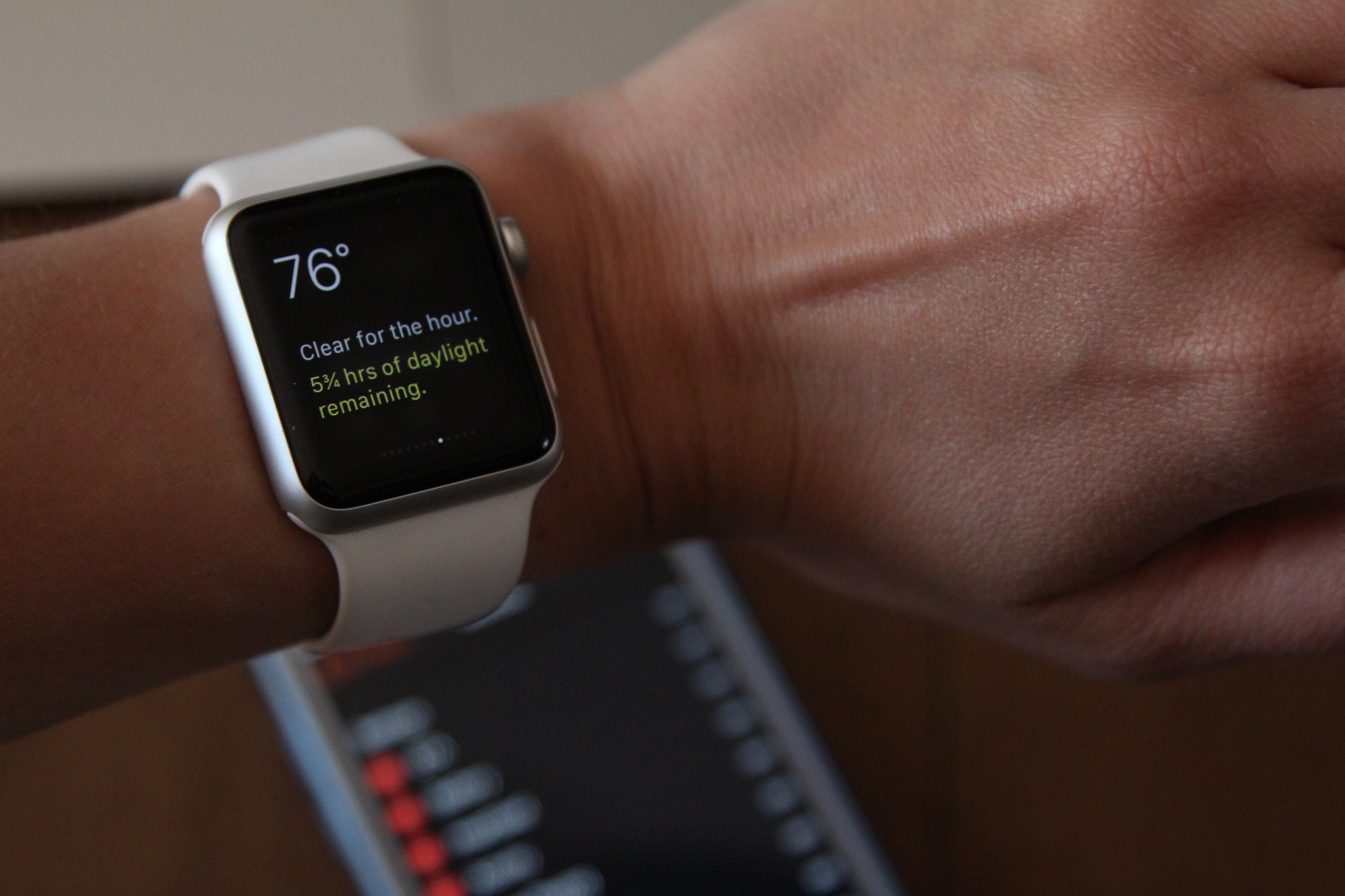
As a person with low vision, my biggest fear with Apple Watch was whether I could comfortably view its small display. As it turns out, seeing the screen is not a problem. I attribute this to two factors: (1) the overall brightness and crispness of the Retina display; and (2) the Watch's custom typeface, San Francisco (more on it later).
The first thing I did after pairing my Watch with my iPhone was crank the screen brightness to the max. It's something I do with all my Apple devices, and my Apple Watch would be no different. I also turned up the text size to one notch below the maximum. Put together, these changes in the screen's appearance helps offset the major shortcoming of the display: its small size. Most importantly, though, is this combination greatly reduces the level of eye strain and fatigue.
iMore offers spot-on advice and guidance from our team of experts, with decades of Apple device experience to lean on. Learn more with iMore!
the Watch's screen is terrific: it's bright, crisp, and the typeface is totally legible
On the whole, the Watch's screen is terrific: it's bright, crisp, and the typeface is totally legible. While I do take issue with some design choices --- the low contrast, black-on-green labels for customizing watch face Complications is a big one --- I am very happy with the Watch's display. Yes, it's small, but it's absolutely readable --- and I don't squint any more than usual.
The bands are interesting --- given my experiences thus far, they have proven to be the most polarizing part of the Apple Watch. In one sense, I'm thrilled with the build and comfort of the bands, yet in another I'm dismayed by how difficult it is to put one on.
I wrote in more detail about Apple Watch bands for MacStories, but the bottom line is that the bands are, I think, an overlooked part of Apple Watch's accessibility story.
I've found the Sport band to be extremely tedious to put on by myself; it's frustrating. For myriad reasons, I prefer wearing a watch on my dominant hand (left). Unfortunately, that means I need to use my partially-paralyzed right hand to manipulate the Sport band. It's an exercise in futility, so much so that I need my girlfriend or her mother to help me put it on every morning. They don't mind helping, of course, but if I can't get the Watch on independently, what's the point? I've tried experimenting with different ways to approach the problem, even wearing my Watch on my right wrist like convention says I should, but nothing has worked. I like my Watch on the left, period.

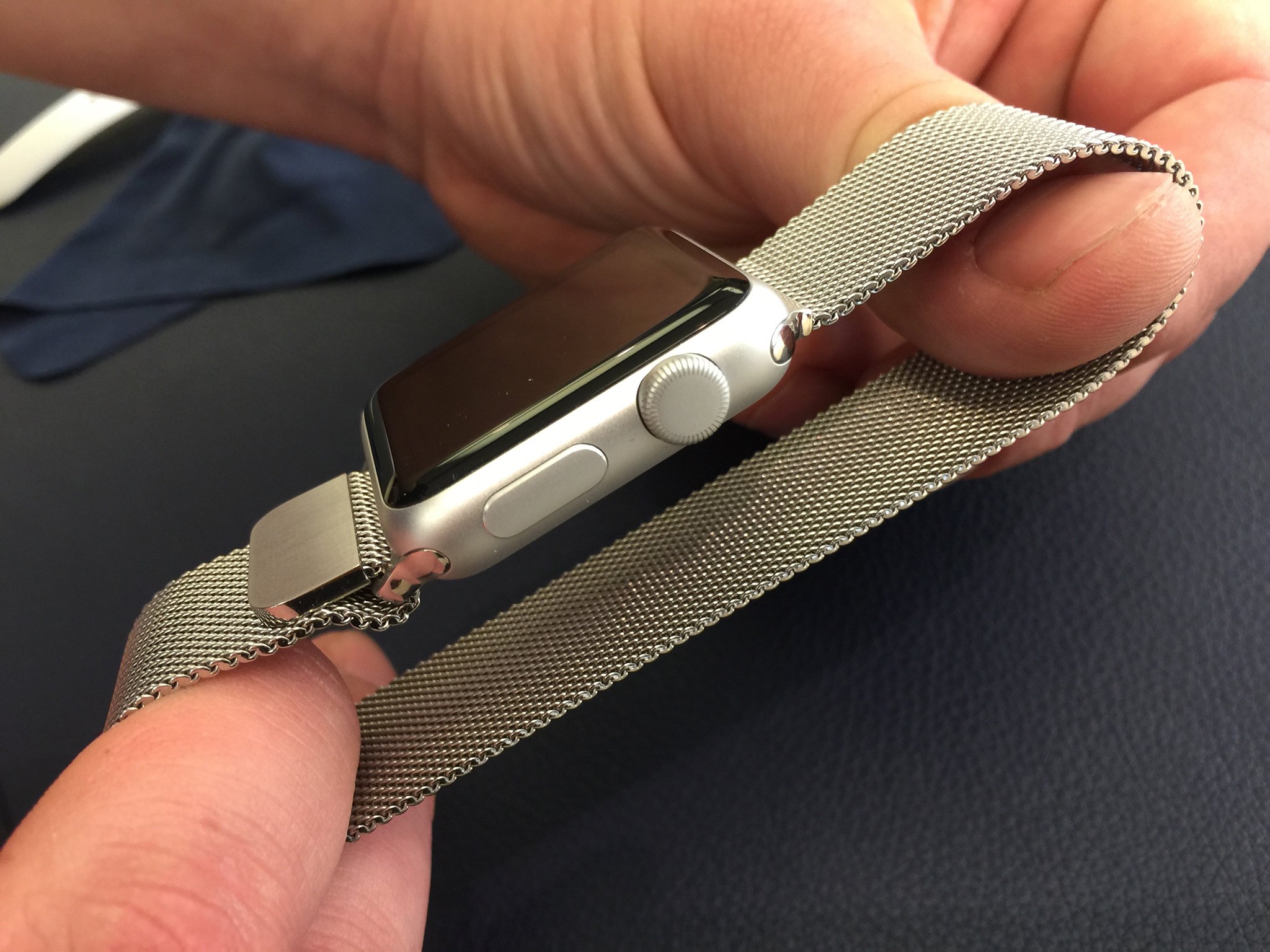
The saving grace for me is that there are band varieties with magnetic fasteners that are easier to put on and adjust the fit. One such band is the Milanese Loop. Apple provided me with one for testing, and I enjoy it very much. Not only is it easy to put on by myself, but it looks great (even with my aluminum Sport model) and feels good; it really is fabric-like.
The band-swapping mechanism deserves a quick mention, too. In my opinion, it is an "only Apple" kind of innovation. Changing bands is so easy, even for me. It's so elegant and ingenious; I love it.
I've been switching back and forth between my Sport band and Milanese Loop based on my mood. The moral here, though, is that potential Apple Watch buyers who, like me, have fine-motor delays should be aware of how the bands work. I strongly recommend making a try-on appointment at the Apple Store before committing to a purchase, so that one can be absolutely sure he or she is comfortable with putting the Watch on and taking it off.
Watch OS, Taptic Engine, and Siri
To me, Watch OS is intuitive and easy to visually navigate.
I find that I use Glances nearly all the time. The great thing about them, accessibility-wise, is the font size is big so I have no trouble reading information. I don't use the Home screen of apps very often, mainly because the icons are a bit small and too close together. In practice, I have to concentrate hard to ensure that I'm tapping the right thing, and more often than not, I don't.

My favorite watch faces are Utility and Solar, and I alternate between them depending on my mood. The Utility face is nice insofar that the numbers are big and easy to see, as is the date. The problem I have, however, is with Complications. I alluded to this earlier in this piece: the black-on-green style for choosing options is not at all good. It's too low contrast, and the tiny font makes knowing what I'm looking at extremely difficult. Similarly, the Complications in the upper corners of the watch face are hard to see simply because they're so small. I like the method for cycling through Complications (the green, pulsing boxes are great), but I wish the labels were presented better.
As for the Taptic Engine, my praise for it couldn't be more effusive. I turned on Prominent Haptic in the Apple Watch app, and I am loving it. I've heard reports on Twitter that the Watch's haptic feedback is too soft, but not once have I missed a notification. Enabling Prominent Haptic "tips off" the wearer that the Watch wants some attention by tapping you a few seconds before a notification comes in. I supplement this by also using sounds, where the audible ding alongside the tactile feedback helps me even more in knowing that something is happening on my wrist.
Siri can be a wonderful accessibility tool, but it needs to be better at working with speech impediments.
Lastly, Siri. I can't tell if it's just my imagination, but it seems like Siri has been vastly improved, at least on the Watch. I use it quite often to send iMessages and have found that it's been aces in terms of transcription. Using Siri on my wrist has been an unexpected surprise, since I've long complained about how bad it's been, historically, at correctly parsing my stutter. That voice input does work so well on Apple Watch gives me hope that Apple will continue to improve Siri's backend tech so as to better handle non-standard speech patterns. Siri can be a wonderful accessibility tool, but it needs to be better at working with speech impediments.
San Francisco
I thought San Francisco, the Apple-designed typeface for Apple Watch, deserves its own section, as I think it plays a key role in the device's visual accessibility.
I fancy myself somewhat of a typography nerd, thus I am drawn very much to San Francisco. It's not only beautiful, but it's very legible on the Watch's screen. Digits are especially readable, which, in the context of telling time, is imperative. Anecdotally speaking, with other fonts, I sometimes have trouble distinguishing between a 5 and 6, as well as 8 and 9. With San Francisco, the glyphs are rendered in such a way that I have no issue whatsoever; each digit is clearly identifiable to my eyes.
In sum, San Francisco is pleasing both aesthetically and functionally. I hope Apple extends its use to its other products.
Miscellaneous observations
A few random tidbits:
- As I reported in my accessibility first look, I have no problems with using the digital crown or side button with my right hand. Likewise, I have no trouble force-pressing or swiping. The only troubles I run into are with entering my passcode (small keypad), as well as using the two-finger press in Digital Touch to send my heartbeat. Granted, I don't send my heartbeat often, but still.
- The haptic feedback in Maps for turn-by-turn directions is incredible. As someone who walks a lot to get around, I find the taps for left and right to be so useful. It saves on having to struggle to read names of streets, which sometimes hidden or hard to read. I can see haptic feedback and iBeacons being used together in some manner. It'd make contextual awareness (e.g., navigating a grocery store) an interesting prospect for the visually impaired.
- I love Apple Watch's ringer when a phone call comes in, for no other reason than it just sounds cool.
The bottom line
As I wrote at the outset, I've spent a lot of time thinking about Apple Watch. From an accessibility point of view, the device is so new and novel in so many ways that it is overwhelming at times to consider every factor. Case in point: this very article is fast approaching 2,000 words. It almost feels like a full-blown review, but it's only because there's just so much important stuff to cover.
So, my three-week take: I like my Apple Watch. I'm enjoying it first and foremost as a stylish watch, and as a satellite for my iPhone. It's still early days yet, but I'm confident that, with time, the Watch will become even more accessible and powerful. There is so much potential with this device, yet I know for a fact that it blows away every talking watch I've ever seen, in form and function.
Steven is a freelance tech writer who specializes in iOS Accessibility. He also writes at Steven's Blog and co-hosts the @accessibleshow podcast. Lover of sports.

