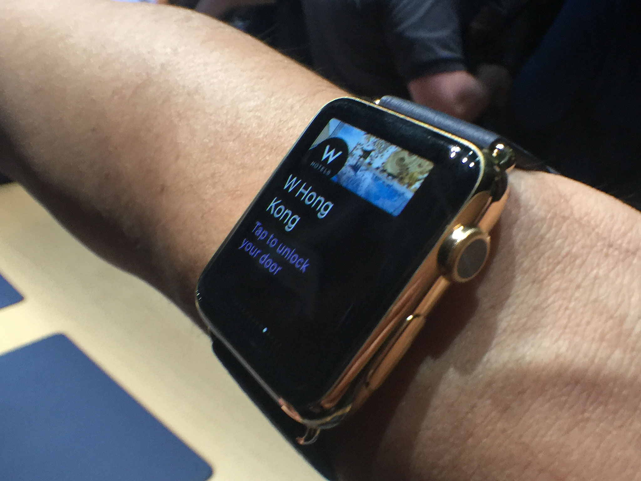
On the Apple Watch and OLED displays

That's interesting because Apple has thus far eschewed OLED (organic light-emmitting diode) displays for iPhone and iPad due to what the company said were the compromises needed to produce the panel at those sizes. A look back at things like PenTile and over-saturation in generations past makes that point hard to argue. Modern OLED, however, has improved considerably. At Apple Watch size, where power efficiency is the priority, those compromises start to fall in OLED's favor.
How much of a challenge developers will face designing for small OLED screens remains to be seen. Apple's been careful to seed best practices, such as using black background, into the Apple Watch HIG from the start. - Designing for the Apple Watch
Also interesting is how the Apple Watch display and HIG fit into the wider design language that's been rolled out across Apple's products, starting with iOS 7 in 2013 and OS X Yosemite in 2014.
Craig Hockenberry, writing on Furbo.org:
I've always felt that the flattening of Apple's user interface that began in iOS 7 was as much a strategic move as an aesthetic one. Our first reaction was to realize that an unadorned interface makes it easier to focus on content.But with this new display technology, it's clear that interfaces with fewer pixels have another advantage. A richly detailed button from iOS 6 would need more of that precious juice strapped to our wrists. Never underestimate the long-term benefits of simplification.
John Gruber, writing on Daring Fireball
Apple hasn't officially stated that Apple Watch uses an AMOLED display, but it's sort of an open secret. The other thing is, regardless of the underlying display technology, iOS 6-style skeuomorphism would've felt downright gauche on the watch. I don't think iOS or OS X needed to eschew skeuomorphic textures, but Apple Watch did.
An iOS 5-era Apple Watch would have been interesting to see, just from a design perspective. But I agree with John.
Apple Watch feels like it was born of the post-skeumorphic age. iOS 7 feels like it wasn't so much in preparation for the Apple Watch as it was in parallel to it. (Whereas the adaptive interface and the multiple display sizes found on the iPhone 6 and iPhone 6 Plus, and the rumored multi-window and iPad Pro, feel like the direct result of the changes that came with iOS 7.)
iMore offers spot-on advice and guidance from our team of experts, with decades of Apple device experience to lean on. Learn more with iMore!
Like Yosemite, the watch also feels as though t's been allowed to go in its own direction. For example, the big 3D, squash-able emoji.
That said, it's not hard to imagine OLED will one day move to the iPhone and iPad, and then black backgrounds and high contrast interfaces, like those on the Apple Watch, could be just as important on iOS as they are on WatchOS.
There might be some idiosyncrasies involved in designing for OLED that might affect the way some apps are designed, and there might be some surprises for developers who only ever tested colors and contract on the simulator. (Which is why Apple is trying to give as many devs as hands-on time as possible.)
Compared to the changes involved in going from standard to Retina density, from 3:2 to 16:9 aspect ratio, from phone to tablet scale, from richly textured to flat, from pixel-perfect to adaptive interface, going to OLED shouldn't be much of a problem.

Rene Ritchie is one of the most respected Apple analysts in the business, reaching a combined audience of over 40 million readers a month. His YouTube channel, Vector, has over 90 thousand subscribers and 14 million views and his podcasts, including Debug, have been downloaded over 20 million times. He also regularly co-hosts MacBreak Weekly for the TWiT network and co-hosted CES Live! and Talk Mobile. Based in Montreal, Rene is a former director of product marketing, web developer, and graphic designer. He's authored several books and appeared on numerous television and radio segments to discuss Apple and the technology industry. When not working, he likes to cook, grapple, and spend time with his friends and family.
