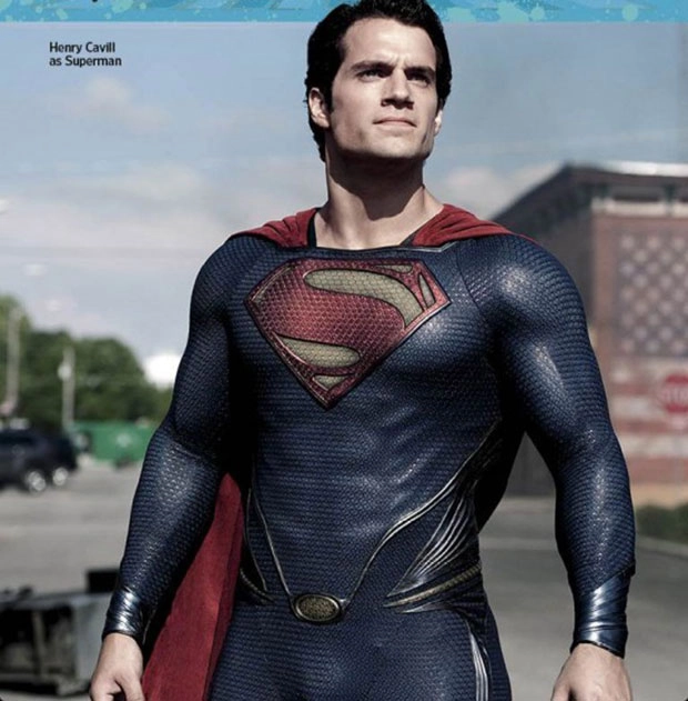
While many people are no doubt ecstatic that newly appointed head of all human interface at Apple, Jon Ive, is reportedly walking through iOS 7 with a sandblaster, stripping out overly heavy skins and skeuomorphic design elements, one look at the just-released Man of Steel publicity photo above makes me think it's really Hollywood that needs its texture fetish dialed way down.
I don't know what their point is in making the Man of Steel look like the Man of Rich Texas Snake Skin. I do know that, in iOS, an argument can be made that textures serve a purpose.

Even if you're rushed, tired, or drunk -- real use cases that need to be considered in a system design -- and you turn on your iPhone while racing or stumbling around, you'll never mistake the rather mundane contacts page in Phone for the leather appointed one in Find my Friends, or the green felt one in Game Center. When your screen lights up, there's a good chance any app you get dumped into will be immediately recognizable, even under the most extreme conditions. An iOS stripped completely bare would not be as usable.
Moreover, even if a screen represents something potentially quite boring -- ugly lists of mostly data -- good visual design can not only overcome that, but transcend it. Letterpress, however flat it might look, jumps and bounces and pops around delightfully, skeuomorphically, with almost every interaction.
The idea of the iPhone and iPad being totally minimalist when it comes to industrial design is so that the hardware doesn't compete with or distract from the display. Filling that display with awesome is the whole point. Balancing that awesome is the key.
Nature abhors flat surfaces. Most organic things in our world are textured, and for many different reasons. Completely flat surfaces are monotonous, just as completely textured surfaces are tiresome. Our eyes crave areas of interest counterpointed by areas of rest. Good designers use both to lead us.
A good Super Suit design, for example, could tightly texture the main blue body so light always catches it in interesting ways, but leave the red and yellow emblem with a far simpler treatment, letting our gaze come naturally to rest right where it's meant to.
The same holds true for iOS. Subtle textures in the background can help flatter elements in the foreground leap out, and be even more usable, even when stressed. Sure, some Apple apps may have gone too far in the past, and dialing them back could make them even better, but making them flat would be just as bad. Personal taste plays some part, but usability is always king. Too much design or too little are both a bad thing.
It's that balance that's missing from the Super suit above, and Hollywood's inability to let any flat surface go unmolested. And it's that balance, more than any arbitrary dislike of one treatment or another, that I hope Jony Ive is bringing to iOS 7.

