Imagining an all-aluminium themed iOS 7
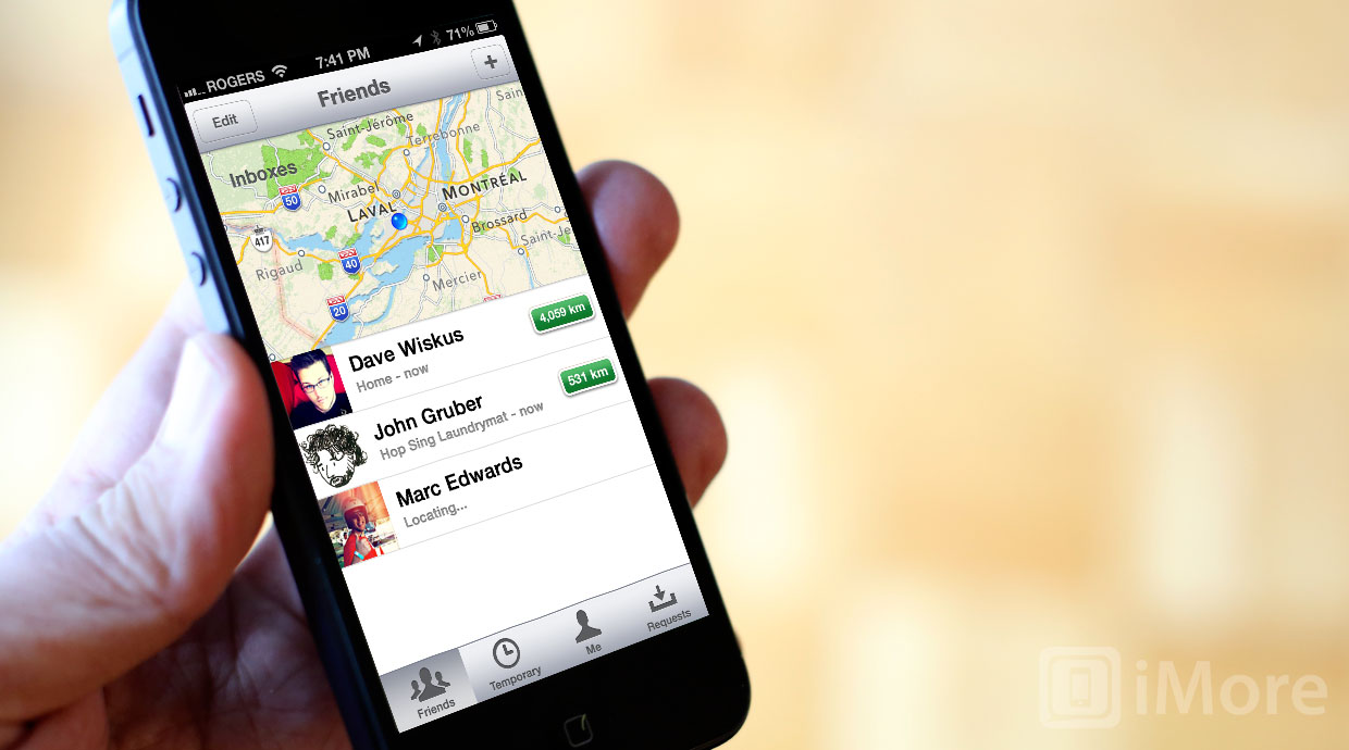
Skeuomorphism -- the use of real world design in a digital context -- has been a target lately. It's also been lumped together with heavy design, elaborate themes, or highly textured skins, to the point of being completely misunderstood. At the extreme, this "skeuomorphic" melange has been held up as an example of iOS being boring, outdated, and bereft of innovation. In more reasonably terms, it's looked at as something that can be useful, but has perhaps been overused.
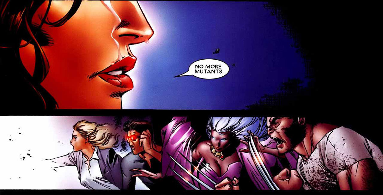
Personally I think there are far more important things Apple needs to do in iOS 7 than wiping the world clean of textures, gradients, and curves, both, but the argument persists so it's worthwhile giving it some form. but let's imagine for a moment it is on the agenda. That Apple's new head of all design, hardware and software, Jony Ive, was set to impose a new, unified, Aluminium theme. That, just like the Scarlet Witch in House of M, he whispered "No more themes."
Instead of arguing in the abstract about how much better or worse it would be, let's mock it up and see what could that look like...
A unified, aluminium iOS
Back before iOS 6 there were rumors of a complete, consistent re-skinning of the core interface into something more subdued and "silver". That didn't come to pass, though Apple's newest built-in app, Maps, did get a more subdued, more silver make-over, complete with new, floating buttons. Inspired by a discussion with Grant Paul for an upcoming episode of the Debug podcast,
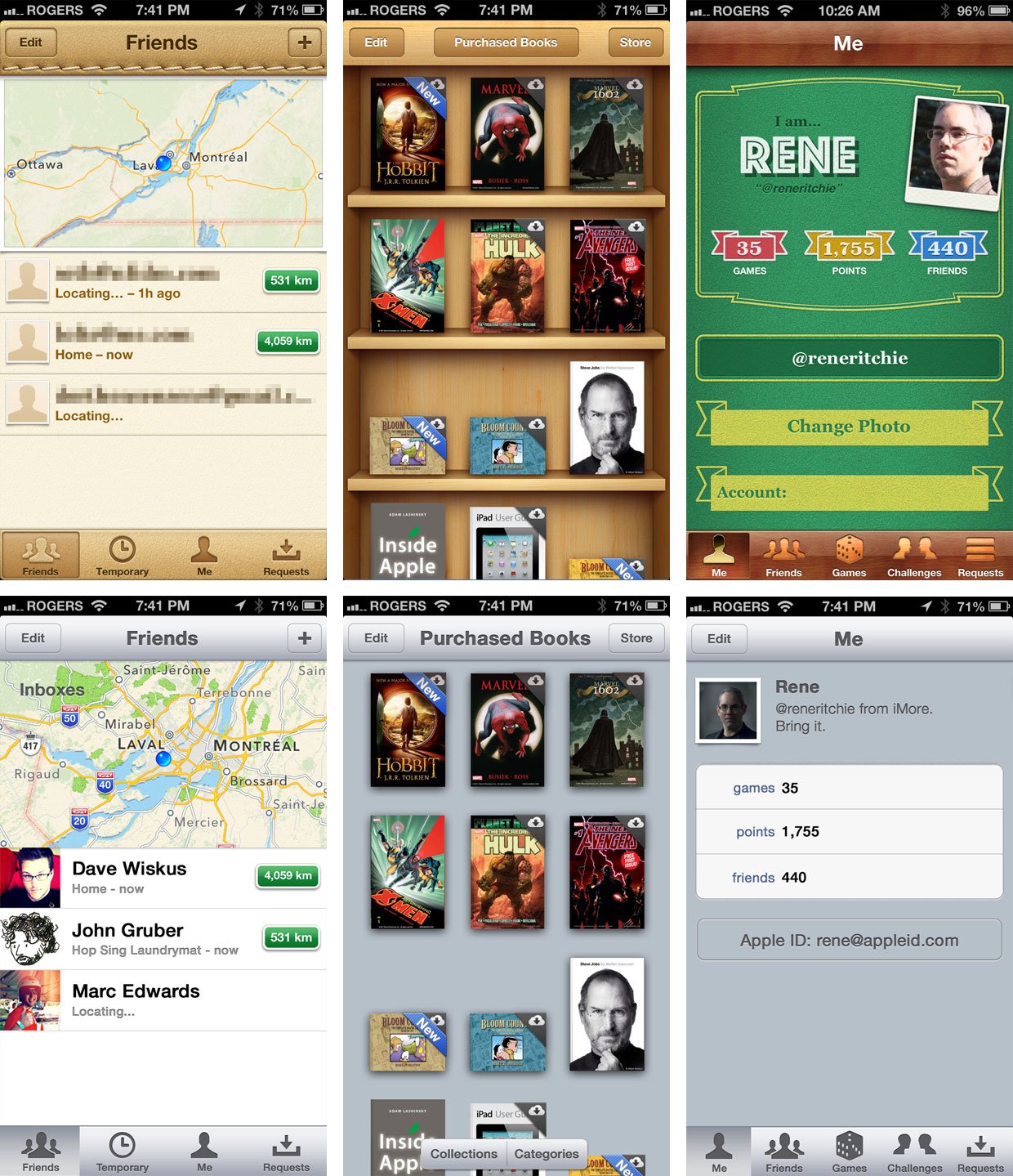
I'm going to use something akin to that as a foundation, with a hint of the WWDC 2012 for the more heavily designed apps. I'm calling it "aluminium" in honor of how Jony Ive (properly) pronounces the word. Here's an example of Find my Friends, iBooks, and Game Center, stripped down and anodized.
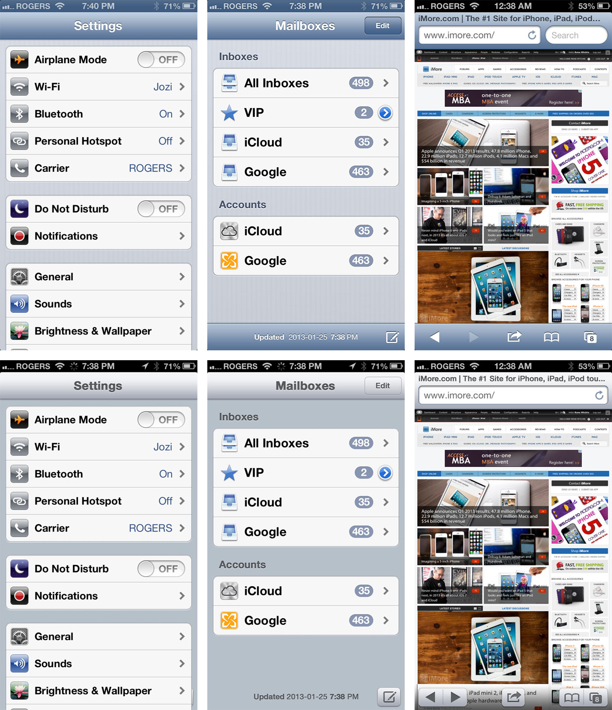
Under the theory that consistency is usability, the more lightly-designed built-in apps could also adopt the same look and feel. Here's an example of Settings, Mail, and Safari.
Additional background
A lot has been written about skeuomorphism lately, by a lot of people far more experienced than me. Dave Wiskus, in an article for Macworld, explored the future of Apple design, saying:
Steve Jobs very purposefully built Apple to be a skate-to-where-the-puck-is-going company, and while skeuomorphic design has acted as a bridge between the physical world and digital abstractions, it's becoming increasingly obvious that the world is comfortable with digital now. Technology is no longer witchcraft to be feared by the masses. We've grown accustomed to having phones, tablets, and computers around us to do things. With both visual and interaction design, we're nearly past the point of real-world metaphors being useful, and the simplest representation is usually best.
- Listen to Wiskus discuss the future of Apple design on the Iterate podcast
John Gruber of Daring Fireball attributes much of this to the evolution from standard to HiDPI displays like Retina:
The trend away from skeuomorphic special effects in UI design is the beginning of the retina-resolution design era. Our designs no longer need to accommodate for crude pixels. Glossy/glassy surfaces, heavy-handed transparency, glaring drop shadows, embossed text, textured material surfaces — these hallmarks of modern UI graphic design style are (almost) never used in good print graphic design. They're unnecessary in print, and, the higher the quality of the output and more heavy-handed the effect, the sillier such techniques look.
Marc Edwards of Bjango also cites the print world, but mentions the technical limitations of rival platforms as a contributing factor to their simpler design languages:
In interface design, square finished corners are faster, because there's no masking. Not including shadows is faster, because there's less compositing. Drawing a flat colour is faster than drawing a gradient. When you have three or six pixel densities, drawing sharp textures is almost impossible, unless you include bitmap assets for every size you're targeting.
Sebastiaan de With brought up a counterpoint on Twitter:
Very 'flat' UI is a meaningless reactionary design fad vs. overdesigned UI. Good designers aren't limited by style but taste and discretion.
- Listen to de With discuss Find my Friends and stitched leather on the Iterate podcast
I'm still of the opinion that it's less about skeuomorphism or it's opposite, digital authenticity, than it is about usability. In some cases, skeuomorphism helps make things discoverable, approachable, and engaging. In others, it just gets in the way.
Update 1: Developer Craig Hockenberry of the Iconfactory concisely points out the major drawback to uniformity on Twitter:
Look at Rene's mockup for Game Center by itself. Can you tell at a glance which app you're using? "Me", but where? Don't confuse the out-of-control skeuomorphic textures with color cues that give a users context.
Update 2: Designer Louie Mantia of Pacific Helm brings up a couple of excellent points, and throws in a gorgeous mockup, on Twitter:
it's not about "flat" vs. "skeuomorphic," but more about "chrome" or "no chrome". I think that this might be a more interesting discussion to have than making all UI aluminum.

Check out the examples above and let me know what you think. Would a unified skin across all of Apple's apps be more elegant or just more monotonous? Would a face lift make iOS less "boring" or just less interesting?
iMore Newsletter
Get the best of iMore in your inbox, every day!
Rene Ritchie is one of the most respected Apple analysts in the business, reaching a combined audience of over 40 million readers a month. His YouTube channel, Vector, has over 90 thousand subscribers and 14 million views and his podcasts, including Debug, have been downloaded over 20 million times. He also regularly co-hosts MacBreak Weekly for the TWiT network and co-hosted CES Live! and Talk Mobile. Based in Montreal, Rene is a former director of product marketing, web developer, and graphic designer. He's authored several books and appeared on numerous television and radio segments to discuss Apple and the technology industry. When not working, he likes to cook, grapple, and spend time with his friends and family.
-
I find this interesting and mostly attractive, but we should always remember that by far the majority of customers have no problem with skeuomorphism at all. It's no exaggeration to say that only "techies" and tech bloggers in particular are really in favour of it's complete removal. Remember also that if that particular group was always to be listened to in regards design, pretty much all desktop UI's would look like Linux, Java interfaces would be king on the web and most of the beauty that is HTML 5 would not exist. When it comes to design, I think I will listen to designers before I take the advice of the average tech-head. It's self-evident that *some* skeuomorphism is both beautiful, functional, and in fact ... the best way to go.
-
+1
-
+2
-
+3
-
I like how it is now. The silver just looks bland to me and think going that route would make it look even more 'dated' than the current design.
-
I don't mind the Skeumorphism for certain apps. I think GameCenter and iBooks are great. I don't like it for calendar, or Find my Friends though. I also believe the same them should apply for list based apps like Music app, Photos, Calendar, Mail, Safari, etc. The examples above are terrific for settings, Safari, Mail, etc. You have have to ask yourself why the music app on iPhone is black, and the iPad version has wood framings?
-
I really don't like that aluminium iBooks. Ugh.
-
Yeah, that is the only one I really don't like in the examples. Also, something looks off about Game Center, but can't place it. I would like to see something more like Shared Photo Streams and Maps (Ken Burns Effect) but that, too, would be overkill. Rene, I would like to say, these articles you do, with the time spent on examples, are among your best - Thanks for the dedication.
-
I think Game Centre looks a bit too much like an address book contact.
-
iBook (G4) was made out of white plastic lol...
-
I know you've railed against Skeumorphism in the past, but I don't have a problem with it. When I look at your comparison, I prefer the way it is now to the bland interface you envision.
-
I agree with the above comments: some skeuomorphism, but iOS needs some of what Rene proposes, as well. By the way, how do you pronounce "skeuomorph"?!
-
The uniform look looks pretty bland. I thought I'd like it more but I don't. An updated look to UI would be nice though. I'm sure jIve will hook it up!
-
I have to say that I agree and cannot abide the faux stitched leather and wood grain effects. In the real world natural materials worked in a sleek contemporary way feels much more in tune rather than something that is trying to look old (or "classic") when clearly they aren't. In a digital design front runner context that the iPhone represents it makes as much sense as steak with custard, and about as appealing too! So let's hope that Sir Jony (needs a second n surely) will come up with something! +1 to Rene for correct pronunciation of "aluminium" too!
-
Also, how is aluminium any less skeuomorphic(sp?)? Sure, the Find your Friends app would look better, but iBooks would look awful and Game Center winds up looking insanely bland. If I were looking at Smart Phones to buy and had to choose between Android and what is being proposed above, I would be choosing Android. Apple moved away from "brushed metal" years ago on the desktop, and now something very close to it is being proposed for iOS? I'm not sure I understand that at all unless it's to draw eyeballs to the site.
-
I agree 99% (leather stitching has to go!) with the only exception being Game Center. I must be the only person to not finding its faux felt game table motif off-putting. Games are meant to be a distraction from the everyday, so let its design announce that its realm is different. One possible solution to the oft-cited complaint that, unlike Android, owners on iOS are stuck with whatever aesthetic Apple provides, introduce a series of themes. By Apple carefully controlling theme alterations, such changes should be considerably more stable than relying on third parties.
-
Looking at everyone's mockups, it looks less like removing skeuomorphism and more like removing texture and color. How exactly can that be construed as an improvement. It makes iOS not only boring but removes a major component on usability. When every thing in smooth gray, your eyes aren't drawn to then necessary pieces of the interface. It reduces usability. Some apps could be toned down, but completely removing all textures, shadows, and colors isn't a way to improve conveyance to users. The interface doesn't need to fade away as the hardware does (excepting apps like Safari) since the interface is the content. People need to focus less on how to "fix" a non issue and focus on improving overall simplicity, consistency (not to the degree of making every app look the same, just function similar) and usability across iOS.
-
I don't really like the Aluminum. But I am not sure exactly what I want. Only what I don't want and only when I see it. So I would have to sit back and deal with what happens.
-
I think somehow you nailed the point here. I think Apple is facing nowadays a problem that goes far beyond just the iOS look and goes all the way to the company's visual identity for overall software. See, while this gray/rounded/drop shadow look used to be considered very cool and even minimalistic in the past, it's now becoming a bit "over" in comparison with what we see in Print and even other mobile platforms this days. Besides, as others commented, has a great portion of skeuomorphism design itself. For Apple's future, I think a design that resembled Flipboard's interface would be a good route. So, in resume, while I agree we have to evolve from too much skeuomorphism here and there I don't think the aluminium look should be the final answer.
-
All the non-Skeuomorphism photos look good except for iBooks. I think iBooks looks horrible in the image; the books look like they are floating in space. I think the iBooks app should keep the Skeuomorphism, but defiantly remove it from gamecenter and friends.
-
Because brushed aluminum isn't 'real world.' #seriously?
-
I don't understand shy you hate on Skeuomorphism so much. I love it, my wife loves it, and my brothers lover it. A non Skeuomorphism desind would seem boring to me.
-
Definately better as it's now! "All-alu" style would be too cold and boring.
-
Agree
-
I love skuemorphism and think that it should stay. However apple does need to decide where skuemorphism is appropriate and when it is not and in the intences where it is not it should be replaced by a cleaner design (perhaps an all-aluminium design) Ps: love your for the use of more 'floating buttons' (and your mock-up for safari)
-
You wear skinny jeans don't you.
-
I find it very strange aluminum version, but we have to taste everything. Congratulations for the post.
-
Looking at the first 3 examples, I like (A LOT) the Game Center mockup. Would be much better.
Find My Friends would be ok too, but... I love current Find My Friends, it think it's one of the most beautiful apps ever made.
On iBooks example, I think putting aluminum just makes everything looks worse. Much worse.
iBooks is one of those examples where skeumorphism is extremely well placed and designed. I wouldn't change 1 pixel. For the second part, I wouldn't change Settings, I would change Safari for that aluminum/gray pattern, but without those overlaid buttons. For Mail, I'm hoping something more like Sparrow. I like colors, I think iOS should retain some colors on key apps. -
I'm with the others that appreciate some semblance...or perhaps a good balance of skeumorphism in iOS with the 'aluminum' facade. As a 41 year old, I like the 'look' of the analog ways I grew up and 'see' things. I also have a seven year old son that truly appreciates the look of the bookshelf, the Game Center...and more so, the look and 'feel' of skeumorphism in subtle but usable doses. It, to me, definitely underscores the importance of iOS and it's innate fluidity and usability...it's very, very intuitive. The skeumorphism adds to that, especially with the 'old' and the 'young'. To me, the only folks rallying against the design of iOS are the tech pundits, geeks (like myself) or the hard core 'Android' only crowd. I develop for both platforms. Just 18 months on Android...four years now on iOS. One of the biggest gripes I have with Android is its limitless customizations. THIS is what kills the UI. Not the compositing or rendering of 'drop shadows' or page turns in a book. When the developer knows the UI...and is confident in its 'look' he or she can more easily develop for that users tastes. I like the idea of themes. I like the idea of continued iOS evolution....but I'm completely against an 'over haul' of the OS. It's unnecessary...as iOS is hands down the most fluent OS on the market. The SDK and support from Apple is easily the best, most efficient programming I've done in two decades....and the skeumorphism present in today's UI looks nice...maybe take some fine grain sandpaper to it, round the edges if you will...but it doesn't need a belt sander or a table saw. Web services is where Apple should invest time. Lay down their arms in the Google war....work together instead of against...and that will pay HUGE dividends for the end user. Google is a search and software company...Apple is a high end hardware company that fortifies their HW with compelling, easy to use software. iPhoto, iMovie, iTunes, et al...are mainly targeted at the everyday Joe or Jane. They don't need Aperture, Photoshop of Final Cut. They're content with the on board, included options. And IMHO, the skeumorphic design aids in usage and the ability the learn to efficiently manipulate the software. My opinion should be taken as a grain of salt though. I still listen to vinyl at home...I still like to see a movie at the theater....and I appreciate classic cars. To me, Apple's design elements are an incredibly cool way of tying our old, under appreciated analog world to the new, enhanced digital era we are living in.
-
iOS is hardly the most fluent mobile OS, that goes to WP7/WP8. iOS is a mess of aqua, black, chrome, and skeuomorphism, with only some consistency. For example, the new iOS 6 music app. It got the chrome treatment, but they kept lockscreen controls, the videos app, and the remote app on the old black/aqua theme (although they are fixing lockscreen controls in 6.1).
-
I like the way it is now. I appreciate the warmer tones, the mock wood. I like to pull up the book shelf and it appears warm and inviting. The whole pont is that the iPad is popular partly because of that relationship to real world objects and textures. It makes it more inviting for grandma to open an ebook, or interact in other ways. It appeals to the average user rather than the extreme techie, jailbreak and Cydia for that. I hope they don't go away from it.
-
Seriously, this is iOS's biggest problem? The background texture? How about this: - Finally get dynamic, variable size widgets on the home screens.
- A better print mechanism, with all the options that a PC has when printing (paper size, portrait/landscape, 2-paged, greyscale, margins, select the tray, etc etc)
- A unified file system, not a separate (or no) handling for each file type
- Multiple switchable user profiles
- Speech command for apps
- If you care about skeu-whatever, make it configurable, let the user choose whether it looks like car interior or like Windows 8. -
How about leaving the choice to the user, and not to Apple? Apple is NEVER going to please everybody, so how about puting, for instance, five polished themes out there and let each user make iOS his/her own?
I hate skeuomorphisms and I think iOS is a mess in terms of design right now, you never know what to expect when you open a new Apple app. How about making all Apple apps skinable and let the user choose "aluminium" or "charcoal" or whatever? -
I think we're conflating "skeuomorphism" and "overdesign" and "discoverability" to a certain extent here. Here's part of the definition of "skeuomorphism" from Wikipedia: "... physical ornament or design on an object copied from a form of the object when made from another material or by other techniques." The example Wikipedia uses is fake wood paneling on an automobile with a steel body: http://en.wikipedia.org/wiki/Skeuomorphism According to that definition, brushed aluminum is also a skeuomorphic ornamentation, because it looks like a false metallic surface on a screen that is actually glass. The aluminum texture serves only to separate functional areas of the app's views, helping discoverability to some extent. I think that kind of skeuomorphism is good. I think "overdesign" is rampant in iOS apps and software in general. Here's the definition of "overdesign" from Wiktionary: "To design too specifically or to too great an extent, as by including unnecessary features."
http://en.wiktionary.org/wiki/overdesign The faux felt of Game Center and fake stitches in fake leather in Calendar spring to mind when I think of "overdesign" in iOS. I think that level of overdesign, with heavy-handed use of skeuomorphism, is bad. (But I think overdesign doesn't necessarily require skeuomorphism. Skeuomorphism just makes overdesign more obvious.) On the other hand, while I think the Compass app is horrendously overdesigned, I think that's a good thing. It looks almost like a physical compass, it acts almost exactly like a physical compass, and there is zero learning curve. It does just one thing, extremely clearly. I think it's OK for apps like that, with very little data to actually display on the small mobile screen, to be grossly overdesigned in terms of skeuomorphic faux-reality. Because the fancy graphics don't overwhelm the actual data displayed. You see it, you instantly understand it, you use it like a physical compass, and that's fine with me. And, looking at the all-brushed-aluminum mockups you did, Rene, I think the lack of design distinction between the apps and surfaces and tappable objects makes the apps all harder to use. It's as if you're driving along a road with everything painted gray and no shadows. Gray trees, gray buildings, gray cars, gray lampposts, gray pedestrians, gray stop signs, gray dogs, gray fire hydrants, gray curbs, gray sidewalks, gray crosswalks, etc. with no shadows to help you see them. It all looks the same, fades together, and makes you work harder to figure out where to turn. All-silver faux-aluminum apps do the same thing. They force you to work harder to determine what to tap and what not to tap. Every app has a learning curve, of course. But an all-silver no-hints app forces that same learning curve on the user every single time you use it. Because nothing is memorable. Everything must be figured out each time. That's bad. The other extreme, ultra-realism, adds to the user's emotional connection to an app. And it might help usability too. But when a user sees the Compass app, the first instinctive reaction is "Wow. That looks awesome. I like this app because it's clear that Apple has worked very hard to impress me, and I am suitably impressed at Apple's efforts." Apple goes for this instinctive, gut-level first impression in everything they do. Hardware and software. I think we underestimate how important looks are in an app. Slickness does count. There has to be some happy medium between all-flat-no-textures "digital truth" and everything-must-look-photorealistic "skeuomorphic overdesign." Maybe "brushed aluminum with colors" is the key. And maybe those colors could reflect possible anodized aluminum iPhone colors. Who knows? -
SockRolid is correct. In addition, the aluminum themes still have skeuomorphs in the form of the arrow going into an in tray, and the die for games. They're recognizable real-world symbols. The 1960s AT&T handset icon for the phone app and the reel-to-reel deck for voice mail are also examples of skeuomorphs.
-
In the physical world we don't simply build the most functional design, we consider the aesthetics as well. Some prefer the ornate beauty of Victorian era furniture, others the minimalistic designs of Ikea (or whatever a quality alternative is). The best design is a fusion of function and aesthetics where the two support each other, but there's nothing wrong with making decisions that emphasise one or the other (unless something becomes unusable or butt ugly). So what's wrong with using this approach in digital assets? Why does everything have to look 'digital'? There will be those who prefer clean, those who prefer some kind of chrome, some who prefer physical world references. Apple will make a call as Apple does. It may not be what some prefer, but that won't make it wrong. (Of course, if they wanted to they could let us skin our phones.) Seems to me to much digital snobbery in these discussions. That said, I think the aluminium look (as an Aussie I appreciate a North American's efforts at getting it right!) is preferable in FMF and Game Centre, but prefer the traditional look for iBooks. I guess I find it more relatable whereas the other two don't matter to me so much. (BTW, I understood Marc Edward's comment to be in relation to needing to deal with Android fragmentation, not that he was championing that cause per se.)
-
One other thing to mention about this anti-skeuomorphism thing... The iBooks "aluminium" screen should just be a list of book titles. If you have pictures of book covers, are you not still being skeuomorphic? Notice how the books that are wider than taller show up in the iBook screen the same way? The anti-skeuomorphism movement can be taken to just as much of an extreem as the skeuomorphism movement. (man I really hate that word) I don't love the look as it is now. However, I really hated OS X 10.2 (is that the right version) where everything was grey, except the red, yellow and green window decorations. OS X is still pretty grey, but at least 3rd party developers are putting some color in their apps.
-
I am more a fan than not of skeumorphic design. For the most part Apple is good at it and because they control the hardware and software the result is pleasant. I am typing on my iPad keyboard with subtle shadows off the keys. Do I want to get rid of that? No. When I download a file in Mountain Lion do I want to get rid of the animation of a file moving into my Downloads folder. Do I want to get rid of that? No. I frankly do not like the completely "flat" look to Windows 8. Count me with the crowd that likes skeumorphic . When I am reading a book in landscape view I like the subtle graphics of a book crease separating the two pages. I like it better than a vertical line or nothing at all. I think that skeumorphic ideas very commonly make interfaces both more attractive and easier to use.
-
Hi Rene, I really appreciate the quality of your work and I enjoy you appearances on the TWIT network. I don't have strong opinions on skeuomorphism, but I really do miss fictional items like widgets on android. I would at least like to have the weather icon show the current temperature from my choice of weather services. And having that on the lock screen would nice too. Apples notifications are shameful compared to android too. The only thing keeping me on iOS right now is iMessage and FaceTime for use with my families devices, as well as Siri. Siri is super useful to me in my line of work, but I have taken the time to really get to know how Siri works.
-
I meant fuctional items like widgets on android. Auto correct darn it! And the the edit function isnt working right now.
-
"The trend away from skeuomorphic special effects in UI design is the beginning of the retina-resolution design era." This seems categorically incorrect to me. It is because of higher quality, high DPI IPS screens that we are seeing more photorealistic UI effects, "chrome", in iOS and Mac OS X. These photorealistic effects were endemic of NEXTSTEP, and obviously, all of the guys in charge of OS X and iOS have been NeXT guys. NeXTSTEP started with higher resolution screens, 1152x864 resolution, in a time when 800x600 was the norm. It's photorealistic icons, shadows, and animations won't be unfamiliar to OS X and iOS users today. With the crazy good displays of today, it really allows for the use of these textures and UI effects seen today. And obviously, Jobs, Forstall, Serlet, Tevanian and Federighi seem to favor it. The only reason the chrome effects would be going away is because the NeXT guys are not in power anymore, and the new people favor a different kind of design. Maybe there's more NeXT people waiting in the wings, but Federighi may be the last NeXT person left to be even be able to take a SVP level position.
-
Re: Gruber's comment and "This seems categorically incorrect to me." Agree. Gruber is such a self-confessed font nerd that I think it affects his perception of graphic design overall. With HiDPI screens, there is no need to tweak fonts to look good on low-resolution screens. In fact, those adjustments that made fonts look good at 72 dpi actually make the fonts look bad at 160+ dpi. Hard to believe that Gruber thinks that a sharper Retina resolution screen is triggering a move away from photorealistic design elements. If it's too hard to Photoshop it from scratch, take a photo of it and use that image.
-
Yeah. Gruber has his affectations. Great thing about JG is that he thinks and writes thoroughly, but he's got curious things about him. He still promulgates the idea that Android devices went large screened because they needed a larger battery and PCB space for LTE chipsets. That still drives me insane on how stupidly wrong that is. Then, there is his love of James Bond movies or his hate of LOTR movies. Ugh. Everyone his their own taste.
-
I'll also put in my vote for liking the existing iOS app designs versus the proposed new design. The only thing I like about the new ones is the background color replacing pin stripes in settings and mail, and in the iBooks app. However, I think I would prefer a texture of some kind rather then straight color. Not a strong one, but one that can sit comfortably in the background. iBooks is the only one that I'd maybe like, but would prefer a texture there too. The "floating" buttons in the proposal is something I just don't like too. Especially as a default look.
-
Reminds me of an old joke: Ole invited Sven over to see his new station wagon. When Sven arrived, he was surprised to see Ole taking a crowbar to the wood grain paneling on the sides and back of the new vehicle. Sven: "Ole! Vat da heck are you doing to your new car?!" Ole: "Just taking it out of the box!" Nyuk, nyuk....
-
Check out the CLIPCLOCK mobile app. The new social hub to discover and share the best video moments with your favorites!!!
Here is the link: http://www.clipclock.com/download/5215 -
I have to agree with a lot of what people have already said, the skeuomorphism looks pretty good for the most part, I actually like how gamecenter looks, on the rare occasion I use it. Apps like Books and Newsstand look great, just how they should look, like a bookshelf. There are things like the pinstripes in settings, and the over use of the linen texture that could use some changes of course. I'd much rather they update some of the dated color schemes (hideous faded blues and grays in Safari and settings), and make some much needed changes to the actual OS, not just tweaking their built in apps. Quick reply for text messaging is long past due, as are widgets (I don't care how useless some fanboys will say they are, I had several of them on my GS3 and they were extremely useful, customizable, and incredibly easy to use.), quick setting toggles in the notification center, improved multi-tasking (a kill all option), notification icons, user configurable widgets on the lock screen, and finally, dynamic icons, it's pretty sad that we are now in 2013, and everyone's iPhone still says it's 73 degrees and sunny 24/7. iOS 7 needs to be big, especially since iOS 6 was really a .x update, and 6.1 is nothing either..
-
Looks like webOS
-
Someone may have already commented this but WHY does the non-skeumorphism version still have the on/off switches?
-
You're right. Using book shaped objects to represent books is skeuomorphic, and as @scott_riley pointed out, gradients and icons are skeu.
-
iBooks just feels cold with the aluminum... Not really a fan. But I agree obviously improvement can be made.
-
I think the skeuomorphic-free screens look like crap! I LOVE Apples skeuomorphism designs. Can you imagine Apple Maps without the green sign textures, or even the subtle textures on the normal vector maps? This 'digital authentic' was a term made up by Google so the neo-nerds of the internet would think it's how things should be designed. Well it's NOT! When everything looks the same, is flat, has no color, etc. it makes navigation and usability much much harder. Have any of you used a Windows Phone before? Navigation takes twice as long as on the iPhone just because everything looks the same and is mostly just text. Give me Apples skeuomorphic design over the crap Google is putting out any day!!
-
Flat look: I HATE. It in fact. i hate it in windows. i hate metro and it's why i never adopted android.
the book app looks fine as is.
the other apps, one i don't use, but they look better chrome. i don't care about it all being chrome personally. Iike the grey music player look, i don't like that. I like the old look. but big picture the more you make ios like android the quicker i'll just go to android. And i'm not against it. But i'm convince the Jobsless Apple will fix everything that's not broken, thus breaking it. I'm convinced they will over thing everything. They will make apps more difficult then they need to be like by doing stuff like hiding all the buttons. I'm convinced at some point they'll screw up the music player based on some idea from some fool who has a library of just 200 songs thus wrecking the experience for people like me with huge libraries. In fact that's one reason i left Palm. you couldn't get large libraries on the phone and even navigating large libraries would be a chore because of the way it sorts and indexes music leaving you with massive lists of songs or album names. Like in a world of single downloads i've know what albums half of my music is on. Regardless, i hope they can get rid of some of that brown leather look but keep things that work. Don't change either just for the i always need something new nerd crowd. They are not the masses that buy the product. -
I've always been a fan of darker colored themes. I had a BB Storm 2 (and one of the few who loved it), and I really liked the look of the blacked out OS on the Storm 2. I would like to see that on iPhone/iPad.
-
Skeumorphism in and of itself, is not necessarily bad. It is only bad skeumorphism that grates. The faux reel-to-reel tape recorder in the Podcasts app is horrible because it a) evokes a physical object that 95% of the userbase has never seen, so it adds no useful guidance, and b) it actively hides some controls. Skeumorphism, done right, can be a good thing. Apple failed not because of skeumorphism per se, but because much of the skeumorphism they added was nonsensical.
-
Whatever the iOS packs, its beautiful. I fell in love with my iPad mini and it think it beats Google Nexus in this regard. Many people compare them but i don't think they are comparable. Here is a comparision: http://www.technograte.com/2013/01/apple-ipad-mini-vs-google-nexus-7/
-
really liking that black theme for safari quite a bit. like QUITE A BIT
-
Apple was always good at using premium materials with an industrial feel, but turning them into a "home sweet home" sensation because of rounded edges or whatever trick they pulled on several devices. And the software that felt recognizable because of it's authentic looks (leather and wood graphics) was also adding to this warm feeling of "home sweet home". Really not sure about making it look all aluminium and "futuristic" would be a good move, it would ruin the sensation for me.
-
I would like this but also it'd be cool if there were different themes of colors available. Maybe like black aluminum, navy-metallic etc....the silver alone seems kind of plain.
-
Wow this is ugly, plain and poorly laid out. It isn't that the anti-skeuomorphic design language is bad, just your design is bad. Sorry Rene, but stick to journalism and not design.
-
The sooner they get away from it the better, when I think of Apple I think of clean and slick.
-
Apple's problem isn't what color a background is, if it's leather or abstract. Apple's problem is this: Sit at a Mac, open a finder window. Resize the window. Note the folders in it stay as they are and get hidden as you make the window smaller. It's insane. Other O/S's have resized the contents of a window for like the past 14 years. Try to name a photograph on an iPad or iPhone. You can't. It's insane. So much for using it with a client, you know for ACTUAL work. Apple is the most counter intuitive platform out there today, it is so old fashioned.
-
I am in the no-skeumorphism camp. But more than that I hope Jonny Ive cleans up all the inconsistency. Actually, I hope he brings a whole new UI theme. Ditch skeumorphism AND aluminium altogether. Give us something simple, yet slick, sophisticated, and uniform. Oh, and ditch the pinstripes too.
-
I actually like the calendar app, and I can't imagine opening up IMovie without a big bright marquee greeting me, with my projects that look like movie posters. Also, I love the way the Find My iPhone app looks like someone just unfolded a map onto a wooden table, you can see the cresses in the map! What other company puts that much thought into their apps! It makes everything more fun and different from other platforms.
-
Nice post ....for feature concepts of ios 7 goto http://www.iphone6updates.com/concept-ios-7-features-redesigns-existing-... bet you will like it
-
I think if they do this it should be an option that I can turn on and off.