iOS 7 brought with it a new, unified palette for everything from icons to interface elements, including the tint colors give to the new "naked" style text buttons. Unfortunately for some people those tint colors are just a little bit too bright to be read comfortably, especially on the primarily white backgrounds. Luckily, iOS 7.1 gives you the ability to darken those colors and hopefully make them much more legible. Best of all, it's easy to do!

How to increase font and menu visibility with the darken colors option in iOS 7.1
- Launch the Settings app on your iPhone or iPad running iOS 7.1 or higher.
- Tap on General.
- Now choose Accessibility.
- On the next menu, tap on Increase Contrast.
- Turn On the option for Darken Colors.


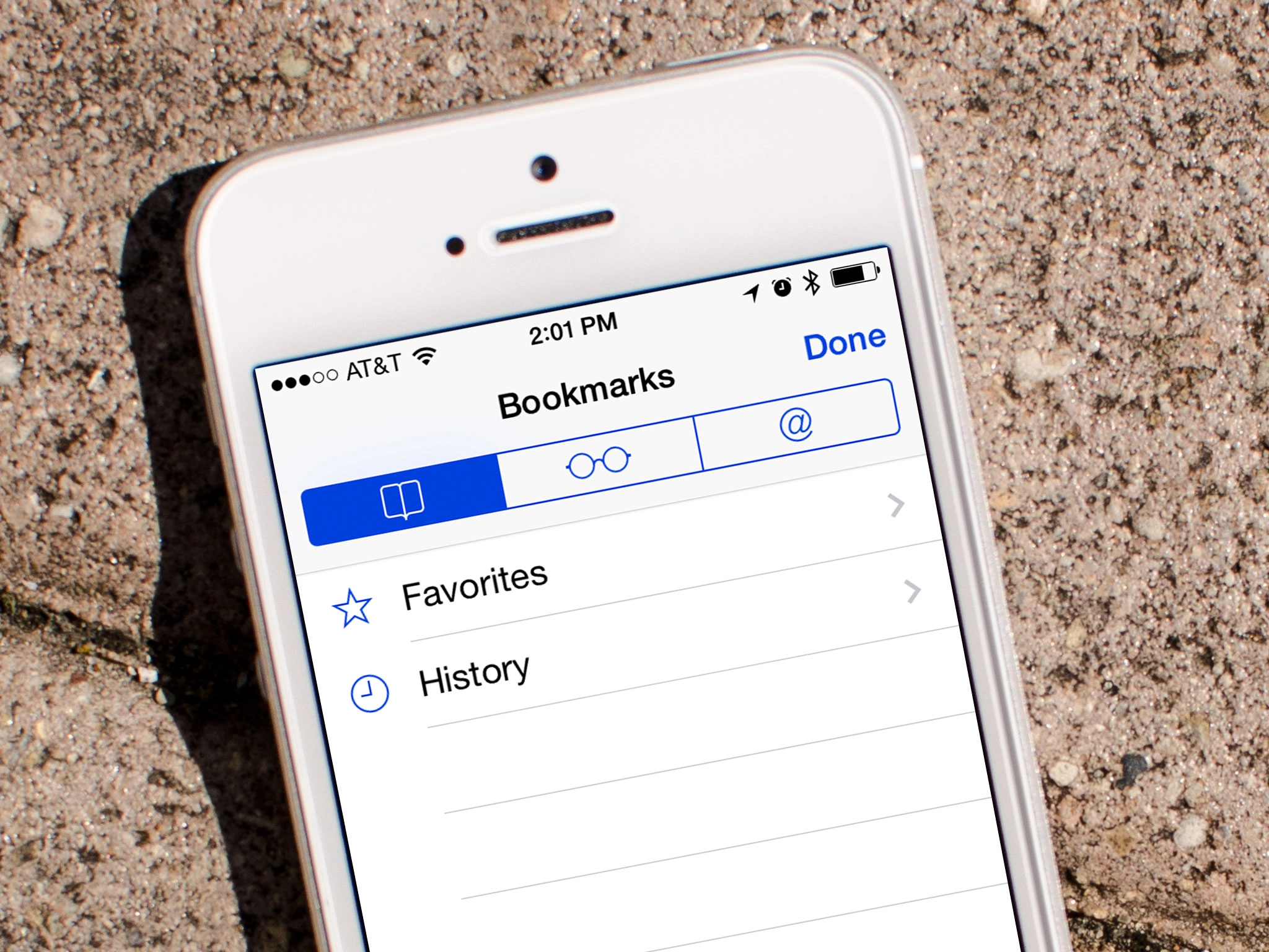
To see the difference in color, quickly toggle the setting on and off and watch the Accessibility back-button in the top left corner of the Settings navigations bar. It'll switch from bight to dark blue and back. It's the most noticeable in apps such as Safari and the Calendar.
Give it a try and let me know what you think! Do the darker colors make it easier to pick out menu items or read smaller colored fonts?

