How the new App Store can push accessibility forward

iMore offers spot-on advice and guidance from our team of experts, with decades of Apple device experience to lean on. Learn more with iMore!
You are now subscribed
Your newsletter sign-up was successful
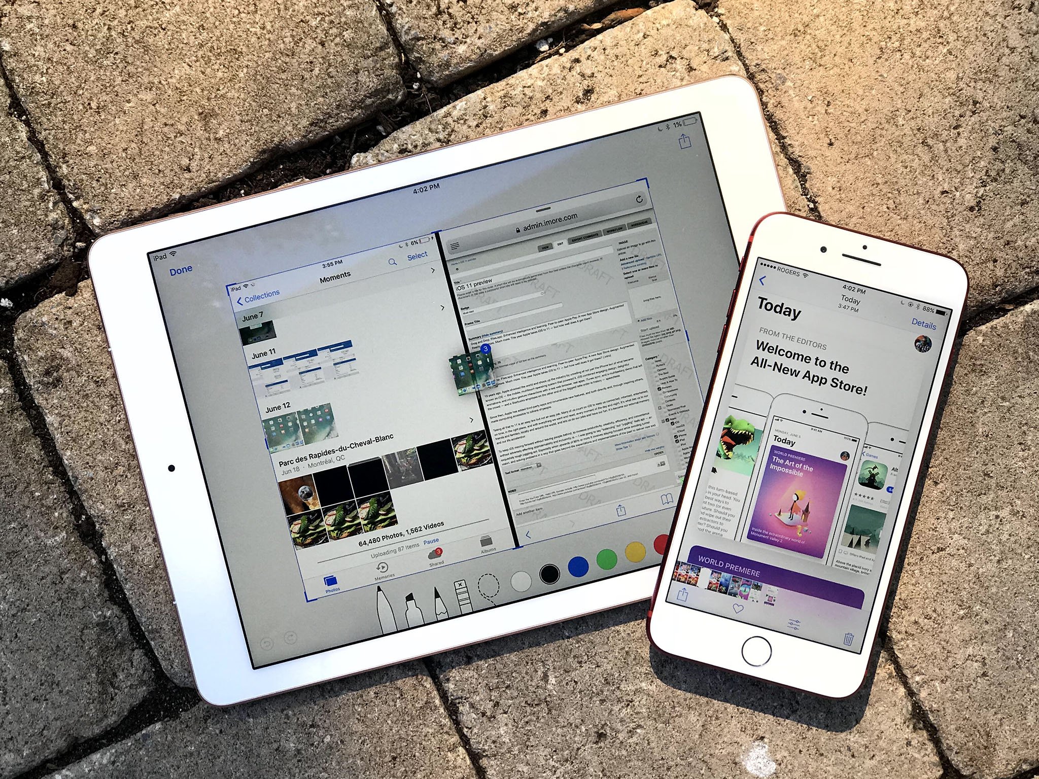
While the lion's share of the attention being paid to iOS 11 is deservingly going to iPad-centric enhancements, another iOS 11 improvement that I believe is just as interesting (and important) is the completely redesigned App Store.
The App Store changes are noteworthy for two reasons: - The visual facelift - The heavier emphasis on editorial
In my time with the iOS 11 public beta thus far, the new look is a refreshing change to what I'm used to on iOS 10. It's clear that the company wants to do more to promote apps and developers and that's admirable; time will tell, but hopefully it'll help indie shops. I enjoyed Jason Snell's smart piece on this topic — he's obviously knowledgeable in this area — in which he ponders what the App Store's more public editorial face could mean for customers, developers, and Apple going forward.
Where the new App Store really gets fascinating is when you consider its changes in context of accessibility. The new design helps Apple in its desire to tell stories, and this year's changes have major potential to positively impact the accessibility community.
Big, bold design
While it still lacks pervasive support for Dynamic Type (sigh), I'm nonetheless excited about the App Store's new design in an accessibility context.
Note: I put iOS 11 on my 2015 12.9-inch iPad Pro, so I've only used the tablet version of the store.
Big, bold headers paired with high-contrast icons and buttons make browsing and downloading apps easier than ever, though the continued absence of Dynamic Type still makes reading app descriptions, release notes, and reviews a chore.
iMore offers spot-on advice and guidance from our team of experts, with decades of Apple device experience to lean on. Learn more with iMore!
These improvements make a world of difference for someone like me with low vision. The UI's use of "cards" makes app icons pop, making it much easier to spot apps at a glance, while the new button-and-tab architecture makes navigation easier. It also lessens eye strain and fatigue.
Needs and tolerances vary, of course, but the design is a net win for pretty much anyone, regardless of visual acuity.
Still, there are questions. It'll be interesting to see (pun intended) what the experience of reading feature stories et al will be like without Dynamic Type. Zoom is obviously available, but it would be nice if you could kick a story into Reader View, á la Safari.
That sort of distraction-free environment not only provides text size options, but it also provides a clean escape from the main interface. Put another way, many people find reading easier when there's nothing to distract their eyes from the words. I'm certainly one of them, which is why I'm such a big fan of Safari's Reader View on both iOS and the Mac.
Apple will undoubtedly tweak the design of the App Store, as well as everything else in the system, several times before iOS 11's final release in the fall. I'm excited to see what this evolution entails. While the broad strokes are likely set, what I critique today isn't destined to ship tomorrow.
The value of editorial
Whereas the design changes of the iOS 11 App Store are functional in nature, the editorial aspects can serve a greater good.
In a nutshell, it's about raising awareness: The App Store editorial team has the power to leverage Apple's advantages (as the owner of a wildly popular platform with massive scale) to give accessibility a bigger presence in terms of mind share.
This realization came to me while watching the WWDC session on the new App Store, where I quickly realized how the editorial team could further usher accessibility into the spotlight.
I've reported numerous times on Apple assembling accessibility-minded app collections: These include apps that play nice with VoiceOver, as well as ones for special occasions such as Autism Awareness Month or, more recently, Global Accessibility Awareness Day. The company has done this for many years, and expect it to continue for the foreseeable future. But the increased focus on editorial — feature stories, how-to articles, and whatnot — could send that awareness meter into the stratosphere.
To me, the possibilities are endless. In addition to the usual app collections, Apple could decide, for instance, to run a feature on AssistiveWare's Proloquo2go, the AAC app for iOS. Such a piece could explain what it does and why it exists. There could be an interview about the app with founder and CEO David Niemeijer. There could even be a how-to article on the best ways to get started with it, or suggest best practices.
To be clear, this concept isn't advocacy journalism; at the end of the day, the App Store is about marketing. Nonetheless, Apple is presented with a substantial opportunity here to give accessibility more eyeballs. As with other underrepresented groups, people with disabilities should have their voices heard, and considering Apple's scale and the push on editorial, accessibility-focused apps and the people who create them are in a prime position to shine brighter than ever.
Moving into the light
For Apple, the benefit is clear. It has yet another way to extol the virtues of its hardware and software. The message is simple: "Our iOS devices are the very best for the disabled." With something like a feature story, that point is driven home even harder. For customers, they're exposed to a class of apps that perhaps they've never heard or thought about before. And for disabled users like myself, we get even more chances to be seen.
I don't expect Apple to highlight accessibility all the time; after all, space and attention is limited. Still, the potential here is incredible, and I hope Apple taps into it often.
Steven is a freelance tech writer who specializes in iOS Accessibility. He also writes at Steven's Blog and co-hosts the @accessibleshow podcast. Lover of sports.


