My Twitter client of choice is Tweetbot. I do this at the expense of a read-it-later service like Instapaper, because I find more often than not that I want the information right now and I'll take the time to get it. Unfortunately, my desire for instant gratification has relegated my use of Instapaper virtually non-existent in practice, despite the fact that I continue to hold the service (and others like it) in theoretical high esteem.
Although I will read a story within Tweetbot's in-app browser, the reading experience isn't ideal, especially on iPhone. In those cases, I will use the Action button to send a page to Safari to read there. Unfortunately, there are times when the trusty pinch-to-zoom gesture won't work with a website, so I switch to Reader View. I've found Reader View to be great: it's not perfect, but it's a handy tool and, most importantly to me, visually accessible.

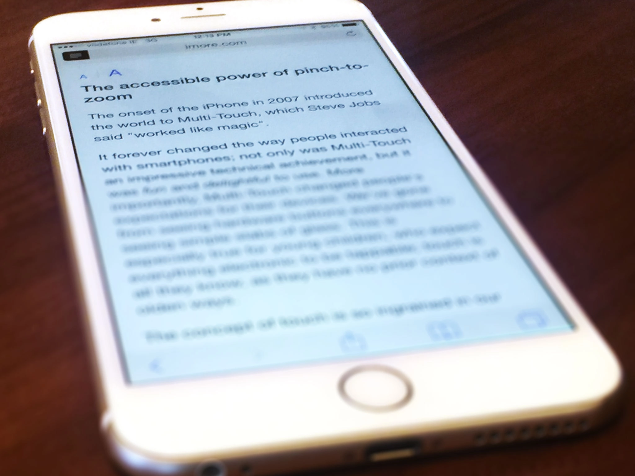
Reader View in Safari is a rudimentary version of Instapaper, insofar that it strips webpages of everything except text and images. The idea is, of course, that the removal of any distractions makes for a more pleasant reading experience. Tap the icon on the left side of the address bar and you're presented with a white page with black text and a button for controlling text size; tap it again and you're taken back to the original page. Apple even lets you know when Reader View is available for a page, flashing a quick "Reader View Available" message in the address bar as a website is loading.
There is both good and bad about Reader View. The good is twofold: (1) I'm able to read in a calming, distraction-free environment; and (2) I'm able to make the text as big as I need in order to see comfortably. I feel no eye strain or fatigue while reading. Conversely, the bad is that Apple gives you no other font choices except for Helvetica Neue.
Personally, I like Helvetica Neue and find it perfectly legible, but my opinion is my opinion. Furthermore, while I can adjust the font size to be as big or small as I need it, the act of adjustment could be better. As it stands today, pressing the "Aa" button will show you the text getting bigger in real time. I find this a bit too abstract for my vision, as sometimes I miss the incremental changes in the size. I'd prefer it if Apple would add a number to each size, akin to what you find in word processors such as Word and Pages. This way, I could see and know what, say, 18 point font looks like, and maybe even save it as a global setting.
The accessibility merit of Reader View is high, at least for me. Its feature set is decidely more bare bones than, say, Instapaper's, but that's okay. All I want to do is read something quickly without necessarily having to use another app, and Reader View provides that for me. There is no extraneous page cruft and I can make the font as big as I need it to be. Yes, more font choices and the like would be welcome additions, but Apple's gotten the foundation right. In short, I find Reader View to "just work" for what I want out of it.
Like with pinch-to-zoom, Reader View, at first blush, seems like a small thing, but the reality is its usefulness is underrated. As a visually impaired person, I find Reader View to be one of iOS's best, albeit unheralded, accessibility tools. It makes reading better for me, plain and simple. I hope Apple continues to improve its functionality, as I very much enjoying using it.

