This iOS 14 concept shows why widgets need to be on the Home screen – and how it should be done

What you need to know
- Apple is likely to announce iOS 14 during WWDC next month.
- We've seen tons of leaks already and expectations are high.
- If I could just get widgets on the Home screen like this, I'd be happy.
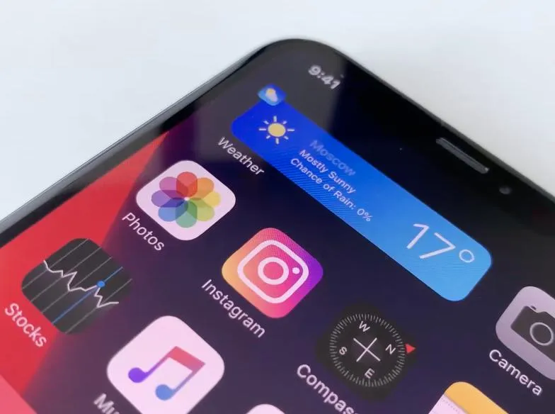
Concepts are usually reserved for the hot new iPhone or a fancy new iMac, but software sometimes gets in on the act as well. That's the case right here with a new iOS 14 concept showing us just how awesome widgets could be – if they were let loose onto the iPhone's Home screen.
Created by Aleksey Bondarev and shared to Dribble, this concept shows us widgets for various apps appearing on the Home screen in ways we've never seen before. Widgets are borne out of their app icon and offer anything from a Now Playing view to a quick way to see the weather forecast. And it's all super fluid and Apple-y as well.
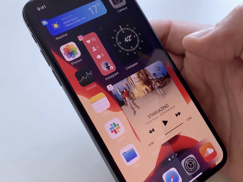
The way apps move out of the way to accommodate a new widget is impressive and I'm assuming that a tap of the widget opens the app whose icon it just replaced. I'm not sure how that would work with any kind of live widget, though. You wouldn't be able to tap a specific piece of data inside the widget and have an action initiated – other than have the app open – for example.
But that's why I don't work on Apple's iOS user experience team. Hopefully, someone who does has seen this concept, though!
iMore Newsletter
Get the best of iMore in your inbox, every day!
Oliver Haslam has written about Apple and the wider technology business for more than a decade with bylines on How-To Geek, PC Mag, iDownloadBlog, and many more. He has also been published in print for Macworld, including cover stories. At iMore, Oliver is involved in daily news coverage and, not being short of opinions, has been known to 'explain' those thoughts in more detail, too.
Having grown up using PCs and spending far too much money on graphics card and flashy RAM, Oliver switched to the Mac with a G5 iMac and hasn't looked back. Since then he's seen the growth of the smartphone world, backed by iPhone, and new product categories come and go. Current expertise includes iOS, macOS, streaming services, and pretty much anything that has a battery or plugs into a wall. Oliver also covers mobile gaming for iMore, with Apple Arcade a particular focus. He's been gaming since the Atari 2600 days and still struggles to comprehend the fact he can play console quality titles on his pocket computer.
-
Yuch. Can't say I am a great fan of the 'sea of icons'. but that looks terrible to me. It looks like an Android screen, overloaded with junk. It does have the advantage of trying to have some consistency in the implementation of the widgets, but the assortment of horizontal and vertical panels and boxes just looked terrible to me. If I want overview information I can just swipe right and get the current widget screen without limiting my quick access to my most important apps. Of course you say I wouldn't have to use it. True. I wouldn't mind if I had the option for the current widget screen to be default though. It would serve the same purpose. All my opinion of course.
-
No way, I think it makes for the potential for a messy UI/UX, totally not Apple's style. I can see a dedicated portion of the screen for widgets perhaps. What I would also like to see is rather than widgets, I'd want to see (more) interactive app icons.
-
Welcome to LiveTiles!