macOS 12.4 broke a vital feature people use every day

What you need to know
- Apple's macOS 12.4 update has removed the flags from the Input Source switcher.
- The flags have been replaced by monochrome two-character country codes.
- Selecting an input is now more difficult to do at a glance.
Apple's recent macOS 12.4 update made a puzzling change to the way people switch the input device on their Mac and it's causing internet-wide confusion.
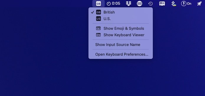
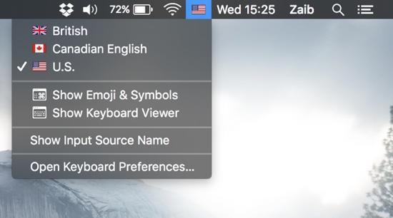
If you're someone who switches their input device regularly, perhaps from U.S. English to U.K. English, you likely do so from the Input Source menu bar item. And if you do that, you're probably more than familiar with seeing a little flag beside the language that you're selecting. Except, with macOS Monterey 12.4, those flags are gone, replaced with simple two-character country codes instead.
Here's how the switcher looks on my macOS 12.4 Mac mini right now:

And here's what it looked like prior to the installation of macOS 12.4 on another machine:

The issue was highlighted in a Stack Exchange post that assumed it was perhaps a setting that needed to be changed or, at best, a bug. But John Gruber has now been able to confirm that no, it's a decision that Apple made for reasons.
A little birdie tells me this is change is the direct result of a companywide effort not to denote languages using country flags. I do see the sense of that, but it's unfortunate it makes it harder to scan the menu at a glance.
The change undoubtedly makes sense to someone inside Apple and sure, not all languages match perfectly to a country's flag — Gruber points out that "Hebrew != Israel." But this is an example of something that has been one way for years, and now isn't. And inaccuracies aside, few could argue that the flag approach wasn't the best one in terms of usability and ease of recognition. Being able to glance at a list and make a selection based on a flag is the way many people have worked for a long time — but not anymore. And that's a shame because the best Mac is one that people don't have to rework years of muscle memory to use.
Maybe Apple could offer the best of both worlds and add a splash of color to those country codes instead of the monochromatic approach it's currently taking?
iMore offers spot-on advice and guidance from our team of experts, with decades of Apple device experience to lean on. Learn more with iMore!

Oliver Haslam has written about Apple and the wider technology business for more than a decade with bylines on How-To Geek, PC Mag, iDownloadBlog, and many more. He has also been published in print for Macworld, including cover stories. At iMore, Oliver is involved in daily news coverage and, not being short of opinions, has been known to 'explain' those thoughts in more detail, too.
Having grown up using PCs and spending far too much money on graphics card and flashy RAM, Oliver switched to the Mac with a G5 iMac and hasn't looked back. Since then he's seen the growth of the smartphone world, backed by iPhone, and new product categories come and go. Current expertise includes iOS, macOS, streaming services, and pretty much anything that has a battery or plugs into a wall. Oliver also covers mobile gaming for iMore, with Apple Arcade a particular focus. He's been gaming since the Atari 2600 days and still struggles to comprehend the fact he can play console quality titles on his pocket computer.
