A little less color: Seeing Apple through color blind eyes
I don't remember taking it, but I do remember the result: My mother said that we received a letter declaring that I was color blind. Even as a little kid, my reaction was to laugh it off as ridiculous — I could see colors, all of them. What a stupid test.

But in college a friend complimented my sweater by saying she liked its shade of green — my blue sweater. A girlfriend's gray socks (probably needing a little bleach?) were actually light pink. That letter was right: I am a mild deutan, with a deficiency of red-green sight (deuteranomaly) that I share with roughly five percent of the male population.

Out of sight, out of mind

While I've appreciated the work Apple does to make its products accessible — I've learned a lot from the writing of Steven Aquino on this subject — I've never really considered myself someone in need of accessibility or accommodation. But the fact is, I do see the world in a different way from 95 percent of the population, and every now and then that matters.

There are a few video games that I'm unable to play because they require quick sorting of colors that I have difficulty differentiating. Some of them have special modes for people like me; others just never think about it. The developers of Destiny did a lot of work to update the game's controls and heads-up display in order to make it more usable by people who can't perceive colors the way most people do.

The design of Apple's MagSafe chargers are a case in point: They contain a clever design to indicate your charging status at a glance — green means charged, amber means charging, and no light means that there's no power or connection.

Except, well... I can't really tell the difference between the green and the amber lights at a glance. For a long time, I didn't even realize the light on the MagSafe connector changed color. (Apple is far from alone here — lots of electronics use subtle color shifts of an LED to indicate things in a way that I simply can't digest.)

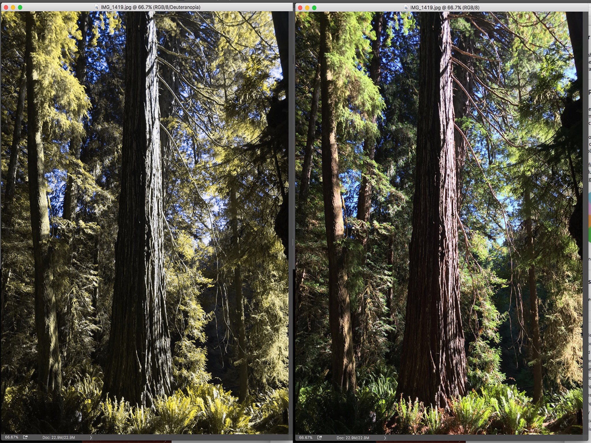
Designers, especially of user interfaces, need to be aware that their work shouldn't assume good color vision. Photoshop offers color-blindness filters (opens in new tab) that can give you a view into how other people see the world. There's nothing funnier than showing someone two images side by side — one unchanged, one filtered as I would see it — and seeing their reaction. To me, they look exactly the same, but apparently that is not the case for everyone else. It's not a joke I get to be in on.

In software, the right thing to do is either design around color blindness or offer an alternative, whether it's a separate color scheme (like Destiny) or even the addition of shapes or symbols to the party. But what if that doesn't happen? Is there something that a platform developer like Apple could do to make their devices more usable by people who aren't great at some colors?

Deuteranopia-colored glasses

Apparently there is. In the iOS 10 beta, Apple's introduced a new settings section under General > Accessibility called Display Accommodations. This section includes the option to invert colors and a Reduce White Point setting that reduces the intensity of bright colors. But the section that fascinates me is a sub-menu called Color Filters. "Color filters can be used to differentiate colors by users who are color blind and aid to users who have difficulty reading text on the display," reads some text below the Color Filters sub-menu in the first iOS 10 developer beta. (Inner editor's note: That sentence could use some punctuation.)

In iOS 10, Apple will let users filter their entire display, whether that's applying grayscale, red/green filters for both protanopia and deuteranopia color blindness, and a blue/yellow filter for a very different form of color blindness called tritanopia. There's also an option to just overlay a color tint of any hue or intensity.

Now, I'm not quite sure what these filters are supposed to do. As far as I can tell, they don't do what I'd like as a color blind person, which is to amplify and shift colors so that they're easier for me to differentiate. Right now the filters seem to wash out colors or turn them into different colors, which seems bananas to me. But it's an early beta; hopefully over this summer Apple will explain the reasoning behind these settings, or tweak them to be more useful to people who have issues with color. They make sunglasses that combat color blindness (opens in new tab) by shifting and enhancing color; I'd love my iOS devices to do that, too.

Expanding the color horizon

As Craig Hockenberry has written, the future of iOS is color managed. Apple is embracing this technology in new ways, with new Mac and iOS displays offering wider color gamuts than have been previously available on mainstream displays. And, it seems, one of the side effects of features like the True Tone Display and the DCI(P3) color gamut is support for people like me who see the world a little less vibrantly than the rest of you. It's not an accommodation I ever thought I'd need, but it's welcome just the same.

Jason Snell

Former lead editor at Macworld for more than a decade, wrote about Apple and other tech companies for two decades. Now I write at Six Colors and run The Incomparable podcast network, which is all about geeky pop culture, and host the Upgrade and Clockwise tech podcasts.

13 Comments
  • Jason - I am delighted to 'meet' a fellow 5%-er. Great article.
    So, the MagSafe changes color? I never realized that!
    I never thought about my devices helping with my color blindness (terrible term - as you eloquently say, I am not color blind, just color challenged).
    Of course, I do not know how much iOS could help me as I don't know what I am missing, but it would be nice to find out.
  • I am so happy there is a tech article about this. A lot of people don't understand when i say i can see in color, but i'm not sure what color I am looking at.
  • Apple Airport WiFi devices also switch from amber to green depending on the presence of an internet connection. I have to wonder what this means for traffic lights. Obviously those are identifiable as top-middle-bottom, but can color blind people otherwise see the difference between green and yellow?
  • I'm probably a bit like Jason - some red-green confusion (and grey-pink, blue-purple) and I can't very easily tell the difference between the amber and green on the Airport Express. But I've kind of trained myself to know that the 'green' color is a bit brighter than the amber. Those two example pictures in the article look the same to me, almost exactly. For a normal sighted person to get the gist - it's not complicated. I always see a color. It's just that for some shades of red and green, it'll look green to me, when it's actually red, and vice-versa. However for *most* shades (I think) of red and green, I can tell which it is.
  • @moxon64
    Completely agree!!
    I call it color dyslexia - like you, I see color but my brain won't tell me what color it is.
    I'm not dyslexic, but I believe those that are see all the letters / words, but often can't decipher them.
  • I never knew the mag safe changed colour either! Who would have thought it :-) This sounds like something that could help a lot of people (me included) and hopefully they will continue to develop it into something useful. One use I can think of is to apply a filter over the camera app to allow colour blind people to 'see' colours more easily. Would help to differentiate the brown from the reds when playing snooker!
  • Great article! I am *very* color blind, and it's ironic that it has become somewhat more of a problem as user interface design has grown. Challenges used to be limited to matching clothes and stop lights, really. And as long as I didn't care if I matched, and memorized the stacking order of stoplights (except at night, where I watch other cars, or in states where they're horizontal, which I relearn), it was pretty much a non-issue. Now, with LED indicators on *everything*, web interfaces, app interfaces, UX design driving toward 'simplification' with color instead of words, etc., the world is becoming more difficult to navigate, so I whole heartedly support the need for thought in this space. Apple does some things right, maybe more than others. Example, Maps is very easy to use and select alternate routes. The nav system in my VW however, always presents me with three routes that are identical in color to my eye, so picking a familiar vs unfamiliar route is always a roll of the dice!
  • I'm the same as you Jason! People think I'm bonkers sometimes and pick out things all around the room to ask what color I see. Mine seems pretty subtle. I see some shades of purple as blue, and the red/green thing. For those above mentioning stop lights. I'm not sure if I'm conditioned to know which is which, or if they came up with some kind of filter system or different shades of red and green for them. But I do remember a time when I started seeing them as their correct color. I started driving around the same time my city upgraded all the stop lights. Around that time is when I was able to see the difference. Could be conditioning because I was actually paying attention since I was driving, or if the new lights changed the hues of green red for better differentiation.
  • I'm another colour blind user. Usually on the computer it's just games where the real problems are. I'm also a deuteranope - usually that means red tends to black and purple is pretty much always just blue. On my Mac most all the UI makes colour sense to my eyes. It's much worse on my work windows laptop with a lame screen. On that screen I am always squinting and moving my head around hoping to be at just the right angle to see well. In my super old "Windows Communicator" messaging app all the traffic lights that are supposed to tell me if my colleagues are able to chat are useless - and it's actually the yellow and green ones there I can't tell apart - colours that I've never felt a problem with in the real world. I just thought of something. I might check out if the "development class" laptops my company gives out have nicer more legible screens - I could ask for a laptop with a better screen as a workaround for my disability.
  • I'm not color blind - but my Dad is. Often he has tried to explain what he sees to me - but my brain really can't comprehend it. That Photoshop image is probably the best thing I've ever seen to help explain it to me. One of my wants is to get him a pair of those "color blind glasses" from Enchroma so he can see what I see.
  • Thank you, Jason, for this article. I can't remember the last time I've found someone writing about a subject that a) relates to me personally in a strong way and b) has not been covered anywhere else to the best of my knowledge. I knew the MagSafe is supposed to change color, and if I really put my mind to it, I can see a difference, but usually, stuff like that is completely lost on me too. In my case, it goes a little further – I can't see 3D either. And I have no idea what other people see, how that would differ from what I see. I can somehow tell that the MacBook in front of me is a three-dimensional object and not just a 2D printout, and I can judge distances properly when driving, but I guess (or rather, I've been told by doctors) I'm doing that in a makeshift way that my brain came up with to compensate, not like "regular" people. But 3D movies have always been a source of confusion for me. When I put on those glasses, I don't see anything pop out of anywhere. It looks the same as before, just more blurry and with washed-out colors. It was even worse in the 80s, when they had those red-green 3D glasses. Yeah, give THOSE to a guy who's red-green-blind and can't see in 3D. :)
  • Note that you don't need Photoshop to simulate color blindness. There's that free open-source app I made called Sim Daltonism (for Mac & iOS).
  • I've known I was seeing colors different since a young boy. It never seemed like a deficiency to me, I just saw colors different, if not better, then everyone else. I could see hints of green in blues (or is it visa versa) for instance that others could not see. A color blind test in college biology class, had me dumbfounded that others could see numbers in a color pattern that I could not, but likewise there was a reverse test where I could see the colored numbers in a pattern that they could not.. deficiency I think not, I had special powers! When one of my twins, both of whom were born with blue eyes, eyes started to turn green I was the first to notice...fully a year ahead of when anyone else would even acknowledge that were not "as blue" as the other twin (his eyes are now absolutely green as agreed by all). Nonetheless, conventional science tells me I'm red green color deficient. Even when I know some indicator light is turning red or green I cannot figure out which one I'm actually looking at most times, particularly with LED. I've always wondered why they chose red as a back light on cars, and bikes, its so dim/darkish looking to me I can hardly notice it. Why not make them blue, its a much brighter color and so easy to distinguish from green. Nice to see IOS at least trying to address issue, but more important would be in car and traffic light safety...why is this not addressed. So how do I know red traffic light from green, subconsciously by position, but consciously I make the distinction easily because the green light is much brighter almost off-white looking light, and the red light is a darker shade, not red, just darker. However there was an instance where this distinction was insufficient. I was approaching a traffic light at night on a street that was lit with street lights that were a very bright greenish (to me) hue, I saw all in these bright green lights in the near and distance but failed to see that dim dark red light in front of me as I drove at full speed right through the light without stopping. Now I know to watch for this particular set of circumstances..