Making the App Store more accessible

iMore offers spot-on advice and guidance from our team of experts, with decades of Apple device experience to lean on. Learn more with iMore!
You are now subscribed
Your newsletter sign-up was successful
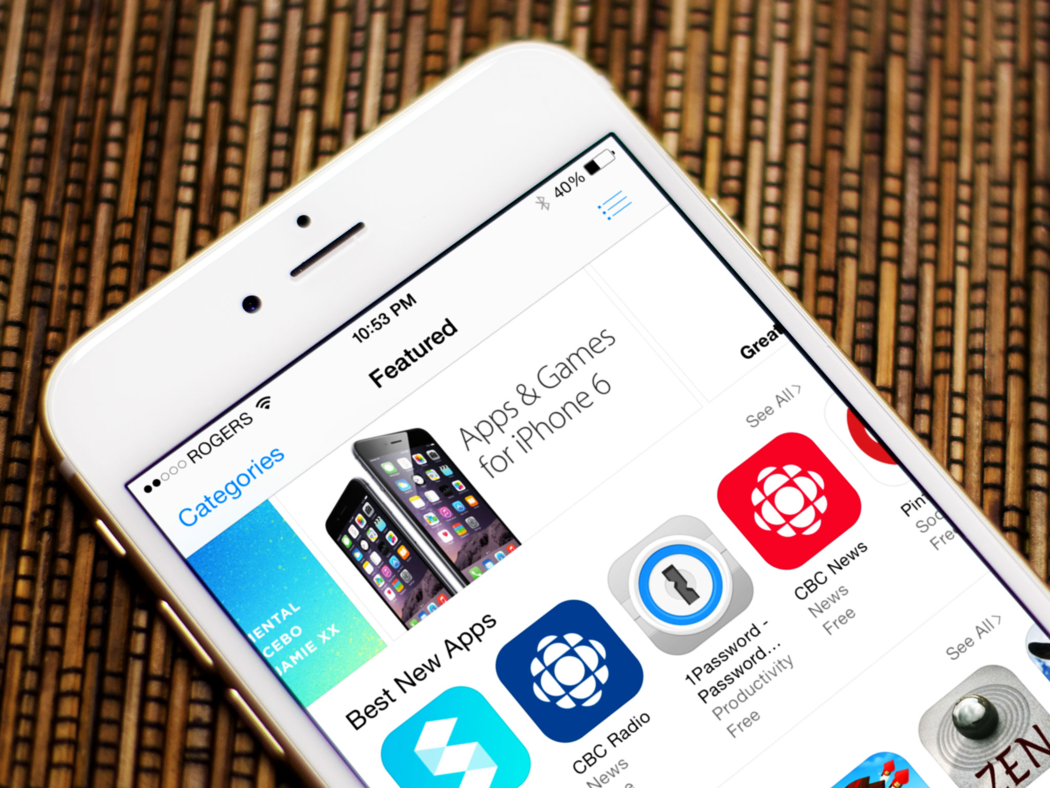
For as much as I laud Apple for their unwavering year-over-year commitment to improving Accessibility on iOS, there remains one area of the operating system that is in dire need of better accessibility, at least visually — the App Store.
The problem with the App Store's accessibility lies with its typography. It's way too small, making reading app descriptions and release notes difficult. Because there's no way to adjust the font size --- and I'd guess the App Store, as an app, doesn't support Dymanic Type --- I'm forced to hold my iPhone and iPad close to my face and squint in order to read about an app. Consequently, however, squinting so much makes my eyes tired and start to hurt, which in turn makes for a pretty terrible user experience.
Of course, the App Store isn't the only one of Apple's digital storefronts that are affected by ridiculously small typography; the iTunes Store and the iBookstore have the same issue. I mention the App Store in particular only because it's the store I use most. To be sure, it's been my experience as a visually impaired person that all three of Apple's stores aren't the best for reading.
Article continues belowIn my testing, I've found VoiceOver does work well in reading aloud app descriptions and release notes, but that doesn't solve the problem of the small font size. What I'd like Apple do to remedy this --- what they should do --- is add a slider somewhere in Settings that controls the size of the font. Or, even better, update App Store.app to support Dynamic Type; this way, the app will support whatever font size users set system-wide. Put another way, I feel the App Store (and iTunes and iBooks) should bend to Dynamic Type's will in the same way that Mail and Messages do.
As it stands today, though, using the App Store on my iOS devices (especially on my iPhone) isn't the most pleasant experience. But when it comes to the App Store, while lots of people like to write about curation and top lists, I think the general accessibility of the Store often goes overlooked. In fact, in all the time I've been writing about Accessibility on iOS, I'm genuinely shocked at how I've neglected to mention this. It's also a curious oversight on Apple's part.
I often peruse the App Store every Thursday, when the front page is refreshed, and also enjoy reading through release notes to learn of changes and bug fixes. As things stand today, though, the small font makes these tasks feel more like work than play.
It's my hope that Apple will address this issue sooner than later.
iMore offers spot-on advice and guidance from our team of experts, with decades of Apple device experience to lean on. Learn more with iMore!
Steven is a freelance tech writer who specializes in iOS Accessibility. He also writes at Steven's Blog and co-hosts the @accessibleshow podcast. Lover of sports.

