Big, bold, and beautiful: Apple's design language is changing in iOS 10

If you haven't been paying attention to Apple this week, there's just a teensy bit about the company's upcoming operating systems you might have missed. New versions of watchOS, tvOS, iOS, and macOS (RIP OS X). New apps. New services. If you're a developer, there's an incredible number of new resources and SDKs to play with.
But this week, I haven't been attending developer sessions at WWDC; I've instead been listening to the wonderful presenters at Layers, Jessie Char and Elaine Pow's design conference. And while I've spent my fair share of time this week poring over developer documentation, I've also been looking at the new operating systems from a design point of view.
Bold steps
Apple's iPhone OS began with healthy ties to skeumorphic design, and for good reason: The company had to convince users that a flat pane of capacitative glass and circuitry could comfortably replace their telephone, calculator, calendar, and more. As the iPhone grew in popularity, its need to prove a relationship to real-world items lessened, and users' general unease with skeumorphic design grew; after a few additional iterations, including apps with wood-grain paneling and more green felt than a casino, enough was enough.
The company stripped iOS's design language to its core, ditching the bubbly icons and rich Corinthian leather. The seventh version of the iOS operating system introduced flat backgrounds, minimalistic font faces, bold highlight colors, soft blurs, and at-times slightly unsettling animations.
Bold moves are rarely perfect ones.
The redesign was a necessity: iOS 6 had become encumbered by its design language, and Apple needed a strong step forward to set the tone for the next ten years of its software. And iOS 7 did that — it was a bold move into a less skeumorphic space.
Bold moves are rarely perfect ones. The new operating system's animations made people motion sick and fonts were too thin to read for most human beings over the age of 30. But Apple has taken to heart customer feedback over the last three years and iterated. Shadows and font weights have returned. Animations have become less jarring.
iOS 10 builds off the design language iOS 7 introduced, but it takes a bold step of its own, meshing the best of the old iOS design with the current style to create something entirely new.
Fixing the visual map
The iPhone and iPad have used slider trays and pop-overs for years to display additional information, but they've been limited and inconsistent. A great example: You can pull up from the bottom to display Control Center, but pulling up from the bottom right would instead trigger the Camera. And sliding left to right would send the Lock screen away in favor of a Passcode for unlocking your device — something that has nothing to do with additional information.
In this older model, I can't build a conceptual map of where these features exist. Notification Center and Control Center theoretically live on top of the Lock screen, but the Camera lives... underneath it? And the rest of the phone OS lives... to the left? But don't the Camera and all other apps exist on top when I launch them from the Home screen?
This likely isn't something the average user thinks about very often, but poor virtual mapping indirectly affects someone's ability to discover features and use them consistently. (I can't count the number of times I've had to walk my parents through the difference between pulling from the middle of the Home screen for search versus from the top of the screen for Notification Center.)
The good news: iOS 10 aims to both refine this concept and make discovery easier. Gone is the awkward mix of swiping: Instead, the Lock screen as displayed takes advantage of content in each direction; swipe from the top for Notification Center, right for the Widgets screen, left for the Camera app, or bottom for Control Center. Along the bottom of the Lock screen are page indicators like those on the Home screen — another indicator that more content hides out of reach on each side.
RIP, Slide to Unlock.
iOS 10 also fundamentally alters one of the core features of the iPhone and iPad: Slide to Unlock, the first multitouch gesture Apple CEO Steve Jobs demonstrated on stage, is no more. By moving this interaction to the Home button — and passcode or Touch ID authentication to a floating layer, rather than a side-screen — it provides a consistent experience for the new Lock screen; when you swipe on any edge, you'll be able to access quick and necessary app content without unlocking your iPhone.
Thinking with layers
With these changes, iOS 10 paints a much clearer visual map for users, built in layers: On the top layer, you have Actions: Notification cards, Widgets, Control Center, and 3D Touch options; on the bottom layer, you have the Home screen; and the middle layer holds your Lock screen (if locked) or other app-related content (if unlocked).
iOS 10's new card-based system for Widgets, Notifications, 3D Touch, and Control Center follows and further crystallizes that design paradigm: The opaque, rounded interface puts each individual notification, widget, and control card in its own environment; it can then "float" above the App or Lock screen layer at the bottom (Control Center), middle (Notification, 3D Touch action, or Widget), or top (Banner) of the screen.
By making each bit of iOS UI its own distinct layer, this also opens up greater horizontal interactions, as with Control Center. As seen in the keynote, Control Center now lives inside a hovering bubble layer, with a Music widget and Home widget just a left swipe away. Not only is this an interesting way to keep Control Center's buttons comfortable and organized, but it also potentially sets up the stage in future releases of iOS to move certain third-party Widget content to that area. (Swipe up and to the left for a third-party calculator, anyone?)
Big and beautiful
As part of iOS 7, Apple bet big on thinner font faces legible at small sizes; with iOS 10, the company is re-embracing font size and weight.
"Big. Bold. Beautiful." It's not only a snappy tagline — it's the company's new design mission.
SF UI Text and SF UI Display are iOS 10's two primary system fonts: The former covers all font sizes under 19pt, while the latter focuses on 20pt+ sizes. UI Text is thicker at those smaller sizes to preserve legibility, but still captures the style of the original San Francisco and Helvetica Neue. UI Display also has thin weights, but in Apple's redesigned apps, they've been smartly combined with bold weights for headers.
If iOS 10's new and redesigned apps are any indication, "Big. Bold. Beautiful." is not only a snappy tagline — it's the company's design mission. In Music, Maps, Health, and Home, the mix of thicker, large headliners and thinner sub-headers provides for a rich, textured experience previously unseen in this era of iOS.
The Music app is the best example of Apple's reinvented minimalist style: The app has ditched colored and shaded backgrounds for a white, sleek background, instead using big, bold headers and images to build each section. "Bigger" images and text were indeed part of the rumor mill around Music's redesign, but I don't believe anyone guessed just how well those elements would integrate.
In part, the bigger font faces provide for readable, tappable touch targets: In the future, instead of stabbing furiously at the tiny mini-player on the bottom of the iOS 9 app, I can look forward to tapping an element double in size, with clearly demarcated play/pause buttons and no More (...) button in sight. (The endless list from iOS 9 is still there, but smartly hidden inside a 3D Touch gesture.)
I mentioned this on the iMore Show, but this move to bigger tap targets is especially smart in apps that might be used in conjunction with other tasks. In its Human Interface Guide (opens in new tab), Apple asks developers to maintain a "minimum tappable area of 44pt x 44pt" for all controls, and notes "Larger items are also easier to tap, which is especially important when an app is used in distracting surroundings, such as in the kitchen or a gym."
Not mentioned here (for good reason) is driving, but as much as Apple encourages its users to talk to Siri or purchase a CarPlay vehicle, there remain many drivers who navigate or select songs on their iPhone. In an ideal world, you should never use your device in the car, but if you insist on doing so, the company can at least make the apps slightly safer to use while distracted.
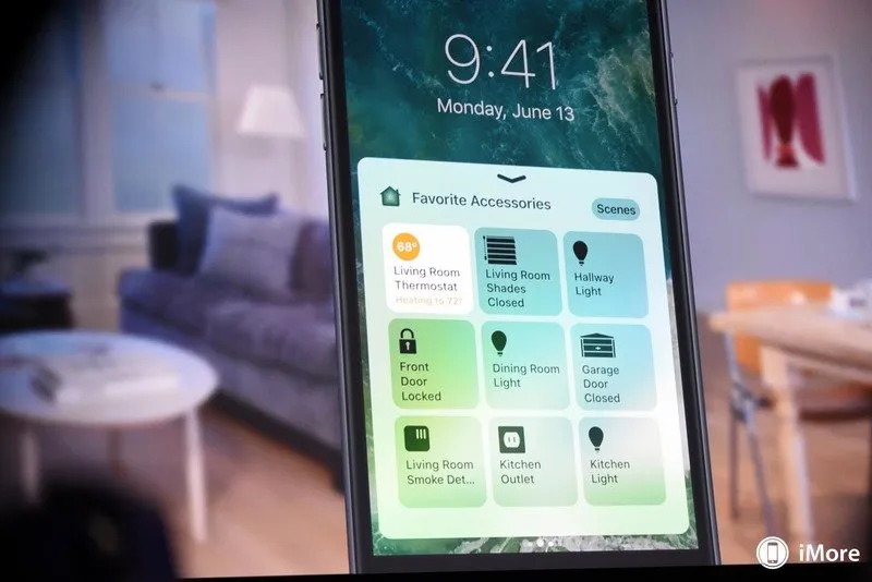
Color, too, is being used in a smart and relatable way. In Health, Apple uses bright colors to demarcate between activities and brighten up icons for discoverability. In Music, the company is letting the album artwork speak for itself, using the fuchsia highlight color for solely text-based links and call-outs. Home, in contrast, plays with a dark navigation bar, orange highlight color, and full-color photographic background for each room. Though at first glance it may not seem to fit in with the style of the other two apps, this textured color approach helps highlight scenes and accessories, set the style of the home, and ties into Apple's design schema with big, bold headers.
Growing up
From an accessibility and user experience standpoint, Apple's design changes have given new cues to users on how to use the operating system. Those bigger touch targets should also provide a more comfortable experience — especially for those on smaller iPhone models.
On a personal level, I'm intrigued by the company's design moves in iOS 10 (and its companion operating systems). Apple has long shied away from bold faces and big font sizes — outside of accessibility options — and bringing them into the primary operating system gives the company room to experiment with the kind of texture it previously needed skeumorphic art to accomplish. It's not always a success, and there are definitely aspects of the Music app's design that I'm not in love with just yet. But it's early days yet.
Based on the keynote and assorted public documentation, we've only really seen four apps take advantage of this new style — if iOS 7 was a seedling, iOS 10 has just started to sprout limbs; we have yet to see how it will grow as the iPhone and iPad further evolve. Remember, the operating system is still in development: Someone at Apple might throw out the whole concept before it ships in the Fall.
But I hope they don't. I'm ready for some big, bold, and beautiful in my life.
○ Everything about WWDC 2020
○ WWDC 2020 remote lineup
○ Download the Apple Developer app (opens in new tab)
○ iOS/iPadOS 14
○ macOS 10.16
○ watchOS 7
○ tvOS 14
○ Discussion forums
iMore Newsletter
Get the best of iMore in your inbox, every day!
Serenity was formerly the Managing Editor at iMore, and now works for Apple. She's been talking, writing about, and tinkering with Apple products since she was old enough to double-click. In her spare time, she sketches, sings, and in her secret superhero life, plays roller derby. Follow her on Twitter @settern.
-
In the case of the Music app it is very Microsoft-esque and not appealing to me.
-
I thought the exact same thing when the revamp of Music was announced.
-
Spotify has nailed it IMO. I'm disappointed Apple Music and iOS 10 in general doesn't have a dark mode. :/
-
Dark mode really should've been in this release. The keynote was somewhat lackluster, and a dark mode would've got a lot of applause
-
I have just moved to iPhone for the first time after years of Windows Phone and I agree the Dark Theme is appealing for some apps. But I found after a time I changed back to the light theme on both my WP and Surface Pro. I found the lighter themes on my 6S a pleasure to experience. My point is will the Dark Theme be a novelty factor?
-
I think there's a lot of desire for it, whether people will try it and then think "actually I preferred it the original way" is another matter. I use the semi-dark mode on macOS, and have applications that can be set to a dark mode set to it, I prefer it like this and don't want to go back, so I think for me personally if I got a dark mode option I'd use it and keep it that way, I use the dark mode on Tweetbot for iOS as well. A lot of people want a dark mode for night time too, even on the lowest brightness and with Night Shift the white can still be quite striking. One thing's for sure, if Apple release an iPhone with an OLED screen they will add a dark mode, because with the nature of OLED screens, they use less battery displaying black but more battery displaying white, this is why the watchOS interface is black
-
Agreed. And for the record, I really miss those too thin fonts from iOS 7. Very elegant and modern, but I get that some people had a hard time with them. Even though Apple sometimes lately seems to struggle with design language, I still think iOS 10 is more pleasing to look at than Android M or N. Android's Material Design is great, but sometimes is just too flat and plain and boring.
-
And illegible for lots of folks.
-
This is why there's a setting in Accessibility for bold fonts. As much as this sounds somewhat insulting, if your eyesight is fine, the text is perfectly readable on iOS's retina display. Accessibility options are there if you have any kind of impairment of any degree, even if your vision is only slightly blurry
-
>for the record, I really miss those too thin fonts from iOS 7. Very elegant and modern I agree. I really liked the look and wish Apple had kept it, somehow making it optional for those of us who had no trouble with it. That look as has been used in a lot of places, and every time I see it, I miss it that much more.
-
i thought it was barely broken as a music player in ios 7 and only needed tweaking. It was streamlined and good for a power user. What i see now is cluttered, wasting space on "recently added" and an attempt at eye candy at the expense of usability. I mean even in ios 8 they added the large album art and random images to lists reducing the amount of entries in a list per page and expanding the amount of finger strokes it took to get through a list. I can't help but think Jobs would look at that and think, "i don't know if that's good since really it makes it more clicks and swipes not less." And i think he'd think these ios 9 and ios 10 changes are often less intuitive.
-
You're not the only one to make the connection to MS. But if you've seen screen shots of Ubuntu Phone, which is a morphed Unity 8 OS (think along the lines of Continuum for Windows), I think it looks a lot more like that than anything MS has done.
-
Yes it does have a bit of a Zune-ish look to it.
-
Some people here aren't old enough to remember the Zune software. It's where Microsoft should have gone with their UI design in Windows 8. Instead, we got what we got, and then Windows 10's ugly UWP design language. Such missed opportunities.
-
As an ex big WP fan and current Surface Pro user I can only agree MS ditched and destroyed some lovely designs for the OS. Hence, I recently bought an iPhone 6S and I love the OS and 3D touch.
-
It does remind me of the 'Microsoft works' formatting I used on reports in middle school in the 90s. its not terrible... For a kid in grade 6 on his first computer....
-
The music app is hideous. Sent from the iMore App
-
I thought the same at first, and there is still room for improvement. But usability is greatly improved. It doesn't seem it from pictures, but it is all around easier and better to use.
-
It's ok except for the 'over-bolding' in many places. Some of the fonts could be way less bold and still be readable by older people.
-
Just as some instances of Helvetica Neue Ultralight were too light, and the contrast between light gray on gray was too little, in some places the bold is too bold and looks chunky and just wrong. I'm still a fan of HNU.
-
At least with the thin fonts there was an Accessibility setting to enable bold fonts for the people who couldn't read it. There's no way to change the bold fonts back to thin ones
-
I just don't spend that much time on my lock screen for me to see how these "bold" new feature will wow me. I think we spend more time on the actual home screen that the lock screen. Would have loved a redesign on the same ole stale home screen . Maybe some spend tons of time on there lock screen but I guess I just don't. Maybe with iOS 10 I'll spend more time on it? I guess.... Sent from the iMore App
-
The home screen has evolved with 3D Touch giving app widget pop-ups. But the grid of icons won't likely go away because it has stood the test of time and proven to be the fastest way to get at your apps. Most people I know who have Android have their home screen covered in app icons just the same because they too discovered it's the most efficient way to get what needs to get done, done fast.
-
I just want some more functionality in organising the home screen. Currently all you can do to organise it is move 1 single app at a time, and be able to put them in folders. Considering that if you create a folder from two apps of the same "category" it will name the folder automatically based on the category, I think Apple could put a feature to auto organise all your apps into folders based on category. There could also be something for sorting icons by alphabetical, or by date of installing, date of update etc
-
yep. the only thing my homescreen needs to do is allow me to unlock the phone and notify me i have a text. i don't even want the actual text to appear just tell me i have one waiting. other than that i don't need all that stuff.
-
And that's totally cool. You'll still be able to disable all of these lock screen features, and I'd encourage anyone with a need for additional security or privacy should absolutely do so. For me, I'm judicious enough with what I allow on my lock screen that I'll take the added features.
-
That's the hole point. It's a change away from apps (not all of course). They want you to be able to do lots of things right from your home screen so you don't have to waist clicks to first get to you home screen.
-
Microsoft did this 6 years ago with their Windows Phone 7 UI. Used correctly, it produced some stunning app layouts. It was my favorite part of that particular OS and it's nice to see it come back.
-
It was too early when Microsoft did it. Sent from the iMore App
-
I think they did it right and tastefully. But unfortunately the OS platform still suffering from a slow grow.
-
Microsoft's platform is suffering because it's crap. Sent from the iMore App
-
Pretty much this
-
Great design is timeless. The old Zune and Windows Phone 7 design language will always look good. The same can't be said of Apple's skueomorphic mess.
-
This. Posted via the iMore App for Android
-
****. Windows Phone 7's UI is really great. It's simple, readable, stunning. Only needs improvements on feature and usability. Sent from the iMore App
-
Anything to help with readability. The low contrast fad has been horrible for us folks over 55.
-
There were accessibility settings to help with that though. There's no way to reverse these new bold fonts
-
Nice write-up of a rather complicated topic (Layers and all). The basic function of any OS is its usability combined with a short learning curve. This obviously means various aspects of the OS need to be discoverable and consistent. IOS 10 appears to improve the OS in all these functions (Ease of use, consistency and, usability). Contrary to what a couple of previous posters feel, I rather like the new Music app. Allowing the color to come from covers, etc, enhances its overall appearance. FWIW, yes, I does look a bit like the Zune Music app, which I always found quite appealing, YMMV.
-
Comparing the first screen shot and the last screen shot, one can see UI design is all over the place. It would be nice if they unified the experience.
-
Ios is finally catching up with Android and feels so good. However wish siri would be a bit smarter but is ok for now developer will work on that
-
It's Android that needs catching up with iOS. When are you going to get AdBlockers on Chrome (iOS 9), or even HomeKit (iOS 8)?
-
Homekit is a success? IoT is still very niche. Small market.
And adblockers are numerous on android. Where do you get your info? -
Really? I could never figure out how to stop ads on Android but on iOS it is much easier. Sent from the iMore App
-
Ads keep the internet free. Unless of course you want everything behind a paywall. Content creators need money, and you can pay either with ads or your wallet.
-
Huh? When was the internet free? You aren't paying your ISP then?
-
It's like how you pay for cable access but also get ads. Do you want to have to pay to see iMore, AC, WC, Verge, etc?
-
The difference between content and infrastructure would seem to be self-evident, but okay.
-
Ads that fit in with the flow of a website and are not intrusive are fine. Ads that pop up and take over your whole screen, are seemingly impossible to close or are so poorly made they bog your CPU down, are not ok, and unfortunately the latter type of ads seem to prevail. So until then, adblocker it is.
-
I realise you can't escape ads but can't they be at least unobtrusive at discreet. Sent from the iMore App
-
You can escape ads with an adblocker
-
Easy to do. one example is to install Firefox and say 'Ok' when it asks to be your default browser. Then add the Adblock Plus add-on for Firefox. You'll now have ad-free browsing on Android.
-
LOL considering the amount of stuff iOS 10 adds that Android already does, I think he is right. Posted from my Nexus 6P
-
Personally I dont think it's that the music app is bold more so than TOO bold. I like that they've cleaned up the navigation and combined some sections so it doesn't feel like you're taking endlessly but I think the font is just too big. Larger than what we have now is okay but on larger phones will it look more scaled down or that much larger? Only time will tell and I feel that Apple will scale it back some throughout the betas (hopefully) but I agree. I think their design language is trying to be more consistent throughout so I'm excited. Also, didn't even think about design colors and I can see a lot of third-parties updating their apps to match so iOS 10, along with opening Siri and Messages has the strong possibility of really meshing everyone in together. Or at least enough to get it started for iOS 11 ;) Sent from the iMore App
-
Looks very similar to Windows Phone 8 UI design to me.
-
Except, nothing at all.
-
You honestly don't see the major similarities :) Really? (I'm assuming you've actually had a reasonable amount of experience using a Windows Phone. Because if you haven't, then in all fairness, it would make your comment completely irrelevent)
-
I have just come over to iPhone and must say the first thing I thought was WP design similarities. As for the current music app on iPhone I actually really like the whole experience and only function I still find difficulty with is when the a-z list appears to the right on lists. I press on this by mistake when aiming for the ellipses. Maybe I need more practice....... I like that on activating the a-z scroll I don't have to keep my finger to the right only - I can move my finger to the middle without losing the scroll. That is a great feature.
-
Actually, I think it looks more like Ubuntu Phone.
-
i'd love to have a classic version of the music player option. just text for the power user except on the actual playing screen where album art is fine. sort of like the ios 8 version minus the album art in the big lists.
-
The Music.app is beatufiul, and a huge step forward. It's now much easier to use the App on the gym, for example.
-
Agreed the music app and Apple Music is vastly improved now. Sent from the iMore App
-
Ok, so basically nothing is good enough for you people. Everybody hate everything.... Comments are so negative and not constructive anymore...
-
First off - Terrific article, one of the best I've ever read!!! "In its Human Interface Guide, Apple asks developers to maintain a "minimum tappable area of 44pt x 44pt" for all controls, and notes "Larger items are also easier to tap, which is especially important when an app is used in distracting surroundings, such as in the kitchen or a gym."" One question, has Apple made the close X box [X] BIGGER and I mean way BIGGER or do I still have to file down my finger tips?
-
Serenity Please ding them hard for the poor UI in the music/podcast player for putting the Play/Pause/FF/RR buttons on the bottom of the screen. These should be in the upper half so you can fully grab your phone when your holding it on one hand. I've dropped phone too many times while standing up on a train. The first time you use them you know it's disaster waiting to happen by holding the phone by the very bottom.
-
These should be on the bottom half for one handed usage. Posted via the iMore App for Android
-
Card-based UI for widgets, notifications, etc....hmmm... where have we seen this before .. Posted from my Nexus 6P
-
Hmmm... http://www.imore.com/sites/imore.com/files/styles/large/public/images/st...
-
Agreed. IOS 10 has more similarities with Android more than before with the card based interactive lock screen notifications with 3D Touch support. Sent from the iMore App
-
I like just about everything I'm hearing here, particularly the functional differences, and "virtual mapping" layout changes. That all sounds good! And besides, I was hoping to hear news of a design refresh. :-) HOWEVER, the one thing that does NOT sound good to me is borderline heartbreaking in how significant I personally find it! If this is right, my -absolute favorite- aspect of an OS7 and later design language that I otherwise am fairly bored with is going away! Specifically, I'm talking about the color coordinated, translucent backgrounds found in things like music, podcasts, notifications, and the like. They are to be replaced with plain opaque white and big headers. "Big, bold......and bland" is what those Music app pictures look like to me. Now, I'll withhold judgment until I can actually see it, of course. I may absolutely love it! They may be able to pull off a miracle. And even if I don't love it initially, I may grow to love it in time ---- And to be fair I was wanting a refresh. ---- But if the Music app pictures are an indication of the whole UI, and if translucent, context sensitive color theming goes away in favor of plain, opaque, irrepressibly constant white, then I can't help but fear that Apple may well punt itself deep into "dead last place in the ---entire industry---" territory in terms of my own personal tastes in aesthetics... ....perhaps I should be more careful what I wish for... But again, I must withhold judgment til I can actually see it, then I can make my decision from there! Thanks for letting us knows about what may be on the horizon, Ren! :-) Cheers!
-
I do love the translucent/blurred effects with 3D touch and colours changing from track to track in music etc. I do not like the Android flat boring squares look at all and as I'm new to iOS hope too that they keep the current design translucency etc..... please...... please!
-
Oh, another question: this was hinted at in the article, but never said outright - we have a decent sense of the nature and degree of difference between iOS 9 and iOS 10.....but what about the others? For instance, how much different will the first "macOS" since "MacOS9" look and work compared to the final iteration of "OSX?" What about TV and Watch? Do we know anything about those yet? p.s. FWIW: I don't know whether to feel like a dolt here, or feel vindicated -or both-, but for whatever reason, I never stopped calling "OSX" "MacOS". It wasn't deliberate rebellion on my part, I guess I just continued to simply think of it as "Mac".....and yes, I did have a Mac before the dawn of "OSX", plus all the crap-ton of use I gave them in the Des Moines public schools back in the day. :-)
-
All that space taken up by text means less music available on the page. As a result, it will take more scrolling or button pushes to actually get to music I want to hear. I guess this is the price we have to pay for all the bloggers saying they were confused by the old interface. I think it needed tweaking more than a rebuild. Also, I would rather have the landing page be the "For you" section or a least give me that option.
-
Just wait for the next rebuild. Won't be too long.
-
The idea of "layers" seems to take from Google's 'Material Design' (whose 'flatness' took inspiration from Microsoft but added the idea of the screen being composed of digital 'materials' with both length and width but also a height above the viewing surface). Unfortunately, Apple's UI/UX doesn't seem to be nearly as fully a thought-out metaphor as material design.
-
I see a strong resemblance of Windows Phone 8 design language in iOS 10. Not to say it's bad, but I am sad to see Windows Phone moving away from that...
-
I wish iOS home screen was anything like wp! I loved my live tiles now that was "smart" home screen not boring or stale at all. iOS home screen? (Crickets...crickets.....crickets) just sayin Sent from the iMore App
-
A bold move well introduced. I'm very intrigued by Apple 's new design for iOS 10
-
This is excellent news, the current one-pixel-wide fonts are just an absolute PAIN to read. And the acres of white space with just a word of text has always amazed me. I understand that the entire look and feel of things must change from time to time to keep pundits happy, but the entire flat, lots-of-whitespace design philosophy has never made much sense to me. With buttons no longer existing and no clues as to what items on the screen might be clickable, when I install a new app I find myself tapping on EVERYTHING on the screen, every word, every graphic, to see if anything happens, to find out if that is a button, or if anything triggers another action that is key to the app. The very fact that a user must do that indicates to me that that entire design philosophy is a complete and utter failure. Yes, actual buttons are "old-fashioned" but darnit at least users knew that if you tapped on them something would happen!
-
Thats why we want jailbreak tool Sent from the iMore App
-
It's indeed beautiful. Just loved it!
-
I am looking forward to the music app update the most of all.
-
I do like the idea of being able to do more on/from the lock screen and bypassing opening the phone and selecting apps. I also like the idea of 3D touch to access more menus or information from the lock screen. As these seem to be options I see every ones needs covered here.
-
hideous music app
-
Great analysis!
-
I thought this was Material Design the first time I looked at it. I see that is not though. Instead, it's a shameless copy.