watchOS 10 is great – but it’s ruined the Apple Watch Fitness app
An exercise in frustration.

Apple’s watchOS 10 hasn’t been out long, but I’ve already found a ton of things I love about it. From little features like the clever widget stacks revealed by scrolling up on the Digital Crown to more substantial changes like being able to set multiple timers (just kidding), it’s a great little update – especially considering it undoubtedly lost engineers to the Vision Pro headset along the way.
One of the main things I use my Apple Watch for is keeping fit and recording my workouts, and watchOS 10 has seen some pretty hefty changes here too. Yet I’ve enjoyed these alterations far less – in fact, I’d almost say Apple has managed to ruin the Fitness app. Logging workouts and checking my progress is now much more cumbersome than it ever was, and there’s not much to show for it.
Death by a thousand cuts

There’s not one major change I can point to and say “this is what broke the Fitness app.” Instead, it’s more like a death by a thousand cuts, with lots of small tweaks that add up to a much less pleasant experience.
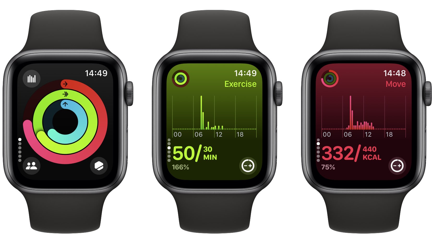
For example, fitness summaries are now far less informative. You now see unlabeled graphs and have to tap a button to get more detail, but even there, there’s vastly less info than the summary used to show. When you’re done exercising, meanwhile, Apple has moved the End Workout button, so you’ve got to retrain your muscle memory all over again.
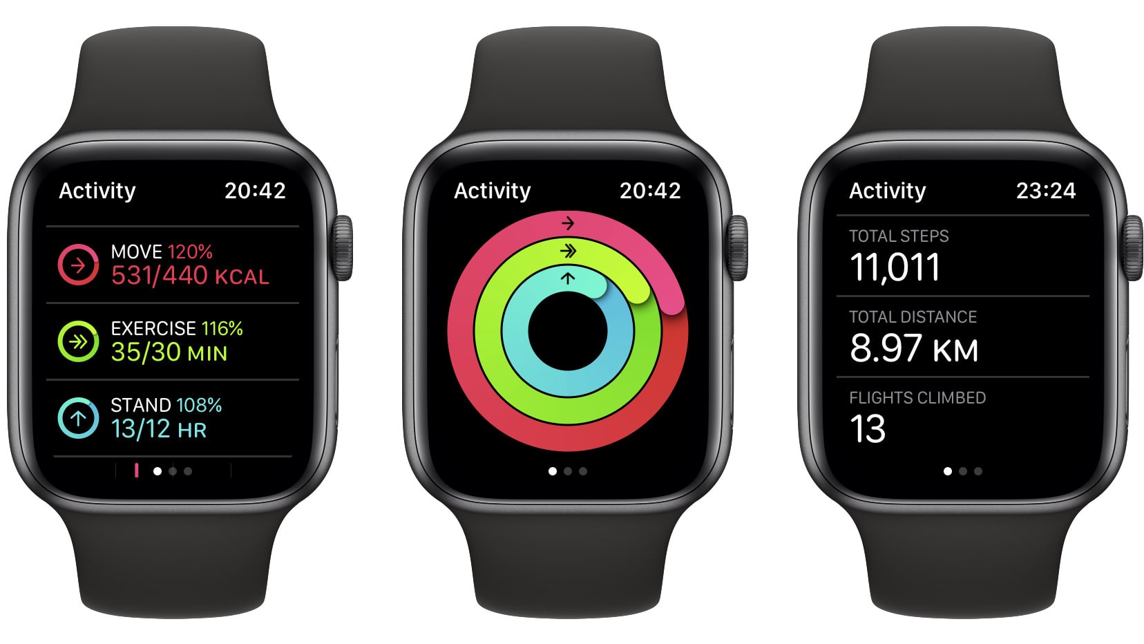
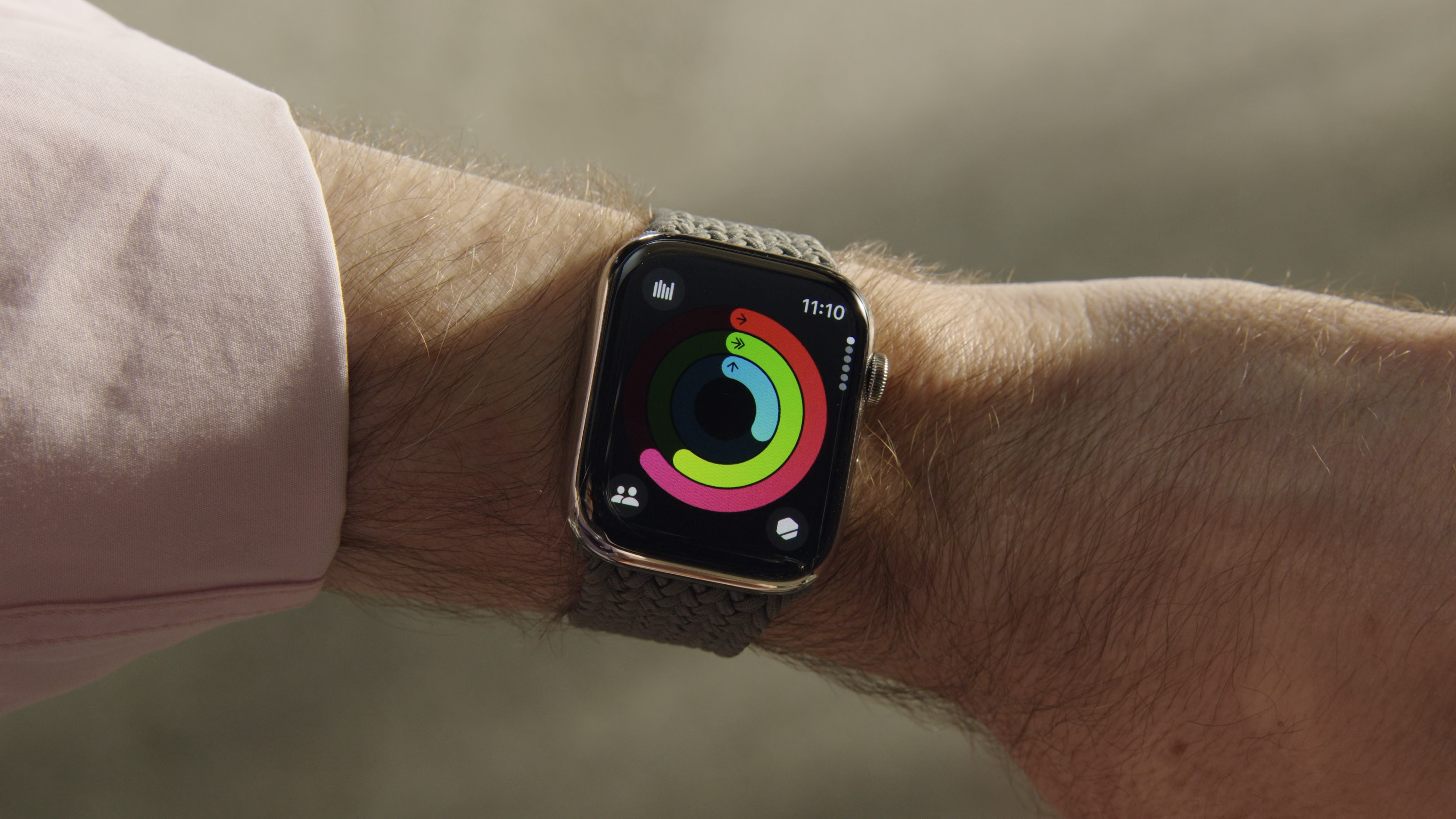
I’ve got a Fitness complication on my Watch’s home screen so I can quickly tap it to see if I’m on track to close my rings for the day. Previously, after tapping the complication I could scroll down to see my activity progress for every ring in one Watch screen. For example, Move 47%, Exercise 50%, Stand 83%, all visible without any swiping. It was a quick way to compare everything in one go.

Now, Apple has separated each ring onto its own screen. That means more scrolling to get to the information you need, when previously it was all right there in front of you.
Worse, Apple has used a flipboard-like animation for scrolling to each ring, complete with haptic resistance. As you move the Digital Crown, the information on the screen starts blurring, before suddenly flipping to the next screen. If you let go too soon, it reverts to the original screen. Spin the Crown too fast, though, and you end up whizzing past the data you wanted to see. This resistance is very different to the smooth, easy scrolling of watchOS 9.
iMore offers spot-on advice and guidance from our team of experts, with decades of Apple device experience to lean on. Learn more with iMore!
That means Apple has both reduced the amount of info on-screen and introduced a learning curve for something as simple as viewing your fitness metrics, which seems pretty ridiculous. And because the text blurs as you spin the Digital Crown, you can’t read it as you scroll – something you used to be able to do before.
Design is how it works

I know this might seem petty, but design is important, and getting it right (or wrong) can make a big difference. The Fitness app in watchOS 9 and before was simple and clear, with plenty of information available with minimal scrolling required.
Sure, the new version of the app is definitely prettier. The screen for each ring takes on the color of the ring itself – the Exercise page has a green background, for example – and that looks undeniably snazzy. But the way you navigate through the app has gotten way worse.
It’s particularly egregious because it violates Steve Jobs’ own dictum on design. When discussing how Apple came up with the iPod’s look and feel, Jobs decried those who thought design was just slapping a pretty face on a terrible product. “It’s not just what it looks like and feels like,” Jobs explained. “Design is how it works.”
If that’s true, then the Fitness app is a pretty clear violation of the Jobs adage. It looks great (better than before, even), but it works much worse. In my opinion, the trade-off isn’t worth it.
So, while there’s a lot I really like about watchOS 10, its redesign of the Fitness app (something I use every day) has me nostalgic for the old look and feel of watchOS 9. Here’s hoping Apple fixes it quickly – and pays a bit more attention to Steve Jobs’ famous saying.

Alex Blake has been messing around with Apple tech ever since he caved to the pressure and bought an iPhone 3G “just to see what all the fuss was about.” He’s spent the subsequent 15 years prattling on about Apple and has somehow managed to do so professionally. Don’t ask him how.

