iOS 7.1 lets you take some of the magic — and all the motion sickness! — out of your iPhone and iPad

iOS 7.1 goes a long way towards "fixing" the usability problems some people experienced with the original version of iOS 7 — not by taking a step back but by taking a step diagonally. Apple has always led the industry when it comes to accessibility. With iOS 7, however, the added improvements were counter-balanced by some added problems. Fantastic new features like switches let you control your iPhone based only on the movement of your head, but other features like the physics and particle engine gave some people vertigo, thinner typography made it harder for some people to read, and "naked" buttons made navigation more difficult for some people to use. So what's the iOS 7.1 middle-ground Apple's found? In short, Accessibility Settings.
The first is an expansion of the Bold Font option, which now also enhances the weight of the keyboard, of the Calculator app, and of many of the standard glyphs (icons) like the share button and trash can. Unfortunately, due to the way iOS works, your iPhone or iPad still has to reboot for the Bold Font option to take effect. If you do make the switch, however, here's how the difference looks (standard on top, Bold below):
iOS 7.1 also expands Reduce Motion, now disabling the physics in iMessage, switching the scaling in the multitasking interface to a cross-fade, and freezing the animations and scrolling in the Weather app.
There are also several options to Increase Contrast in iOS 7.1. You can Reduce Transparency to make things like folders and Control Center opaque. You can Darken Colors to make things like the navigation words and glyphs slightly less bright, and you can Reduce White Point to make tone the backgrounds down to a step to light gray. Here's what the differences look like (default on top, Increased Contrast below)
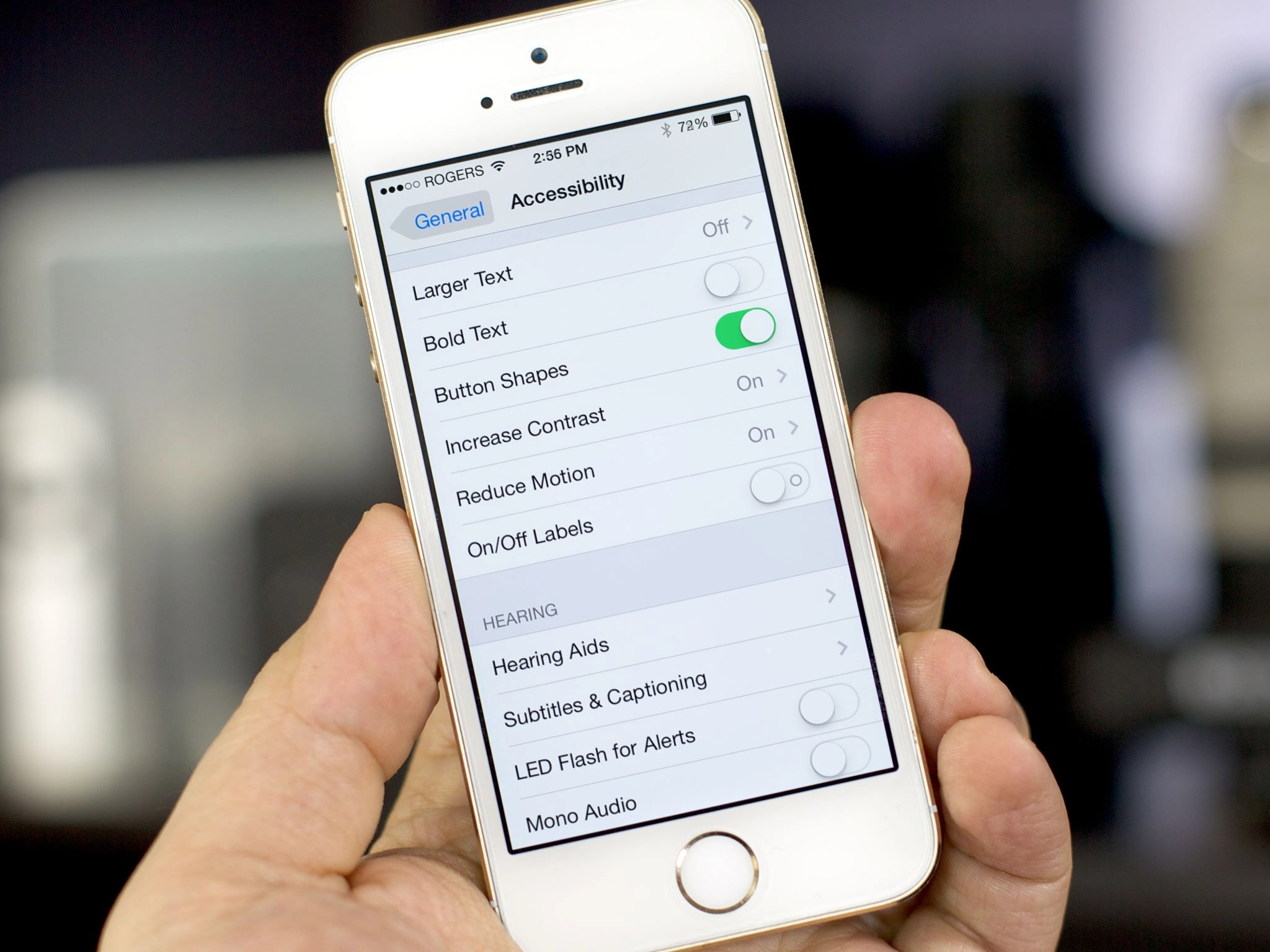
Finally, you can enable Button Shapes. With iOS 7, Apple stripped out a lot of the "chrome" (heavy interface elements) including the embossed button shapes of iOS 6 and previous versions. That left them "naked" — text or icons with nothing around them. The shapes, however, helped with affordance (something that hints at how an interface element should be used). They made buttons look like buttons and their outline showed their touch-targets (the exact area you could tap to activate them). So, with iOS 7.1, Apple given us the ability to bring them back. Toggling Button Shapes on fills in the background around a naked text and glyph buttons with a darker color outlining its shape and also underlines naked text buttons on dialogs to make them look more like web links. The result of the former doesn't look exactly right but it will be more usable for anyone who really missed traditional button elements. Here's how it looks (iOS 6 on the left, iOS 7 in the middle, and Button Shapes turned on in iOS 7.1 on the right):
That Apple felt the need to add these settings is interesting. It appears to acknowledge that some people had serious usability issues with iOS 7. Rather than walking anything back by changing the defaults for everyone, however, Apple simply added options for those who need or want thm. My guess is that Jony Ive and team still firmly believe in the direction they took iOS 7, they just feel it's taking the rest of us a little longer to adjust to it than they'd hoped. So, the settings are indeed a middle ground. Something that's there for those who find iOS 7 challenging or distressing to use.
I still like the overall design of iOS 7, including the default typography, animations, and contrasts. The naked buttons haven't hurt usability for me but they still seem unfinished, design-wise. Either way, I've not enabled any of the walk-backs above. However, if iOS 7 was hard for you to read, if it made you motion sick, or if was in any way difficult or uncomfortable for you to use, these news settings will provide some welcome relief.
Have you turned on any of the new iOS 7.1 accessibility features? If so, which ones and how are they working for you?
iMore Newsletter
Get the best of iMore in your inbox, every day!
Rene Ritchie is one of the most respected Apple analysts in the business, reaching a combined audience of over 40 million readers a month. His YouTube channel, Vector, has over 90 thousand subscribers and 14 million views and his podcasts, including Debug, have been downloaded over 20 million times. He also regularly co-hosts MacBreak Weekly for the TWiT network and co-hosted CES Live! and Talk Mobile. Based in Montreal, Rene is a former director of product marketing, web developer, and graphic designer. He's authored several books and appeared on numerous television and radio segments to discuss Apple and the technology industry. When not working, he likes to cook, grapple, and spend time with his friends and family.
-
I tried the button shapes but took it off after about 30 seconds. I do like the bold font option though.
-
Gonna check out the bold Sent from the iMore App
-
Reminds me why I liked my BlackBerry--options.
-
Yes and no. Company's should work really hard to make all the tough decisions and not dump the work on their users. Only if something is truly divisive should it be an option. Most people never change settings, so good manufacturer decisions are really, really important.
-
What's wrong with giving more options? Assuming the decisions made by the manufacturer are going to be the best for everyone seems a little arrogant to me. Giving people choice (even if not widely used) is hardly a bad thing Posted via the Android iMore App because my phone gave me android for free
-
Sounds like the same mindset that let's governments make all your decisions. I shouldn't be surprised.
-
A designers' job is to figure out hard problems and solve them. It's not that difficult to understand. Great products are obvious. They involve a lot of deep thought, testing, trial, and error. Obviously some options are important but the fewer that are needed, the better.
-
I don't think cc3d was claiming it was a difficult concept to understand. Speaking down to people does not lend more credibility to your argument. I think your next comment very much depends on what your definition of a "great product" is. One definition could be great products are ones that are successful in the marketplace, and if this is so then there are dozens of examples of great products that were not obviously great pre launch. Many products that have gone through rigorous testing, trial and error have been deemed failures. I think the market has spoken on options, the more options the better. I can't think of one time when confronted with less choice rather than more most people would say "yeah, I would prefer less". This does not mean good design isn't important, just that everyone's view of what that design should be will vary. Posted via the Android iMore App because my phone gave me android for free
-
I've never had a response from someone as high up as you! Ah!!! To your comment: yes and no. Yes, divisive options are of course things we all hope for. As a BlackBerry owner, I always knew I had a hand up on Apple products because of the customization--BUT I respected Apple for offering an idiot-proof device that (clearly) attracted an entire market worth of humans. No, because that is limiting yourself. When you limit yourself, you never know what is really needed or not wanted, because you never hear feedback about things that aren't there--obviously. So, what I can say is that there must have been people complaining to Apple, and that's a bad place to be. Complaining to Apple? Could you imagine? Maybe you can't, because you're tight with them (not rudely), but in perspective, Apple could not have been happy. The first thing I thought of when I read about this update was BlackBerry. Not because of the options or any of that--but because of the way in which it was talked about and released. It makes no sense to me. The options they added are worthless. Why? You said it, most people never change the options. But, do most ever know they exist? Why do most people never change options? There are two scenarios--they either don't know they exist, or they are so minimal, that they don't really change much. When you update the OS, why not a quick animation--especially for this update--showing the new options, what they do, and where to find them. I mean, someone out there in the "accessibility" section must agree with me. You added accessibility options but offer no way on how to "access" them. I, personally, am unhappy with the new keyboard. Why must I be given a new keyboard when I was perfectly OK with what I had? Why must I be given new motions--mine are turned reduced, but the switch app animation actually makes me sick now, when it didn't before. Who out there complained about the Phone buttons? The f? Seriously? Complete waste of resources, designing the new answer and end bologna. Hey man, I'd love to write for you guys, so I'll withhold my true feelings about all of this meshed together, but I can agree with you its a yes/no situation. But, for the things they spent time adding to the OS, they should've left this to dev's--and let them produce apps for options like the ones added. My final statement will be this: In my 26 year old opinion, Apple needs to start offering more options, but more importantly correctly expose them--"get the people going." *this was not my plug to become a writer.
-
Love, love, love the bold! Love dark color also! love button shap too! But would like to find out what is draining my battery now on iPad Air and iPhone 5!
-
I think a colored outline around buttons would look much better than a grey background.
It might actually look better than the nakedness of the default look. -
The gray shapes still look off, yep.
-
7.1 is LAGGING!!! using iPhone 5 with just a few apps installed. anyone got the same problem? most lags are when opening Control Center and switching sites in Notification Center.
HOW TO FIX THAT? -
I like darken colors and reducing the perspective zoom on wallpapers. Other than that I like the look and feel of 7.1. I think shapes and Bold text is for the older folks lol. Sent from the iMore App
-
As a test I enabled 'reduce motion' a couple of days ago, and I must admit it makes my iPad feel more calm, less restless. I don't miss the zooming effect when opening/closing apps. What I do 'miss' in 7.1 is the iMessage physics, but not so much that I would disable 'reduced motion' again.
-
Interesting that Apple is praised here on accessibility. Maybe I am different to everyone else, but I have never been able to use OS X because it lacks accessibility support for poor-sighted people that need a white-on-dark high-contrast theme. That is, in fact, why I have been using Linux as my desktop for the past 13 years. iPhone has a low-contrast low-brightness IPS screen (read, not very good), so the white-heavy UI there, luckily, hence, is not a problem, but higher quality desktop displays are impossible for me on black-on-white kind-of themes. Hence, I cannot use a Mac, for instance. In terms of real-world computer accessibility, Microsoft, of course, has been the true champion, even though I have never really used Windows extensively myself since the 90s.
-
Reduce white point should not be about the brightnes/ gray at all. It is the same as white balance or color temperature is for photography. What it does is it shifts whole color gammut to the warmth side (less blue color). Idea is that artiffical room lighting is warmer than daylight and so the unmodified colors look too blue when screen is used inside.
-
Yes, Reduce White Point should be about colour temperature, but try it. It reduces the backlighting and does nothing (seemingly) to the colour temp. I switched it on this morning as soon as I read this article. Now to try it after dark...
-
I tried the button shape but didn't like it. The bold option it's unnecessary to me for now, iOS 7.1 the new keyboard different the letters seem darker. BUT I do appreciate you letting me know about the reduce white point and the darken colors option! Oh I was in need of something like that ^^ Sent from the iMore App
-
Of all my iOS7 gripes now only the overall whiteness remains. I still would like to see an all pervasive dark theme, because I use my iDevices in the dark a lot.