iOS 6 and the curious choice of the colorful new status bar

Ahead of WWDC 2012, rumor had it Apple was considering a fresh coat of paint for the default iPhone interface elements (UIKit). Now that iOS 6 has been introduced, instead of a new, unifying silver look, like Leopard gave OS X, we've gotten several new looks, and a newly tinted status bar to go along with them.

In iOS 5 the default iPhone status bar was constrained to very few states: translucent (for use on top of Lock screen or Home screen wallpapers), light gray, black, or hidden (for videos, games, and other full-screen apps).

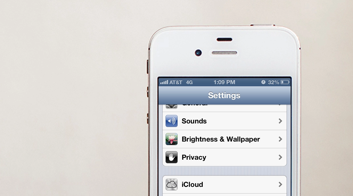
With iOS 6, the translucent and hidden states are still there, as is the black state, but the light gray default has been replaced by a color that's tinted based on the that of the menu bar -- or more exactly, a color averaged from the bottom row of menu bar pixels. Developer Simon Blommegård ran several tests and determined if, for example, you entire menu bar was yellow but the bottom row of pixels was half red and half blue, the status bar would be tinted with a purple hue.

You can see the new, tinted status bar plainly in the keynote video when the new Mail features are shown off. (About 90 min. in). You can also see Safari, Passbook and other apps that have been opted-out and set to black instead.

This raises an interesting design question: Should the status bar be part of the app interface, or should it disappear into the casing.

On a black iPhone, the black status bar almost becomes part of the device itself. Even on a white iPhone, due to the black border around the screen, the black status bar becomes more device than interface element.

Consistency becomes invisibility.

If iOS only ever used a black status bar, it would be unobtrusive -- all but unnoticeable to users unless and until they went looking for it. In other words, attention would remain on the app content, not the iOS chrome.

Even in iOS 5 and earlier, the black and light gray status bars were repetitive enough, and light gray matched the default menu bar enough, that they all but disappeared.

The tinted status bar doesn't do that right now. In default Apple apps, it sticks out in a more obvious shade of blue. Arguably that's because it's new. But given its potential to change colors, Skittles-like, from app to app, it'll be hard pressed to fade into unobtrusiveness any time soon.

Themes, skins, carrier customizations, and other variables aside, other major mobile operating systems handle it this way. The status bar is uniform to the point that dedicated users have to go double check to see what color it is, so unmemorable has it become. webOS specifically targeted that experience, keeping their status bar black and rounding the corners so it would look more like words on the case than pixels above an app.

Yet with iOS 6 Apple is deliberately drawing attention to the status bar.

So the question becomes, what advantage is there to having a more noticeable status bar in apps like Mail and Settings? (Apple overrides it with black in apps like Safari and Find my Friends.) Is there information contained in the status bar that needs to be more noticeable in default app interfaces? Does it simply make utilitarian, more data-driven apps a little more cosmetically attractive, where content-rich apps are better left to the less obtrusive black?

Apple showed off the new, more colorful status bars during the WWDC keynote, but iOS 6 is still in beta and things can change between now and the general release date this fall. There's also always a chance some new system in the iPhone 5 could shed better light on the switch to the tinted status bar, so we'll have to wait and see.

Right now, I'd prefer to see Apple go pure black across the board in iOS (and let developers overwrite it if they choose to). Even on a white iPhone, a consistent status bar becomes part of the device, there when I need it, gone when I don't.

Rene Ritchie
Contributor

Rene Ritchie is one of the most respected Apple analysts in the business, reaching a combined audience of over 40 million readers a month. His YouTube channel, Vector, has over 90 thousand subscribers and 14 million views and his podcasts, including Debug, have been downloaded over 20 million times. He also regularly co-hosts MacBreak Weekly for the TWiT network and co-hosted CES Live! and Talk Mobile. Based in Montreal, Rene is a former director of product marketing, web developer, and graphic designer. He's authored several books and appeared on numerous television and radio segments to discuss Apple and the technology industry. When not working, he likes to cook, grapple, and spend time with his friends and family.

18 Comments
  • i think its fine the way it is now. i like the new one. i would not like the black. it would have been nice if you had photo shopped a screenshot so we could see what a black bar looked like. i would but im too lazy
  • Just a note: "UIWebKit" is not a framework. I believe you are referring to simply "UIKit".
  • Honestly when I first loaded up an app that used the new status bar I thought the new colour meant that I had unread notifications, after clearing all my notifications I eventually found this wasn't the case. I have also noticed that the 'translucent black' status bar is now a darker colour of the navigation bar. Look closely at the Facebook Messenger app.
  • A color like that is not too shabby. As long as it blends. The changing status bar with different apps is a feature that some developers have already been using, it's nice.
  • Agreed 100%
  • Right now if you use Netflix on the iPhone the status bar actually turns to a red hue matching the page color. Before defaulting to black when you navigate through. Definitely seems like something they have had the ability to do ? Never notices it until people starting talking about the chameleon like status bar
  • I Forgot to mention, this is on IOS5
  • As a long time Mac user? Just have it black all the time. Then apps decide if it's there or not.
  • Well you gotta think also this is the first beta it could be different in the next beta. Just like the old background for folders and what not looking like legos in early iOS 4 betas.
  • Does this still work with already changing status bar colors like in the middle of a phone call (bar turns green) or recording (red) or using AirPlay mirroring (blue)
  • Constant black status bar would make the screen image seem off center.
    But yes, the color tints are not welcome.
  • Apple needs the status bar to be part of the screen, not the device, so that the 16:9 screen on iPhone 5 looks even bigger.
  • My theory is that it's to do with the design, specifically screen size, of the upcoming iPhone 5. They probably want to make the screen real estate as apparent as they can with a 4" screen, as a black status bar on a taller device (especially on a black iPhone) would 'unbalance' the device's top/bottom border symmetry.
  • My guess is that they're setting the groundwork for notifications on the status bar. By making it stand out, it contrasts with the rest of the screen, so it will stand out more when something pops up on there. Just my guess :-D
  • i hope they aren't changing it to red and orange and that crap. That stuff could make me move to a different platform. the look of ios is what sold me. A drastic ugly change could ruin that.
    this is what bugs me about the just change the os people. If it looks hideous what good is that?
    and since Jobs died they've made some really tacky style decisions like those gummy bear colors on the apple tv. I guess when Jobs died the people with style were all gone.
  • This paragraph sums up the blind isheep nature of most Apple fans:
    So the question becomes, what advantage is there to having a more noticeable status bar in apps like Mail and Settings? (Apple overrides it with black in apps like Safari and Find my Friends.) Is there information contained in the status bar that needs to be more noticeable in default app interfaces? Does it simply make utilitarian, more data-driven apps a little more cosmetically attractive, where content-rich apps are better left to the less obtrusive black?
    ---The very fact you ramble for that long about the almighty changing the status bar color goes to show how deeply you have stepped into your own pile of apple bs. Maybe they just wanted to change it? Thought it might look fresher and newer, knowing isheep would derive some magical meaning from it all. And of course, you took the bait.
  • I agree with Rene on this.. I was always a fan of the black status bar.
  • what Brian explained I'm impressed that a stay at home mom able to earn $4483 in four weeks on the computer. have you read this website makecash16com