iOS 6: A fresh coat of paint
A brief look at the history of Apple's mobile UI, and what hints it may hold for iOS 6
Sometimes you break out the sledge hammer. Sometimes you knock down the walls and rebuild from scratch. Palm did that. Microsoft did that. RIM is doing that. Other times you pick up a brush and slap a coat of paint on the walls, and the place suddenly looks good as new.
With iOS, Apple has both said and acted in a way that indicates they consider familiarity to be a feature -- that's why the iPad introduced in 2010 pretty much looked and worked the same way the iPhone did when it was introduced in 2007, and the same way both still do today.
It's also the reason the core of iOS -- Springboard -- isn't likely to change any faster than iOS' hundreds of millions of mainstream users can digest. Because, to users, the interface is the app. Apple can remove Google data from Maps.app, but as long as the interface works in a familiar way, and the content remains accurate and appealing, to many users the change will be transparent. How many noticed when Apple swapped out Skyhook Wi-Fi location data for Apple's own database?
As much as we've explored the idea of new iOS Home screen interfaces, and what potential a 4-inch, 16:9 iPhone screen may allow, we've also been hearing for a while now that renovation may not be on the agenda this year. For iOS 6, what we might be getting is more like a coat of really good paint.
But which colors will they use?
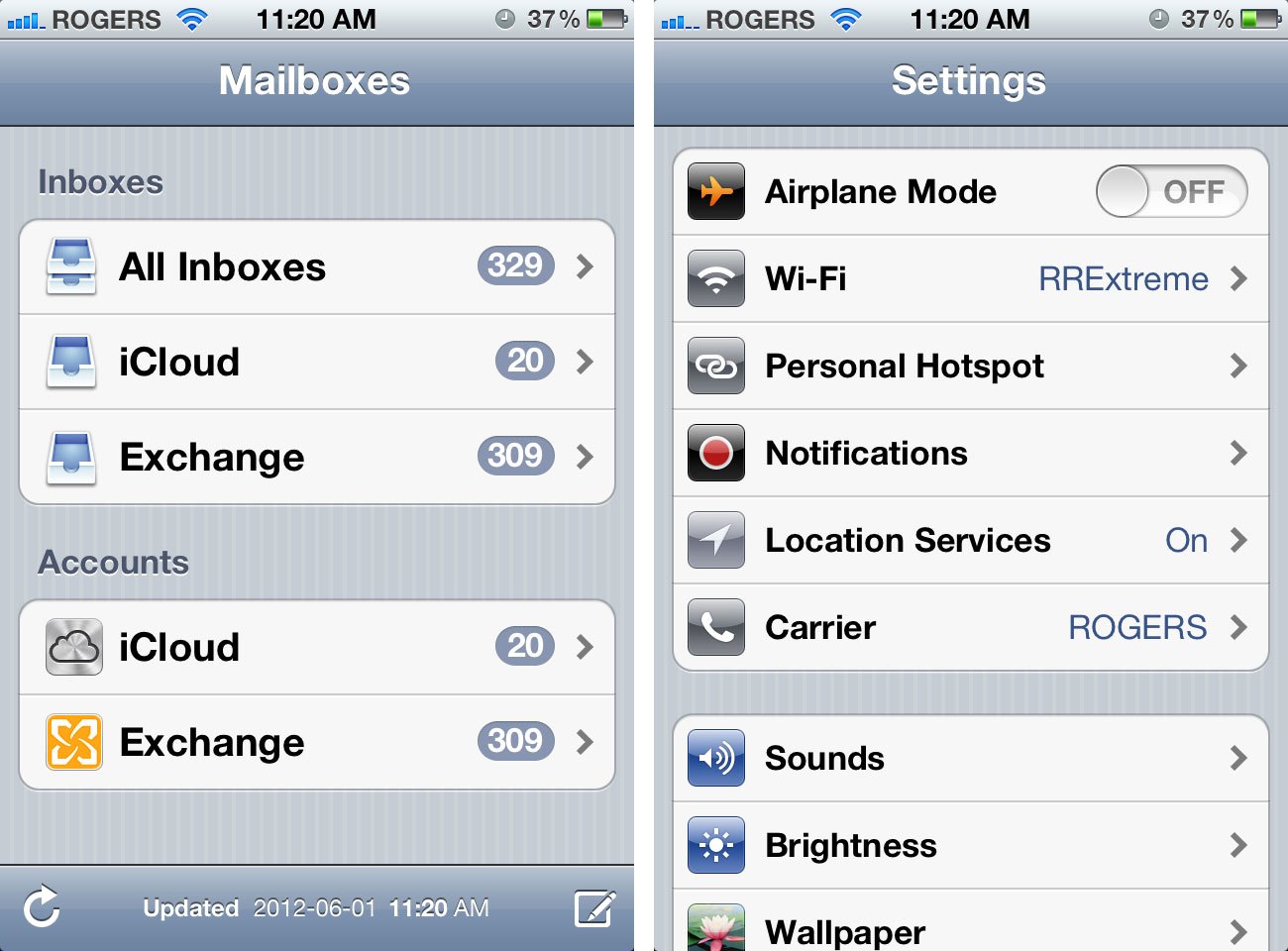
Here's a brief look at Apple's iPhone interface designs over the years, and how each of them would look applied to the default UIKit. (That part's just for fun -- many of them are clearly ludicrous.)
Pinstripes
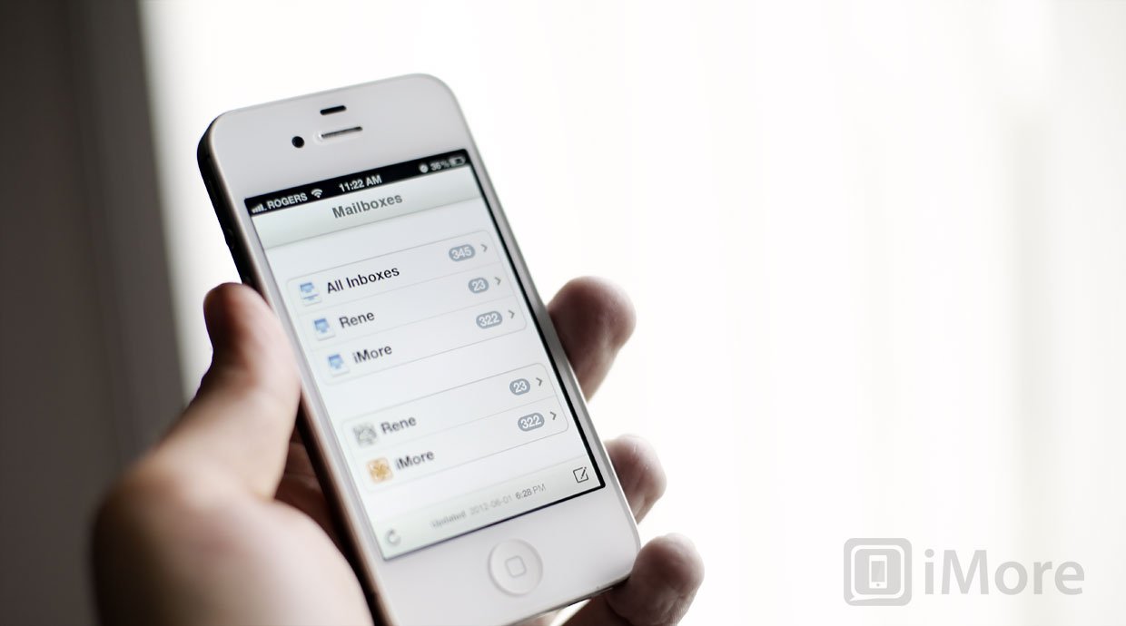
The original iPhone app treatment remains the current iPhone app treatment. Pinstripes. Back in 2007, compared to PalmOS, Windows Mobile, BlackBerry, and Symbian, the pale gray blue and subtle white line of iOS 1 (iPhone OS) worked. Or at least, people were all too busy playing with inertial scrolling and pinch-to-zoom to really pay attention to the color-scheme.
iMore offers spot-on advice and guidance from our team of experts, with decades of Apple device experience to lean on. Learn more with iMore!
There were a few exceptions, like Notes with its yellow pad treatment, but most of the core iOS apps came into the world in pinstripes, and have worn them ever since.
Felt
For the first few years, first-party Apple apps stuck to the default interface. iOS 4's Game Center, released in 2010 was one of the first major, notable exceptions. It was made to look like a Las Vegas gaming table complete with green, burgundy, and yellow felt with polished wood trim.
Linen
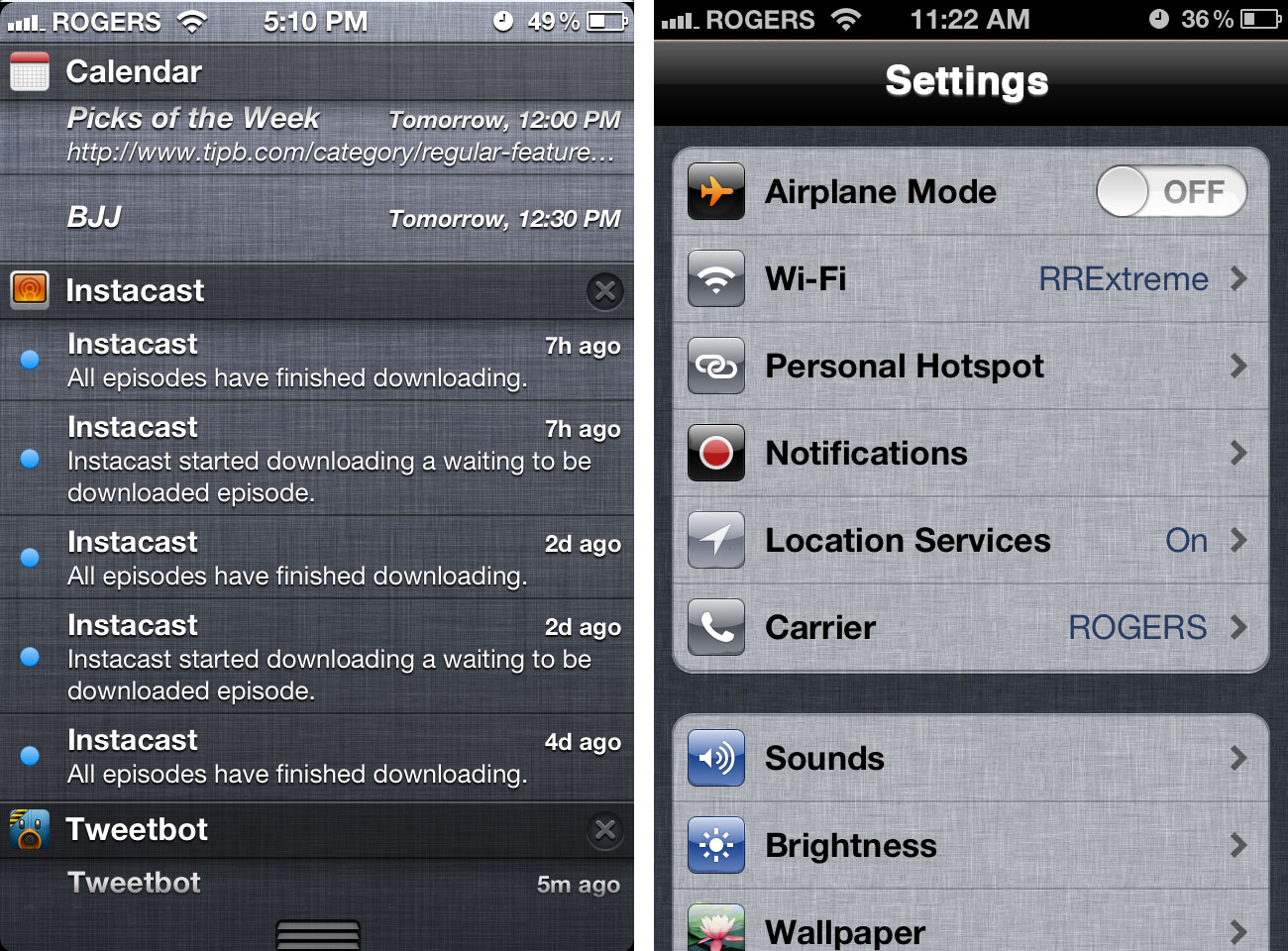
With iOS 4, Apple introduced the linen texture as a metaphor for background or behind-the-scenes content, and aggressively expanded it in iOS 5 and OS X Lion. It was used in setup screens, for the fast app switcher dock, for folders, for Notification Center (breaking the background motif), and Siri. It wasn't used in the same way as felt, as a skin over UIKit, but as a way of visually differentiating an alternate level of functionality.
When you saw linen, you knew you weren't in an app any more.
(We originally developed the iMore app using the default UIKit, until Nickelfish's Justin Marcucci suggested a linen based interface would be more modern.)
Wood
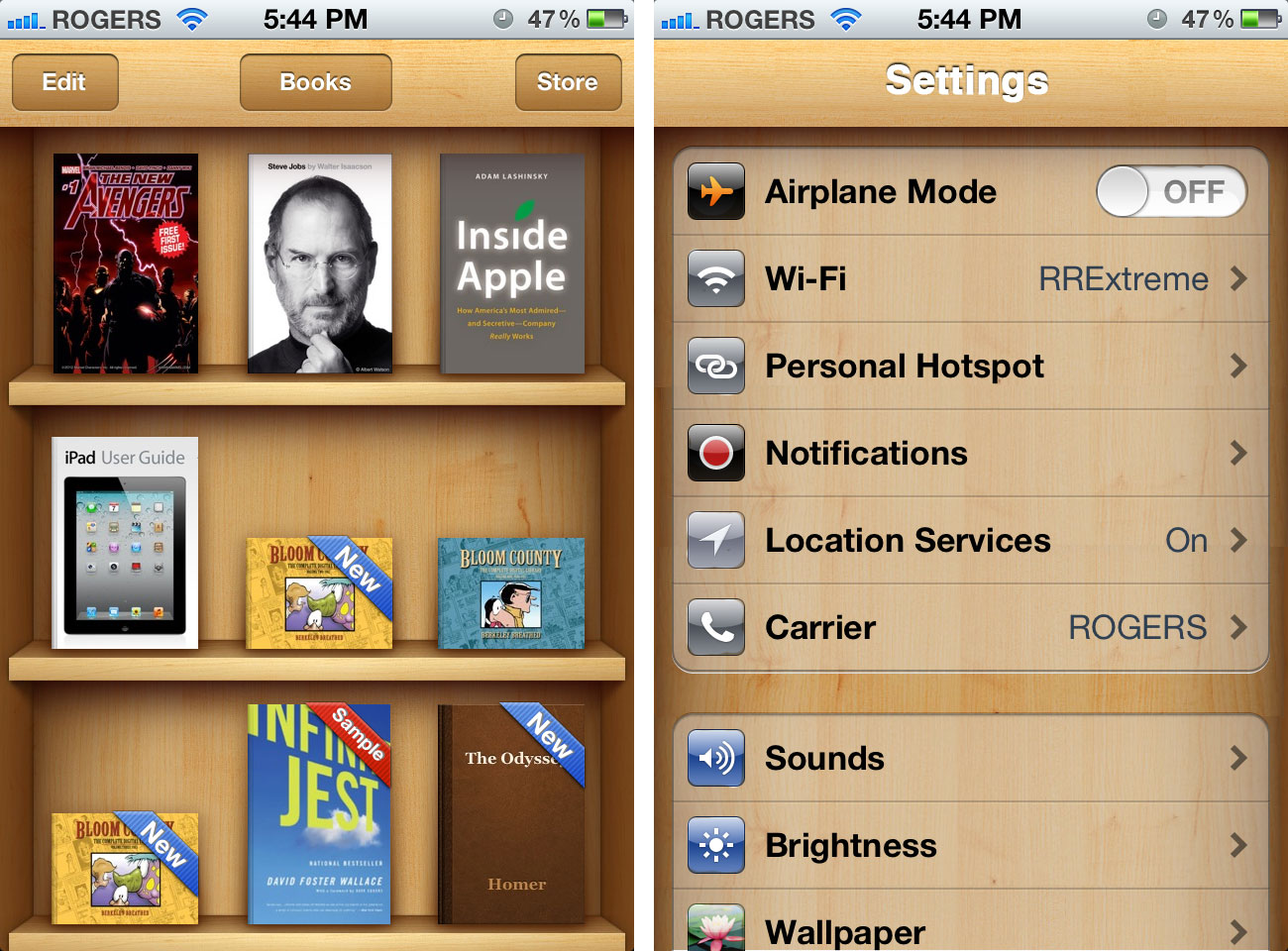
Alongside iOS 4, Apple released iBooks, which unlike the iTunes Store and App Store, needed to be downloaded separately. While it used the default interface for the store component, the built-in reader used a wooden shelf motif for the list view.
iOS 5's Newsstand featured a similar, fold-out version of that look. In 2012, the iTunes U reboot went with the same interface as well, only darker.
Leather
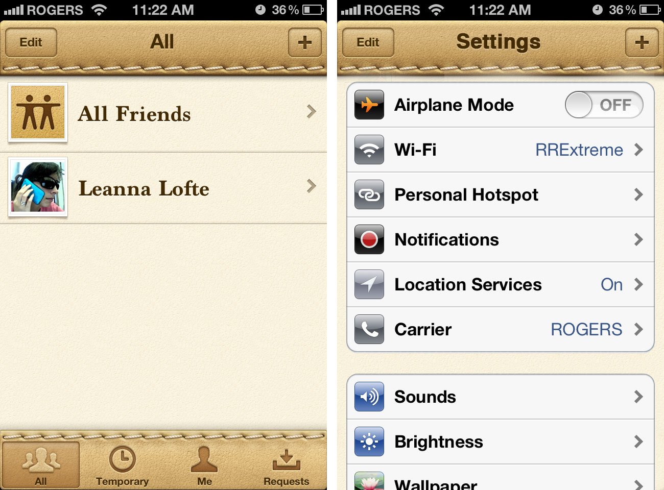
2011's Find my Friends, which like iBooks wasn't included in the core OS but required a separate download from the app store. It took the stitched leather look, which Apple had already used in the iPad and iOS X Lion's calendar and address book, to it's fullest extreme.
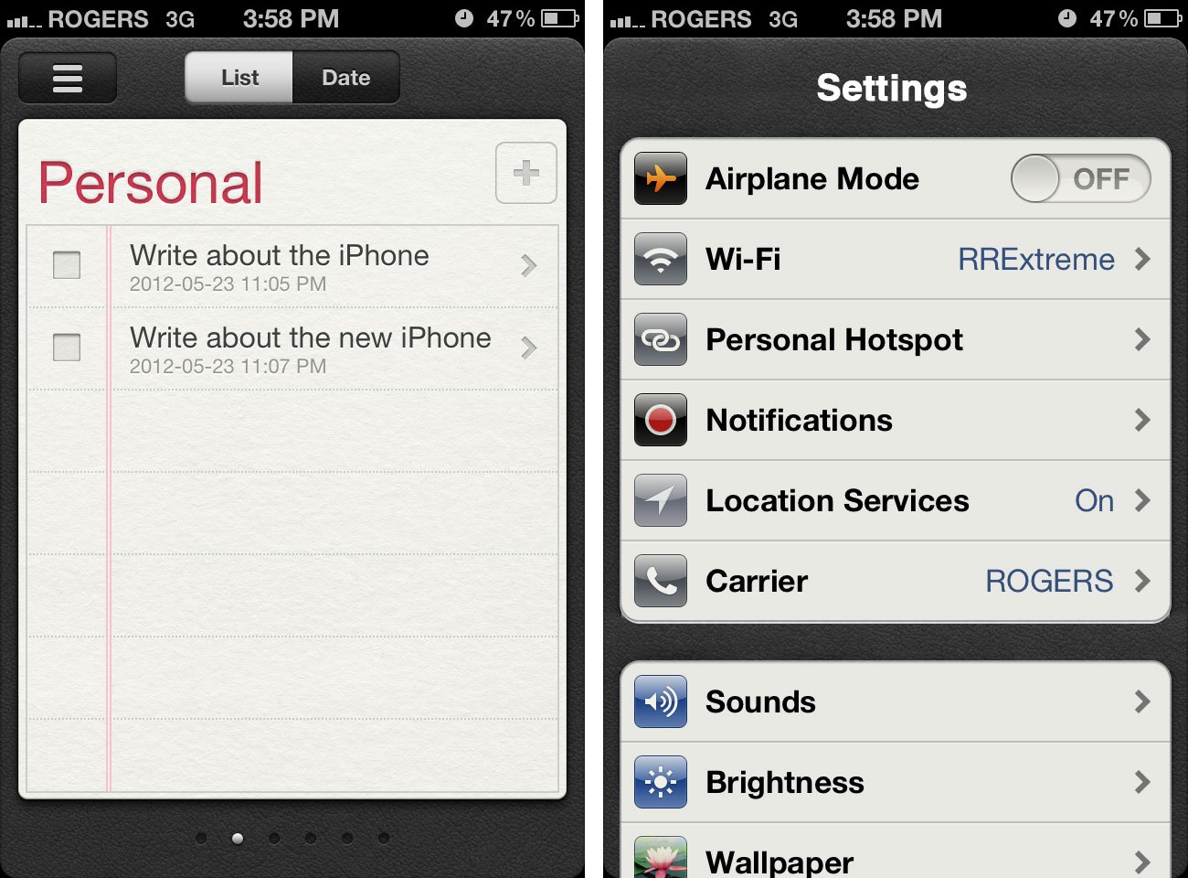
Reminders, also introduced in iOS 5 in 2011, also wore leather, albeit less like comfy couch and more like an action-oriented jacket.
Silver
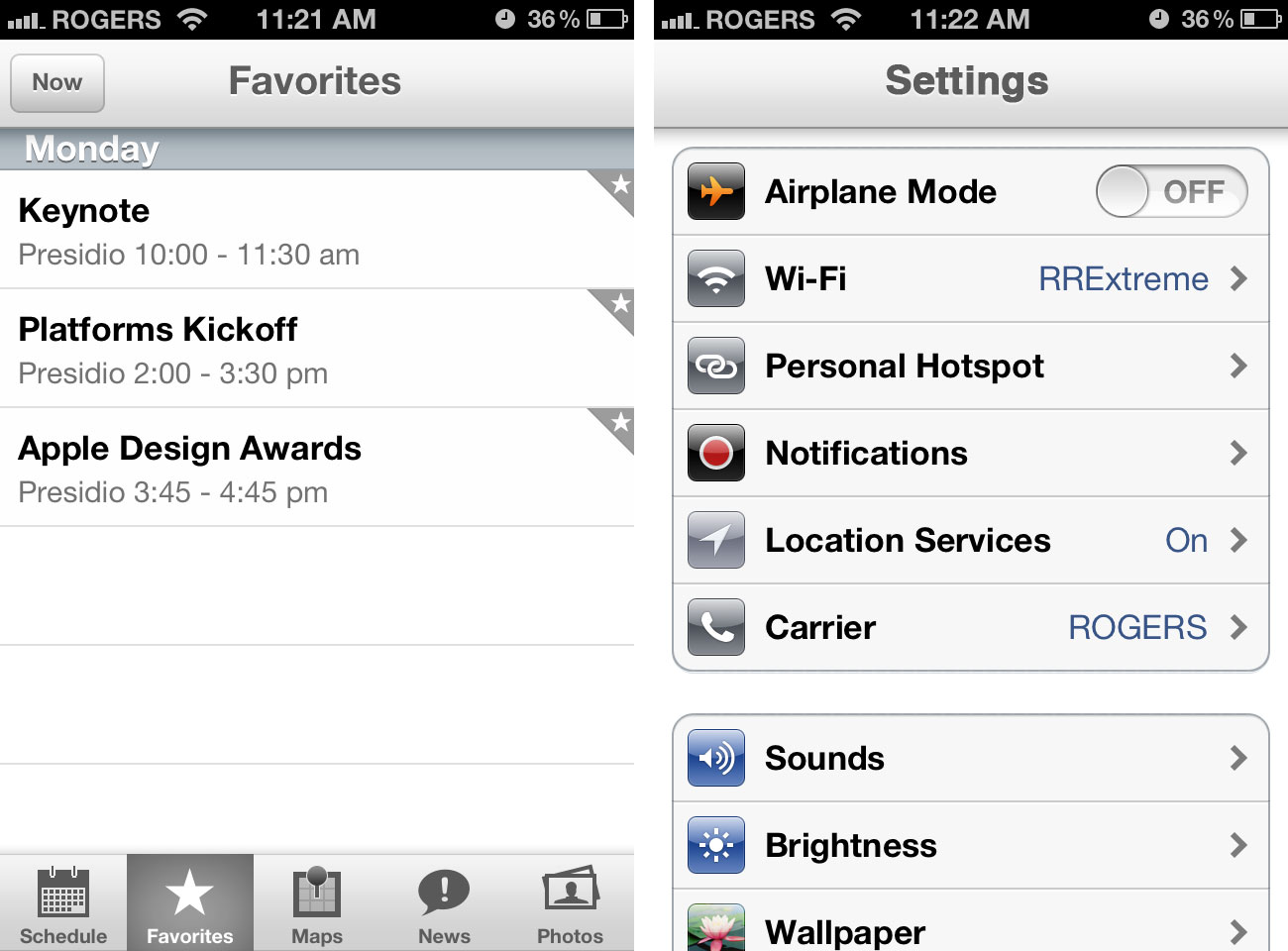
When Apple released the iPad in 2010 with iOS 3.2, they announced they'd re-written many of the core apps from scratch, including the above-mentioned leather-bound book looks. More than that, however, they dropped pinstripes from the get go. Instead, they went with a more subtle, more silver looks for the default apps.
Apple's 2012 WWDC app brought this look to the iPhone as well, but with an even more subtle effect.
iOS 6
Apple has worked relentlessly over the years to make the iPhone and iPad all about the screen. Casing has been minimized, bands have been flattened, buttons have been moved behind the curves.
At the same time they've made apps more visually dynamic, using many of the aforementioned skeuomorphic designs. That's for two reasons:
- To make apps appear friendlier to people for whom technology initially feels inaccessible.
- To make otherwise boring, data-driven apps more visually interesting.
As much as the mockups above were fun to render, Apple treats the default interface chrome more like casing than like content. The Settings app doesn't need to be made more accessible or more visually interesting -- it would distract rather than add to its experience.
There's a common cliché associated with Apple design -- 10:3:1. From a handful of concepts, one production version emerges. It's probably no coincidence the WWDC app, and the leaks of the redesigned Maps app look like evolutions of the default interface first introduced with the iPad.
And personally, I think the iPhone would look great with a fresh coat of silver.
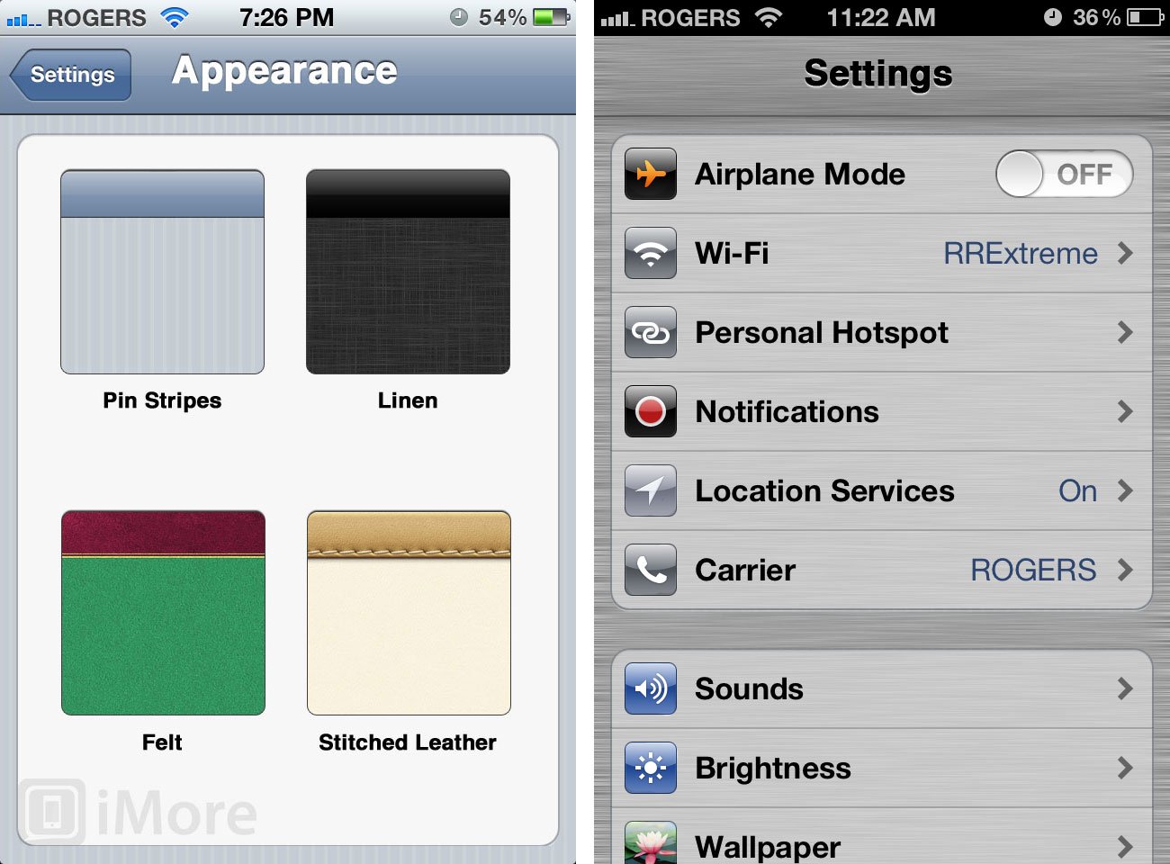
Update 1: Since I started working on this late last night (photos don't shop themselves!), both iDownloadBlog's Christian Zibreg and 9to5Mac's Mark Gurman have also reported hearing about interface refreshes to Apple's core iOS apps. WWDC should be fun.
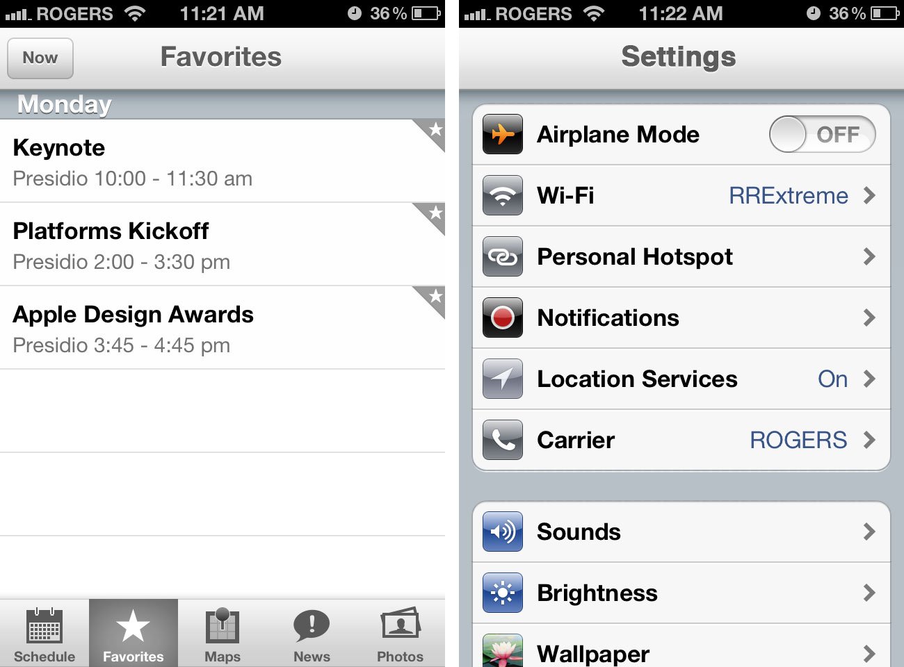
Update 2: Here's a variant on silver, inspired by Michael Steeber, with a darker background for better contrast.
Additional resources
- iOS 6: Higher hanging fruit
- iOS 6: Is it time for Apple to revamp the multitasking fast app switcher?
- The 16:9 iPhone
- The 4 inch iPhone
- How Apple could provide direct document access in iOS 6
- iOS 6 and the opposite of widgets
- Is it time for Apple to revamp the Home screen?
- The challenge of bringing Siri to the iPad
- iOS 6 and privacy: How Apple should draw inspiration from Android for better app

Rene Ritchie is one of the most respected Apple analysts in the business, reaching a combined audience of over 40 million readers a month. His YouTube channel, Vector, has over 90 thousand subscribers and 14 million views and his podcasts, including Debug, have been downloaded over 20 million times. He also regularly co-hosts MacBreak Weekly for the TWiT network and co-hosted CES Live! and Talk Mobile. Based in Montreal, Rene is a former director of product marketing, web developer, and graphic designer. He's authored several books and appeared on numerous television and radio segments to discuss Apple and the technology industry. When not working, he likes to cook, grapple, and spend time with his friends and family.
