iOS 7 Preview: Control Center promises quick access to all your most common toggles

Control Center provides one-swipe access to to all your settings and media controls from anywhere on your iPhone or iPad!

Quick access to system-level toggles has been one of the most constant, consistent power-user feature requests -- nay, demands -- for years now. Everything from jailbreak apps like SBSettings to iOS 6's brief flirtation with URL Schemes for Settings made it a must-have on every geek list, come every Apple iOS keynote. And now, with iOS 7 and Control Center, it's finally a reality.

Here's how Apple (opens in new tab) describes Control Center:

Control Center gives you quick access to the controls and apps you always seem to need right this second. Just swipe up from any screen — including the Lock screen — to do things like switch to Airplane mode, turn Wi-Fi on or off, or adjust the brightness of your display. You can even shine a light on things with a new flashlight. Never has one swipe given you so much control.

Control Center icon

And, based on what Apple's shown off to date, here's how it works:

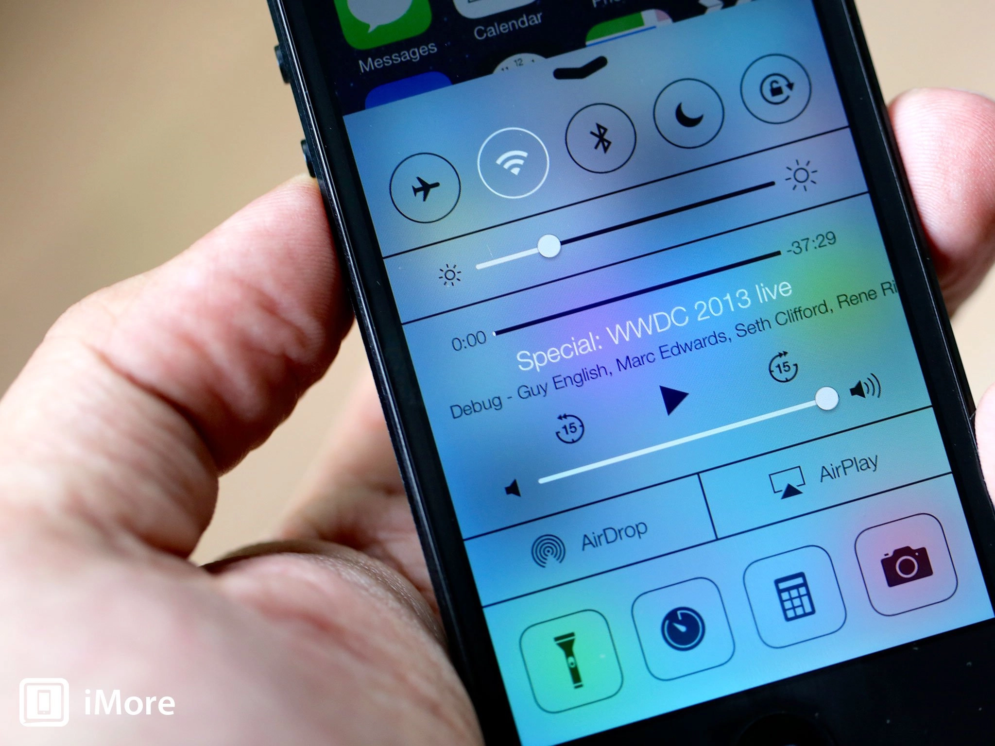
  • Like Notification Center, Control Center is a layer that you can slide out on top of the main iOS interface. It enjoys the same, bouncing, playful iOS 7 physics, and the same blur effect that mutes but doesn't entirely obliterate what's underneath. Unlike Notification Center, which comes from the top down, Control Center is activated by swiping up from beneath the screen, and rather than dark, smoked glass, it's given a light, frosted effect.
  • You can access Control Center from anywhere on your iPhone (or iPad), including from the Lock screen.

Control Center on Lock screen

  • The top row Control Center provides handy on/off switches for commonly used settings like Airplane mode (which, when turned on, will turn off the cellular radio), the Wi-Fi radio, and the Bluetooth radio, as well as toggles for Do Not Disturb mode, and the portrait/landscape orientation lock. Black means off, white means on.
  • Next is a slider for screen brightness, and a set of media controls that includes a positional scrubber, the title of the track/episode you're listening to or watching, the name of the album/series that track/episode is from, skip backwards or forwards buttons, pause/play, and a volume slider.
  • If available, AirDrop and AirPlay occupy the next layer, and allow you to quickly access sheets with their individual options.
  • The bottom row of icons consists of a Flashlight to toggle the LED flash on or off, and variants of Clock, Calculator, and Camera icons for quickly accessing those apps.

Control Center bullets

That Control Center functions so much like Notification Center, and even uses similar nomenclature makes it easy to understand, even for non-power-users who haven't been lamenting its absence on iOS for years. It'll give the obsessive compulsive among us nearly instant access to toggles we probably ought not be toggling all the time, but it'll also give plenty of regular people a fast, easy way to get at things as simple as media controls and even a flashlight when they need them.

Swiping up to reveal Control Center will be confusing for people who've spent any time on webOS, BlackBerry 10, some versions of Android, or even the iPad's gesture navigation system, and personally I do find the swiping up as a way to show the fast app switcher/multitasking cards much more intuitive than the double-button click. However, Android's current two-finger swipe down to switch from their version of notification center to their version of control center isn't as easy to use, and ultimately, as goes Apple and iOS 7 will go hundreds of millions of users.

As to the design itself, while I have concerns about the low contrast and thinness of the icons and typography used, overall the usefulness exceeds the usability, and hopefully the latter can at some point be brought up to match the former. Sadly, Apple hasn't said anything about the customizability -- or lack thereof -- of Control Center, but if the past is any indicator, we probably won't be able to change the settings, controls, or apps presented. At least not this go around.

I once wrote that iOS wasn't meant for geeks, and while I still think that's generally true, with iOS 7 and OS X Mavericks, Apple is starting to show they now have more than enough love to go around.

Control Center will ship as part of iOS 7 this fall. Check out the resources below for more, and let me know -- how do you like what you've seen of Control Center so far?

Rene Ritchie
Contributor

Rene Ritchie is one of the most respected Apple analysts in the business, reaching a combined audience of over 40 million readers a month. His YouTube channel, Vector, has over 90 thousand subscribers and 14 million views and his podcasts, including Debug, have been downloaded over 20 million times. He also regularly co-hosts MacBreak Weekly for the TWiT network and co-hosted CES Live! and Talk Mobile. Based in Montreal, Rene is a former director of product marketing, web developer, and graphic designer. He's authored several books and appeared on numerous television and radio segments to discuss Apple and the technology industry. When not working, he likes to cook, grapple, and spend time with his friends and family.

32 Comments
  • Control Center can be available from the lock screen - or not - user choice. A good thing. :)
  • Kch, I was wondering about this...the control center can be deactivated on the lock screen if wanted that way? What about the notification center? I was thinking that I don't want access to those while the phone is locked...my way of thinking is that it is locked for a reason, and everything should be accessed once the phone is no longer locked.
  • Yes... In Settings... there's a toggle under Control Center for "Access on Lock Screen" - yes or no... Notification center, you can turn on/off the Notifications view & Today view on lock screen.
  • Excellent, thanks!
  • Go ahead Apple and take the webOS gesture area. It's time to get rid of the button.
  • I don´t Apple can do that. They may go on revising how it looks and eventually remove it all together, but not abruptly. I say first reduce it to capacitive.
  • You need a physical Home button for mainstream users, but I'd like both.
  • I'm new to IOS and I kind of like the home button on the iPhone. Maybe just redesign it so there are not as many mechanical failures. Never had an issue with mine. I'm so anal I use the assistant touch button to kill my screen and go back to the home page just so I don't wear out my buttons. Been doing that since the phone was new, it's only a few months old. Damn I am loosing my mind. Ii just really like the hardware.
  • didn't Webos still had a home button? it lit up and then they made it digital. I want a home button anyways. And my mom is 65. she uses it to get back to the home screen. She never uses gestures. There is no reason other than for change sake to get rid of it. It doesn't make things better.
  • I'm not a huge fan of the look, though not perturbed enough to rant about it. My question is regarding the contrast in real-world usage. In the pics, it looks like the music information in particular is hard to read, with thin fonts over a gradient with inadequate contrast at some points. For people who have run it more than few days, how much (if at all) do you consider this a problem? Can you still take in that information at a glance, or do older/tired eyes require a double-take to get it?
  • The fact that this control center frame doesn't reach the top of the screen and ends abruptly bothers me. Why not fill the screen ? It looks half baked as is. Weird design choice... Sent from the iMore App
  • If it filled the screen, it would be confusing to many users how to make it go away. I think it covers more of the screen on the smaller iPhone 4/4S screens than it does on the tallboy 5. This is going to be my single most-used feature of iOS 7 if the 5S battery is as weak as that of the 4S. I'll be turning radios off to conserve power all the time.
  • I never turn anything off and I have great battery life. How long are you going between charges?
  • Hi Rene -- I daresay I'm working my phone harder than you. My device full of apps and games, lots of notifications, and streaming and shooting photos all day. And the odd phone call here and there, too. When I'm in my car or at my desk, it's on a charger, because it doesn't last more than four hours at a stretch otherwise.
  • IOS is generally quite power-efficient when it comes to managing bluetooth and wifi. I leave them on, and haven't noticed any significant power drain.
  • Love the new Control Center. Would like to see the user be able to change which apps we can access with it. I personally don't use the calculator
  • I totally agree with you. We should be able to pick what apps we want, but as this is only a beta, I'm sure that will be a feature come the GM.
  • (Y) We should be able to pick up the apps that we use the most into the control center !!! Kind of convenience.
  • "However, Android's current two-finger swipe down to switch from their version of notification center to their version of control center isn't as easy to use, and ultimately, as goes Apple and iOS 7 will go hundreds of millions of users." FWIW the two-finger swipe down is just the power user shortcut for Android 4.2's Control center equivalent, the regular entrance is a button from within their notification center equivalent.
  • But that's kinda even worse. It's an extra step to get there
  • On a side note, that Control Center icon could actually serve better for the Settings app. The current iOS 7 one with gears... oh gawd.
  • I really really really wish there was a button in Control Center to open multitasking. The only thing that annoys me about my iPhone is having to double-tap the home button. I'd say at least 1 out of every 5 times I try to do it I don't do it fast enough and wind up in Spotlight.
  • That'd be sub-optimal. Multitasking should be a top level gesture, same as Control Center or Notification Center.
  • As somebody who burns out their home buttons with alarming frequency, I would just like it to be *any* gesture.
  • I pumped my fist in the air when I saw the control center feature during the keynote, a feature on Android that I wish I had on iOS. It looks clean and well implemented, can't wait for iOS 7!!!
  • Looks very useful, but design looks... quite poor? Not bad, I mean. I only prefer old good iOS style... [...] and new hero's coming: smartman.mobi
  • They need a toggle for LTE too. I leave my LTE off so my battery last longer and like to turn it on when I need to FaceTime or watch a video.
  • I figured that there was room for an upward swipe on the home screen, and had my fingers crossed that Apple wouldn't waste it on "widgets." Was very surprised and happy to see Control Center in the keynote.
  • What I'd like is the phone in the keynote. looks an awful lot like one of those windows phones I've been coveting. The Lumia 928's camera running the stability and app choice of iOS? There's a dream.
  • That phone is the iPhone 5...?
  • Look again. The phone in that image is narrower, the buttons on the side aren't the same. That's no iphone 5.
  • The Control Center is nearly impossible to open with many of the cases on the market right now. I have an expensive Griffin Survivor case on my iPod touch that covers EVERYTHING except for the screen. Since the case is raised around the border of the screen, you can't actually slide up from the very bottom, which is required to open the control center. I use the screen orientation lock very frequently. I'm REALLY going to miss being able to double click the home button and swiping to the right in order to get to the screen lock.