
YouTube jumped onto people's screens 12 years ago, and since then, the massive online video service connects over 1.5 billion people from around the globe to original content, music, news, cat videos, and so, so much more.
Now the company is taking its familiar logo — the black You with the white Tube in the bright red box with the slightly rounded corners that's meant to symbolize the site's play button — and is making a few changes… but that's not the only thing that's changing on one of the internet's largest sites to ever exist...

We have the word tube in a tube. This is weird. No one know what this is.... [this change is] an evolution, not a revolution. (Christopher Bettig, Head of YouTube's Art Department)
What's new, YouTube?
YouTube's logo will be changing, along with the look of the site altogether — there will be new fonts and colors across YouTube's desktop and mobile apps.
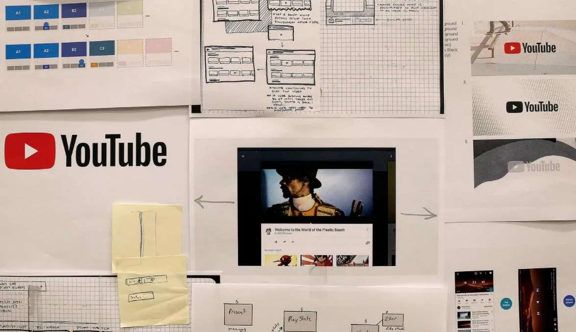
We've made the header white to let content take the lead and moved the navigation tabs to the bottom of the app so they're closer to your thumbs... We've also been experimenting with new ways to display all videos in the best possible way. Soon, the YouTube player will seamlessly change shape to match the video format you're watching, such as vertical, square or horizontal. (YouTube Blog Post
Another super cool feature that's new to YouTube is dark mode, which darkens the white parts of your screen so you can easily enjoy a more theatre-like atmosphere as you watch your favorite YouTubers!
When will we start seeing these changes?
The changes should be rolling out on your mobile devices and desktop later today!
The bright red cherry on top of this update sundae is a refreshed YouTube Logo and YouTube Icon. Designed for our multi-screen world, the updated Logo combines a cleaned up version of the YouTube wordmark and Icon, creating a more flexible design that works better across a variety of devices, even on the tiniest screens. Why's it more flexible? When room is limited (say on a smartphone) you can use the brightened up Icon as an abbreviated Logo, which will be seen more easily and read more clearly. (YouTube Blog Post
What do you think?
Do you think YouTube's logo change is a big deal, or could you care less about it as long as all your favorite videos are still available for easy viewing?
Let us know what you think in the comments below!
We know this is a lot of change, but we want to make clear that there's one thing that stays the same: YouTube's mission. We're here to give people a voice and show them the world – no matter what device they use. (YouTube Blog Post

