Increase contrast is an Accessibility feature that makes it easier to make out text and interface elements iPhone and iPad. While one of the modern design tenants at Apple is depth, achieved by layers of transparency and blur, for some people with visual impairments, it results mainly in noise and distraction. With increase contrast the transparency becomes solid and the blue becomes sharp, making everything clearer and easier to read, tap, and understand.

How to darken colors, reduce the white point, and turn off transparency on iPhone and iPad
- Launch the Settings app on your iPhone or iPad.
- Tap on General.
- Tap on Accessibility.
- Tap on Increase Contrast.
- Turn On or Off any of the toggles for the options you'd like — below is a description of what each does along with screenshots.


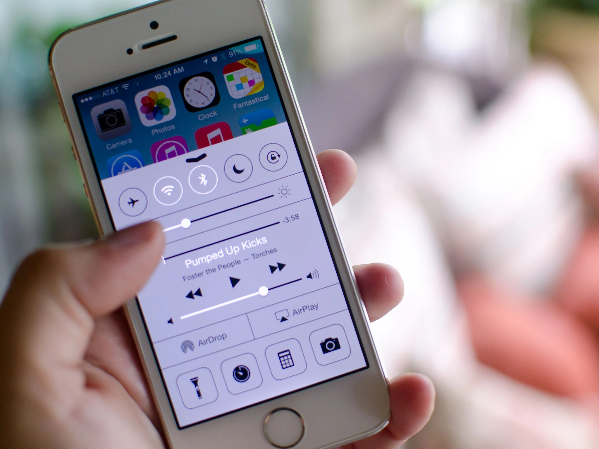
Reduce Transparency - As you can see in the screenshots below, reducing the transparency will add a solid background to the dock on every Home screen along with making Control Center, popups, and keyboards much less transparent.

Darken Colors - Darkening colors will make menus and tabs darker which may make them stand out more so you can read them easier. In the screenshots below, you can tell that the menu buttons are a darker shade of blue when the Darken Colors option is turned on.

Reduce White Point - Reducing the white point will make whites across iOS much less harsh. Simply toggling the switch on and off should give you a pretty good idea of whether or not you prefer the brighter whites or the toned down versions.
Do you use any of these options on your iPhone or iPad to make iOS easier on your eyes? Are there any other options you'd like to see Apple add in future versions of iOS? Be sure to let me know in the comments!
How to get more help with accessibility for iPhone and iPad

