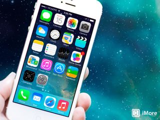
Latest rumors suggest iOS 7 to be "black, white and flat all over"

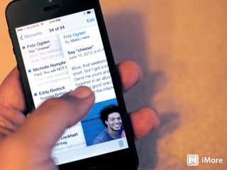
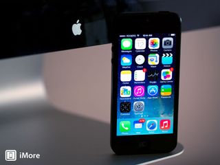
The latest rumors surfacing about iOS 7 suggest that it will be "black, white and flat all over." Everyone seems to expect that Jony Ive has gone through iOS with the sandblaster, and the latest rumors suggest just that. The latest comes by way of 9to5Mac's Mark Gurman:
"Sources have described iOS 7 as 'black, white, and flat all over.' This refers to the dropping of heavy textures and the addition of several new black and white user interface elements."
Speculation -- and excitement -- continues to build ahead of WWDC in just a few weeks where we strongly anticipate seeing the fruit of Ive's labors. The 'flattening' rumors just won't go away, and the results of an iMore poll back in April suggested that a large number of you would also like to see some kind of refinement throughout.
Either way, we don't have long to wait until WWDC. Where would you start with the look and feel of iOS 7? What would you change about it? Does the mention of black and white interface elements excite you?
Source: 9to5Mac
iMore Newsletter
Get the best of iMore in your inbox, every day!
-
I'll be interested to see how it looks and everything they changed.
-
I'm sure Apple could make it work. The only thing I really hope for is when the heavy textures are dropped, iOS would boot up faster and more fluidly.
-
I hate to admit it but all this flattening talk scares me a bit. All the mock ups I've seen so far seem to be going backwards. That being said I love jony's hardware designs so I'll have to give him the benefit of the doubt
-
This ^^^ . . . I'm nervous too because I'm one of those wierdos who loves it the way it is, however I totally trust Jony's design sense and his sensitivity to current ios users. I'm hoping he strkes a middle ground and not something like 'the other guys' . . but I'm sure it will be cool.
-
Jony Ive is a product designer, not a graphics designer. Those are two completely different fields of design.
-
But surely he's a designer first and foremost. And he designs things that look good, also? So why not good looking software?
-
Because it is one thing to be able to design things made of glass and aluminium and another thing to be able to design things made of ...pixels !
-
Yes, but the whole point is he's not just any ol' designer, but one of the best designers on the planet. I'm going to assume he has taste. He's not clueless, he's worked at Apple for 18 years.
-
Technically, Jony Ive is a Industrial Designer. Industrial design is the combination of product, graphic, architectural, and mechanical design. I took industrial design in college many years ago and can tell you that Jony Ive is trained to design a new IOS 7. The people under his control are "product focused" industrial designers as well.
-
I disagree. I think things are looking pretty good based on the rumours and I have high hopes but being trained as an Industrial designer is actually *not* the same as having the skill set to pull this off. Generally speaking, Industrial designers design 3D objects, graphic designers design 2D objects, and interaction design is something else entirely. Industrial designers do get training in graphic design, but usually only in the sense of being able to do the artwork for the design of the 3D object or the packaging for the 3D object.
-
Jony Ive, though.
-
Mock ups.
-
I thought the same thing, sounds like it may look generic and be taking a step backwards. If anything, supposing it doesn't settle well with folks Apple should at least allow the new look to be changeable back to how it appears now.
-
i think we can see some of that in app store already. in some apps, you a different install button, with black letters on top of a white background. completely flatt. and it looks nice.
-
right now there are some highlight apps that say "apps for passbook" click there and the button's as described :)
-
I've j/b my iPhone and have been using the "FlatIcon" Winterboard theme. It looks SO much nicer than the bulgy icons they have now.
-
I have a good hunch that iOS 7 will NOT be black and white; though it may be flat. IMHO, Jony Ive will be focused more on improving 'usability' rather than overhauling all UI elements. To be honest I am surprised that there is so many baseless rumors floating around about black and white interfaces. NOT HAPPENING.
-
And you clearly have your sources, too ;-)
-
LMBO
-
Ive has an excellent sense of style and taste and has yet to produce a turd. The rumor could be "green and yellow and bumpy all over" and I'd still be interested.
-
Hopefully iOS 7 is interesting this time around. And also I hope that they add new emojis to the emoji keyboard in iOS 7 like they did with the previous version of iOS 6.
-
Since I'm Korean and I like apple (irony, isn't it?), I would really love Apple to add support iTunes for korea :( I don't know whether Apple is just being mean to Korea (Samsung) or they think it's just not worthy to create a market in such a small country. After launch of iPhone 5 in December, they only (?) sold out nearly a million iPhone 5. I personally think that is still worth adding support iTunes for Korea even though Samsung is just dominating the smart phone market in Korea.
-
At least you have an App Store. Try to be patient, you'll get your music + movies, eventually.
-
Could it be that Samsung has some massively financed influence that is blocking Apple from getting iTunes into S. Korea?!
-
In other words, a metro UI copy!!
-
Let's see if it is. Personally I'm not fond of Metro.
-
One of the nice things about iOS is that it's pleasant to look at…unlike Android and Windows phone. Black and white doesn't sound too pleasing to the eye. Look how nice Fantastical looks with its color scheme...would not be as nice in B
-
Fantastical has skeuomorphism on its toolbar. Be gone!
-
That might be interesting... though color is a necessity as well. Black & White and flat all over with dark shades of colors - where necessary, etc. would be so frickin' awesome!
-
Hmm, let me think about that...
-
Flatter design will really be a non-issue for me. But I'm happy to hear that they'll be updating the notification center. I'd love to see an API implemented to allow developers to add widgets to their apps which can then be added to the notification center.
-
I think it mostly sounds good but I'm concerned about the suggestion that each of the main Apple Apps will be based on a different colour. Some people (myself) just don't like some colours. For instance the sickly green on the Messages app is actually the main reason I don't use it and I know others feel similar about either it or other rudely or grossly coloured apps. Apps that you use all the time should be neutral so as to attract the most users. Arbitrarily excluding users because you want this app to be bright blue or that app to be bright green, because of some preconceived idea of design is just as bad as forcing people to use skeuomorphism because of a preconceived idea of it's utility. Also, I think the linen texture is both subtle and useful and one of the only "texturey" things that actually works in the current OS, so I don't see why they have to remove it.
-
agree wholeheartedly on the linen
-
You don't use certain apps because of the color??? To each his own,but you gotta be kidding me with this one.
-
Using or not using an app based on its color is completely valid. Color schemes are an important thing during the development of an app. Improper or inconsistent use of colors can effect usability. I know when I get an app that is a harsh, bright orange, I tend not to use it again. Also take into consideration people who have different degrees of color blindness. A green app may potentially look like a dull or dark muddy tan.
-
you dont use text msgs cuz of the color of the icon? I dont think apple has to design its UI for OCD people, go see a doctor (btw your icon is a "sickly green" color! lol)
-
Actually, any developer knows that the appearance of the icon is very important and in many cases, determines whether people use the app or not. This is all basic, known stuff. Ask a real designer. Yes, if you make an app with a hideous icon in glowy, garish colours there are huge numbers of prospective customers that won't be able to bring themselves to use your app. Colour is not only very important, it has a strong emotional impact and people have strong associations with this or that colour. This is why on OS X, one of the few customisations you have is the colour of the highlight. This is also why on a web browser one of the things that they always allow you to customise is the "link highlight" colours and "visited link" colours. The icon is like the "front door" and the chief advertisement for the app. Everyone who designs apps knows this. It doesn't have to be over the top pretty, but it can't be so ugly or jarring as to turn people away. People have aversions to certain colours.
-
Hahahaha, this is ridiculously funny. You can throw all the developer, UI/UX, time of the month, mood ring, etc...talk out there all you want bruh. It's still weirdAF that you don't use "messages" bc of the icon color, end of story. Then there is this gem--> "there are huge numbers of prospective customers that won't be able to bring themselves to use your app." I won't go any further into that pile of rubbish. (It would've been a bit less ridiculous if you left out the word "huge" though)
-
I agree with Gazoobee on this. Consider that, statistically, 1 in 12 people have some sort of color blindness. I am not color blind, but I know if an App icon is poorly made, I begin to feel that maybe the App itself is also poorly made. The icon is the front door to the app, much like how a store front is the front door to a store. If the store front is poorly managed, one can make the assumption that the store is poorly managed as well. A good test is to take different app or home screen screenshots and upload them to this color-blindness simulator, which will give you an idea of how people with different types of color blindness perceive the appearance of said apps and home screens. http://www.color-blindness.com/coblis-color-blindness-simulator/ In addition, in the area of web design, there are guidelines for making accessible website for people with disabilities. Walmart was sued due to their website not properly conforming to the WCAG standards. This all ties to the Americans with Disabilities Act.
-
It all comes down to brand preference. If anyone could make a blind test of interfaces, I bet Metro would come on top, because of aesthetics, speed, functionality and practicality. But it has the Microsoft brand attached to it, so people tend to dislike it immediately. Whatever Apple designs will be automatically loved by most of its fans, the same ones who claim to love iOS stale icons right now but will heavily criticize it the second Apple comes with its new interface.
-
Hiding all of the controls is not simple, nor practical, and having all those tiles update before oneself would be stressful and confusing. Just look at Chris Pirillo's father testing Windows 8 in that hour long video. He was totally confused. Windows 8 and the artist formally known as Metro are simply, in my estimation, badly designed.
-
And yet if it was designed by Apple it would be the best thing ever. I would like to see his father using an iPhone for the first time and having to guess that you have to push the homebutton to exit things, and not close the "window" touching something on the screen. Anyway, I was talking about phone interfaces, not PCs.
-
> I think it mostly sounds good but I'm concerned about the suggestion that each of the main Apple Apps will be based on a different colour. I think that's the best part of the news. Each white, with a differing accent color. Simplicity. Simplicity. Simplicity.
-
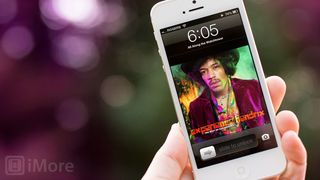
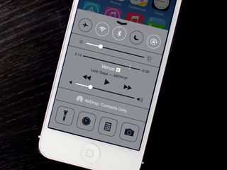
It's my personal opinion but the lock screen does very little so to me it just enables the user to enjoy the beauty of their screen and whatever lock screen image they put on it. So the solid black time bar is going to be even more in the way of that now. So that is one thing I'm not looking forward to having. I am excited to see how the black/white and flatter look will be implimented though. The main thing that I've heard is that they are looking at having Wifi, BT, DND, etc. toggles in the Notification Center along with more gesture controlled notifications. So I'm really looking foward to seeing how that works and if it makes it into the final cut. This is all making the wait so much more unbearable lol.
-
Being a new iPhone 5 owner I kind of like the way the icons look. I have quite a few top of the line Android devices and have changed the theme to the flat look, Black and White Look. I much rather have color to a black back round, which I currently have on my phone now. I would like to see IOS incorporate a great File Management system, much like the way Android does, loosen up on the strings a little. Such a nice piece of hardware too tied down. Loosen it up and the iPhone will even sell more if possible. Just My Opinion.
-
Be specific.
-
This sounds like it's going to be boring. And that's really upsetting. Yea iOS needed a change. Rene has said it countless times, it's now one of if not the oldest mobile OS' on the market. But this change constantly sounds like it's going in the wrong direction. Everything's going to be black in white? It's cliche' but it's like we're going from OZ back to Kansas. No one wants to go backwards. And when people see how "flat" this OS has gotten, I'm sure that will turn some of them away. With so many other "colorful choices," sort of speak, on the market, why would someone go with black or white? All this talk of a flatter OS just scares me. Everyone saying they don't want skeuomorphism any more, it has to go. Sure, some elements of it has to go. Like Game Center. That's just a mess. But honestly, doest the fact that the notes app looks like a yellow notepad really truly make you hate iOS? Or that iBooks looks like a book shelf? C'mon, seriously. If you hated it that much you would have left. And Rene says over and over that iOS and iPhone is a phone for the masses. That he can use it, but so can his mom and sister who just do the basics with it. I don't see people like that enjoying black and white elements when all those little things like a bookshelf make the iOS fun for them. This is just not going in the direction I hoped it would. Sure Jonny Ive can make great products, but almost all his products are black, white, sliver/aluminum. Sure that makes awesome products, but I personally don't see it being appealing to the eyes.
-
> But honestly, doest the fact that the notes app looks like a yellow notepad really truly make you hate iOS? No, it just makes me dislike the Notes app. I never liked it, and I've been using iPhones since '07.
-
Congrats on that (and for replying to over half of the comments on this article in such a wiseass manner)
-
Honestly, most of the changes don't sound too bad to me. We'll see here in June how far Jony Ive took it and well it looks.
-
I could care less about the look. I just want more functionality
-
I hope that there is some sort of balance to the new design. I think that removing things like the leather, green felt, wood textures, etc., would be a good thing. But I kind of like the linen textures and such. I do like some of the very subtle shading, too. Going to the extreme monochromatic flat style would disappoint me. There has to be a nice balance between the two extremes.
-
A change could be good, as long as it is a progression of change, rather than just "here it is, the new interface, get used to it" This is one of the reasons I am not liking the current version of iTunes. I used to use it all the time, but now that they have made it more "cover art" based by default, I rarely use it. The cover art, especially the amount they show on screen at once, feels too heavy. Yes, I can still go to the list view, but it is NOT the default, and it is an extra step that was not needed. Changing around everything all at once would be the same as Microsoft's changes to Windows 8, and we now see that they are doing a 180 on some of those changes since they are bringing back the Start menu and implementing a "Boot to Desktop" feature. Just look at OSX, the iteration on the main interface didn't happen quickly. It slowly evolved in both UI design and feature sets. The dock has had 3 visual changes over the past decade, the window frames have changed maybe 3 times as well (pinstripe-aqua, brushed metal, and now smooth plastic gray). Also, we were introduced to the gray linen backgrounds with OSX's dashboard widgets (the reverse side), which then migrated over to iOS as a major texture. The pinstripes also went to iOS, but that has slowly faded away and now only remains in a select few default apps. Change is good. Too much change all at once is bad.
-
This almost sounds as if my iPhone will date itself looking like its running Mac OS 9. I already hate the ugly dialer in the current iOS. My older Galaxy Nexus running 4.2.2 just looking at the phone app alone fits with a singular theme and looks beautiful. The dial pad remains simple and stylish but with so much more. If there's anything I hope for a sweeping change is the address book. Even on my iPhone 5, I'm still looking at tiny thumbnails. The same app on my iPad just makes me want to beat them silly. All the extra screen space is a waste! Grr... Must restrain anger. Had my iPhone 5 for less than a month due to my 4S being stolen. I loved that phone but as a long time customer of T-Mobile, I'm happy to easily get 4G speeds.
-
I hope people tell the truth about how they feel about the change. I think even if it is bad people will just take a swig of koolaid and call it the best ever. I know some people will really love whatever change comes but some of them will just fall in line.
-
Does someone knows the "Scroll Web" app??
-
I don't like the thought of black and white at the minute but no doubt when apple drop the new look I will probably warm to it.