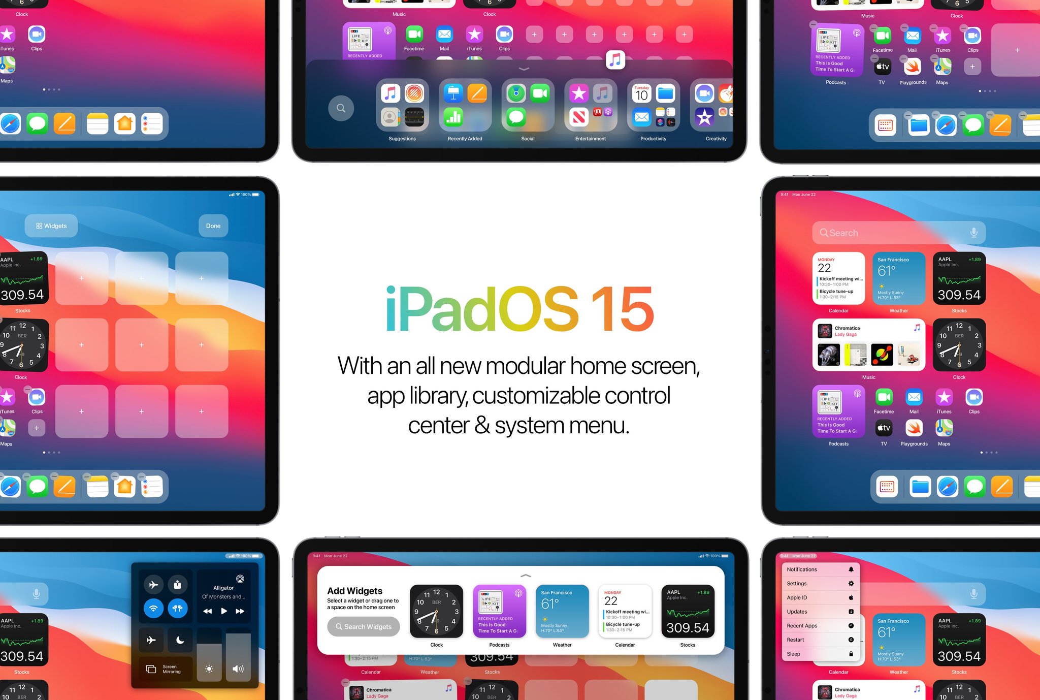
This iPadOS 15 concept is several steps in the right direction

iMore offers spot-on advice and guidance from our team of experts, with decades of Apple device experience to lean on. Learn more with iMore!
You are now subscribed
Your newsletter sign-up was successful
iPadOS 14 is still in beta, so we won't have a complete picture of everything until later this year when it releases to customers later this year. But people are already envisioning next year's iPadOS update, including Parker Ortolani, product development lead over at Buzzfeed and someone who's spent quite a lot of time building concepts for potential iOS updates.
Ortolani's concept reimagines the iPad Home screen as a modular space for both apps and widgets, where they can live side-by-side as you want them to. And while I have some quibbles, overall, I love the ideas behind this concept.
Let's dive in.
Article continues belowWhat I love
As disappointed as I am that widgets on iPadOS 14 remain confined to a single sidebar on the Home screen, the fact is that having that sidebar alongside widgets pinned on the Home screen would have been visually off-putting. Ortolani's concept keeps more to the overall grid concept of iOS and iPadOS, but more importantly, it's more in line with something Apple might do.
Instead of keeping the same app icon spacing that exists on iPad today, which wouldn't work visually with the new widget design, this concept shrinks the space between apps so that a grid of four apps will take up the same amount of space as a single small widget, just like on the iPhone. It also allows you to fit more apps on the screen if that's something you want.
Another aspect of a wider widget deployment on the iPad Home screen that I think this gets right is the removal of the Today view, at least as it currently exists on iPad. I just can't imagine Apple keeping the current Today view while allowing widgets to be placed anywhere on the Home screen.
I also like that this brings widgets on the iPad into portrait orientation. Then there are features like the inclusion of the App Library, the reimagined Control Center, and the pro menu behind the clock. All of these would serve to tighten up the iPad and establish a visual identity even further separated from the iPhone.
iMore offers spot-on advice and guidance from our team of experts, with decades of Apple device experience to lean on. Learn more with iMore!
What this concept gets wrong
There are some nitpicky details that I wouldn't bet on. For instance, I wouldn't count on the widget library sliding in from the top of the screen. I'd bet you still tap the screen, tap the +, then pick your widget just like you do now.
I also think this concept leans a little too heavily on the idea of the iPad as a power user-oriented device. With things like Notification Center behind a hidden menu, users looking for their notifications might be confused to find the widget library taking its place.
Most of the people using iPads aren't pros or power users, so you want to make sure all of the essentials, where their apps are, notification center, the dock, etc., are easily discoverable, and, hopefully, moved around as little as possible.
What do you think?
Overall, I like this concept and think it would be a big step in the right direction.
But how do you feel about it? Can you see Apple going this route? Sound off in the comments, and tell me if you want to see widgets all over your iPad's Home screen.
Joseph Keller is the former Editor in Chief of iMore. An Apple user for almost 20 years, he spends his time learning the ins and outs of iOS and macOS, always finding ways of getting the most out of his iPhone, iPad, Apple Watch, and Mac.

