iPhone Apps
Latest about iPhone Apps
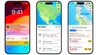
This iPhone app can tell you your flight's delayed hours before your airline can
By Daryl Baxter published
Flighty 4 launches with some fantastic features, such as airport performance stats, insights from Air Traffic Control, and more.
Best iPhone and iPad apps for college students: Start the school year off right!
By Stephen Warwick last updated
As you head back to school, these are some of the top iPhone and iPad apps you need!
Milk The Cow and 4 other random apps I downloaded as a teenager
By John-Anthony Disotto published
You can look at your old App Store download history but you might find a weird app or two.
The 101 best iPhone apps, ever!
By Andrew Williams last updated
The best iPhone apps you can download right now! From Delta to Pixelmator here's everything you need.
With 50 million WhatsApp users now rocking iPhones, can we stop talking about green bubbles?
By John-Anthony Disotto published
With 100 million WhatsApp users in the US and over 2 billion globally, is it time to give WhatsApp a try?
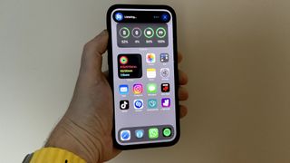
Best free apps for iPhone in 2025
By Palash Volvoikar, Daryl Baxter last updated
Here's our pick of the best free apps for iPhone that you can download right now.
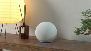
How compatible is the Amazon Echo with an iPhone?
By John-Anthony Disotto last updated
If you have an Apple household, can your iPhone co-exist with an Amazon Echo or Dot? Absolutely!

Zenless Zone Zero is out now: Here are the five things you need to do first
By Tammy Rogers published
Zenless Zone Zero is finally out, but what should you do to get started?
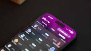
Apple Sports app promised star potential, but I'm benching it immediately
By John-Anthony Disotto published
Apple Sports is here, but it leaves a lot to be desired for a dedicated sports score app.

Can AI create the perfect photo?
By Becca Caddy published
iPhone Photography Week AI-based photo editing tools are everywhere, but there are strengths and limitations to be aware of.
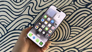
iPhone developers can now start preparing for Apple's massive EU App Store overhaul
By Daryl Baxter published
iPhone developers can now use TestFlight to try out app marketplaces, web browser engines, and more in iOS 17.4.
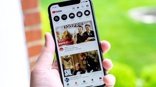
YouTube for iPhone no longer has an iMessage app after Google silently removed it in a recent update
By Oliver Haslam published
The YouTube app on your iPhone no longer has an iMessage app attached to it
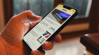
Google Chrome for iPhone is stealing one of Safari's smartest features
By Oliver Haslam published
Google Chrome is getting ready to offer an iPhone usability feature that is already available to Safari users.
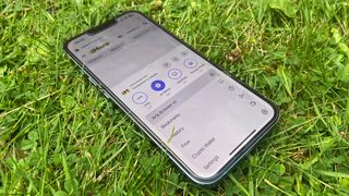
Opera's awesome iOS web browser now brings AI to your iPhone, as well as your Mac
By Daryl Baxter published
Opera’s AI assistant has arrived on its iOS web browser, but will you use it?
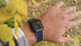
How to manually add workout data to the Health app on your iPhone
By Christine Chan last updated
Did you complete a workout but forgot to wear your Apple Watch? Fortunately, you can manually add workout data on your iPhone through the Health app.
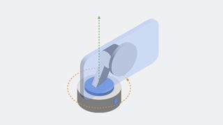
You will soon be able to use your iPhone as a pet camera
By John-Anthony Disotto published
Apple's DockKit will allow developers to create per-tracking camera software for your iPhone.
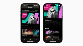
Madonna is coming to Apple Fitness Plus playlists to celebrate Pride Month
By Tammy Rogers published
To celebrate Pride Month in June, Apple Fitness Plus is going to feature Madonna as an LGBT+ artist spotlight.
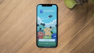
3 of the best Mastodon apps to use on iPhone to help move on from Twitter
By Alex Blake published
Looking for the best Mastodon experience on iOS? You’re in the right place.
iMore offers spot-on advice and guidance from our team of experts, with decades of Apple device experience to lean on. Learn more with iMore!
