Apps
Explore Apps
-
Art Apps
-
Audio Apps
-
Best Finance Apps
-
Business Apps
-
Camera Apps
-
Drawing Apps
-
Educational Apps
-
Entertainment Apps
-
Finance Apps
-
Health and Fitness Apps
-
Lifestyle Apps
-
Mac Apps
-
Productivity Apps
-
RSS Apps
-
Shopping Apps
-
Social Apps
-
Sports Apps
-
Travel Apps
-
Utilities Apps
-
Virtual Machine Apps
-
Weather Apps
-
iPad Apps
-
iPhone Apps
Latest about Apps

Apple approves WeChat update ahead of iPhone 16 event, but it still wants to negotiate fees
By Lloyd Coombes published
Apple has approved a version of Tencent's WeChat app, but still wants to get a cut of in-app fees.

ChatGPT on Mac just got a big update in the EU
By Lloyd Coombes published
More regions now have access to ChatGPT's Memory functionality on macOS.

Sonos has delayed products to focus on fixing its app "crisis"
By Lloyd Coombes published
New report suggests Sonos has delayed a set-top box and scaled back headphone shipments.

Google Photos gets an Apple Intelligence-inspired update to help you find your favorite snaps
By Daryl Baxter published
A new 'Ask Photos' feature lets you search for photos with everyday language, instead of using key words.

Apple's App Store fees make bringing Xbox Cloud Gaming to the iPhone 'impossible'
By Joe Wituschek published
Microsoft says that Apple's 30% App Store fees are stopping it from making a native app for Xbox Cloud Gaming on iOS.

This cute character holds your Beats Pill — and costs $500
By Lloyd Coombes published
Artist Verdy is releasing the new Vear Toy to hold your Beats Pill, but it'll set you back $500.

Apple struggling to curtail so-called 'dual use apps'
By Lloyd Coombes published
New report highlights Apple's challenges with 'Face Swap' apps in the App Store.

X still banned in Brazil, but Apple doesn't need to take it off of the App Store
By Lloyd Coombes published
The Brazilian Supreme Court demanded Apple remove the 'X' app from its App Store, but has now softened its stance.

Snapchat finally comes to iPad in new update — 13 years after debuting on iPhone
By Daryl Baxter published
13 years after coming to the iPhone, Snapchat arrives on compatible iPads in a new update, but only in Portrait mode for now.

My favorite macOS email app just added a huge feature for anyone stuck in meetings
By Lloyd Coombes published
"Meet With" is Spark's new feature to help manage your Calendar appointments.

Apple goes after Adobe Premiere with its new Final Cut Pro ads
By Joe Wituschek published
Apple has released two new ads for Final Cut Pro — one for the Mac app, and one for the iPad app.

"Re-releasing the old Sonos app would be worse" says CEO after major app blunder
By Connor Jewiss published
After a major blunder with the refreshed Sonos app earlier this year, the CEO has said that "re-releasing the old Sonos app would be worse."

Threads gains new features that could make you more likely to leave X behind
By Lloyd Coombes published
Jumped to Threads? You'll be pleased to know Meta's platform has a few new tricks up its sleeve.

Your next Patreon sub might cost more — if you're paying with iPhone
By Stephen Warwick published
Apple has told Patreon it must use in-app purchases for new subscriptions from November, which means they might be 30 percent more expensive.

Fortnite on iOS is one step closer according to Epic, and it's not alone
By Stephen Warwick published
Epic has submitted Fortnite and other apps to Apple for final notarization, meaning Victory Royale is back on the menu.

User backlash has reportedly caused Apple to rethink iOS 18's Photos redesign
By Lloyd Coombes published
Apple has apparently walked back changes to the Photos app after user concerns.
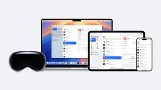
1Password security flaw might make iOS 18's Passwords app even more enticing
By Lloyd Coombes published
Apple's new Passwords app is about to arrive just as a 1Password vulnerability has been announced.
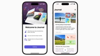
Apple Intelligence could supercharge one of iOS 17's most disappointing apps
By Lloyd Coombes published
Apple's underwhelming Journal app needs an upgrade, and Apple Intelligence could provide just that.
iMore offers spot-on advice and guidance from our team of experts, with decades of Apple device experience to lean on. Learn more with iMore!
