Apple
Latest about Apple
Apple loses $14bn Irish tax case against the EU
By Stephen Warwick published
Apple must pay back 13 billion euros to Ireland following a ruling in its unpaid taxes case.
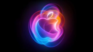
How to re-watch Apple's iPhone 16, Apple Watch Series 10, and AirPods 4 event
By Joe Wituschek published
If you missed the special event or just want to watch everything again, here's how you can re-watch Apple's "It's Glowtime" event.
Every Apple product discontinued after the iPhone 16 event
By Connor Jewiss published
While the iPhone 16 event was all about new iPhones, Apple Watches, and AirPods, it also marked the end for all of these Apple products.

Listen to all of the music from Apple's 'It's Glowtime' September event
By Joe Wituschek published
Apple always features a ton of music during its events. Here's how to listen to all of the music from today's "It's Glowtime" special event.
Apple could get a major fine the day after the iPhone 16 reveal event
By Lloyd Coombes published
Apple's next big date with the European Commission is Tuesday - right after the iPhone 16 reveal.

TIME names the 100 most influential people in AI, but Tim Cook is nowhere to be seen
By Stephen Warwick published
TIME has unveiled a list of the 100 most influential people in AI, and Apple's absence is telling.
How to watch the iPhone 16 Glowtime reveal event - tune in for iPhone 16, iPhone 16 Pro, iPhone 16 Plus and iPhone 16 Pro Max
By Lloyd Coombes published
APPLE EVENT How to watch Apple's "Glowtime" event, where the company is expected to show off the latest iPhone and Apple Watch.
120 Spain retail employees leave Apple following "substantial change in working conditions"
By Lloyd Coombes last updated
Apple has reportedly laid off staff from three stores in Spain, pivoting to more "young part-time workers".
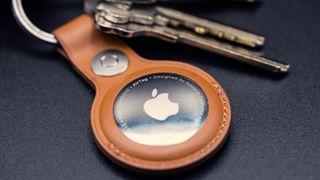
Apple AirTag 4-pack is down to $75 in this Labor Day discount – that's $18.75 for each tracker
By Connor Jewiss published
Apple's AirTags are one of the most popular Bluetooth trackers. And with this Labor Day discount, you can score a 4-pack for just $75 – that's 25% off.

Apple wants to scrape content for Apple Intelligence training
By Tammy Rogers published
Some of the internet's largest publishers are refusing to let Apple use their content to train the generative AI at the core of Apple Intelligence.
Apple's services division has lost 100 people in a rare round of job cuts for the company
By Oliver Haslam published
Apple has cut around 100 jobs in a move that affects people working on the Apple News and Books services.
A lot of Apple services are experiencing outages today
By Joe Wituschek published
Apple Books, Apple iCloud Mail, Game Center, News, Photos, and Stocks all experienced outages today.

A key executive is stepping down at Apple
By Joe Wituschek published
Luca Maestri, Apple's Chief Executive Officer, is stepping down from the role in favor of a new one.

How to watch Apple's 'It's Glowtime' iPhone 16 event on September 9th
By Joe Wituschek published
Apple's iPhone 16 event will kick off on September 9th. Here's how to watch it.
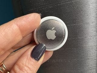
Woman catches thieves by mailing herself a package containing an AirTag as bait
By Joe Wituschek published
A woman in California helped police catch two thieves by mailing a package containing an AirTag to herself as bait.
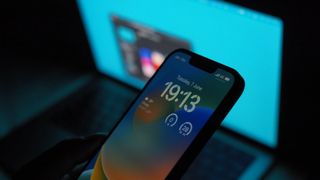
Introverts rejoice! At the EU's insistence, you'll soon be able to delete the Messages app from your iPhone in iOS 18
By Stephen Warwick published
Apple has today announced more tweaks and changes coming to iOS 18 in the EU.
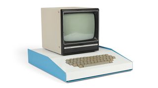
This Apple-1 from Steve Jobs' desk could fetch $1 million at auction
By Connor Jewiss published
An Apple-1 computer from Steve Jobs' desk is currently up for auction with a starting price of $500k, but could fetch up to $1 million.
iMore offers spot-on advice and guidance from our team of experts, with decades of Apple device experience to lean on. Learn more with iMore!

