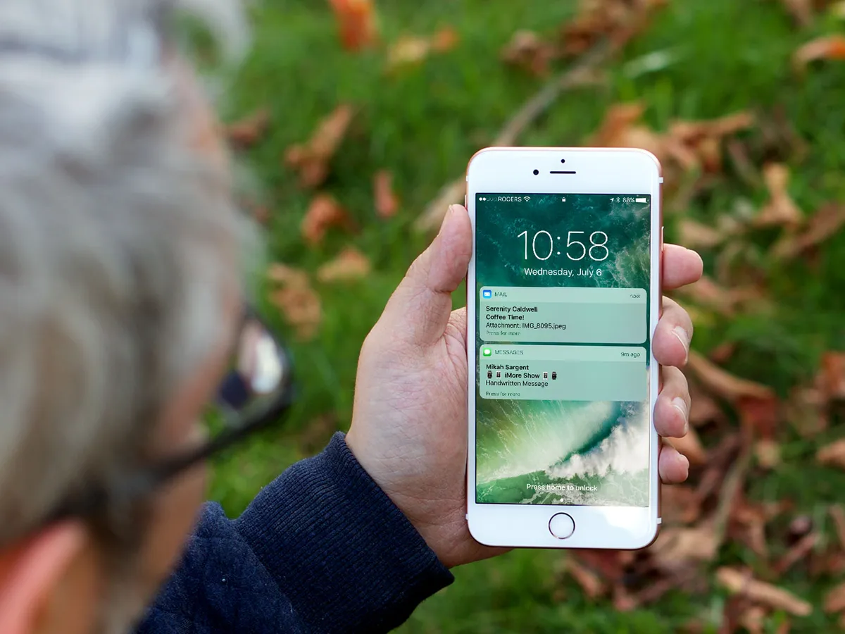
The Lock screen is the first screen you land on when you boot up or wake up your best iPhone, it serves as both assistant and gatekeeper — it keeps you informed and up-to-date at a glance, and keeps your iPhone and iPad secure against unauthorized access. That means there's a lot of functionality you can get to quickly, but also a lot of privacy options you can toggle to make sure what's available is only what you want to have available.
How to navigate the Lock screen on iPhone and iPad
Apple has re-invented the Lock screen, changing everything from the way you unlock your iPhone or iPad, to the way you glance at your info or quickly take control. It's simple once you get the hang of it. You just need to familiarize yourself with how to navigate the Lock screen and the world is your oyster!
Once you know the basics, quickly accessing the camera, Notification Center, your Wallet, and even Siri become a breeze!
How to customize the Lock screen on iPhone and iPad
Lock screen serves two contradictory purposes: It provides fast, convenient access to a ton of features like the camera, Siri, Control Center, and more, and it also prevents unauthorized access to the private contents of your iPhone or iPad. You can absolutely swap your wallpaper to make it your own, but you can also disable many of the conveniences if you'd prefer your Lock screen to be on lockdown.
You can adjust all sorts of settings to help customize your Lock screen. Changing wallpapers, turning off what is accessible through the Lock screen, and setting how much time has to pass before your best iPhone or iPad locks, can all make the Lock screen feel more like it's working for you.
How to set up and use Face ID on iPhone and iPad
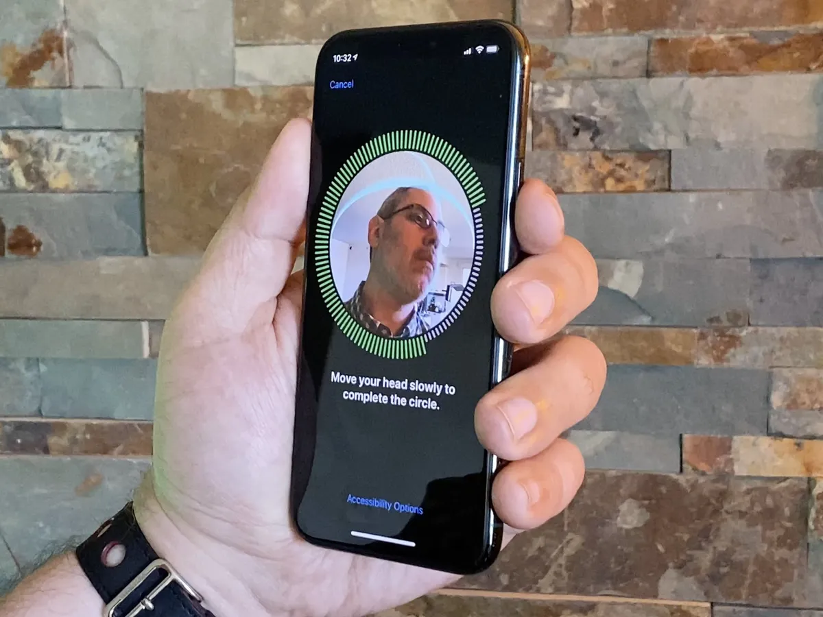
If you're using a newer iPhone or an iPad Pro, you'll have the option of setting up Face ID to unlock your device. Face ID is Apple's name for the biometric facial identity scanner on its latest iPhone devices and with it, you can not only unlock your iPhone or iPad, but you can also authenticate Apple Pay, the App Store, and iTunes transactions.
How to set up and use Touch ID on iPhone and iPad

Touch ID is still around on the iPhone SE (2020) and plenty of iPad models, and it's as handy as ever. Touch ID lets the Home button identify who you are by scanning your fingerprint. That way, your iPhone or iPad knows to unlock, to authorize iTunes, App Store, and Apple Pay purchases, to give you access to your password and banking apps, and more. And they know to keep other people out. By setting up Touch ID, you can stay relatively safe, but still, make it quicker and easier than entering your passcode when you need to get into your iPhone or iPad.
How to set up and use a passcode on iPhone and iPad
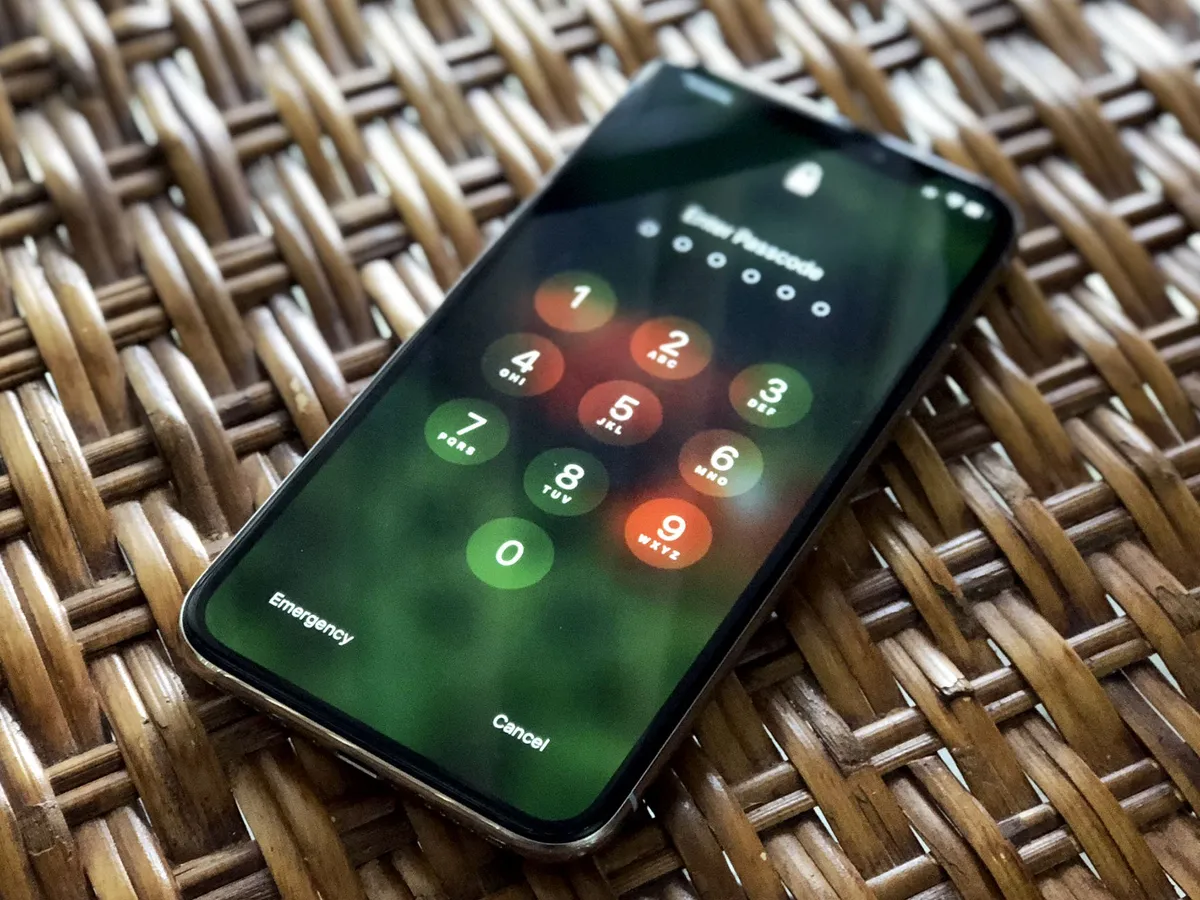
Setting a passcode means anyone picking up your iPhone or iPad has to enter a series of numbers — or, optionally, a full-on password — to unlock it. It also enables hardware-level encryption for all your data. That means it's incredibly hard for anyone who doesn't have the passcode to get to your private messages, photos, financial and health information, etc. Even with Touch ID and/or Face ID, you should set a passcode, and set as strong a passcode as you feel comfortable with.
The Lock screen is just the start!
There's plenty more to see in iOS 15, so once you've figured out your preferred Lock screen settings, don't forget to explore your iPhone or iPad thoroughly.
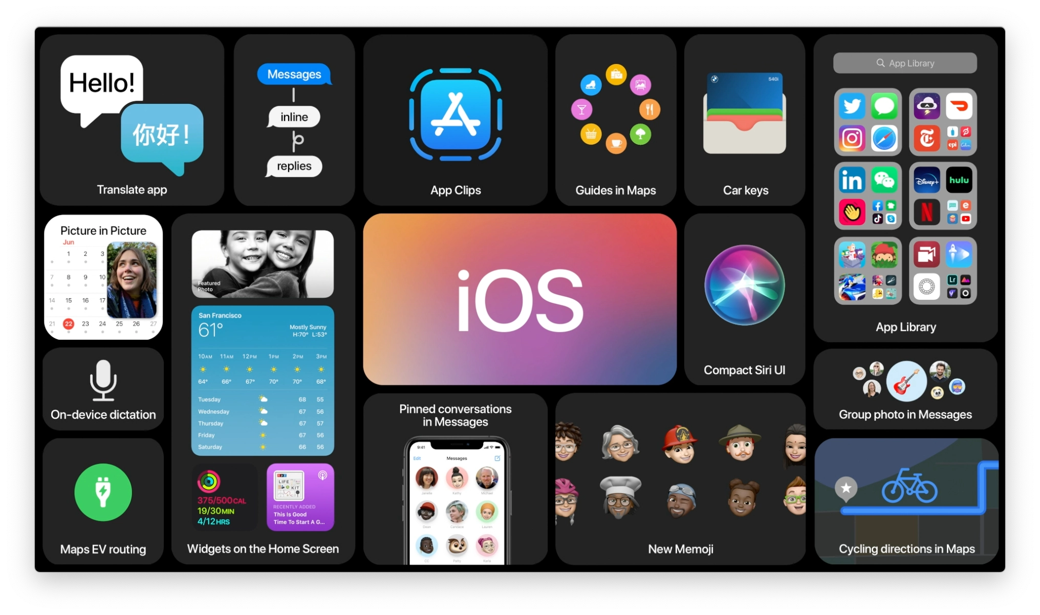
Updated February 2022: Updated for iOS 15 and iPadOS 15.