• What's the best iPad?
• Set up your new iPad
• Best apps for that new iPad
• How to ace the Apple Pencil
Since Steve Jobs introduced the iPad in 2010, the tablet market has never been the same. It's so much more than a bigger iPhone; it's a portable workstation, a creative drawing tablet, and a fantastic way to view your favorite media. Thanks to iPadOS 17 -- and soon, iPadOS 18 -- the iPad helps you get anything you want done. Whether you're an M4 iPad Pro power-user or an iPad mini maven, there's never been a better time to get an iPad. iMore has all the advice you need to get the most out of Apple's tablet.
The current lineup
The iPad lineup is deep and wide, including Pro models with extra features, thin and powerful Air models, minis, and more. Here's the roster:

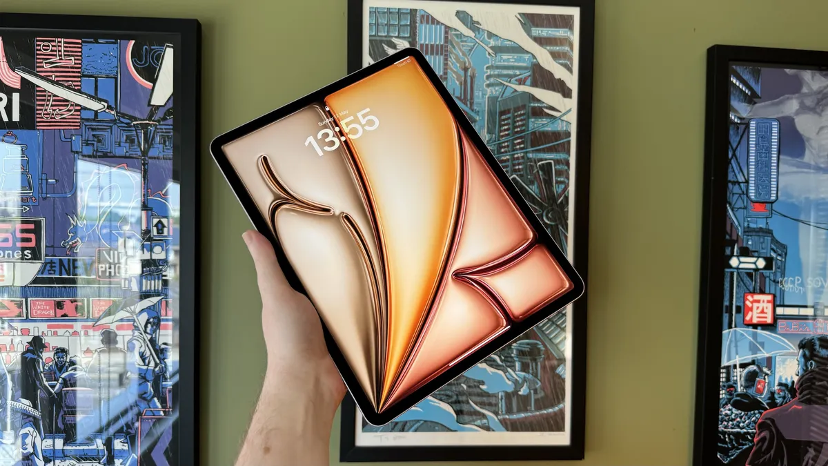
iPad Pro (2024, M4) More power, thanks to the M4 chip and a gorgeous new OLED display.
iPad Air (2024, M2) Power and performance without the "pro" price tag.

10.9-inch iPad (2022, A14 Bionic) A gorgeous new screen and refreshed design for a mid-range marvel.
How to troubleshoot iPad problems
iPad is an amazing computer, managing to be powerful, portable, and accessible all at the same time. If it's working. If it's giving you problems — if it's sluggish or stuck, won't power off or power back on, if the battery is draining fast or not charging properly — then it's a worthless hunk of metal and glass. Your first instinct might be to call Apple Support or visit the Genius Bar, but that all takes time. If you just want to get everything working again, here are some things you can try on your own right now!
Common iPad problems | Fix iPad battery issues | Fix AirDrop | Reset iPad
Latest about iPad

iPad users in the EU can sideload apps starting tomorrow
Apple has confirmed third-party app stores will be available on the iPad from tomorrow, September 16.

You can buy this iPad for $199 right now thanks to a 40% discount
Apple's iPad 9 is on sale for just $199, a 40% discount on its original price.

More affordable iPad Magic keyboard in the works
The new iPad Magic Keyboard is very expensive — so Apple is looking at making a cheaper version, says Gurman.

Best Apple Pencil alternative in 2026: grab the non-Apple stylus that's right for you
In need of a great stylus for your iPad but don't want to pay the steep cost of an Apple Pencil? These great non-Apple stylus alternatives are just as good, if not better in some respects.

iPad 10th gen back down to its lowest price ever in the best iPad deal of 2024
The entry-level iPad is back down to $299, it's lowest ever price.

We might be getting a new iPad mini at Apple's September 9th event
Apple is running low on iPad mini stock, indicating that the company could be ready to release a new generation.

Plans to give free iPads to 'digitally excluded' Scots have been axed so the money can be given to council workers instead
Plans to give free iPads to people who are "digitally excluded" in Scotland have been canceled so the money can be redirected to help avoid worker strikes.

Popular iPad design app Procreate slams generative AI and promises no plans to offer it — "We're never going there"
Amid lots of design programs (including Adobe Photoshop) adding AI features, popular iPad design app Procreate promises that it will never introduce AI.
I just sold my iPad for a Kindle Paperwhite — here's why
Despite Apple spending years trying to convince me to use an iPad, I found that a Kindle was what I needed all along.

Best iPad for students in 2026: Get more done at school with a brand new Apple tablet
The best iPad for students is packed with features for all your education needs, and can be easily carried from class to class.

iPad Air and iPad mini next on the list for OLED screen upgrade
The next iPad Air and iPad mini tablets could feature OLED displays, which could both debut as early as 2026.

Best USB-C Headphones for iPad Pro 2026
Want to use headphones with your iPad Pro? Here are the best USB-C headphones options out there.

It turns out that the iPad Pro is Apple's most popular model, after the newest models score even more sales
A new report shares that the iPad Pro is once again Apple's most popular iPad model, and the newest devices are proving even more popular.

The iPad mini 6 is currently at its lowest-ever price making it perfect for going back to school
The iPad mini 6 is now at its lowest-ever price at Amazon, making now the perfect time for an upgrade.

iPad Fold: Five features that could make this tablet the best iPad yet
We each asked ourselves how a folding iPad would convince us to buy one - and the answers may surprise you.

M4 iPad Pro with OLED might finally be the AAA gaming device Apple has promised, say Digital Foundry experts
Digital Foundry’s latest report on the M4 iPad Pro suggests it's an excellent gaming machine.

You might have to wait some time for Apple's foldable iPad
According to investor notes, Apple’s foldable iPad won’t arrive until 2026.

The LuLulook 360 stand is the perfect companion to your brand-new iPad, especially if you're lazy. Like me.
Review Click the iPad into place.


