A complete visual departure from previous versions, iOS 7 focuses on clarity by removing all but the most essential elements and chrome, deference by getting out of the way of content and apps, and depth by building the entire experience on top of a physics and particle engine that moves, blurs, parallaxes, and layers in virtual 3D. It touches every app, every pixel, and every bit of the system. It's far from perfect, and there are issues — as superficial as icons and as deep as consistency — yet to be overcome, but along with new features like Control Center and AirDrop, and improvements to Notification Center, multitasking, the Camera and Photos apps, Safari, Siri, and more, it's the most exciting update to iOS in years, and to mobile interface since the original iPhone. But it's also facing most competitive market ever. So, given the alternatives, is it enough?

iOS evolution

iOS was introduced back in 2007 with the original iPhone and has been expanded, refined, and improved ever since. Part of knowing where we're going is knowing where we've been. Here are our reviews of past versions of iOS for iPhone and iPod touch, and since 2010, iOS for iPad as well.
- iOS 6 for iPhone and iPad
- iOS 5.1 for iPhone and iPad
- iOS 5 for iPhone and iPad
- iOS 4.3 for iPhone, iPad
- iOS 4.2 for iPhone | iOS 4.2 for iPad
- iOS 4.1 for iPhone
- iOS 4 for iPhone
- iOS 3.2 for iPad
- iOS 3.1 for iPhone
- iOS 3.0 for iPhone
- iPhone 2.2 for iPhone
- iPhone 2.1 for iPhone
- iPhone 2.0 for iPhone
Compatibility and updating
iOS 7 comes pre-installed on any new iPhone, iPod touch, or iPad. It's available as a free update to anyone using an iPhone 4, iPhone 4s, iPhone 5, or iPhone, an iPad 2, iPad 3, iPad 4, or iPad mini, and an iPod touch 6. Not all features are available on older devices.
You can update over-the-air (OTA) on on-device or over USB using iTunes on Mac or Windows. OTA updates-in-place are typically the fastest, setting up as a new device is typically the best way to get the best performance.
- How to update to iOS 7 using over-the-air (OTA) Software Update on iPhone, iPod touch, or iPad
- How to update to iOS 7 using iTunes
- How to update from iOS 7 beta or GM to the official release version
iOS 7 interface and experience gets its game on
The biggest change to iOS 7, and the most important, is the system-wide redesign. With, Apple has taken interface and experience from static to dynamic. It's more nuanced than that, of course, but that you have to see it moving to understand how it looks and works reveals the essential truth of that statement. iOS 7 feels alive and vibrant. It's the vision of Apple's senior vice president of design. Formerly restricted to hardware, he's now responsible for hardware and software both, and his predilection for stripping away everything inessential until only the most authentic, most necessary elements is evident. The green felt is gone. The wooden shelves are gone. The stitched leather Steve Jobs was so fond of is gone. In their place is a lot of solid colors with only the subtlest of gradients and textures remaining. Architecturally, it's laid bare. Design-wise, there's nowhere left to hide.
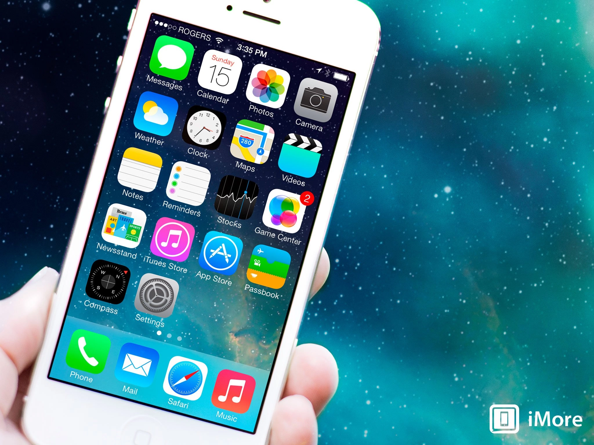
If you've used iOS before, everything is going to look different after you update to iOS 7. The change is striking. Here are some examples showing iOS 6 on top and iOS 7 on the bottom, including the Lock screen, Home screen, and Notification Center. (Yes, the hands on the Clock icon on the iOS 7 Home screen really do move now.)

Say goodbye to rich textured themes in Game Center, Compass, and Newsstand. You're not going to have green felt to kick around anymore:

And say hello to objects that exist in a virtual three-dimensional space, and can be directly manipulated, like multitasking cards, Safari tabs, which behave like a souped up version of Passbook passes.

Every screen of every app has been given a fresh coat of paint, from Calendar to Notes to Reminders. Every. One.

The redesign is based on three key principles: clarity, deference, and depth.
Depth is handled by the new physics and particle engine. The entire interface and experience is built on it. Screens no longer move because someone animates them, they drop and collide and bounce because of behavior ascribed to them. Likewise icons fly in like a fleet coming out of hyperspace, and apps and folders and days and months zoom in and out like portals into deeper worlds, chat bubbles bounce like balloons, cards knock together, and wallpapers and entire Home screens that shift with your every movement, providing glimpses into what's just below the surface.
Gaussian blur shaders are used liberally throughout iOS 7 as well. So much so they seem to be on more than they're off. The pixels below are sampled in real time, so if a banner moves in the App Store beneath Notification Center, you see it, blurred, moving beneath Notification Center. When you swipe between modes in the Camera app, the live preview image you're looking at blurs as it transitions. When you start FaceTime - now a dedicated app even on iPhone - before you place call you see your own image, captured by the front-facing camera, blurred and looking back at you. It's computationally expensive enough to make a graphics engineer cry, it's also something as visually distinctive as the physics and particle animations.
Here's what it looks like:

iOS has always stressed direct manipulation and 1:1 touch tracking, because it created the illusion of genuine interaction. Combine that with the new engines, and now the illusion is even better. You're not just tapping buttons, you're moving objects through their own virtual space. You're not just flipping through a stack of tabs tediously drawn to look and move like cards, hiccuping and losing proper perspective as you go. You're flipping real card-shaped objects that fly past, always in perfect perspective because they're rendered to be. It's so real, it begins to feel like a game. and that's exactly the point. Real gamification is about enabling discovery though play. It's about rewarding intuition with delight. It's about making computing fun.
Here are some examples of directly manipulable objects in the form of multitasking cards, Safari tabs, and Passbook passes:

Deference is handled by getting rid of the heavy chrome, the obtrusive and unmoving title bars and tab bars and thickly delineated buttons past. Now everything is edge to edge, from the subtle animations of snow and rain and lightning in the Weather app to the unified search field that minimizes and controls that fade away in Safari, to the use of translucency so content can continue to provide context. It's also philosophical, prompting developers to rely less on Apple's default UIKit and paint the screen in a way that best suits their own tastes and apps.
Buttons have also been simplified to the point where, in many cases, I don't even know if I can still call them buttons (though Apple does). They're utterly without chrome or adornment of any kind, naked bits of sometimes colored text that trust in a new generation's learned knowledge of multitouch.
Clarity is best highlighted by the new Text Kit, which allows fonts to dynamically scale not only in size but in weight so type always looks great, and people who want a bigger size for increased legibility can have it, screen size be damned. Text Kit isn't getting the attention other elements of iOS 7 are getting, but it absolutely deserves it.
It also highlights one of Apple's best qualities. They look at problems that need to be solved, not solutions that keep being proposed. When people said they wanted multitasking, they didn't mean they wanted battery-melting infinite processes. They wanted to listen to Pandora while surfing the web. So Apple made an API for that, and other high-demand background services, and has now created just-in-time multitasking to meet even more needs (see below). Likewise, when some people say they want a bigger screen, what they're saying is they want to see more content and have text at a bigger size. Deference and Text Kit solve both those problems on devices of all sizes.
Here's the new Lock screen, which shows the text, the translucency, and the physics-based wallpaper:

Speaking of which, the new default system font is Helvetica Neue, and it tends towards the ultra-thin at times. Why Apple didn't go with their own, custom system font is a mystery, and while Helvetica Neue looks beautiful at times, it can be hard to read as well. Luckily the same Text Kit system allows you to easily scale and thicken it if and as needed.
There are other problems too. The icons all reference the same grid now, one that seems drawn from Apple's hardware designs. They range from beautiful, like Photos, to unbalanced, like Safari, to background dependent, like Stocks and Voice Memos. Rumor has it they were specced out by the graphic design department instead of the human interaction department, something Jony Ive felt would bring fresh eyes and a new approach. It's triggered some legitimate criticism and some change aversion both. Over the last 3 months most of the icons have come to no longer bother me, but flat or not, few leap out at me as genuine improvements. Also, the glyphs are thin the point of looking fragile, and sometimes simplified to the point of non-obviousness.
Likewise, some of the interfaces are breathtakingly gorgeous to the degree that even now I can't stop starting at them. Everything from passcode entry to the dialer is palpably improved. Other interfaces, not so much. Particularly the status bar, which comes off as much cluttered and confusing now than at any point previously. Also, the cellular signal strength indicators, circles now instead of curved bars, convey the same information yet take up far more space.
Here's a look at Safari, which shows the deference of receding interface, but also the status bar and glyphs:

It feels like some of the key ideas of iOS 7 - clarity, deference, and depth - were taken a step too far in some places, to the point where they get in their own way. Maybe that's the way it works. Maybe it's what happens when you're sprinting so quickly towards something new and you can't decelerate fast enough after crossing the line.
Hopefully that gets pulled back and polished in future versions. It's hard changing something used and depended upon by hundreds of millions of people. Even with the massive changes in iOS 7, most major components remain spatially consistent. People familiar with where the phone icon was in iOS 6 will find it in exactly the same place in iOS 7.
The new buttons that look like naked text links on the web might confuse some people. The new location for Spotlight - swipe down on any Home screen - might frustrate those simply trying to find their apps and the new way to access video - swipe left on the Camera - might escape those simply trying to make a recording.
That'll change quickly. Shock, if any, will pass. This is better. It sets the stage for the future and since Apple seldom looks back, they'll drag the rest of us along with them. A week in, a month, a year, we'll look back at old versions of iOS the way we look back at old video games.
iOS 7 also looks fantastic on the iPad. It should. The original iOS was designed in a pre-iPad world and was retrofitted onto its bigger screen. This is the first iOS designed for the iPad. It's open. It's expansive. It fills the screen without spreading itself too thin. You could argue it looks even better on the iPad than iPhone.
Right before iOS 7 was announced, I asked what was next for human interface. With iOS 7, Apple answered.
iOS 7 Siri gets Wikipedia, Bing, Settings, Twitter, but doesn't get on-board
Siri sits on top of iOS as a secondary, natural language interface layer. A personal digital assistant big on personality and partnerships, but challenged in reliability, with iOS 7 Apple has continued to add new services while redesigning everything that's come before. Gone is the linen and beautifully rendered sports, movie, and other widgets, and in their places is the starker, cleaner, and more translucent treatment. It'll even fly in sample questions for you if you're not sure what to ask. The resulting look is sometimes hauntingly great, other times murkily bad.
The principal new element is a sound wave that harkens back to Siri's predecessor, Voice Control. It's a fun visual. Not as fun is the heaviness of the text, which looks out of place compared to the thinner treatment found in the rest of the interface. It does help usability, however, and more specifically, glance-ability, which is more important than consistency when it comes to how Siri is used.
Siri gets two new, high quality voices in iOS 7. One is male, the other female. They're not available in all languages yet, but it's just a matter of time. Having new voices was increasingly important for Apple. The original female Siri voice wasn't exclusive to Apple, and that was an odd choice to begin with, and something others could use to graft onto Apple's attention, and competitors could use to tease them. Hopefully these new voices are original, and Apple's alone.

New features include the ability to change Settings. While that's geek-centric and mirrors another new iOS 7 feature, Control Center, it's also welcome. Likewise Siri can now access more communications feature. Where previously Siri could find email and messages, and read messages, playing voice mail is a nice addition. So is the ability to find and show tweets. Hopefully Apple continues to expand on this until Siri can find, read, and otherwise access with all messaging on iOS.
New services include Wikipedia and Microsoft for Siri search, especially image search. Some might assume that it's just one more casualty in Apple and Google's cold war, but Siri has always been a partnership play and it's just as possible Microsoft offered Apple the best deal. What remains to be seen is how good the results are, because that's the only thing that really matters at the end of the day.
Siri has also become persistent. Previously if you left Siri for any reason and then came back, all your previous results were gone. Now you can simply scroll backwards and see search results, movie listings, and whatever else you recently called up. This might seem trivial, but it's incredibly useful.

What Apple hasn't added is any local, on-device functionality for Siri. Google's been doing this for a while, and it helps minimize network connections and backend servers as a point of failure. Basically, for any action that involves only the apps on the phone or tablet, for example, toggling a setting or adding a reminder, all voice parsing is done on the device. Only when a request needs to go online, like to check the web or check with a service, does it hit servers. Siri currently goes to the servers for everything, making it slower and subject to more failures than Google's voice tech.
Siri also didn't get was any of the predictive assistant services Google Now enjoys. Like Google on Android (and in more limited fashion in the Google Search app for iOS), Apple on iOS can aggregate all sorts of calendar, location, environmental, and social data, and can synthesize from it where we are, where we need to be, with whom, and under what conditions. Instead of waiting for us to ask, Siri could be providing it preemptively so we don't even need to ask.
Apple has shown they're doing a little bit of that with Notification Center's new Today screen, which will tell you the time (with traffic) to your next most likely location. Perhaps they'll evolve a system complementary to Siri, rather than a component of Siri, to handle predictive assistance. That's be a shame though, since Siri has that Pixar-like personality that helps make assistant services accessible.
Ideally, a predictive Siri would replace the current notifications on the Lock screen, and the Today screen. Either way, Google seems closer to the movie version of Tony Stark's Jarvis right now than Apple, and I hope that turns around, and soon.
iOS 7 Notification Center flirts with prediction, stays away from action
Notification Center could previously be pulled down from anywhere in iOS except the Lock screen. Now it can be pulled down from the Lock screen as well. Notification Center previously shared the linen texture indicative of the sub-layers below iOS. Now it shares the gaussian blur shader - smoked glass variant - indicative of the layers above. That makes it more consistent both visually and behaviorally. If privacy is a concern, however, Lock screen access can be disabled in Settings.
Because, like the rest of iOS 7, Notification Center uses the new physics engine, you can not only pull it down now but yank it and watch it collide with the bottom, bounce, and then settle into place. Fun. It also makes use of navigation gestures, in this case to move through three new, tabbed states: Today, All, and Missed.
All is similar to what Notification Center has shown since iOS 5, though the Weather and Stocks widgets have been moved to the new Today view, and the iOS 6 Tweet and Post to Facebook button are gone. Some might lament their loss, but they were out of place there. The wrong solution to a real problem. Unfortunately, no right solution has replaced them.
Missed is similar, but constrained to the last 24 hrs. How useful that is depends on the volume and type of your notifications. Labeling it "Missed", however, doesn't seem to accurately define its contents. "Recent" would be a better fit.

Today shows you the current day and date with a brief, written description of the current weather in your current location, and a written description of your next appointment. It can also tell you if current traffic conditions will impact your next trip. As visual representations of data go, it's non-optimal.
The written out weather and next appointment are a step backwards when it comes to glance-ability, if a step forwards in terms of informational density. The graphical weather widget was easier to take in a glance, but provided little more than "sunny" or "rainy". In a perfect world, Apple would find a way to balance both. Re-introduce a graphical element and keep the deeper text. Likewise with stocks, which used to scroll in one tidy widget, and now sprawls out row after row after row after row...
Integrating traffic information for frequent locations, on the other hand, is outstanding and hopefully only the first indication that Apple is heading towards a more Google Now-style implementation where they parse location, time, calendar, and every other metric they have at their disposal and present contextually appropriate, predictive alerts in Notification Center or in something even better that replaces it in the future. Hopefully the near future.
If you're not a fan of your phone tracking you, which is how it predicts where you want to go and when, you can disable Frequent Locations in Settings > Privacy > System Services. Privacy, like security, is at perpetual war with convenience.

Beneath the text you get a more elaborate, more graphical look at Calendar, Reminders, and Stocks, as well as another written out description, this time recapping what's coming up tomorrow. If you can make it down that far. Like in previous versions of iOS, you can turn off what shows up in Notification Center, and in the Today view specifically, and use Do Not Disturb to selectively make sure notifications don't become annoyances.

Unfortunately, Apple still hasn't added any gesture-based way to dismiss notifications. Other platforms have allowed you to swipe away notifications for a long time already. The immediacy of "tossing things away" is tough to beat. Hopefully Apple addresses this, because the tiny little X button is discoverable, but not very usable.
Apple has, however, added notification sync, so when you dismiss a notification on one device, it will dismiss it on all devices, so you don't have to deal with the same alerts, again and again and again...
Perhaps the biggest omission in the whole system remains interactive notifications (sometimes called actionable notifications), which Apple just introduced for the Mac in OS X Mavericks but hasn't added to iOS. The ability to quickly respond to a message, reset a timer, or otherwise handle simple items without having to switch apps is even more necessary on mobile than on the desktop. Android has had them for while, so here's hoping OS X is just a precursor to the same or similar system on iOS, and sooner rather than later.
iOS 7 Control Center provides quick if not customizable access to toggles
Quick access to system-level toggles has been something every power user has wanted since the day the original iPhone shipped. Some 7 years later, Apple gives us Control Center. Like Notification Center, Control Center is a layer that you can slide over the main iOS interface, including the Lock screen if you so choose. It enjoys the same, bouncing, playful iOS 7 physics, and the same blur effect that mutes but doesn't entirely obliterate what's underneath. Unlike Notification Center, which comes from the top down, Control Center is activated by swiping up from beneath the screen, and rather than dark, smoked glass, it's given a light, frosted treatment.
That Control Center functions so much like Notification Center, and even uses similar nomenclature makes it easy to understand, even for non-power-users who haven't been lamenting its absence on iOS for years. It'll give the obsessive compulsive among us nearly instant access to toggles we probably ought not be toggling all the time, but it'll also give plenty of regular people a fast, easy way - and more obvious than the old fast app switcher controls - to get at things as simple as media controls and even a flashlight when they need them.

Control Center's top row provides handy on/off switches for commonly used settings like Airplane mode (which, when turned on, will turn off the cellular radio), the Wi-Fi radio, and the Bluetooth radio, as well as toggles for Do Not Disturb mode, and the portrait/landscape orientation lock. Black means off, white means on, and a brief bit of text will show up to confirm it so.
The next row is a brightness slider, from dark to light, then media controls that includes a positional scrubber, the title of the track/episode you're listening to or watching, the name of the album/series that track/episode is from, skip backwards or forwards buttons, pause/play, and a volume slider. If you tap the track title, you'll be taken to whichever app is currently playing the media, be it Music, Podcasts, or something else.
If available, AirDrop and AirPlay occupy the next row, and allow you to quickly access sheets with their individual options.
The bottom row consists of icons to toggle the LED flash-come-flashlight on or off, and variants of Clock, Calculator, and Camera icons for quickly accessing those apps.
The wedding cake design is serviceable and keeps all the controls organized while avoiding clutter. The toggles on the top look good, though some of the lines lower down are thin to the point of fragility. The only downside is that Control Center isn't customizable, at least not yet. If you'd rather have different toggles, like personal hotspot, or different fast app access, like Twitter, well that's your tough luck, at least for now.
But, baby steps. I once wrote that iOS wasn't meant for geeks, and while I still think that's generally true, with iOS 7 and OS X Mavericks, Apple is now showing that they have more than enough love to go around.
iOS 7 Gesture navigation provides expert if inconsistent shortcuts
iOS 7 continues Apple's long history of gesture-based controls, some system-wide like the new swipe up from the bottom bezel to open Control Center, and some app (or multi-app) specific, like the new swipe right from the left bezel to travel back up the hierarchy Mail or Messages or the history in Safari, or the new toss to close apps in multitasking or tabs in Safari. There are also fantastic new "peek" gestures that let you pull left just a little bit to see individual time stamps in Messages, or pull down to turn a notification banner into the full-fledged Notification Center. Gesture controls can be tricky, however. If not direct they can be hard to discover, if not consistent they can be hard to habituate, and if not carefully considered they can collide and conflict with each other, both system-wide and app specific.

For example, when Apple first introduced four-finger navigation gestures for the iPad, you could accidentally swipe your way out of Fruit Ninja and into Mail. Now, you can swipe up in Hue to try and manage your lights and end up with Control Center instead. You can disable Control Center from being accessible inside apps, but since not everyone will, developers have to assume it'll stay on, and cede basic gestures to Apple and the system.
Because the swipe-right gesture appears limited to certain apps, namely Mail and Messages, it won't collide with other apps already using that gesture. However, the way Apple is implementing the interface in iOS 7 in general, because of that gesture in Mail or Messages, could make other apps look odd. Especially ones that currently use the popular "hamburger button and basement sidebar" design (I'm looking at you Facebook, Google apps, etc.) Even if iOS doesn't stomp all over them, if they look wrong, or simply feel wrong on iOS 7, they may be forced to change and become more Mail or Messages-like. (And that might not be a bad thing.)
The good news is that all of these are direct manipulations. The bad news is that they're not all consistent or symmetrical. Direct manipulations are more easily discovered than abstract gesture controls (which iOS stays completely away from for everything but accessibility), but in order for them to be habituated they need to be consistent. Notification Center is the perfect example. Any time, from anywhere, you can swipe down and what happens is exactly what you expect to happen - it appears. Control Center is the same.
The sideways gestures are where iOS 7 starts running into problems. First, because they're only implemented in specific apps, they require the user to remember which apps include them. Worse, because they're implemented inconsistently and asymmetrically across apps, they require the user to remember what they do in each app. That's a high cognitive burden.
For example, in Safari - and in Photos, Calendar, Weather, and other apps before it - swiping from left to right takes you backwards through the sequence, and swiping right to left takes you forward. That's logical and symmetrical. Even Camera, where swiping changes modes, moves through the modes in sequence and remains consistent.
However, in Mail and Messages, swiping from left to right doesn't take you back through the sequence of messages, but up in the message hierarchy. You swipe back from message to message list to - in mail alone - message list box. Where it gets more challenging is swiping from right to left, because not only doesn't that take you forward through the sequence, it doesn't take you deeper into the hierarchy either. What it does is switch from direct manipulation to quasi-abtract command, revealing a destructive action - delete. That's not only asymmetrical (swiping different directions results in different behaviors), and inconsistent with other apps, it's a massive contextual change.
Photos can have hierarchies with albums, Calendar days with months, so there's some overlap, but Apple's recognizing that hierarchies in Messages and Mail are far more important in real-world use cases than they are in other apps, and re-assigning the gesture. They're also keeping it simple by not, for example, leaving a one finger swipe to move through sequences of messages and using a two-finger swipe to move back to the hierarchy. That's understandable and, in a world filled with trade-offs, sensible.
Switching from direct manipulation to go back to abstract command to delete is less understandable and sensible, but more a reflection of a legacy control Apple's been using since iOS 1 (iPhone OS 1.0).
Here are some examples, with the Mail gestures (back vs. delete) on the left, Safari gestures (back vs. forward) in the center, and downward swipe gesture on Home (Notification Center vs. Spotlight) on the right:

In a perfect world swiping from right to left from the edge would move you into whatever message your touching, while touching a message and holding would allow you to delete it, much like cards and tabs. Apple has used modal gestures before, for example an edit button that changes an upward movement from the general scroll gesture to a specific item re-arranging gesture. Likewise, swiping down from the bezel reveals Notification Center, but swiping down from the screen in Home reveals Spotlight search. It adds complexity but also functionality. Detect if the gesture started at or near the edge, and if so make it navigation. If not, if it started on the meaty part of an item in a list, make it editorial. It will require learning, but not much.
The most important thing is consistency. Unless and until a swipe takes you back in every app where there's something to go back to, it'll always be harder to remember and become habituated to. Unless and until a forward swipe does something in every app where there's a backward swipe, and there's something to forward to, likewise. Unless you can pull a pass up out of Passbook as easily as you can shove one down and back into the stack... You get the idea.
For gestures to succeed for the mainstream, they have to always be where they're expected, and always do as expected. With iOS 7, we're only part way there.
iOS 7 Multitasking made intelligent
Mobile multitasking is all about compromise. You either limit what can be done by apps, or you limit the battery life of the device running them. iOS has always been fantastic at multitasking. It was built on the same foundation as OS X, after all. The very first iPhone demo showed Steve Jobs start some music, fade into a phone call, jump out to check the web and email, jump back to the call, and then fade back to the music. The compromise then was no third-party apps, and post iOS 2.0 and the App Store, no multitasking for third-party apps.
iOS 4.0 brought multitasking to App Store apps, but compromised on who got access and what they could do. VoIP, navigation, and streaming audio were wide open, everything else tightly timed or still turned off. With iOS 7, Apple is trying to have their background and their battery life too, and they're using some very smart technology to do it. Instead of simply allowing persistent, pre-emptive multitasking like OS X does on the desktop, and like how some competitors do on mobile, Apple is recognizing that they have neither a power cable plugged into the wall, nor a desire to offload battery and task management to their customers, and they're using a dynamic, just-in-time system to try and get the best of both worlds. Here's how it works:
Intelligent scheduling lets apps you use frequently - for example, Facebook or Twitter if you check them near-constantly - to update frequently so whenever you launch them, they'll have all the latest information ready and waiting for you. Apps you use regularly but not frequently - for example, if you check the news when you wake up and before you go to sleep - can update just before you typically check them so they use less power but still have the information you want, when you want it.
Opportunism and coalescence let apps take advantage of circumstances to update efficiently as well. For example, apps can update during any of the very many times a day you unlock your device and the system is powered up. Apps that require it can update when your radio signal is strong and power requirements are at a minimum. And if and when something like GPS gets powered up for one app, other apps that need it can tag along for the ride and get their updates handled as well.
Where previously you'd get a push notification, go to the app, and then have to wait for the app to download the data, now push triggers prompt background updates so that the data is ready and waiting for you by the time the app opens. At least in theory. Developers can even send silent/invisible push triggers to wake up their apps for update, which greatly increases the usefulness.
With the iPhone 5s specifically, the M7 motion coprocessor will persistently track accelerometer, magnometer (digital compass), and gyroscope data without the need to power up the main processor. Apps can then pull the data, which essentially gives them full background access without the need to actually be open and consuming resources in the background.
This all works based on the concept of perception being reality. It doesn't really matter when an update happens as long as it happens before we see it. That's what makes just-in-time so much more efficient - and so much less wasteful - than all-the-time.
All of this sounds great in theory, but it remains to be seen how well it will work in practice, especially at first. As more and more developers integrate the new multitasking features, and Apple continues to improve the system, it should become better and better.

The new multitasking interface, however, is a huge improvement right now. The old fast app switcher was never a great solution. Apple tested other metaphors for iOS 4 before they settled on it, including something like OS X Expose, but Safari Pages, and more expressly, webOS cards, always felt like a better solution. Cards not only match the physicality of iOS 7 in general, they're something with which almost everyone is already familiar.
Not that it looks perfect yet. There's a Home card, for example, that might help ensure mainstream users aren't confused about how to find the Home screen, but there's already Home button for that. All Home does in card view is break the metaphor (how can the card view sit on top of Home when Home is in it?).
Unlike some other platforms, cards aren't kept "live". You can't watch a video play in card mode, for example, and it doesn't seem like websites update if you just sit there staring at Safari either. It's arguable live cards aren't necessary and not a great use of resources, but like constant blur filters they can be an impressive effect.
Also, in webOS, every instance of an app could have a card. For example, you could have multiple web pages open at the same time in card view, or multiple email message drafts ready and waiting. Multiple web pages would quickly over run the interface, however, and are better handled in Safari's rolodex. webOS used Stacks to organize sets of cards. Again, greater complexity, but greater functionality. Right now, simpler feels better.
Thankfully, Apple did duplicate the webOS method for closing apps. Instead of holding apps down until they jiggle, and then hitting the little X badge - which conflated the action with deleting apps from the Home screen - you simply touch and hold a card and then toss it up and away. You can also toss multiple cards away at once (up to three - the maximum shown on screen at any time). And no, there's still no option to "kill all apps", because you don't ever need to "kill all apps" even if sometimes it's a fast way to troubleshoot rogue processes.
In addition to the new card interface, Apple also retained the old fast app switcher's icons, placing them at the bottom of the cards. Cards capture static views from the apps they represent, but those representations might not immediately be recognizable. One mostly white page can be hard to differentiate from another mostly white pager. Icons are made to be recognizable, even at a glance. Cards and icons together provide for both greater information and faster recognition. Win. Win.
Back before iOS 6, I hoped for a better fast app switcher. With iOS 7, Apple delivered.
iOS 7 Camera gets real-time filters... and a square
Like much of iOS 7, the Camera app has gotten a complete makeover, but for the most part has remained spatially consistent with previous versions. The shutter button, flash button, camera-switch button, and photo thumbnail are all exactly where they used to be. Options has been replaced by a dedicated HDR button, however, panorama moved, and the grid toggle banished to Settings.
Moreover, the method for changing between still and video has changed. Instead of a binary switch, you can now swipe left from still to video camera, and also swipe right to get to the new square mode (cropped still), and right again to get to panorama. Taking the place of the old still/video switch is the new filters button. There's a real-time blur effect between each mode, of course, just for good measure.

On the iPhone 5s you also get an additional video camera - 120fps slow motion.

And you can set in and out points right in the Camera app.

Taking photos on iOS 7 in general is lightning fast. Gone is the old shutter closing animation, new is a fade-to-white-and-back so fast if you blink you might miss it. You can just tap, tap, tap, and take photo after photo after phone. Did I mention how fast it is? Even high-dynamic range (HDR) is noticeably faster, though still much slower than non-HDR photos.
if you hold your finger down on the shutter button it'll take continuos photos. On the iPhone 5s, you also get a proper burst mode that, Instead of overwhelming you with tens of photos per second, Apple leverages the new A7 to automagically choose and present the best ones, including the multiple highlights of an action shot, if available, yet still lets you dive into all the shots if you ever want to pick your own. That's a great example of providing primary level ease of use, and secondary level expanded use, and how these types of features should be done. By everyone.

The new filters apply to the still and square cameras. They don't apply to the video or panorama cameras. If you apply one, they're live and you'll see them in the preview the way they'll look when the photo is taken. They're subtle, as filters go. Mono, Tonal, Noir, Fade, Chrome, Process, Transfer, and Instant. There are three types of black and white, one desaturated, one over saturated, and and one each that tint towards blue, red, and green. Nothing blown out, nothing vignetted, and nothing overly dramatic.
Here's what the iOS 7 black and white filters look like when compared to the black and white filters from,Instagram, Google+, Twitter, and Camera Noir, in order:

There's no tilt-shift, no frame or border effects, and no sliders for controlling the amount of filtration. Depending on your tastes, that's either a huge negative, or a huge plus. I've wanted Apple to co-opt filtering for a while now, given how many other apps were piling on the feature. Whether this helps calm that down, or only spur it on further remains to be seen.
Alongside the new square mode, the new filters highlight the immense influence Instagram has had on mobile photography. I don't mind it at all. When not using Instagram I've still had the urge to square-cut photos anyway, and having to do it in post with the crop tool is less than elegant.
The new eye-candy, the new features are fine. It's the new speed that's killer.
iOS 7 Photos filter your life into years, collections, and moments

After 6 years and 6 versions of iOS, the trusty sunflower icon that's come to represent the Photos app has been retired and a new, more abstract, multi-color "flower" has taken its place. So has a completely new interface metaphor. Back in 2007, the ability to pinch-to-zoom photos was one of the major multitouch selling points of the original iPhone. Back in 2010, so was the ability to peek into stacks of photos on the iPad. What was once done by genius animation is now done by iOS 7's new physics engine. You can still swipe. You can still pinch. You can still peek (though it's a little clumsy right now). But after 6 years and 6 versions, Apple is also replacing the default view, the never-ending linear chronology of images known as the Camera Roll, with a new Photos view, divided in Years, Collections, and Moments, that automatically organizing your images based on time and location.
Moments divides up your photos more completely, introducing breaks for every major change in time or place. Photo thumbnails are roughly the same size as they were in the old Camera Roll, fitting four across in portrait mode.
Collections are intelligent groupings of moments. They further coalesce a few places and dates that are close together. So a day that has a few places, or a place that covers a few days. The goal seems to be to break up the view into more easily glance-able chunks while still providing some general time and location data for context. The photo thumbnails are slightly smaller here, fitting ten across in portrait mode.
Years simply divides photos up by year. So, 2013, 2012, 2011. Location highlights are also shown. It's very literally a bird's eye view of your year in photos. And the photo thumbnails are tiny, fitting what looks like 32 across in portrait mode.
To help make up for the tiny size of thumbnails in Year and Collections views, Photos lets you touch your finger down on a photo to pop up a larger sized thumbnail for that photo. Moving your finger around switches between photos. This lets you more easily select a specific photo out of the much higher density of photos presented in some views.

The idea of using automatically generated metadata isn't anything new for Apple, but making them the primary point of entry is, and it's a change very much for the better. Rather than absolutely breaking sets up by time and place, however, Photos lets the coalesce together in right-sized sets. Too few, or too little, and even the new Collections and Moments lose utility. It's very clever.
What's not so clever is the use of iOS 7-standard white as the initial background color, especially on the single photo view. You can tap to get rid of it, and set the photo on far less visually competitive black, but then why have it to begin with?
Once in the single photo view, you can still Edit, Share, or Delete. Edit includes previously available functions like rotate, auto-enhance, red-eye removal, and crop, as well as the same new filters as the Camera app. Again, they're subtle.
Here's what they all look like, None, Mono, Tonal, Noir, Fade, Chrome, Process, Transfer, and Instant, in order:

The Places tab is gone, locations now accessible by tapping on a place name label. Shared is now the second tab, and the old, raw Camera Roll is now buried in the Albums tab along with My Photo Stream.

You can share using the Select button/text at the top right in most views, or entire moments or photos from moments can be shared using the Share button/text atop each individual moment in the Moments view. (Yes, that is a lot of Share buttons on the Moments view...)
Share sheets have been completely re-imagined. You can now swipe through and add more photos right from the share sheet. You can also share via the new iOS version of AirDrop, with integrated services like Messages, Mail, iCloud (Photo Stream), Twitter, and Facebook. Flickr is a new addition to supported services. You can also can still perform basic functions like copy, slideshow, AirPlay, assign to contact, use as wallpaper, and print. Their glyphs, unfortunately, are as thin and fragile-looking as the new iOS 7 design language dictates.
The ability to add extra photos right from the Share Sheet is fantastic, and saves having to cancel, add more, and share again. Much more efficient. Likewise, the horizontal scrolling in the additional photo selector, AirDrop, services, and functions selectors is both space efficient, and usable.
Given the iconic nature of the original iOS camera apps, iOS 7 had some big shoes to fill. It's done it, even if there are some sore spots that will take some time to wear in.
iOS 7 Photo Streams finally get truly social sharing

Apple is often criticized for not "getting" social and rightly so. Ping was a non-starter, Game Center has had growing pains, and the original Photo Stream was unidirectional sharing at best. With iOS 7, however, Apple has given Shared Photo Streams some much needed, and much better thought out, improvements. While technically part of the Photos app, the update is significant enough to warrant special attention.
You can add a photo - and now a video as well! - to Shared Photo Stream using the Share Sheet. The sheet itself has been redesigned, of course. No more paperclip renderings needed. You can still add a comment, however. The big difference is that once you've added a photo or album, the people you've shared it with can add additional photos of their own.
That's right. Apple's social photo sharing service can now actually share photos socially and multi-directionally!
You can see all your shared photos, and all the photos shared with you, along with comments and other social cruft, in the Shared tab of the Photos app. There's also a new landscape mode for faster swipe-based browsing. You can tap a photo to switch from the white to black background and remove said social cruft in either orientation.

The only limitation to the new Shared Photo Streams, the only anti-social aspect of Apple's social photo sharing, is that - like iMessage - it's bound to Apple devices. Perhaps one day Apple will add a Shared Photo Stream viewer to iCloud.com, replacing the old MobileMe Gallery viewer that used to live there, but that day is yet to come.
For now, as long as you and everyone you want to share with is using a Mac or iPhone, iPod touch, or iPad, it'll work great. If you're using multiple platforms, or anyone you want to share with is using multiple or alternate platforms, Photo Streams could be onerous or even a non-starter. Given the popularity of Facebook, Flickr, Instagram, 500px, Path, and other services with great iOS support, however, no one will be hurting for options.
Like iTunes Radio, Reading List, the upcoming iCloud Keychain, and other iOS-exclusive features, Shared Photo Streams isn't aimed at everyone, and especially not at geeks. It's aimed at the mainstream who just want a simple, easy solution that gives base level functionality. And for them, all of the aforementioned services including Photo Stream, are the zero-effort starting points.
iOS 7 AirDrop lets you easily share your stuff, no bumping needed
With iOS 7, Apple's peer-to-peer, ad-hoc Wi-Fi file transfer protocol, AirDrop comes to the iPhone, iPod, and iPad. Originally introduced on the Mac with OS X 10.7 Lion, it was attached to the Finder to allow anyone to beam any file or folder to anyone else with in range. The iOS version doesn't have a user-facing filesystem to work such universal wonders with. In a perfect world it'd be hooked into my long-lusted-after Files.app and FilePicker system, but for now it's Control Center and Share Sheet bound.
AirDrop works with photos, videos, contacts, voice memos, passes, and anything else that can hook into the iOS sharing system. Once an item is selected, AirDrop will automatically detect any discoverable iOS 7 devices within Wi-Fi range and, if available, show you the contact picture of their owners. Tap one or more contacts to start the sharing process. Providing the detection process works like it's supposed to (try toggling Wi-Fi off and then back on if not), it really that simple. Tap, tap, tap. Share. Share. Share.

If someone tries to send you an item via AirDrop, you'll get a popup. Decline, and it'll go away. Accept and the item will transfer and then open for you in the appropriate app. You can choose to be discoverable to no one, to contacts only, or to everyone with iOS 7.

It works by creating an ad hoc point-to-point Wi-Fi connection between devices. You don't have to be on the same Wi-Fi network, just within range with Wi-Fi turned on. It doesn't use or need cellular networking (3G or LTE), and while there may be reasons to hope it eventually ties into Bluetooth 4.0 Low Energy, it doesn't do that yet either.
iOS 7 AirDrop also doesn't work with OS X AirDrop at present, which is perplexing given the shared branding. Hopefully that's coming soon. Probably not coming soon is near-field communications (NFC). Apple hasn't seen fit to include an NFC radio in any iOS device, and has gone out of their way to make fun of how competitors have implemented NFC-dependant features.
At the end of the day, NFC is a chipset not a feature set, and nothing any human should ever concern themselves with. Does a device do what it needs to do for you is the question. If it does, then who cares what chipset it is or isn't using. If it doesn't, then who cares what chipset it is or isn't using.
The ability to exchange small binary blobs without the need to physically bump phones, however, is compelling. PalmOS used to do it over infrared, and it was tedious and frustrating, but it was the future. Point-to-point Wi-Fi is way better than infrared and NFC both. BT LE might be as well. Maybe some day the distance limitation will be overcome and any contact we have, anywhere online, will be immediately available for... WarpDrop?
iOS 7 Safari amps up search, tabs, sharing, reading, and more!
Safari is one of the most important apps on iOS, and so it's not surprising it gets one of the biggest redesigns in iOS 7. The gateway to the web on iPhone, iPod touch, and iPad, Apple finally gives it a unified search bar, along with some slick new social features, a better reading list, and an all-new, all awesome new tab interface that really shows off the new design language of iOS 7.
Page rendering is fast, as you'd expect. Thanks to the ongoing browser wars, the WebKit HTML rendering and Nitro JavaScript rendering engines show no signs of slowing down. Neither do mobile processors. iOS 7 Safari flies on an iPhone 5. The new gesture navigation is perhaps best implemented here as well. You swipe from left to right to go back in your page history, from right to left to go forward. The direct manipulation is near-perfect and the pages are layered to make it visually obvious what's happening. More of this please.

Unified smart search fields - omnibar if you're retro - means what used to be two separate boxes - URL address and search - in iOS 6 are now combined together in iOS 7. It's something desktop Safari did a while ago, and browsers like Chrome and Firefox have been doing for longer still. I'm still not a huge fan of unified address and search fields in general - I never saw the need for the URLs I type in to be parsed by the company who made the browser. Even if they separate fully formed URLs from search terms at the interface level, there are all sorts of opportunities for user errors that spawn searches, and they don't need any more data from me - and on me - than they get already. However, they're convenient in a lot of ways as well, and it looks like they're truly, fully the new normal now. Safari Reader integration - a text-row glyph to the left of the unified search bar on sites where it's usable - is also well done.
The idea of the unified field minimizing and controls disappearing when you scroll down, and maximizing and reappearing again when you scroll back up again is great. Sometimes you just want to hit something now, now, now and having to stop and remember to scroll up a ways to trigger their return can be frustrating. Letting a single tap on the screen call back controls would be a good compromise, since that's a common behavior in iOS already.

Tapping into the unified smart search field lets you enter a URL or search term, and also gives you a grid of your favorite sites or bookmark folders. When you start typing in the unified smart search field, you get shown the top hits for that term, results from Google (or whatever your default search engine is set to), as well as results from Bookmarks and History, and Find on Page results for the text string as well.

The Bookmark button opens up a tabbed interface that starts off with the traditional list of your bookmarks.
The next tab, represented by a reading glasses glyph, is for Reading List. As the name suggests it shows you pages you've saved to Safari Reading list on iOS or OS X. You can toggle between Show All and Show Unread. You can swipe to delete items from your reading list, as always. Best of all, you can scroll continuously through articles without having to go back to the reading list. At the bottom of each article is an "Up Next:" footer that, if you scroll past it, seamlessly pulls up the next article in the list. It's excellent.
The third tab, represented by an @ symbol, is for Shared Links. It uses the built-in iOS Twitter integration to parse out and present links shared by the people you follow. If you're interested in things to read, but don't want to wade through chit-chat, photos, and other material, this is your view. If you have multiple accounts, you'll be shown items from all of them. Unfortunately, there's no de-duplication yet, so if you follow the same people from multiple accounts, you'll get multiple copies of the same items in the list. Tapping on the tweet takes you to the article, and the tweet remains shown on the top so you don't forget the context and who shared it. Just as with Reading List, when you get to the bottom of one article, there's a footer you can scroll past to go straight onto the next. Also excellent.

The new Tab browser is epic. It shows off everything that's great about iOS 7, including the new physics engine that allows for the rolodex metaphor, the parallax effect that allows for "peaking" at what's behind things, the direct manipulation that allows for intuitive re-ordering and removal, and the absolute delight of the experience in general. It's just so well done, it makes me incredibly eager to see what this type of interface work can lead to in the future. Layering iCloud tabs at the bottom works great as well, though the lack of a tab limit means they could take a moment or two to scroll down to them.

One of my favorite new features is a Privacy toggle right at the bottom of both the smart search, bookmarks, and tab views. Easy access to privacy mode means you don't have to switch to the separate Settings app to toggle it any more. If there are web sites you'd rather not have tracking you, but others that require tracking to provide a service (say Google.com vs. TestFlightApp.com) it can save you considerable back-and-forth time. Hopefully we'll eventually be able to have private tabs co-existing with non-private tabs at the same time.

iCloud Keychain, a way to manage, sync, and generate passwords for websites in Safari, was originally included in the iOS 7 feature set, and in the betas, but isn't included in the release version. It's possible Apple is waiting on OS X Mavericks to ship before enabling it on iOS 7. Either way, here's how Apple described it:
Safari is one of the most important apps on iOS, so it's great to see it getting so much attention, and such good attention.
iOS 7 App Store gets location-based popularity, goes kid-friendly

The App Store debuted with iOS 2 (iPhone OS 2), and over the years added genius recommendations, card-based search, and more. Now, in addition to a complete visual make-over in iOS 7, it's also getting in on the location game with Apps Near Me, and finally - yes, finally - adding a kids category for children of all ages.
The App Store, like the rest of iOS 7, has a completely new look and new, native-esque speed. There's a new Kids category, which is subdivided by age range (i.e. 6-8) to make it easier for parents to find appropriate apps for their children. That's great to see. The whole category system in general, however, seems ripe for innovation and hopefully Apple will step on the gas in improving that as well.
The new Popular Near Me tab shows you location-based recommendations, so, for example, if you're at the ball game, or shopping, or at a popular tourist trap, you can see what apps other people are finding useful while there. I really don't care what apps other people are using on my street, but I might care what apps other people are using at a specific venue or attraction. Still, of all the things Apple could have spent time on when it comes to the App Store discoverability...
iOS is tied into social now, why not start some advanced matching based on my friends, or what other people on the entire network have that's similar to me but not yet owned by me. Also, the search-results-as-cards metaphor has somehow survived another year. Again, ripe for innovation.
We do, however, get Wish Lists.

The App Store can now also be set to automatically update apps when new versions become available. Automatic updates will be great for me. No more firing up an iPad and seeing 65 updates pending, and then me having to wait as they update. There's always the chance of a bad update, but there's probably more chance of a needful update not being done. Net positive? Still, for those who don't want them, or don't want them absent a roll-back mechanism, they can be turned off in Settings.
When you download an app from within the App Store, you get a small, round, almost iTunes music preview-style icon that lights up, draws a thinker circle around itself, and offers you a handy stop button at its center to pause the install if needed. If you exit the App Store, you'll see a really slick animation of the Jony Ive icon grid getting filled with a faded icon, and then a circle that lights up like a radar-sweep inside it. Updated apps get a small blue dot to the left of their name so you know they've been updated at a glance. The dot disappears after you launch them for the first time, post-update.

If you're using an iPhone 5s, you can have Touch ID authenticate the iTunes transaction instead of typing in your password, if you prefer.
If you're downloading over 3G or LTE, the limit has been raised to 100MB. That's not just for the App Store, but all cellular downloads. Plan your data usage accordingly.
iOS 7 FaceTime audio disrupts voice calls, Contact Blocking disrupts stalker calls

Apple's FaceTime is a built-in way for anyone on a recent iPhone, iPod touch, iPad, or Mac to quickly, easily make and receive video calls. It's been a boon to long distance families and relationships, traveling lovers and parents, and those who use sign language alike. Sometimes, however, you're just not dressed, styled, or simply in the mood to be seen. While there's always been a workaround to kill the FaceTime camera, with iOS 7 Apple is, at long last, making FaceTime Audio its own, proper thing.
To put it in perspective, FaceTime audio is doing to voice calls what iMessage did to SMS and MMS - taking the carrier out of the loop. Unfortunately, just like FaceTime Video at launch, Apple's not allowed to run FaceTime Audio over the cellular network yet. That means Wi-Fi only for now. But my goodness the sound quality! People actually sound like people! Everyone I've tested it with has been amazed at how great it sounds. Apple's just put a VoIP phone into the hands of every iPhone, iPod touch, and iPad user on the planet. And more importantly, once that comes with all the great calling systems iOS 7 has to offer. Yeah.

Apple is also adding the ability to block people from reaching - especially disturbing or otherwise harassing - you via the phone, FaceTime, and Messages. One of the downsides of the constant connectivity we enjoy on the iPhone is constant availability, and while it's annoying when people we know expect us to respond 2/47, it's even more annoying when wrong numbers or malicious people can reach us all day, every day.
Last year, with iOS 6, Apple added a Do Not Disturb feature to prevent iPhones, iPads, and iPods from buzzing, beeping, and otherwise going off when we were trying to sleep, rest, or otherwise enjoy some gadget-free time. However, it was a general and temporal system, so you could turn everything off for a certain period, not specific people persistently, or forever. Blocking seems to handle that second, incredibly important part.
You can access your blocked list via Settings, and the list exists in, and is identical in, Phone, Messages, and FaceTime Settings, so it doesn't matter which one you use. Adding a person to the blocked list adds all their phone numbers and FaceTime and iMessage-associated email addresses to the block list. You can edit the list to remove one or all of the telephone numbers and email addresses afterwards.
There's been no explanation of how exactly blocking works yet, but in our tests it seems to prevent any blocked contact from reaching us on any iOS 7 device. It won't block contacts from reaching you on devices that don't run iOS 7, including non-Apple devices (i.e. if you take your SIM card out of your iPhone and stick it in an Android phone).

As someone who's had FAX machines dial my number over and over again, repeated wrong numbers, and even enjoyed carrier telemarketers-gone-wild calling to pitch me dozens and dozens of times a week, I've got a finger hovering over the the block hammer already. Come at me, bozos.
iOS 7 security locks down activation, mics, fingerprints, and more

Find my iPhone - also referred to as Find my iPod or Find my iPad on those devices - has always been a great way to help you find your phone or tablet under a sofa, in another room, or even at a restaurant, coffee shop, theater, or similar public place. It's been great for lost devices. Stolen devices, not so much. Now, with iOS 7, Apple is addressing theft with what they hope is a powerful new deterrent - activation lock.
There's a Lost Mode which track down your iOS device and shows its approximate location on a map, much as it always had. There are also handy buttons to enter Lost Mode, and well as to play a sound and to remotely wipe the device. What's more, if a thief wants to try and disable Find my iPhone, or wipe the phone to disable tracking, activation lock will force them to enter your Apple ID and password first, and if not entered, prevent any software tampering with the tracking.
That goes for anyone as well. If you plug your iPhone into iTunes and hit Restore, it'll tell you to turn off Find my iPhone - which requires you to enter your Apple ID password - before proceeding. Likewise, it'll ask you on the device if you want to trust the computer it's connecting to.
iPhones and iPads are valuable targets for criminals and activation lock looks like a good way to make the devices less attractive. While it probably won't do much to slow down crooks who want to grab iPhones and iPads for parts, anyone hoping to resell a functional device now has to worry about circumventing activation lock as well.

Use of the microphone is now regulated by Privacy Settings, which is a great addition. Also, as mentioned under Notification Center (above), so is Frequent Locations. Furthermore, Personal Hotspot now generates stronger default passwords.
One thing to take into consideration is that iOS 7 is also more convenient than past versions, including offering Notification Center and Control Center access on the Lock screen. Siri, which previously had Lock screen access, now also gains access to Settings, like Control Center. That means, for example, someone could put your device in Airplane Mode even without knowing your Passcode or having your Touch ID fingerprint. If that concerns you, you can disable Lock screen access in Settings.

If you have an iPhone 5s, you also get Touch ID. By far the most mainstream friendly biometric authentication technology, with the Touch ID fingerprint identity sensor, you can unlock your iPhone 5s without the need to enter a passcode, and authorize iTunes account purchases without the need to enter a password.

In the perpetual battle between security and convenience, where many people would rather go without a passcode or strong password than fuss with anything complicated on mobile, Apple's Touch ID fingerprint identity sensor aims to do for authentication what iCloud did for backup and restore - make it easy enough that people will actually use it.

It also sets Apple up as an authentication provider, and in a way that doesn't require you to broadcast your real name the way FaceBook and Google do. It uses the secure enclave on the new Apple A7 chipset to make sure fingerprint data can't be taken off the device, a capacitive scanner to make sure only your real, live finger can activate it, can handle up to 5 different fingerprints per person or group of persons, but also absolutely identifies you as the person doing whatever you're doing.
iOS 7 offers big improvements for big business

iOS 7 continues Apple's tradition of consistently improving and extending Enterprise support for iPhone, iPod touch, and iPad. Previous years introduced such basic, core functionality as Microsoft Exchange ActiveSync, and hardware encryptions.This year offers more specific additions that, never-the-less, might make a big difference to big business, both those who manage devices in IT, and who use them, in corporations and SMB (small and medium sized businesses) alike.
Open in Management allows IT to control which apps can open which documents/attachments. For example, if you get a work PDF, your company can make sure only their approved app can open that PDF. They can also make sure that, if you get personal document, you can't open it in the company's app. Though it doesn't sound anywhere nearly as encompassing as something like BlackBerry Balance, it does sound like a good start towards compartmentalizing corporate and personal data.
Per-app VPN lets IT to control VPN access for corporate apps and data, while excluding non-corporate/personal apps and data from the tunnel. That means, for example, you can connect to the company internet securely, but your private web browsing doesn't go through HQ...
App Store license management changes the way apps purchased in volume work. Previously, companies could buy a ton of apps and basically give them to their employees. But, if an employee transferred or left, and no longer needed the app, they kept it anyway and the company had to buy it again. Now, the company can retain ownership, revoke an app from an employee that no longer needs it, and give it to another employee who does. It also keeps both the company's account, and the employees iTunes account separate and distinct, so install and re-download work on device, but control remains with IT.
Apple has made Mobile Device Management (MDM) faster with iOS 7 as well. Company-controlled devices can be enrolled automatically, configured with settings and policies more quickly, and get iPhones and iPads in user hands more easily. Over-the-air (OTA) supervision has likewise been improved. New MDM configuration options also allow third-party solutions greater functionality under iOS 7, including app management, custom fonts, accessibility options, AirPrint, and even AirPlay destinations. So, basically, more can be managed on-device by the remote administrator.
Single sign-on (SSO) means people can log in to their enterprise accounts once, and have that login work for all their enterprise and App Store apps. (Think login into Twitter on iOS and having all Twitter apps authorize based on that login.)
Third-party app data protection uses the existing iOS Passcode lock (and perhaps Touch ID?) to secure corporate data, encrypting it with a strong, unique key. That means IT doesn't have to worry about securing data separately. If an iPhone or iPad is rebooted, the encryption is enabled until the passcode is entered.
Caching Server 2, part of OS X Mavericks Server, means people don't have to go all the way to iTunes - to the iTunes Store, App Store, or iBooks Store - to get updates and new content. It's all waiting for them on the in-house system.
And, of course, all the improvements made to the rest of iOS 7 will make life for enterprise users easier and better as well.
iOS 7 SpriteKit, UI Dynamics, and inter-app audio

At the beginning of this review, I mentioned how it almost feels like you play iOS 7 as much as you use it. The original iPhone's interface required OpenGL support to such a level that it eventually birthed a mobile gaming empire. iOS 7's physics and particle engine seems poised to take all of this not only to the next level, but to the next generation. The reason for that is as simple as it is spectacular - Apple's taken everything they used to make iOS 7's engine and bundled it together into not only a new set of UI dynamics for app developers, and Sprite Kit for game developers.
That means developers and designers get a lot of really good stuff "for free" that used to have to be custom made, or brought in independently from something like Box2D, if at all. Existing projects can throw away code and let the new APIs take its place, and new developers can just include it from the get go, adding effects they might not have been able to do on their own.
Making high quality interactions in iOS 6 and older versions sounded tough and tedious, animating more than modeling, and building even a few types really well was really difficult. iOS 7 and technology like UI Dynamics removes that burden. Designers and developers can dream up the perfect interactions for their apps, and iOS 7 will help make it a reality.
Neither the new UI Dynamics or Sprite Kit are customer-facing feature. Neither was a 10 tentpoles Apple's senior vice-president of software, Craig Federighi, spent any time on during the WWDC 2013 keynote or iPhone event. However, he did show off every delightful ricochet in Notification Center, every bounce in Messages, every flip, every spin, every zoom, every parallax, every pan, and every bit of interactive awesomeness that the new physics engine enables.
Once again Apple is providing amazing frameworks that'll allow for even more amazing apps down the road. 3 months post-iOS 7 launch, 6 month, 1 year... They could fundamentally change the nature of the apps we use every day. It's something that could be transformative. Again.

It's not everything though. At least not yet. Full-on inter-app communications -- similar to Android's intents or Windows Phone's contracts -- were high up on many geek's iOS 7 must-have list, yet nothing of the sort was announced by Apple at WWDC 2013. Well, almost nothing. Apple has added inter-app communications to iPhone and iPad, they've just restricted to one very specific type: Inter-App Audio.
It means apps like Apple's GarageBand and third-party apps will be able to pass around audio files, which means artists and producers will be able to create even better work. It means... it's at least a beginning.
iOS 7 adds support for Game Controllers and iBeacons

Accessory makers are getting some great new features in iOS 7 as well, and that means, presuming they take them and run with them, we'll be getting great new accessories that tie into our location, that let us get our game on, and that make our existing speakers, keyboards, and more work better than ever.
Games are, in part, defined by the control schemes available to them. Pong was fantastic with paddles. Modern real-time strategy games can benefit from a full-on PC keyboard. By going beyond the touch screen, and allowing not only accessory makers to create MFi (Made for iOS-device) controllers for iPhone, iPad, and iPod touch, but developers to create games that take advantage of them, it'll open up a whole new category of games.
It's also a step towards the future Guy English spoke about on Talk Mobile 2013, where we can walk into a living room, drop our phones on a table, pick up a controller, AirPlay to a big screen TV, and displace the current consoles. It's a step towards the mobile devices becoming mobile brains, and adapting to different environments. (Imagine Nintendo bundling Mario or Zelda for iOS with a custom controller...) Now the manufacturers and developers have to start delivering on that future, today.
The same holds true for iBeacons. Their success or failure depends on more than just Apple, but on enough places deploying them for them to become meaningful. Micro-location requires micro-locators, small, Bluetooth 4.0 LE devices that are placed in homes, offices, schools, or other places in order to create a navigation system something like GPS (global positioning satellites) but in an indoor, decidedly terrestrial way.
The interaction between an iOS device and an iBeacon could turn off a light when you leave a room, or on a coffee maker when you enter a house. It could help you find your way to a meeting in a building you've never been to before, or your way along a hiking trail for the first time. It could help a child who requires visual assistance get to their class on time, or a group of children making their way through a science exhibit. It could make transactions possible without the need for additional radios like NFC.
Again, if they're deployed in sufficient quantities. I'm not sure if the technology or its implementation is specific to Apple, but if it is, and if it's iOS only, than that might curtail wide-scale deployments which require a service with cross-platform support (like GPS). Hopefully iBeacons are a type of micro locator that works with general micro locator technology, and bolster accessibility.
iOS 7 also handles on-device Wi-Fi accessory setup, and it's a sign that we're increasingly moving to a mobile first, or mobile only world for some, where the post-PC is no-PC and iPhones and iPads need to be able to handle things all on their own. Using your iPhone to automagically setup your Apple TV is an example of another NFC-style technology BT LE and Wi-Fi can do all on their own. It'll be interesting to see where, and how far, Apple can take it next.
Battery life and performance

Battery life and performance for me on the iPhone 5 and iPhone 4s, and on the iPad 4 and iPad mini have been excellent. There was an initial hick-up after new installations, which could be the result of re-indexing or some other short-term overhead, but day-in, day-out I've been getting as good a battery life and performance on iOS 7 as I got on iOS 6.x.
iPhone 4 and iPad 3 performance hasn't been as good. Both were first generation Retina display devices, and the tax on the graphics processing unit (GPU) was already heavy. Still, being able to run iOS 7 apps will be incredibly important going forward, so updating might become a necessity, as might upgrading to newer hardware that runs iOS 7 better.
iOS 7 and the new beginning

When BlackBerry 10 launched earlier this year, it made iOS the oldest of the modern major mobile operating systems. webOS, Android, Windows Phone all launched after Steve Jobs unveiled the original iPhone in 2007. (Some well after.) iOS, which had started the smartphone revolution, was facing a world where it was no longer revolutionary, and it was unclear what, if anything, Apple would or even could do about it. After all, it's difficult if not impossible to change course when hundreds of millions of customers are being dragged behind them.
But that's what Apple does. They ditch floppies. They ditch PowerPC chips. They reorganize their executive teams, shake up the very people who got them to where they were, and they radically change course months into their product cycle. In short, instead of dragging legacy, they get out and push the future.
It's messy. And iOS 7 is still messy around the edges. I've been using it since June, through all the betas, on all my main devices. I know from its messy. But it's also damn good. Excellent even. It's computationally expensive in a way that will be non-trivial for the competition to match, especially when paired with the equally forward-thinking new Apple A7 and Apple M7 chipsets in the iPhone 5s. That's good for us, because when competition is hardest, the results are the best. Case in point:
After the iPhone in 2007 and webOS in 2009, I wondered often and out loud what would be next. It's this. iOS 7 is what's next.
And most importantly, it's just the beginning.

