iOS 6 is a software update divided against itself. Apple claims over 200 new user-facing features, which is the same if not more than previous versions of iOS. Many of these are good and solid, reducing the friction and increasing the functionality of iOS, and delightfully so. But a lot of it them are also about Apple and the future of their platform.
In that regard, iOS 6 is nowhere near as audacious as iOS 2, which brought the App Store, or iOS 5, which cut the iTunes cord, took us to the iCloud, and brought Siri along for the ride. It doesn't remove user and developer pain points the way iOS 3 did with cut/copy/paste or iOS 4 did with multitasking. iOS 6 is more of a soft-reset and a way to set the stage for iterations to come. It strips Google almost completely out of iOS and introduces an all-new Maps app and increased Siri intermediation. It introduces Passbook, which isn't a digital wallet, but does provide a single repository for tickets and balances, and starts to make mobile transactions convenient and comfortable. It abstracts and outsources sharing with new Facebook and enhanced Twitter integration, so Apple no longer has to worry about creating awkward new networks of their own. And it increases support for China, which has become a hugely important market for Apple.
But if iOS 6 is about Apple and the future, what does that mean for iPhone, iPod touch, and iPad users today? Is there still enough here, individually and in sum, to make it a compelling and competitive update?
Article continues belowLet's find out...
iOS 6 in 6 minutes
If you don't have time to read all the words below, but you still want to see all the highlights -- Maps, Siri extensions, Passbook, Guided Access, Shared Photo Streams, and more -- then here's everything you need to know about iOS 6 in just 6 minutes.
iOS 6 preamble
Before we get to the good stuff, and break down all the features of iOS 6 from iCloud and Lock screen, and app by app in the order in which they appear on the iPhone 5 Home screen, there's some house keeping to get out of the way first.
Previously on iOS...

iOS 6 is the latest in a series of iPhone, iPod touch, and iPad updates going back to the original iPhone OS released in June of 2007. Rather than cover previously released features again, you can find full reviews for earlier versions here:
- iOS 5.1 for iPhone and iPad
- iOS 5 for iPhone and iPad
- iOS 4.3 for iPhone, iPad
- iOS 4.2 for iPhone | iOS 4.2 for iPad
- iOS 4.1 for iPhone
- iOS 4 for iPhone
- iOS 3.2 for iPad
- iOS 3.1 for iPhone
- iOS 3.0 for iPhone
- iPhone 2.2 for iPhone
- iPhone 2.1 for iPhone
- iPhone 2.0 for iPhone
How to update to iOS 6
iOS 6 is available as an over-the-air (OTA) update right on your iOS device, or as a tethered update over USB Dock cable via iTunes on the desktop. OTA is typically faster as it updates in place. iTunes, however, allows for a clean install if you worry about a bad backup restore causing battery life or other issues.
iOS 6 compatibility
iOS 6 is compatible with the following iOS devices. Not all features are available for all devices, especially older devices, but they'll all be able to run iOS 6 apps (binary compatible) which is a huge advantage going forward.
- iPhone 5, iPhone 4S, iPhone 4, iPhone 3GS
- iPad 3, iPad 2
- iPod touch 5, iPod touch 4
iOS 6 feature availability
Not all iOS 6 features are available in all countries or regions. For example, standard maps are available in 177 countries as of this writing, while Siri movie showtimes are only available in 3. Some features will be added to additional regions in October, while it's likely data availability and partnership deals will mean longer waits for many others. Apple provides the following feature-by-feature, region-by-region availability breakdown:
iCloud

Alongside iOS 5, Apple introduced iCloud to not only cut the iPhone, iPod touch, and iPad computer cord, but take iTunes into the cloud. With PC-free set up, back up, and restore features, mail, contacts, and calendar sync, iTunes in the Cloud for apps, books, music, movies, and TV shows, Documents in the Cloud, Photo Stream, Find my iPhone, and Find my Friends, Apple in large part succeeded. Some of it was slow, some of it was rocky, and some of it still has occasional outages, but for the most part it works.
Recently Apple expanded deep iCloud integration to the Mac with OS X Mountain Lion and the forthcoming iTunes 11. They also added Notes, Reminders, and banner-style notifications to the iCloud.com website.
Bringing all that feature parity to the rest of the ecosystem means there's not much new to iOS this year.
You do get the ability to set up iMessage and FaceTime as part of the new device set up process on all devices, and to enable Siri not just on the iPhone, but all compatible devices. iCloud will also sync your custom dictionaries, and your Safari tabs across devices (see Safari, below).
The biggest new feature, however, is Shared Photo Stream. (See the Photos sections, below.)
Siri

Siri, the natural language interface that serves as Apple's virtual personal assistant, was introduced with iOS 5 as an exclusive feature for the then-new iPhone 4S. With iOS 6, Apple is increasing support to the iPad 3 (which only had Dictation at launch) and the new iPod touch 5 and iPhone 5. Apple is also increasing language support to include Canadian (English/French), Spanish (Spain/Mexico/US), Italian, Swiss (German/French/Italian), Korean, Mandarin (Mainland China/Taiwan), Cantonese (Hong Kong/Mainland China)
In addition, Apple has expanded Siri's feature set to provide sports information, restaurant reservations, movie listings, social sharing, and app launching. There's also a driving mode called Eyes Free.
At the time of this review, Apple stated that they were working with select car manufacturers to integrated Siri Eyes Free with on-board voice control systems, which would allow drivers to easy initiate Siri, ask questions or give instructions, and results back without the screen turning. Since I wasn't able to test it, I'll update this section when it Eyes Free becomes more widely available.
All the other features worked as promised. Indeed, a lot of them live completely inside Siri, as though it's the beginning of a new OS all unto itself. When it does hand off to built-in apps like Maps, Safari, or Phone, there isn't even the usual multitasking carousel animation. You're just there. (Getting back is another story -- you still have to re-activate Siri and repeat your query.) Now you can also be taken to third-party App Store apps like Yelp and Open Table as well (and those do carousel.)
That's an interesting twist. Apple knows that for end users, the interface is the app, and the more they can do with Siri, the less people will default back to Google. That means we get better natural language search, and Apple gets to intermediate data away from Google and broker it to select, best of breed providers like Yelp and Open Table.
But only if Siri works. Technically, Apple still lists Siri as being in beta, but their commercials haven't reflected the reality of many users, and indeed set false expectations that might have done more harm than good. Over the course of the last year, the Siri servers kept going down, results took forever to load, and in general, the experience was bad enough that some people simply stopped using it. Siri in iOS 6 still isn't perfect, but it's been much better for me than it ever was before. I use it constantly to hear and reply to texts while travelling, to quickly get information about movies or book tables at restaurants, and even to dictate portions of articles like this ones while on the go.
If Apple can nail reliability and win back confidence -- a big if -- Siri and natural language interfaces could be a big part of their future.
In the meantime, it would be nice if Apple let you access the Siri back end via Spotlight. If voice isn't working, or you're someplace where voice would be rude or inappropriate, being able to quickly type a query and get back the same quality of response would be valuable.
Siri sports scores, standings, schedules, rosters, and stats

Siri now knows sports. Or at least, Siri knows quite a few sports, in quite a few places around the world. Those mainly consist of the most popular sports in the most popular markets, like MLB, NBA, and NFL for the U.S. and soccer/football for Europe. If you prefer CFL in Canada, cricket in India, or even NASCAR or the UFC in the U.S., there's nothing for you yet, but it's easy to see Apple adding more sports and leagues in the future.
Here's what's available now.
- Soccer: Italian Seria A, English Premier League, Dutch Eredivisie, Major League Soccer, French Ligue 1, Spanish La Liga, and German Bundesliga
- Baseball: Major League Baseball
- Football: NCAA Football, NFL
- Basketball: NCAA Basketball, NBA, WNBA
- Hockey: NHL
You can ask questions like:
- "What was the score of the last Buffalo Bills game?" and get a new scoreboard widget showing the results.
- "What are the Italian Seria A standings?" and get a scrollable widget with up-to-date team standings.
- "When is the Montreal Canadians first game of the season?" and get a new schedule widgets giving you the data and time for the appropriate game.
- "Who's on the New York Yankee's roster?" and get a list of all the players.
- "Who scored the most points in the NBA last season, Labron or Kobe?" and get a comparative answer showing each players stats card.

The sports information comes from Yahoo! but is presented by Apple in clean, Siri-style widget form with well designed sports themes. That should make them a surefire hit for those who want to keep up with games while on the go, or just win bar bets in impressive fashion.
Siri restaurant reservations

Siri in iOS 6 can not only find a place to eat or drink, but make sure you have a table waiting for you when you get there. While ostensibly, you can ask Siri to make a reservation at a specific restaurant for a specific time and place, in my experience the system has trouble handling non-English names (or names in languages other than the one currently selected in Settings). Since most large metropolitan areas will have a mix of European and Asian restaurant names at the very least, that's a problem.
What works better is just asking for a reservation at a specific time, and then choosing a restaurant from the list Siri returns. To help you choose, Apple has partnered with Yelp! to provide the following information:
- Type of food: Asian, vegetarian, American, etc.
- Price: Average cost of a meal, from $ (cheap) to $$$$ (expensive)
- Location: Street address
- Distance: In miles/kilometers
- Rating: Average, 5-star Yelp rating and number of ratings
- Operating hours: Days of the week and times of day
- Reservations: Bookings available through OpenTable
- Contact info: Phone number, website address
- Map info: Where it's located and how to get there
That allows you to ask Siri for restaurants in numerous ways, from general to granular.
- "Find me a restaurant within 1 mile", "find me an Italian restaurant", "find me a 5-star restaurant" will all return widgets containing all the places that fit the criteria, sorted by proximity and quality.
- "Make me a reservation for 7 o'clock", "Make me a reservation for a table for 4 tonight" will both return a list of restaurants with the availability you requested.
From the restaurant widget, you can tab to call, email, or see location information, all of which will send you to the appropriate built-in app. (If you want to go back to Siri after, you'll need to re-ask your question.) Details and reservations, however, are provided and handled by Yelp and Open Table (and are clearly labeled as such). Photos and ratings information are available inside the widget, but if you want more, or you want to check in or leave a tip, Siri will push you into the Yelp app. Likewise, if you want to complete a reservation, Apple will punt you into the Open Table app (where it'll behoove you to have an Open Table account already set up).
If you don't have the Yelp or Open Table apps installed, Siri will prompt you to install them first.
I've used Siri to make reservations several times now, and while having to move into the Open Table app to complete the process isn't seamless, it is workable. Yelp ratings, on the other hand, are a mixed bag at best. It'd be nice to see Apple aggregate both professional and crowd sourced reviews to give a better result (like Rotten Tomatoes does for movies).

The touch targets within the widgets, for example, for adding a photo, aren't great even given the limited real-estate afforded by the widget. Overall, however, the ability to you ask for anything from a type or quality of food, to table and time availability, to making a reservation, to being shown just exactly how to get there, is an excellent addition to the Siri service.
Siri movie listings

Siri in iOS 6 can also tell you about movies, provide you with information about their cast and crew, showtimes and synopsis, tell you their MPAA and Rotten Tomatoes rating, run their trailer, and show you where they're playing, or what their availability is on iTunes. More precisely, Siri can fetch:
- Studio: Who produced the movie
- Title: What the movie is called
- Director: Who directed the movie
- Actors: The 3 top highest billed stars of the movie
- Rotten Tomatoes rating: The aggregated percentage review rating of the movie
- Content Rating: The MPAA rating for the movie (G, PG, R, etc.)
- Runtime: The length of the movie in minutes
- Description: A brief teaser about the movie, including plot, characters, and actors.
- Showtimes: If the movie is still in theaters, where and when it's playing.
- iTunes availability: If the movie is no longer in theaters, but is on iTunes, purchase and rental information.
This allows you to get information about, help finding movies, at either a general or fairly granular level.
- "What movies are playing nearby?", "what G-rated movies are playing nearby", or "what movies starring Milla Jovovich are playing at 7pm tonight?" will all return a showtimes widget containing any and all movies that meet the criteria you set.
- "What movies were directed by George Lucas" will both return a list of movies. "Who directed Marvel's the Avengers?", "When is the Hobbit: An Unexpected Journey coming out?" or "is the Matrix a good movie?" will return that specific movie's information widget. "Play the trailer for The Dark Knight Rises" will find the movie information widget and immediately launch the in-Siri trailer player.
You can tap on a movie theater to see its location, tap on a movie to learn all about it, tap a rating to see Rotten Tomatoes reviews (you can't tap into the Rotten Tomatoes app to get more reviews and information like you can with Yelp, because there's no standalone Rotten Tomatoes app in the App Store), and tap on the trailer button to see the trailer.
You can, however, tap right into the iTunes app to buy or rent a movie if it's available there. There's no Netflix or any 3rd party integration, however, which would be a nice-to-have. So would the ability to buy tickets with Siri the same way you can make restaurant reservations. Given Apple's new Passbook system (see below), it seems like a natural fit, perhaps waiting only on the partnership deals.

For now, though, Siri's movie listings worked well in my tests. Siri really can help you find a movie, tell you where it's playing and who's in it, and show you its trailer and ratings to help you make your ticket-buying choice.
Siri social posting and app launching

Rounding out the base new feature list, Siri in iOS 6 has gained the ability to post to Twitter and share to Facebook, as well as launch apps. Basically:
This is strictly an input only solution, however. You can't check anyone's Facebook status or have anyone's latest tweets read out to you, all you can do is send a brief status update to Twitter or Facebook. Launching apps is exactly what it sounds like.
- "Post to Twitter: To find out what I'm doing, check app.net!" will pop up the Siri Tweet widget with the text filled in and ready to post.
- "Post to Facebook: To find out what I'm doing, check Twitter." will pop up the Siri Facebook widget with the text filled in and ready to post.
- "Launch Netflix" or "Play Field Runners 2" will switch you out to the appropriate apps.

Siri already took dictation for Messages and Mail, so updating Facebook and Twitter is both familiar and a good extension to the functionality. It would be nice if you could also share any other information Siri pulled up for you. For example, if the answer to your question was a sports or movie widget or Wikipedia snippet, and you could say "post to Twitter" or "send via email" -- basically the Siri equivalent of a Share Sheet -- it would be even more useful.
Being able to launch apps is okay too, though in situations where your hands are too busy to tap an icon, they're probably too busy to tap whatever you need to tap inside an app once Siri's done launching it.
Siri on iPad

The interface on the iPad is slightly different in the same way the interface for Notification Center is slightly different, allowing it to avoid looking silly on the much bigger, less orientation-sensitive iPad display. Siri on the iPad supports all the same features as Siri on the iPhone, past and present, with the exception of those requiring the Phone app. (Obviously.)

Accessibility

Something that Apple absolutely does not get enough credit for is their longstanding -- and outstanding -- support for accessibility features, and iOS 6 is no exception. To the already impressive list of accessibility features, Apple is adding Guided Access, a way to lock the iPhone, iPod touch, or iPad into a single app, to help people with autism or similar challenges work independently, without having to worry about accidentally closing an app. It also provides single-app mode functionality for everyone, which makes the iPad in particular far more useful for everything from school tests to mall kiosks.
And they're not stopping there. AssistiveTouch has been improved as well.
Guided Access
Guided Access allows you to put the iPhone, iPod touch, or iPad into single-app mode. Once enabled in Settings, a triple-click of the Home button brings up the Accessibility menu, and Guided Access is the new top option. Tap it and whatever app you're in shrinks down and you're provided with the ability to turn off the Home button (so the app can't be exited), turn off multitouch (so controls won't work, and, for example, a slide-show couldn't be interrupted), and turn off shaking. What's even better, you can trace your finger around any arbitrary group of controls and iOS will auto-detect the touch targets in them, surround them in an editable marquee, and selectively disable them for you.
Hit start, set and confirm a passcode, and you're locked. Triple click Home again, enter the Passcode, and you can change the configuration or hit End to turn it off. It's simple, understandable, and flexible.
Taken by itself, Guided Access is just another in a long line of excellent accessibilities features for iOS. Combined with single-app, and on the iPad specifically, it becomes a powerful tool for any school to give tests, stores to run kiosks, or institutions to provide everything from exhibit information to menu selections. It lets anyone provide highly specific applications, in highly controlled environments, keeping things simple yet still powerful for users and customers.
Although not ideal, Guest Access, can even be used as a work around for the lack of a proper guest mode in iOS. Simply launch Safari, lock it in Guided Access, and hand it to family member, friend, colleague, or anyone who needs it, and you don't have to worry about the hitting the Home button and digging through your personal content.
AssistiveTouch
Introduced last year as part of iOS 5, AssistiveTouch as a way to provide functionality, via a single screen tap, to anyone for whom hardware buttons or multitouch gestures were difficult or impossible to perform. With iOS 6, Apple has added a few more default AssistiveTouch actions:
- Siri: Launches Siri as if you held down the Home button.
- Device: Shake is removed and the icons redistributed to allow room for More icon, which then provides Gesture, Shake, Screenshot, and Multitasking (brings the fast app switcher interface).

You can also still create your own, custom AssistiveTouch commands as well.
Notification Center

iOS 5 gave us Notification Center, a better organized, less obtrusive way to handle the growing number of iOS alerts. But notification can quickly turn into interruption, and the banner, popup, badge, beep, and buzz that makes sure you don't miss an important email or meeting during the day and quickly make you want to smash your phone when Game Center trumpets you out of sleep at 3am.
Apple addresses that in iOS 6 with Do Not Disturb. It also, somewhat awkwardly, adds buttons to let you quickly post to Twitter or Facebook directly from the Notification Center shade.
Apple does not address banners rolling down over top bar buttons just before you're about to tap them. Sadly.
Do Not Disturb

When Do Not Disturb is enabled, in addition to a greater sense of peace and sanity, you'll see a small crescent moon icon in the status bar. That means no beeping, no buzzing, no screen lighting up with Lock info alerts.
You can choose to flip Do Not Disturb on manually at any time, or schedule it for your normal sleeping hours, and if being completely out of contact is more stressful than relaxing, you can create exception for people on the Favorites list, or people who call back twice within three minutes. (See the section on Settings, below.)
Nothing is lost or missed, however, and if you go and check the Notification Center shade, all your alerts will be right there waiting for you.
Do Not Disturb isn't full on profile system that can switch dozens of settings between work, home, and beside mode at the touch of a button or simple change of GPS location, but it's a start. And it works well enough that you may "forget" to turn it off...
Twitter and Facebook quick-post buttons
The original Notification Center shade contained widgets for Stocks and Weather that provided useful information at a glance, from anywhere, without having to stop what you're doing and launch the built-in apps. While many hoped for new, addition widgets in iOS 6, or better still, an API to let App Store apps plug into the Notification Center widget system, we got no such thing.
Instead, we got Twitter and Facebook. And nothing that pulls and displays your latest @mentions or Facebook posts, of course (giving back makes social networks cranky, it seems), just a couple of buttons -- Tap to Tweet and Tap to Post.
It is helpful in that it lets you send a tweet or update your Facebook status with switching apps, from anywhere (would that Messages and Mail could be sent so). It also has good, basic functionality like auto-completing some Twitter usernames (@l gave me @leolaporte, @lexfi, and @lorenb but not @llofte, for some reason?). It doesn't seem to auto-complete #hashtags, however. You can also tap the subtle Friends button on the Facebook sheet to select your audience, but there's no @friend completion. Both allow you to tap Location to share where you are as well. Neither allows you to paste in or otherwise insert photos.

But the buttons do seem misplaced in Notification Center. Apple would be better off creating a proper quick send/reply system, perhaps as part of a larger, actionable notification update for the future...
Facebook integration and Share Sheets

Where iOS 5 brought us Twitter integration, iOS 6 brings us Facebook integration. More than that, however, it brings us a new Share Sheet interface for hooking into not only Facebook and Twitter, but Messages and Mail, AirPrint and the clipboard, and more.
Facebook integration
iOS 6 has "deep" Facebook integration, which either makes your year or makes you want to run screaming, depending on how you view the world's largest, most pervasive, most invasive social network.
Firstly, you can post your Facebook status directly from Notification Center (see Twitter and Facebook quick-post buttons, above). You can also share websites, photos, Game Center stats, Maps locations, and App Store apps and iTunes and iBooks media via the Share Sheet (see Share Sheet, below).
Facebook contact information, events, and birthdays are integrated into Contacts and Calendars, though you can turn it off in Settings. Annoyingly, I can't find a way to turn it off in Notification Center without disabling it completely.
Again, there's no Facebook widget to help reading instead of writing, so for everything else you still need to go to the Facebook for iOS app proper.
Share Sheets
Previously, the Action/Share button in iOS brought up a drab list of things you could do with your content. It looked especially bad in landscape mode which, given the iPhone 5 will have a 16:9 aspect ratio, would have been a big problem. But with iOS 6 Apple has switched to a new, icon-and-grid-based Share Sheet that not only looks better, it holds up better in landscape mode.
Icons associated with apps use their associated app's icon, of course, which makes them easily recognizable and identifiable. Utilities use new, gray metal icons that blend together enough that they take a little longer to visually sort.
The system-wide Share Sheet is accessed via the same Action/Share button as before, and the icons will vary depending on which services are available given the content you want to share.
For example, Photos will let you Mail, Message, Photo Stream, Twitter, Facebook, Assign to Contact, Print, Copy, or Use as Wallpaper (or Mail, Message, or YouTube videos). A Safari web page will let you Mail, Message, Twitter, Facebook, Add to Home Screen, Print, Copy, Bookmark, or Add to Reading List. Tapping an icon won't take you out of what you're doing and send you to the associated app, however. Instead, it will bring up a simple, embedded version of the app, let you do your sharing or printing or change your wallpaper, or whatever, and then let you get back to whatever you were doing. Non-displacing awesome.
Facebook, as mentioned above, is the big new addition here. It works using the same interface as the Notification Center quick-post button (see above), but attaches whatever content it is you wish to share. Depending on that content, you'll get additional options as well, for example the ability to tap a photo and choose which of your Facebook albums it gets posted to.
If a file can be opened in other apps, including App Store apps, for example a PDF file that can be opened in iBooks, Kindle, GoodReader, PDF Expert, etc. then the Share Sheet will display their icons as well. Tapping one will, of course, take you out of where you are and send you to the App Store app.

There are still no Android-style intents or Windows Phone-style contracts, however, so Share Sheets don't enable any real inter-app communications. You can use built-in apps to perform quick content pushes, or App Store apps to open associate files, but that's it.
Likewise, you can't change default apps or register your own apps in iOS, so you can't get Google+ or LinkedIn to show up in the Share Sheet, or an IM client or 3rd party photo sharing app like Instagram.
I get that iOS wasn't made for geeks but for the mainstream, but some flexibility here would be good to see in the future.
Lock screen, Home screen, and system-wide services

Both the iPhone 5 and iPod touch 5 support a new, 4-inch, 16:9 aspect ratio, 1136x640 screen. That means you get 176 extra pixels on the Lock screen, Home screen, and in apps. Apple has also made some system-wide tweaks to the default interface look, most prominently tinting the status bar across the top of the screen. They've also made iOS feel faster thanks to an interesting expansion of their embedded sheet system. Last, but certainly not least, Apple has addressed privacy with granular settings to rival Notification Center.

16:9 widescreen support
For the Lock screen you don't get anything more than room for more Lock screen notifications. On the Home screen, you get room for an additional row of icons. If you're keeping count, that's 24 (including the Dock), up from 20 on previous generation iPhones and iPod touches.
All of Apple's built-in apps have also been updated to support the new screen size. App Store apps will have to be updated to support the new screen size. For apps that use lists (UITableView) or grids (UICollectView) it could be a relatively simple process. Just make sure everything is working, add a Default-568h@2x.png so iOS detects your support for the new resolution, compile under the iOS 6 SDK, upload, and await approval by Apple.
For others who need to re-design interfaces to support both wide and standard displays, or who want to add different rather than just more content, it could take longer.
Spotlight
When you search for apps, Spotlight will now show you the folder, if any, that contains the app. That makes it easier to find the app next time without Spotlight, if you want to.
Status bar
In iOS 5 there were three types of status bar -- translucent, black, and light gray. The first two remain. The first, the light gray, has been replaced by a tinted color based on the that of the menu bar -- or more exactly, a color averaged from the bottom row of menu bar pixels.
This raises an interesting design question: Should the status bar be part of the app interface, or should it disappear into the casing?On a black iPhone, the black status bar almost becomes part of the device itself. Even on a white iPhone, due to the black border around the screen, the black status bar becomes more device than interface element.
The tinted status bar doesn't do that right now. In default Apple apps, it sticks out in a more obvious shade of blue. Arguably that's because it's new. But given its potential to change colors, Skittles-like, from app to app, it'll be hard pressed to fade into unobtrusiveness any time soon.
I'd prefer to see Apple go pure black across the board in iOS (and let developers overwrite it if they choose to). Even on a white iPhone, a consistent status bar becomes part of the device, there when I need it, gone when I don't.
In-app embedding
Apple has cleverly expanded their use of in-app embeds to make iOS 6 feel perceptively faster. Since iOS 4, when you switch between apps, you get a carousel effect that helps spatially orient you and cue you to the change. But leaving one app and going to another is slow, and using the fast app switcher, or worse, Home button and searching for the app again, to return to where you were before is cumbersome.
Apple hasn't added a better Home screen app switching metaphor in iOS 6, but they have reduced the amount of times you'll have to switch apps for mundane tasks, instead increasing the amount of times those apps can come to you. It's not actionable notifications by any stretch, its just an expansion of what Apple's been for a long time already.
In Photos, you can share a photo via email without having to switch to, and find your way back from, the Mail app. iOS 6 does even more of that. In addition to the Share Sheet implementation already mentioned above, for example, if you tap an App Store link in an email, instead of being sent to the App Store, an App Store sheet comes up, you can tap to get the app, and then resume reading your mail. It's not everywhere, and it's not appropriate everywhere, but thanks to Share Sheets and the new, non-ejecting App Store (see App Store, below), it's enough to take a few more edges off the overall experience.
Privacy
After a year of controversy, and many years of neglect, Apple has introduced good, granular privacy controls to iOS. They're a good compromise between informing and annoying.
Privacy is now a top-level tab in Settings, which is excellent. Much like Notification Center controls, you can enabled or disable privacy on a per-app basis for Location Services, as in iOS 5, but also now for Contacts, Calendars, Reminders, Photos, Bluetooth Sharing (hello!), as well as Twitter and Facebook.
The lockouts are bi-directional, so you can stop apps from accessing your Contacts, for example, but also stop Facebook from accessing the App Store, for example. This is a big deal.

The downside is, of course, when you launch a new app it'll ask to access your Twitter accounts, then your Location, then your Contacts... and so on, one after the other, which might cause some people to just start tapping without reading. In that regard I still think a Privacy Sheet might be a better alternative.
Apple has also removed UDID (Unique Device IDentifier) access from developers and created new, better controlled API that provide properly limited functionality. Taken together, this is a massive, and necessary step forward.
Increased support for China

One look at Apple's quarterly earnings reports, and the attention given to the greater China market in the conference calls that follow, should leave no doubt as to how important China is to Apple. iOS 6 reflects that reality.
That's why, in iOS 6, China gets better Chinese text input and dictionary support, Baidu, YouKu, Tudou, and Sina Weibo support, and Siri in Mandarin and Cantonese. Apple in return gets a more compelling product offering for the greater Chinese market, which will be huge for their future.
Messages
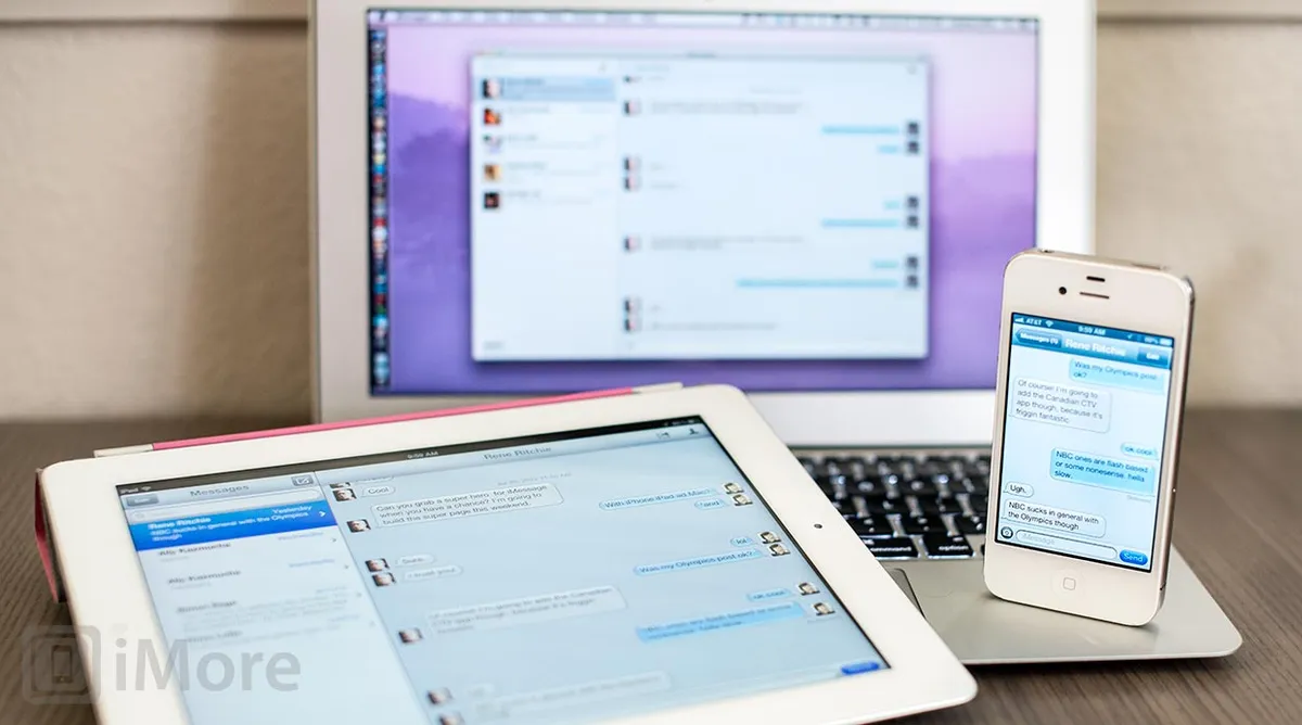
Previously, you could iMessage someone at their iPhone phone number or Apple ID, but only iPhones would receive the phone number iMessages, not iPod touches, iPads, or Macs. Now Apple is unifying the service so all your iMessages will go to all your devices.
When you log in to you Apple ID on an iPod touch or iPad, Apple will fetch any associated iPhone phone number and ask you if you want to add it to your iMessage send/receive list. Once you tap okay, Apple will alert you that the phone number (or additional email address, it works the same), has been added to your device, and list the device by name. As a security and privacy measure, Apple will also send the same alert to your iPhone and any other devices registered to the same AppleID. If FaceTime hasn't been likewise unified already, it will be registered as well and you'll get alerts for both of them.

Once that's done all your iMessages are unified (if not pacified).
Also, for those occasions when iMessage isn't working, or you simply don't want to use it, iPhone owners can now hold down on a message bubble, trigger the pop up menu, and choose to send as old-fashioned SMS instead.

iMessage still isn't as feature-filled as BlackBerry Messenger (BBM), but it doesn't need to be. It lets iOS users communicate without involving the carrier, and now it does it in an even more simple, unified way.
Calendar

With iOS 6, the Calendar app reaps the benefit of Facebook integration, allowing you to view your Facebook events and Facebook birthdays right alongside your iCloud, Google, and other calendars. Facebook events are marked with a small Facebook icon, and events you've been invited to but haven't accepted are outlined just like any other as-yet not accepted event invitation.

You can turn Birthdays and Facebook Events off inside the Calendar app by tapping the Calendars button at the top left and then unchecking them, but sadly that won't remove them from Notification Center (which can quickly fill with Birthdays -- as though they were breeding in there...) You can also turn the sync off completely in Settings, but that's the nuclear option. Apple should just kill notifications if they're turned off within the Calendar app.
Photos

One of the big additions to Photos in iOS 6 includes the only big addition to iCloud -- Shared Photo Streams. Another is the built-in Facebook posting. Both use the new Share Sheet, which Photos gets along with the rest of iOS, along with Mail, Message, Twitter, Assign to Contact, Print, Copy, and Use as Wallpaper.
For videos, the options are constrained to Mail, Messages, and YouTube. Yes, even though the Apple YouTube app is gone, its icon lives on in the Share Sheet. That's important because, as of this writing, the Google YouTube app for iOS didn't support uploads.
Posting to Facebook from the Photos app is quick and easy (see Facebook Integration, above). Shared Photo Streams have a few more options.
Shared Photo Streams
To share a photo, tap it, then tap the Action/Share button, and tap Photo Stream (looks like the Photos app icon) in the Share Sheet. You can choose to add the photo to an existing shared Photo Stream, or to create a new shared Photo Stream. If you create a new shared Photo Stream, you'll have to enter the email addresses of the people you want to share it with and choose whether or not you want to leave it public for anyone to see on iCloud.com. Then just add a comment (as you would on Facebook or Twitter), and tap the Post button.
Anyone sharing the Photo Stream with you will get a notification about the new image and any new comments added to it. You'll get a notification about anyone accepting a sharing invitation as well. Likewise, the Photos app will now show a badge if you have any new Photo Stream activity.
To see the Photo Streams you're currently sharing, simply tap the Photo Stream tab at the bottom of the Photos app. To see a photo, tap the photo. To see comments, add a comment, or like the photo, tap the comment bubble at the bottom right. You can change the sharing options of, or delete completely, any Photo Stream you shared by tapping the blue arrow to the right of the Photo Stream.

Given that Apple integrated Facebook and Twitter, it's interesting that they also chose to create Shared Photo Streams. There will be people, however, who don't want to join a social network but do want to easily, privately share photos with friends and family. As long as everyone is all-in on the Apple ecosystem, Photo Stream allows for just that.
Camera

The Camera interface has gotten a slight interface tweak, with a black bar on iPhone and iPod touch, and a subtler, more finished camera button on the iPad. On the iPhone 5 and iPod touch 5, you can even take a picture while shooting video now. There's also an all new Panorama mode.
Panorama mode
iOS 5 had a Panorama mode buried deep in the code that Apple chose never to release. Well, they've chosen to release it now, and it's pretty much as auto-magic as I'd been led to believe. Just tap options, tap Panorama, tap the Camara button, and start panning in a steady, level motion, and... That's it. iOS will take the stream and turn it into an up to 23 megapixel panorama.

It's incredibly easy to use, much easier than apps that take multiple shots and stitch them together, and it produces perfectly fine results. Other platforms, and variants of other platforms have had it for a while. As usual, Apple's approach isn't as flexible or configurable, but for many people that trade off will be just fine.
Videos
The Videos app loses video podcasts, which have moved to a standalone Podcasts app launched alongside iOS 6 (see the Music section, below, for a look at the new Podcasts app).
Although you can go to the iTunes Store app (see iTunes Store, below) to view a list of previously purchased iTunes videos, including Movies, TV Shows, and Music Videos, and re-download them to the VIdeos app, it'd be nice if Apple surfaced that here as well. I have on music video with an iCloud button next to it, but no Movies or TV Shows, so the functionality is there, it's just not consistent.
iTunes Match for movies is likely a non-starter with Hollywood, but an embedded version of the Purchased tab would be far more user friendly and efficient, and could co-exist nicely with the Shared (Home sharing) feature.
YouTube (Removed)

With iOS 6, YouTube is no longer a built-in app. The old app was developed by Apple but pulled data from YouTube. Apple didn't updated it aggressively and Google wasn't able to show ads in it, which is their core business. So, instead of it continuing to languish, far behind both the Android YouTube app and the mobile web app, Apple and Google let it die.
And now Google has released their own YouTube app for iOS. As features go, it has more of them. You can't upload from the Google YouTube app, but you still can from iOS via the ShareSheet, so it's not a functional problem. The only real problem is Google's abysmal support for AirPlay. If you try to enable it in-app, you get audio only and a popup telling you to use AirPlay mirroring instead. Then you get a slow, cropped, horrible, stammering experience that sends you running back to the web app.
If you just want to watch videos (with ads) on your iPhone, iPod touch, or iPad, however, it's great.
- Free - Download Now
Maps

With iOS 6, the old Google-powered Maps app is gone and in its place is an all-new, all-Apple Maps app, with data supplied by TomTom and others. Making a new Maps app solved a problem for Apple -- getting their biggest competitor, Google's, data hooks off of their platform and taking control of their own location destiny -- but did it solve anything for users? Did it result in a better Maps experience for us?
Google reportedly wouldn't let Apple have turn-by-turn, and now we have turn-by-turn. But we lost things as well, like StreetView. We gain Flyover, but we lose transit directions. If all of that sounds like one and a half steps forward and two steps back, you're not wrong. Re-building a Maps app from the ground up, especially one with custom made vector maps, fancy 3D models, and almost all the features users have become accustomed to is non-trivial. The engineering and design effort Apple had to devote to this, the companies they had to buy, and the integration they had to perform had an equally tremendous opportunity cost. The effort Apple put into replacing something came at the expense of that effort going into entirely new features.
This isn't iMovie or Final Cut Pro, however. This isn't a niche app that a segment of users will complain about until Apple has a chance to re-implement all the features the radical redesign was initially forced to shed. Maps are mainstream. Maps are serious. Maps are my mom and my sister not being able to find where they need to go.
Apple has a lot of currency with their user base. They're spending some here. The new Maps is beautiful, smooth, and at times, breathtaking. But it's not fully baked. Not yet. And it will be painful for everyone, Apple, users, and developers until it's done.
(Google is reportedly going to release a standalone Google Maps app into the App Store, and one far more competitive with the Android version of their Maps app, which could provide a strong alternative until, and even after, Apple has iOS Maps fully up to par.)
Mapping
Apple is licensing the raw map data from TomTom and others now, but they've redrawn all the map art themselves using resolution-independant vector graphics. Google did this for the Android version of Google Maps, but Apple hadn't for the old version of iOS Maps. The difference is striking. They scale quickly and accurately and look great from any angle. Apple also renders labels and iconography separately, so no matter which way you turn the maps, you can easily read and understand what's on them.
You can search for locations, just like before, though points of interest are better singled out, as are current location and current pin location. You have the same three basic modes as before -- standard, hybrid, and satellite. You access them, as well as Drop/Replace Pin, Print, Hide/Show Traffic, and List Results via the same page-curl button at the bottom right as before. If you zoom out far enough in standard mode you get a map of the world like you'd find in an atlas. If you zoom out far enough in hybrid or satellite mode, you get a 3D rendered Poly9 style globe that you can spin around.
The Arrow button at the bottom left will still pull you back to your current location, and a second tap will still orient you according to your current direction. Now, however, any time you're not pointing north, a new compass icon appears at the top right. Tap it and your orientation is returned north (and the compass icon will disappear until needed again). If you're in standard mode, you'll see a 3D button to the right of the Arrow button. Tapping it will give you a non-exciting angled view of the area. If you're in hybrid or satellite mode, however, the 3D icon becomes a building icon and tapping it will put you into Flyover mode (see Flyover, below).
Mapps includes local search and over 100,000,000 points of interest, everything from schools, to restaurants, to museums, to hotels, to Apple Retail stores, right on the maps, ready for tapping. In most cases, tapping brings up the popup menu for that location, in the case of traffic problems, like construction, however, you're given more precise details about the problem.
You can hide the popup menu by tapping it, and show it again by tapping the pin or icon that spawned it. The popup is labeled with the location name and Yelp rating, if any. On the right is a blue Arrow button. Tapping on the blue Arrow button brings up an information page on that location. If there's no Yelp data, Apple will show you whatever it standard data it has. There's a large, hero image spot on the information page that will get a static satellite photo if that's all Apple has. If there's Flyover for the location, you'll get a subtle pan of the 3D model. If there's Yelp data, you'll get a Ken Burns-style photo montage.
Yelp reviews, and photos. You can tap to read more reviews or see more photos, or you add your own, but you'll get sent on over to the Yelp app to do it. Likewise if you want to check in or write a tip.
On the left of the popup label used to the StreetView button. Now it's the Navigation button. Tap it and you're on your way. You can also enter into routing mode by tapping the new Right Turn icon at the top left. That's where Driving, Walking, and Transit (with a huge caveat) have moved to (see navigation and traffic, and transit, below).

All of this works very well, depending on where you live. In the United States, it's excellent. In Montreal where I live, it's been near flawless. However, different people in different parts of the world have reported less accurate data and results. Apple is continuing to bring better data to more locations, but there will likely be turbulence while they do (see Availability, below).
Navigation and traffic

Turn-by-turn navigation is hugely competitive market with well established players like Gamin/Navigon, TomTom, TeleNav and others, as well as free alternatives from the likes of Google on Android and Nokia on Windows Phone. You have to have some serious resources, not to mention mapping stones, to get into it, and that's exactly what Apple is doing in iOS 6. Navigation works for both driving and walking directions, and you can enter it turn-by-turn mode in one of three ways:
- Ask Siri to take you somewhere: "Take me home", "show me how to get to Yerba Buena Gardens", etc.
- Tap the Navigation button on the right of the location popup menu.
- Tap the Right Turn button and search for a route.
Siri is fast. Just ask for a place, you'll get sent right into the Maps app, briefly shown routes, and then automatically started on your way. Tapping the Navigation button only slightly less so -- if there are multiple routes you'll be presented with them, and you can tap to switch between them, or tap Start to begin. The Right Turn button gives you the most options. It allows you to switch between Driving and Walking directions with the Maps app, Transit directions in a third party app (if there is one), and switch between routes if multiple ones are available.
Once you're on your way and navigating, tap anywhere to exit full screen mode and get menus and buttons back. Tap End to stop navigating and return to Maps. Tap Overview to switch back to routing at the beginning, or to see your current location during the trip, and Resume to return to navigation. Tap the 3D button to switch between the standard and a slightly angled view. Navigation stays in standard mode, though, so not satellite imagery or fancy Flyovers here. If there's construction, you can tap the icon to get more information about it. Based on crowd-sourced traffic data, iOS will also alert you to any changes in traffic and offer alternative routes, along with an estimate of the time you'll save, if available.
If you exit the maps app, a green bar stays at the top of your screen to remind you navigation is ongoing (similar to the on-call, tethering, and other colored bars in previous versions of iOS). Voice navigation continues when you're outside the Maps app, and the green bar will even change to a sign overlay when turns are immanent. Navigation also persists even on the Lock screen. That's the advantage of a first-party solution.

Navigation gives good, clear instructions using Siri's voice. The animation is fantastic, with cinematic pans between sections and for changes in direction. Everything is beautifully illustrated, with faux sign posts for directions. I've used iOS Maps navigation frequently and it's worked well. On several occasions it's even worked better than well-known third party navigation apps, providing proper directions when they sent me in circles. Again, however, the quality of mapping data in your area will be the determining factor in how useful it is for you.
Flyover

Flyover uses 3D modeling to literally let you "flyover" cityscapes, from Sydney to Montreal, Cupertino to Paris. It looks absolutely amazing. It's not available in all cities yet, but a growing list of major ones. (Apple has to literally fly around and shoot the cities, then clean up and assemble the models.)
To enter Flyover mode, tap the 3D button at the bottom left of the screen when in hybrid or satellite mode (i.e., looks like model buildings rather than simply saying 3D. Then you can use one finger to move the screen around and two fingers to control the camera angle.

To call Flyover a demo or a commercial isn't fair, but neither is calling it a mapping service, at least not yet. It's more of a simulator, like an open world, but real world, game where, absent bosses to fight you can simply let yourself explore. Let yourself wander and wander. It's like a ride at California Adventure. I've lost hours to it.
But I've not once found it as useful for real-world location orientation as Google's StreetView was.
Transit

Transit is less a feature in iOS 6 than it is a casualty. Rebuilding Maps from the ground up was no doubt a Herculean task and getting it done in time for launch no doubt required compromise and came at a cost. Collecting transit information sounds like an arduous task with multiple, fragmented, fractious stake-holders. Google did all the heavy lifting for this previously, and as of now, Apple hasn't been able to replicate that effort.
So they're punting. In iOS 6, the Transit button remains in maps, but will now ship you off to a 3rd party App Store app to provide that service. When you search for directions, and choose Transit, a list of installed transit apps comes up and you can tap to launch one and get your routing information. If there are additional apps in the App Store, Maps will show those to you as well. Then it's between you and the 3rd party app.

This might be a boon for 3rd party transit apps, but it's reduction of service for users. Instead of one, unified, consistent experience, everything from quality to interface will vary from app to app -- if an app is even available in their area.
Whether or not Apple leaves it this way, or whether they introduce their own transit directions in a future update remains to be seen. For right now, I'm lucky, I have a great transit app available to me. But if you don't, that doesn't help you one bit.
Reporting a problem and adding a location
The advantage to having hundreds of millions of users on your platform is that anything like Maps will get pounded on, relentlessly, by those users. There's immense value in crowd-sourcing all of that data and feedback, and using it to improve the system. Apple, to their credit, is making that easy in iOS 6.
To inform Apple (and presumably their partners) of any problems, inaccuracies, or omissions in their mapping data and points-of-interest (POI), just tap the page curl at the bottom right, tap Report a Problem above the Print button, and then select the type of problem you want to report: Search results are incorrect, street or other label is incorrect, location is missing, problem with directions, problem with satellite image, or if none of those fit, my problem isn't listed.

The rest is up to Apple. If they take advantage of the potential feedback pool here, they'll have tremendous opportunity to iterate and improve iOS 6 Maps quickly. And they need to.
Weather
Weather in iOS 6 is unchanged when it comes to functionality, but the interface has been redesigned and the weather images redrawn to be sleeker and more modern.

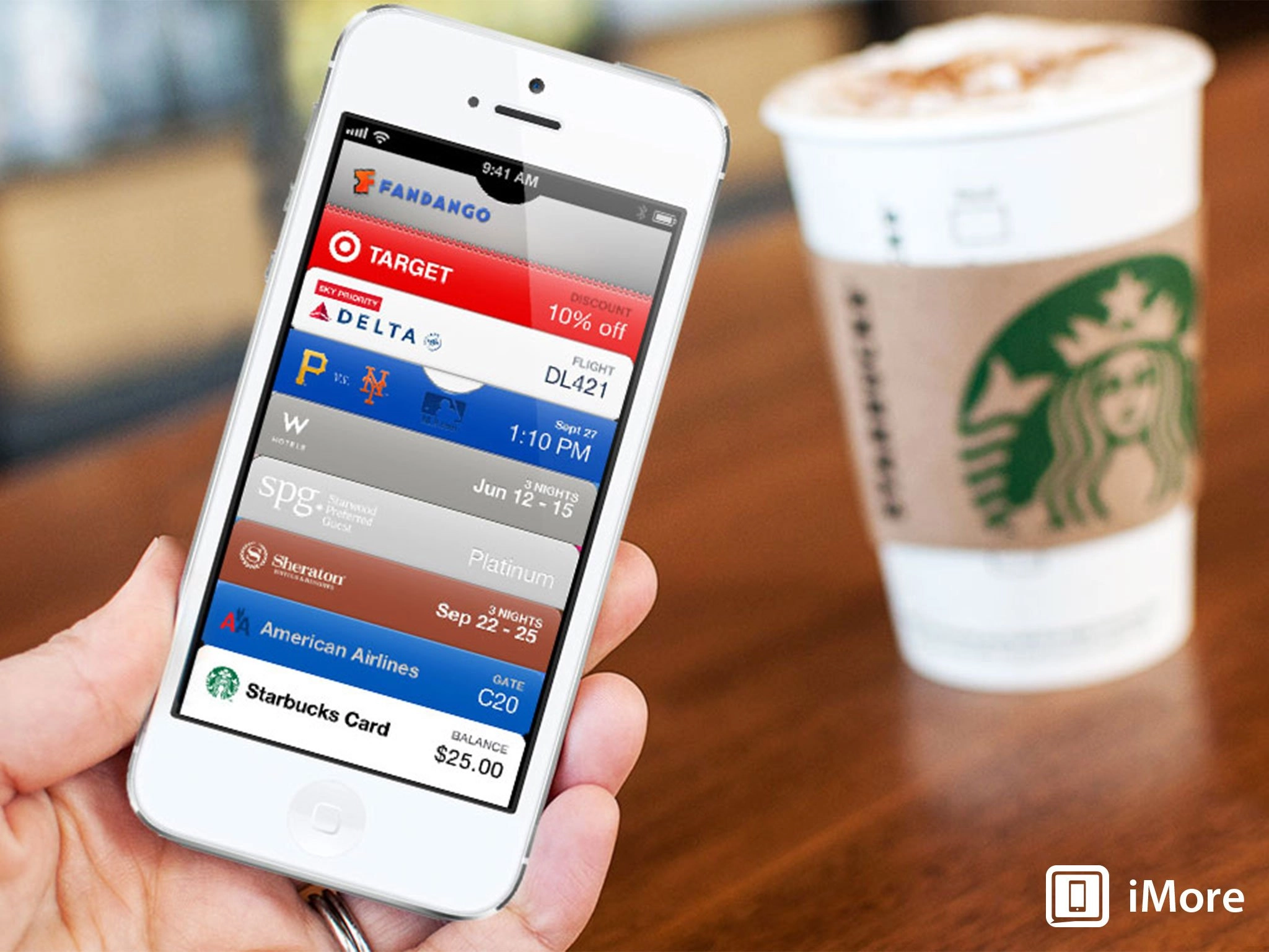
Passbook

Passbook is a brand new, built-in app for iOS 6 designed to serve as a one-stop repository for all the tickets, coupons, gift cards, and other vouchers provided by third-party App Store apps. That means all the stuff in your Apple Store app, Starbucks app, Delta app, Fandango app, and more is easily accessible via a single Home screen icon. Apple contrasts this with the pre-iOS 6 experience of having to fumble for an app then fumble for a pass inside it. If you remember you have a pass. Since Passbook knows what time it is and where you are, it can put whatever card you need right on your Lock screen, right when you need it.
The way it works it simple. Passes are JSON files with bundles resources that can be presented to you in apps, or as links on the web or in email messages. Tapping them inserts them into Passbook. That means you don't need to have the Starbucks app installed to used Starbucks gift cards in Passbook, or any 3rd party app for that matter.
When you get to the airline gate, the Starbucks line, or the movie theater, however, instead of having to find the appropriate app, launch it, and then find the appropriate pass in the app, Passbook collects them all together for you in one place. (And Apple has gone to some length to make their passes good looking, and to help developers make their passes good looking as well.)
To use a pass, tap it and it will come up out of its slot and take over the screen. If you have more than one pass for the same thing -- 2 tickets for Amtrack, 3 coupons for Target, etc. -- you can swipe between them. If the pass is a gift card, it can show up-to-date balance information right on the front. If the pass is a ticket, and something like the gate changes, that will also be displayed right on the front.
To see additional information about a pass, tap the info button at the bottom right and it'll flip over, just like the Weather or Stocks apps. On the back, you can pull to refresh, toggle Lock screen notifications on or off, and see additional information like confirmation numbers, locations, and other details about the specific pass.
And if you don't want the pass anymore, you can tap the trashcan button, confirm the deletion, and Apple will turn it into skeuomorphic shreds right before your eyes.
Passbook can also present Lock screen notifications so, when the right time comes, or you arrive at the right place, your passes pop up. If something changes, like the gate information, you'll get a notification as well. And multiple notifications stack up, just as you'd expect.
On the negative side, while Passbook itself is excellent, some of the apps that feed passes to it are still dreadful, thin website wrappers with horrible user experiences that make selecting, paying for, and getting to the point where you can add the pass to Passbook an arduous and annoying process.

Passbook is interesting in that a) instead of making a repository for something traditional, like documents, Apple is doing it for something still on the horizon, digital vouchers; and b) unlike Google and Microsoft, it's not yet a real mobile wallet with built-in payments.
That makes Passbook stuck in both the past and the future. It has QR and bar codes, not NFC or other wireless transaction processing. It leaves payment in the hands of 3rd parties, not Apple's massive iTunes cash register. in those regards it feels like a first step, a testing of the waters -- a way to make the mainstream comfortable and want more of the convenience.
The only question is how long it takes mainstream users to decide those waters and fine, and want to dive in, and for Apple to get the partnerships in place to take that next step. For now, however, Passbook trumps apps, and makes it easier than ever to swipe, scan, and go.
Clock

The iPad has a clock app! It works the same way as the iPhone and iPod touch clock apps that predate it, but with an interface better suited for the bigger screen.

Sadly, the iPad still does not have built-in Stocks, Weather, Voice Memo, Compass, or Calculator app like the iPhone and iPod touch.
You can also now pick any song in your Music library to serve as your alarm sound. Just pick an alarm, tap Edit, tap Sound, and then tap either of the pre-loaded songs or tap Pick a Song to choose something else. Simple, but a great addition.

Reminders
Reminders remains much easier to add to with Siri than it is to add to with the tap-heavy app itself. However, with iOS 6 you do gain the ability to re-orders tasks in a list using the same Edit and drag process other apps have enjoyed since the early days of iOS.
iTunes Store
The iTunes Store, first launched as part of iOS 1.1 (iPhone OS 1.1) alongside the original iPod touch now get a new, darker makeover. The functionality really hasn't changed, nor has the search taken on the new App Store interface.
The iTunes Store also remains an HTML5-filled app, which even Facebook has now abandoned for their iOS app. That means it's slow and subject to the whims of network connectivity. There's likely no helping that for now, though. iTunes needs to be updated so often, it's the only way to do it.
One thing that does help, though, is iOS' extended use of embedding as mentioned in the Home screen section (above). If you tap on something that has an associated app, like the iTunes Music Festival, you don't get sent into the App Store. The App Store page comes to you, and once you're done you can keep on browsing media.

App Store
The App Store gets the same new, darker look as the iTunes Store, but the interface has gotten an even greater overhaul. Especially search. Apple has also fundamentally changed the way the App Store handles password requests, and how they handle the download process in general.
Apple has been messing with the App Store search algorithms for several months now, in some cases making things better and more logical, in others seemingly breaking them completely. It's likely a work always in progress and right now the results themselves seem okay. It's the new interface that's problematic.
Gone is the drab of informationally dense list view that let you see a large selection of apps at once and choose the one that caught your fancy. Now you get a card-based view (not dissimilar to Safari Pages) which really on shows you one app at a time. This means you have to swipe a lot more to see options, and developers face a tougher time than ever getting noticed -- unless they're the first or second search result.
So it looks better but it doesn't work better. If anything Apple should be exploring metaphors like this for the fast app switcher, not App Store search. To get an idea of the loss of efficiency, imagine if Google worked this way...

A better solution might be to restrict card view to landscape mode, like CoverFlow in Music, and either go back to list view for portrait mode, or use the new category format to show differently sorted search results, like most relevant, highest rated, most "liked", most recent, etc.
App Store pages themselves get a new layout, the Share Sheet, and the ability to Facebook Like (and Unlike) right from the Reviews tab. There's also a tab that shows you Related apps, both from the same developer and based on what customers who downloaded the app have also download.
Overall, it's a more finicky layout but it does provide more information on the apps themselves. There are still no demo videos, but there are tabs to see more apps by the same developer and to get the app's update history. Also, if you already have the app installed, instead of a price-tag Buy button or Download/Update button, you get an Open button that sends you straight to the app.
On the hugely positive side as well, Apple has solve two long-standing annoyances with the store itself. First, you no longer have to enter your iTunes password to update apps. Just tap and install. And installing an app no longer boots you out of the App Store. They install while you stay in the store. If you remain on the app's page or the update page, a progress bar at the bottom of the app icon will tell you the download progress. This does come at a cost for brand new users, who may be left wondering where their new app went (since they're no longer taken out of the store and forced to watch it install on the Home screen, where they can find it again later). To help mitigate that, Apple is wrapping a tiny "New" ribbon around freshly installed apps. While this compromise is slightly worse for the uninitiated, it's far, far better for the vast majority. How many real stores take you home and make you watch as they hang your new trousers, after all?

There are still no vides, still no upgrades, still no demos, still no children's section, still no so many things. But the App Store, being an HTML5-fed app like the iTunes Store can enjoy some small level of update whenever Apple wants. And iOS 6, if nothing else, shows Apple is still working hard on the App Store experience.
Game Center
Game Center gets Challenges, so you can tap scores or achievements and trash talk your friends even more than previously. Speaking of friends, with your permission the new Facebook integration can try to hook you up with the people you already know. And yeah, you can swipe and delete Game Center entries for games without having to delete the games anymore. Nice. Fine.
But the really big news for Game Center is, thanks to OS X Mountain Lion, it now goes across Apple's entire product line. That's right, you can challenge and play your friends not just on iPhone, iPod touch, and iPad, but Mac as well. And vice versa. And thanks to AirPlay Mirroring now being ubiquitous on all the latest devices, you can all push your games through an Apple TV and onto the big screen HDTV if like.

We're not there yet, not by any stretch, but if Hair Force One and Faux Stig (see WWDC screenshot, above) are any indication, we're witnessing the death of the dedicated, non-portable console box. The future of gaming mobile and projected. Casual gaming is already there. More will follow.
FaceTime

FaceTime now unifies iPhone phone numbers with Apple IDs, just like Messages (see Messages, above). It can now also be used over the cellular network, if your carrier chooses to allow it, and if you're on an appropriate plan, if your carrier chooses to restrict it.
(Skype has been doing this for a while. It's utter garbage that the carriers try to prevent iOS from doing the same.)
Phone

The Phone app gets an all new, very silver dialer. I wasn't a fan when I first saw it and while it doesn't bother me as much as it used it, I still don't find it visually pleasant. Your tastes will of course vary. Phone also enjoys all the benefits of Do Not Disturb (see Notification Center, above) but also gains a few additional features all its own. The first lets you decline a phone call while replying with a canned or custom iMessage or SMS message. Reply with Message options all begin with "Can't talk right now..." and you can choose from:
- I'll call you later.
- I'm on my way.
- What's up?
- Or a custom message of your choosing
The second lets you decline with the Remind Me Later feature. Options here include both timed and geofenced, location-based reminders:
- In 1 hour.
- When I leave.
- When I get home.
- When I get to work.
To get to these options, Apple provides a variation of the fast Camera access system they introduced in iOS 5 and improved on in iOS 5.1. When you get a call, you're shown a phone icon to the right of the usual Slide to Unlock control. Swipe it up and you're shown both the Reply With Message and Remind Me Later options. Tap the one you want, and you're done -- your Message is sent or your Reminder is set up.
Interestingly, neither option showed up when I received Skype calls, but did when I received land-line calls that don't have messaging capability.

Reply With Message harkens back to when Bill Gates shocked the mobile world by taking the CES stage with Ed Colligan to announce the first Windows Mobile Palm Treo. It seemed like genius magic back then. It seems like practical feature now. Tying location into call reminders is smarter, but Apple still isn't pulling the trigger on contextually predictive features. If my iPhone knows I have an appointment across town in 15 minutes, and it knows traffic and timing is such that I can't make it, why not alert me and give me the option to message or call my predicament and reschedule?
That'll be one of the next competitive battlegrounds, and Apple has all the pieces in place to execute on it, if they so choose.
Lastly, 5 years later and Apple still hasn't given us a simple Setting switch to turn off alert beeps and buzzes when we're on phone calls. If the proximity sensor can turn off the screen and the touch sensor, we should be able to tell it to turn of notifications if we don't want them rattling our skulls when our phones are at our ears.
Mail gets in-app App Store embeds, as mentioned previously (see Home screen, above) and a host of other small but convenient features that as a whole greatly enhance usability.
Loren Brichter-inspired pull-to-refresh is now in Mail, and is also now a standard control developers can use in iOS 6 apps. Unlike the original Tweetie version that inspired it, iOS refreshes at the apex of the pull, and doesn't wait for you to release first. Even in an era of push email, pull-to-refresh is therapeutic and empowering, if nothing else.
There are two new, specialty inboxes in iOS 6 mail -- VIP and Flagged. Anyone you add as a VIP in Contacts gets put in the special VIP inbox, and any messages you flag in Mail, get put in their respective, dedicated inboxes so you can more easily find them later.
You can now attach photos or videos to an email already in progress without having to leave the Mail app, go copy the photo, and come back. Just tap and hold to get the menu popup, tap the arrow to step through the menu options, and tap Insert Photo or Video, and voila. Sadly, it doesn't help with any other kind of file you might want to attach, like an iWork document. But: baby steps.
Each email account can now have its own email signature, so your work email and home email, for example, don't all have to be stuck with the same "Sent from my iPhone" if you'd rather they not be so stuck.
You can also tap and hold the Compose New Mail button at the bottom right to get a list of saved draft emails, if you want to continue writing something previously started.

Again, nothing jaw-dropping in and of itself, but some good updates to an already usable mail system. Now we just need some hot mark-all-as-read action...
Safari

Safari has been on the iPhone since the first version launched in 2007, and has been steadily improved, year after year, version after version, ever since. iOS 6 follows the same, steady, evolutionary pattern, addressing perennial user pain-points like image uploads, and providing parity with features from other browsers, like Chrome's tab sync. It also makes Reading List more robust, and provides an interesting way for websites to alert users about, and move them into, apps.
First off, Safari gets the new Share Sheet, with options for Mail, Message, Twitter, Facebook, Add to Home screen, Print, Copy, Bookmark, and Add to Reading list.
Safari on iPhone and iPod touch also now have a similar Full Screen button to the Videos app. Tap it, and the content fills your screen and only ghosted back/forward and exit-full screen mode controls remain. This was likely necessitated by the new 16:9 aspect ratio of the iPhone 5 and iPod touch 5. Landscape navigation bars were long enough on the old devices, they'd make the new ones look ridiculously vertically stunted.
iCloud tabs let you see pages that are open on any other iOS or OS X device you have logged into the same account. So, if you start reading a page on your MacBook, you can instantly open it on your iPhone while you take the bus, and iPad while you sit at the coffee shop, and never lose your place. (If other people have access to your devices, make sure you exercise discretion about which pages you leave open -- nothing like NSFW content popping up for others at work, or at home, to stumble upon...)
On the iPad, iCloud tabs have their own, iCloud-shaped button. On the iPhone and iPod touch, they can be found via the Bookmarks button.
What's more, you can tap and hold the back/forward navigation buttons to reveal a history selector for the current tab.
Reading List, introduced in iOS 5, has been extended with an offline mode. Now, when you save pages to Reading List, Safari will download a copy of the contents and keep it available to you, even if you don't have a connection when you want to read it (for example, if you're on the subway to or from work).
Photo uploads fix one of the longest standing problems with iOS. At long, long last, Safari will now intercept buttons on web sites that try to access your file system, and present you with the Camera app or Photos app image picker instead. So adding avatars and putting pictures on social networks can now be done directly in Safari. Hallelujah.
If you go to a website that also has an App Store app, like Yelp! -- or iMore eventually! -- the website can tell you about the app with a Smart app banner, and give you a button to view it in the App Store. If you already have the app installed, the Smart app banner will give you a button to open the app, and take you to the same place in the app that you were looking at on the website. (Likely not automatically, but using some form of URL scheme.)

As much as Apple added, they also took away -- just like OS X Mountain Lion, they've removed built-in support for RSS and, if you want to keep reading them, will now politely direct you to the App Store to buy an app. I found Safari RSS hugely convenient on both iOS and OS X, and it's annoying that it got floppy disked. But that's Apple's way.
Broken down, it's taken so long to get image uploads into Safari that almost every popular website has already created an app to provide that functionality. Still for sites that haven't, it's a welcome addition, long past due. iCloud tabs can be handy for someone who has a lot of Apple devices. The Instapaper inspired Reading List still won't be enough for power users, but it's finally beefy enough to be useful for most casual users. Smart banners once again show Apple's prioritization of apps over web content, and given how much of a better user experience native apps remain, that's not a bad thing.
Taken together, the Safari update is very good. There are the usual enhancements to the Nitro JavaScript engine so performance is excellent, and no doubt on the new iPhone 5 hardware will be even better.
Music

Music gets a new, silver-style interface in iOS 6, at least for iPhone and iPod touch. (iPad had it already.) Like Videos (see Videos, above) Music loses podcast content to the new, dedicated Podcasts app available in the App Store.
If you have iTunes Match enabled, you can no longer swipe-to-delete songs in the Music app. iTunes Match manages storage automatically, deleting locally cached music when storage runs low. If you turn off iTunes Match, you can again manually delete music.
Podcasts

Shortly after Apple unveiled iOS 6 at WWDC 2012, they released the standalone Podcasts app into the App Store. They've now updated it to support both iOS 6 features and the iPhone 5's taller screen. I originally intended to include all of this in my iOS 6 review but due to size and time constraints, I'm posting it separately, and belatedly.
Before the release of the dedicated Podcasts app, podcasts were downloaded via the iTunes app and could be played back in either the Music or Video app, depending on whether they were audio or video podcasts. That split, along with with the lack of any ability to subscribe to podcasts, made it a less than ideal experience, which numerous third party apps tried to solve).
Apple's attempt to solve it themselves is similar in structure to iBooks or Newsstand. It has a place to find your existing content and a place to get more content, in this case the Library and Catalog views. (Since podcasts are all free, it's not called a "Store" as it is in other, similar Apple apps, but it's functionally similar.)
The Library view organizes your shows in either a grid view, featuring album art, or a list view. To see the episodes of a particular podcast, tap it. There's pull-to-refresh support so you can check for new episodes at any point. From the episode view, you can tap an episode title to start streaming it immediately, the white downward arrow button to start downloading it (the 50MB limit applies if you're on cellular), or the the blue arrow button to get more information, including episode descriptions (which should include show notes, but since links don't function, they're essentially useless). You can also hit the share button to access the Share Sheet so you can Mail, Message, Twitter, Facebook, or Copy the podcast link.
Tap the podcast artwork or the arrow to the right of it to see options for that podcast. Options include the ability to toggle the podcast subscription on or off, auto-download on or off, the sort order (oldest or newest first), the play order (oldest or newest first). You can also mark all episodes as played or unplayed.

When an audio podcast episode is playing, you get full screen album art that, unlike the Music app, is properly centered. Tapping the list view button at the top right gives you a list of additional episodes, so you can easily switch between them. Tapping the album art, which replaces the list view button at the the top right, takes you back to the main player screen. This is pretty much the same behavior as the Music app, and the consistency is appreciated.
Basic controls are also consistent in behavior if not in look. In Podcasts the buttons are big, gray, industrial, and almost old-school looking. You have play/pause and skip back/forward, and if you hold down on skip back/forward, you get rewind and fast forward. There are also two new controls, a 15 second skip back and skip forward. They're useful if you missed something and want to quickly re-listen or re-watch it, or if you want to hurry through a segment you don't enjoy. De-emphasized beneath them are the volume scrubber and the AirPlay button (if an AirPlay device is detected).
Unlike the Music app, if you tap the album art you aren't taken to list view. Instead, the album art lifts up to reveal a heavily skeuomorphic options panel that fills much of the screen with an old-style reel-to-reel tape player. It also provides controls for sharing (with the same sheet as above), for listening speed (1/2x, 1x, 1 1/2x, 2x, and 3x), and a sleep timer (off, 5, 10, 15, 30, or 45 minutes, 1 hour, or when the current episode ends.) There's also a positional scrubber with a tiny red line indicating your current time index in the podcast. While the touch-point appears tiny, it works just like the positional scrubber in the Music app. You can also reveal the options screen by using the small "gripper" control at the bottom of the album art to pull it up. To return to the player screen, grab the gripper -- now at the top -- and pull it back down. Strangely, you can't tap the tape deck to pull it down the way you can tap the album art to pull it up. No consistency points there. (or fit and finish points.)

Also, even though Podcasts is an App Store app, it does seem to enjoy certain privileges not afforded other App Store podcast apps. Namely, Podcasts gets to use its special controls on the Lock screen and in the fast app switcher. Instead of the standard skip forward/back buttons, which annoying skip entire episodes for other players, the 15 second forward and backward buttons are presented instead. If other players do have access to the same controls, hopefully they'll implement them. If they don't, Apple should make them available so everything in the App Store stays as fair and functional as possible.

The video player interface is different than the audio player interface. Unlike the audio player, the video player isn't given the same character or style, and there's no skeuomorphism in sight. Instead, it's almost identical to how podcasts used to be played in the Videos app. It does add a playback speed button, however, but without the 3x option. There's a fullscreen/widescreen toggle, which is more important on previous 3:2 iPhones and iPods than it is on the 16:9 iPhone 5 or iPod touch 5. Also missing are the new 15 second back/forward buttons, and in their place the single, old 30 second back button. It's also the only part of the Podcast app that supports landscape orientation (though you can watch in portrait as well if you really want to).

Unlike iBooks or Newsstand, Podcasts also has a strange hybrid area that's in the Library section but provides Catalog content. It's called Top Stations and it's another way for Apple to display featured or recommended content, but using a radio dialer metaphor rather than the usual iTunes Store list display. It's accessed through a huge tap at the bottom of the screen, and given equal waiting to the podcast library itself, which is interesting.
At the top, you can toggle between audio and video podcasts. On the "tuner" band you have the basic iTunes podcast categories on top and under them, the sub categories. Under that you have large-sized album art for 5 shows, one on top of the other. Swiping horizontally moves you through sub-categories and then categories. Swiping vertically takes you through the recommended podcasts. Horizontal and vertical scrolling is independent, so if you swipe down to the fifth podcast in one category, you'll still be shown the first one if you swipe over to a different category. Tap the artwork and the latest episode will start to play. Otherwise, if you linger for a momentarily, an info icon will appear to the bottom right of it. Tap it and you'll get a list of episodes and a Subscribe button.
It's a visually dynamic way to suggest new shows, and a novel way to bring "Store/Catalog" content into the "Library" part of the app. It'll be interesting to see if we get analogs to this in iBooks and Newsstand (racks?), and the other player apps like Music and Videos.

The Catalog section is what used to be the Podcasts section in the old iTunes app, but all done up in the new iTunes app style. Tap the Catalog button and you get the iBook's style revolving door animation. Inside, there are tabs for Features, Audio, Video, Charts, and Search. If you tap Charts, you start off with an audio and a video chart combined on one page with horizontal scrolling, along with a Categories button at the top left to get more specific charts. If you you tap "See All >" you get a proper vertical list view of either audio or video podcasts. The Categories button, however, gets awkwardly re-prositioned next to the the back button for Charts, which squishes the screen title between it and Library (which sometimes appears and sometimes doesn't), and truncates it beyond the point of usefulness.
There's also a lack of consistency for audio icons, with the toggle using the fairly common speaker icon, and the tab bar using a chunkier, rounder speaker glyph, which is odd.

Search bifurcates between episodes and podcasts. The episode results page is the more chaotic of the two, presenting stacked vertical lists of 4 episodes each that you can scroll through horizontally, as well as a large set of album art for related podcasts that isn't vertically stacked but can also be horizontally scrolled. For the episodes, tapping on the downward arrow beside a specific episode starts it downloading that episode. Tapping on the album art or the episode title, or anything else for that matter, takes you to the podcast page. In the podcast results tab, you're simply given a list view of shows that match the search results. Tap on any one of the podcasts and you're taken to its information page.
On the individual podcast pages you get general information about the show, including the artist, rating, category, and can hit the Subscribe button to add it to your library. You also have tabs for the show's Details, which includes the description and episode lists, Reviews, which lets you Like a show via Facebook, along with the regular iTunes reviews, and Related, which shows you more podcasts from the same artist, and more podcasts in the same sub-category.

If you have more than one iOS device, iCloud support will sync your subscriptions between them, as well as maintain your last position.
Overall, the Podcasts app adds a lot of features that were sorely missing from Apple's original iTunes app podcast implementation. It isn't perfect, and indeed a lot users are finding it buggy and frustrating at times. Episodes mark themselves as unplayed. Interaction with iTunes on the desktop is unfinished to say the least. The Podcasts app is also plagued by a general bug in Apple's audio API that causes audio playback to re-start after using Siri or placing a call.
Hopefully Apple continues to polish and improve it, though given what's happened with the App Store app recently that's a double edged sword at best.
The feature Podcasts needs most now is background downloads. If Newsstand can fetch your periodicals every morning, Podcasts should be able to fetch your podcasts when you're plugged in and connected to Wi-Fi. However, Apple doesn't allow other App Store apps to do that, so either it would be an unfair competitive advantage, or Apple would finally have to make a background downloading API available to everyone. I've heard rumors of the latter, so lets hope it's coming, and sooner rather than iOS 7...
Power users may want to stick to a power client, of which the App Store has several, but for those who simply want to enjoy the occasional podcast, as well as iCloud sync and Apple-style integration, Podcasts is a great choice.
- Free - Download now
Bottom line
iPhone OS 1.0 was all about delighting users with a an enthralling multitouch interface and a fresh new take on the smartphone. iPhone OS 2.0 to iOS 4 were about filling in and rounding out features and functionality, and making the iPhone, and later the iPad, an ecosystem. iOS 5 was about taking the iPhone and iPad to the iCloud.
iOS 6 is all about preparing for what comes next, and unfortunately for users this time around, a lot of that has to do with Apple. There's never a good time to go back and rebuild things users don't think need rebuilding, like Maps, or set up things that won't be fully realized for another generation or two, like Passbook. Yet Apple is choosing to do all of those things, and more. And they're choosing to do them now, in iOS 6.
Android remains a relentless competitor, but Google is being forced to go back and work on user experience, cohesiveness, and consistency, something Apple nailed in iPhone OS 1. webOS has been murdered by HP. Windows Phone is as much held back as it is supported by a Microsoft obsessed with Windows everywhere, and is yet to find a clear story or market. BlackBerry won't even have a shot at a relaunch into early 2013. And the Facebooks and Amazons are still more vapor than ware.
Apple seems to believe they have an opportunity, right now, to fix some of the problems they themselves have been facing. They seem to believe the tock in their product update cycle that includes the Retina iPad, iPhone 5, and perhaps iPad mini give them the chance to repatriate and reforge the vital elements of their platform.
In a perfect world, Apple could do everything all at once. But we don't live in a perfect world. We live in a world of opportunity costs, where even one of the richest, most successful companies on earth has to face certain realities. Namely, engineering talent is as limited as time itself. The money and effort expended on redoing Maps and expanding Siri couldn't be spent on actionable notifications, inter-app communications, new fast app switching metaphors, or any of the other higher hanging fruit iOS arguably still needs.
Compared to previous versions of iOS, and compared to competing platforms, iOS 6 doesn't have the same level of customer facing pizazz this year. Sure, there's Do Not Disturb and the new Privacy features, FaceTime over 3G, Siri for iPad and iPod touch, VIP mail, Panorama photos, Safari image uploads, single-app-mode, and many small, satisfying gems, but making a new Maps app was a huge amount of work for Apple that couldn't be spent elsewhere. And positioning Siri and Passbook for the future compromised Apple's ability to deliver on the present.
So yes, iOS 6 is a software update divided against itself. But taken as a whole, as the sum of all its new and better features, it's still strong enough to stand. Now that they've positioned the platform for the future, however, the bigger challenge Apple faces is nailing what comes next.
Leanna Lofte and Ally Kazmuch contributed photography for this review

