Review Video Evolution Siri + Search Wallet + Apple Pay Notes Maps News QuickType iPad multitasking Safari Performance Security Efficiency Miscellany Bottom Line
After the radical redesign of iOS 7, which gave us a cleaner, more flexible experience, and the functional revolution of iOS 8, which extended and continued that experience between apps and devices, iOS 9 takes a moment to solidify and round-out everything that's come before, and start us towards everything that's coming next.
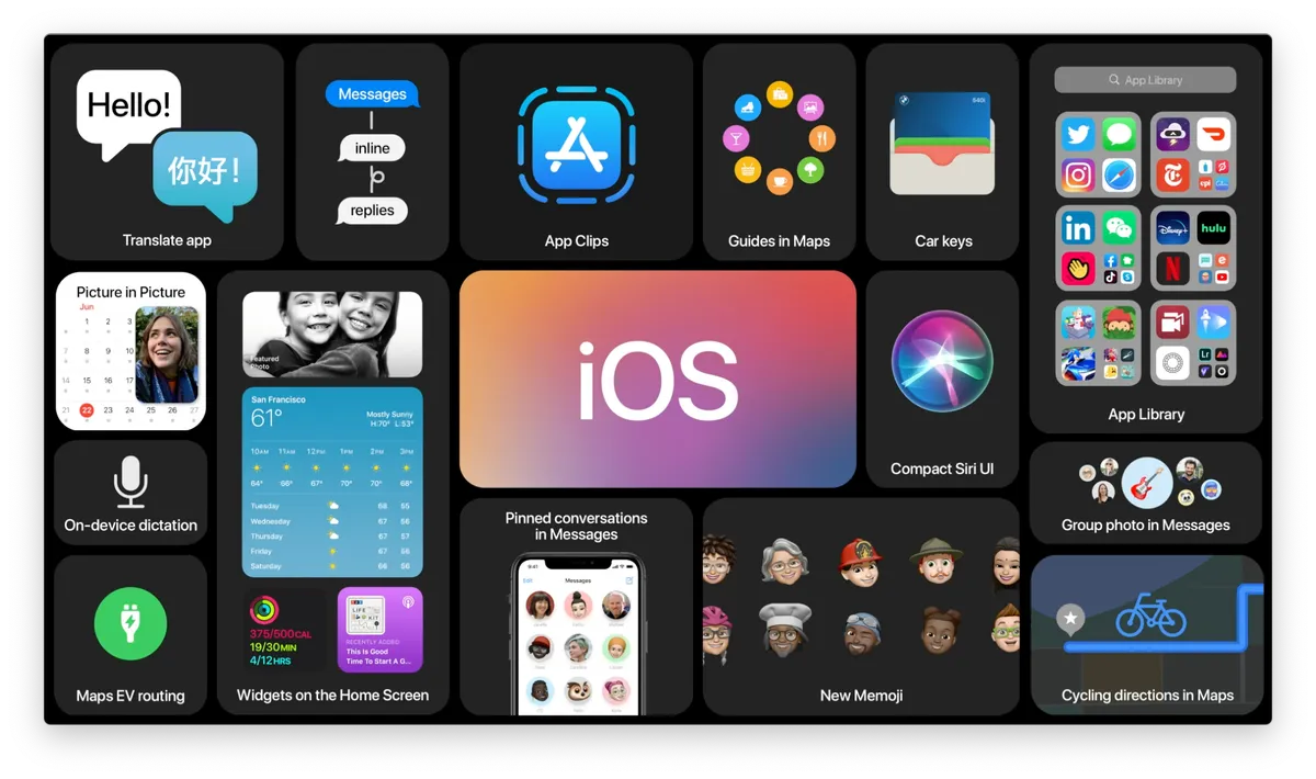
This includes making Siri and Search broader and more proactive, expanding Apple Pay, rebuilding Notes, adding transit to Maps, launching a News app, enhancing the QuickType keyboard and bringing multi-app multitasking to the iPad, amping up performance, extending battery life, tightening up security and privacy, and making the update process much more efficient.
Absent the radical and the revolutionary, then, iOS 9 has to deliver on the promise not of more but of better. After the giant leaps, it has to stick the landing. So, does it?
- Read the iOS 9 review in ebook form on the iBookstore! - $1.99 - Download now!
iOS 9 video review
Give us four minutes and we'll give you the biggest highlight of iOS 9.
iOS 9 evolution
| Header Cell - Column 0 | Header Cell - Column 1 | Header Cell - Column 2 | Header Cell - Column 3 | Header Cell - Column 4 | Header Cell - Column 5 | Header Cell - Column 6 | Header Cell - Column 7 | Header Cell - Column 8 |
|---|---|---|---|---|---|---|---|---|
| Version | iPhone OS 2 | iPhone OS 3 | iOS 4 | iOS 5 | iOS 6 | iOS 7 | iOS 8 | iOS 9 |
| Year | 2008 | 2009 | 2010 | 2011 | 2012 | 2013 | 2014 | 2015 |
| Name | Big Bear | Kirkwood | Apex | Telluride | Sundance | Innsbruck | Okemo | Monarch |
| Features | App StoreEnterprise enhancementsiPhone SDKMicrosoft Exchange | Accessories accessCalendar enhancementsCut, copy, and pasteEmbedded MapsIn app purchaseLandscapeMMSPeer-to-peer connectivityPush notifications (redux)Spotlight searchStocks enhancementsVoice Memos | Enterprise enhancementsFoldersGame CenteriAdiBooks for iPhoneMail enhancementsMultitasking | Camera enhancementsGame CenteriCloudiMessageNewsstandNotification CenterPC freePhoto enhancementsRemindersSafari enhancementsTwitter integration | Accessibility enhancementsApple mapsChinese enhancementsFacebook integrationFaceTime over cellularMail enhancementsPassbookPhone enhancementsSafari enhancementsShared Photo StreamsSiri enhancements | AirdropCamera enhancementsControl CenteriOS in the CariTunes RadioiWork for iCloudMultitasking enhancementsNotification Center enhancementsPhotos enhancementsSafari enhancementsSiri enhancements | ContinuityExtensibilityFamily SharingHealthHomeKitiCloud DriveInteractive NotificationsMessages enhancementsPhotos enhancementsQuickTypeSpotlight enhancements | Siri intelligenceSearch (new)Apple Pay enhancementsNotes (new)Maps (transit)NewsMulti-app (iPad) |
| Extras | Contact searchLanguagesMail enhancementsMobileMeParental controlsQuick look enhancementsScientific calculator | Open GL ES 2.0Video RecordingVoice Control | 720pFaceTime | 1080pSiri | Panorama mode | 120fps Slow motionBurst modeFaceTime AudioOpen GL ES 3.0Touch ID | 240fps Slow motionAdaptive UIApple Pay | 3D TouchLive Photos4K video |
Each new version of iOS expands upon, refines, and ultimately advances all the versions that have come before. For details on those previous versions please see the previous reviews:

Previously...
- iOS 8 review
- iOS 7 review
- iOS 6 review
- iOS 5 review
- iOS 4 review
- iPhone OS 3.0 review
- iPhone OS 2.0 review
Compatibility and updating
You can download and install iOS 9, for free, on any device capable of running iOS 8. That includes every iPhone, iPad, and iPod touch released since 2011.
- iPhone 6 Plus
- iPhone 6
- iPhone 5s
- iPhone 5c
- iPhone 5
- iPhone 4s
- iPad Air 2
- iPad Air
- iPad 4
- iPad 3
- iPad 2
- iPad mini 3
- iPad mini 2
- iPad mini
- iPod touch 6
- iPod touch 5
Note: Not all features are available on all models. Some require more recent processors or other hardware. We'll note them as and where applicable in the review.
iOS 9 Siri & Search
Siri is Apple's virtual personal assistant. It launched as a beta in 2011 and has been improved and expanded upon every year as part of iOS feature releases, and continuously as part of server-side updates. Most recently that's included new Apple Music commands, and backend improvements that Apple says have made Siri 40% faster and more accurate. But then, when you're handling a billion requests a day, you can never be too fast or too reliable.
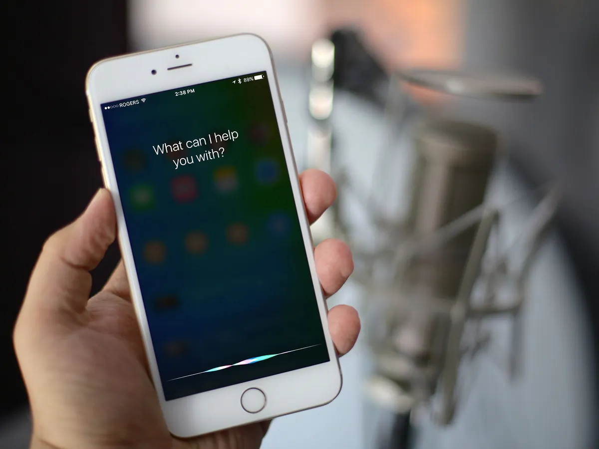
With iOS 9, Siri is getting a new interface that looks like Siri on the Apple Watch, with a side-to-side pulse straight out of KITT from Knight Rider or the Cylons from Battlestar Galactica, only in multi-color and multi-wave style.
Siri for Photos
Siri can now find photos on the iPhone and iPad. You can ask for photos based on dates, locations, and albums. If you've set up Faces in Photos for OS X and synced them using iCloud Photo Library, Siri can also find pictures of the people you know. If you don't use Faces, or if the person you ask for isn't in Faces, you'll get image search results from Bing.

So, for example, you can tell Siri to "Show me photos from San Francisco in June" or "show me photos of Katherine". It's a terrific way to quickly and easily find pictures of the people and places that matter to you, and in a way that's far more efficient than simply tapping your way through albums.
Because it requires Photos for OS X, and because of Apple's stance on privacy, however, it takes some effort to get it working. It'd be great if some form of Faces technology could be brought to iOS, and that once you chose to set up a face, the system could do more to bulk process them up for you.
Ideally, I'd be able to tag Kathy on my iPhone or iPad and then, once I plug in for the night, it could automagically start identifying and tagging her in other photos, and perhaps even create a smart album for photos that need confirmation. And yes, I did just sneak a feature request for iOS-side smart albums in there as well.
Siri... This!
Siri's contextual awareness now goes beyond sequential inference, which remembered your previous request so it could use it as a filter for your next one. Siri is now also aware of what you're doing when you ask a question. That means, if you see something in an app like Messages, Mail, Safari, Notes, Maps, etc., you can say "Remind me about this" and Siri will set a Reminder and link it to the content you were interacting with at the time.
Thanks to the same system Apple uses to implement Handoff and universal links (see below), if an app indexes activity, the reminder can take you right back to where you were in the apps as well.

So, for example, if you get sent a picture of an iPhone case and want to remember to look it up later, you can say "remind me about this at 3pm", and a reminder will be set with a link back to the message. Likewise, if a new podcast episode drops while you're busy, you can say "Remind me about this when I leave home", and you'll be able to enjoy it during your commute.
I've been using it a lot, and it's been working fantastically. It's not just a clever way to use activity indexing, it's convenient and genuinely helpful addition to Siri.
Proactive
Siri also becoming more "proactive". What Apple means is that Siri will try to provide you with information it thinks you might need even before you ask for it. When it comes to virtual assistants, prescience can be controversial. That's because, as typically implemented, it requires you to upload significant amounts of personal, private information to a company's servers.
Apple's doing it differently, though. Apple isn't bringing your data up to the cloud, they're bringing the service down to your iPhone or iPad. That way, your data stays yours. It's not shared with Apple or anyone else. It doesn't allow for everything competing cloud-based services offer, but it does balance functionality with privacy and provide an option for people who value the latter even more than the former.

With proactive, when you plug in your headphones, Siri can recognize the behavior pattern, anticipate you're going to go jogging, and bring up Now Playing with your usual playlist. When you connect to your car, Siri can continue the audiobook you were listening to the last time your drove.
When you create a calendar event or mail message with a common subject or group of contacts, Siri can offer you a list of the usual people you invite or copy. When you receive an invitation, Siri can automatically add it to your calendar.
If traffic changes, Siri can alert you to leave for an appointment earlier and provide up-to-date driving directions. When an unknown call comes in, Siri can check your mail and, if it finds the number, suggest who it might be.
It's not as extensive as what Google Now offers, but it also doesn't require perpetual access to your online information and behavior the way Google Now does. And for some that'll be a better deal.
Seamless links
Up until now apps have been mostly opaque to the rest of iOS. Custom URL Schemes and x-callback-url workarounds allowed for some linking between some parts of some apps, but there was nothing approaching transparency, consistency, or ubiquity. You couldn't use the system search to find content inside of apps, you couldn't open web links inside their associated app, you couldn't go to specific content in an app, and even if you could, there was no easy way to get back to where you came from.
Since most people now spend most of their time not on the web but in apps, that's a problem. Apple's solution is to enable deep linking into app content, universal linking to the same content in apps and on the web, and back linking to where you were so you can quickly return from where you went. In other words, to make search and links, apps and the web, seamless.
So, for example, you no longer have to try to recall which app you used to take a note, go there, and browse around in an attempt to find it. You can simply type whatever snippet of the note you remember into search, and the app that contains it will pop up and show it to you. Tap the deep link, and you're in.
If you're looking for a recipe for tasty Canadian poutine, type that into search and not only get website results but results from apps that contain the recipe. The local content is indexed so you can tap a deep link and go directly to the recipe inside the app.
Because metadata, like phone numbers, can be associated with the content, you can also perform actions right from the results. For example, if a restaurant finder app shows you a great new Italian place, you can tap the phone icon to call it.
Anything that can be deep linked can also be search linked. Apple keeps an online index of all deep links developers have specifically tagged as public and associated with web content. That way if you don't have a recipe app or restaurant finder installed, search results can still recommend the app for you, and you can install it to get the information you want.
This adds an entirely new, opportunistic dimension to app discovery. One that's great for developers and customers alike.
The connection between apps and websites also means the days of tapping a link and going to a mobile website are over. Now, a universal link takes you to the same content inside a website's app. For example, if someone sends you a Twitter URL and you tap it, you no longer get condemned to m.twitter.com. Instead, you go straight to the tweet in Twitter.app.
And straight back again. Any time you link out, your previous location is bookmarked. Then a back arrow and label containing the app you just left are added to the very top left of the status bar. They're not persistent and will disappear if you start doing anything else, but if all you want to do is check something quickly and then go right back to where you were, they're magically convenient.
To continue the previous example, you tap a tweet in Messages, view it in Twitter.app, hit the back link, and are immediately returned to Messages so you can keep on chatting.

It works by using the same activity indexing for apps (NSUserActivity ) and app registration for websites (app-site association files) that Apple introduced in iOS 8 for Handoff and shared login.
Apple has also added ways for developers to index and associate a variety of features, content, and metadata, both in-app (CoreSpotlight) and on the web (Web Markup{.nofollow}).
To make sure the indexes stay up to date, especially in cases where app data changes frequently, an app indexing extension can be provided. CoreSpotlight will call the extension to make sure indexes are up to date.
For online content, including app-associated online content, Apple indexes it in a traditional way using the Applebot web crawler. For app content, however, Apple is thinking differently. They don't want to scrape app content and cram it all into an index. Rather Apple wants to let developers choose what they want to index, and what they think will be most valuable for their users.
Private information, like your activity in apps, is indexed privately on your device. It's done for convenience so you can save your position in a document your were editing, get your latest step count, or return to the exact place you came from in the previous app. It's never shared with Apple or anyone else, and never synced online or to other devices.

There are some caveats, of course. Some of the search features, specifically some of the indexing, are only available to iPhone 5, iPad 4, iPad mini 2, and iPod touch 6 or later devices. (Apple A6 processors or later).
Also, Apple will only let apps owned by a website register for universal links. That's because, in order to work, a developer needs to prove ownership by adding their app details to the app-site association file on their HTTPS server, and associate their website domains in their app entitlements in Xcode.
That's for security reasons, so no malware can try and intercept or steal your data. For example, no fake app can try and take over your Facebook links. But it does mean third party apps are locked out as well. So, if you prefer Twitterrific or Tweetbot for your Twitter links, no joy. Your links will only open in the official apps.
The overall results of the system, however, are lightning fast. Screens slide in and out like the automatic doors on Star Trek, and switching apps is now all but indistinguishable from pulling up embedded views. Perceptively, iOS flies and it's every bit as big an improvement for intra-app discoverability as it is inter-app navigation.
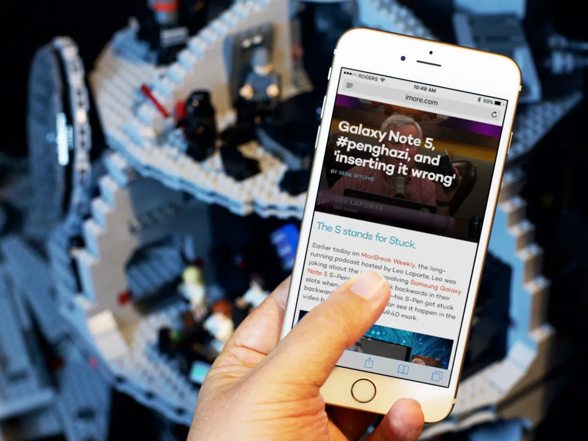
Search and Suggestions
To make voice and text better integrated and more consistent, Siri is largely subsuming Spotlight. Referred to simply as Search, you can now type when you can't talk. (Technically Search also includes Dictation built-in, so you talk even if you didn't want to start with full-on Siri.)
This means natural language input—asking questions the way a human would—is now available with the keyboard as well as the microphone. Search has also been given access to sports scores, stocks, weather, Apple help, YouTube, Vimeo, iCloud drive, Health, holidays, calculations and conversions, and more.
Results can even include actions. So, for example, you can search for a contact and FaceTime, message, or call right from the result. Type "Jerry", tap and call Jerry.
You can't execute commands like Siri, though. At least not yet. So, if you type "message Paul I'll be late" or "shuffle Nine Inch Nails", you'll simply get web search results.

You can still access Search by pulling down on any Home screen, just like you've been able to do since iOS 7. You can also access it by swiping to the left of the main Home screen, just like you could prior to iOS 7. That's right, iOS 9 brings the "minus one" screen back, but with significant improvements. Most prominently, instead of presenting a vast expanse of empty screen, iOS 9 presents Siri Suggestions.
Siri Suggestions are based on things you've recently done, things you typically do, and things the system thinks you might want to do because of time, location, and related activities. You can turn Siri Suggestions off in Settings > General > Siri, but it's all or nothing. There's no way to selectively turn off sections that don't interest you.

The first row is Contacts. So, for example, if you just messaged a friend, their icon might be there so you can quickly message them again. If you typically call your significant other before you leave work every day at 5 pm, your significant other's icon might be there as well, ready and waiting for you to make the call. If you have an appointment with someone in your calendar, their icon might be there in case you need to reach out to them.
This replaces the Favorite and Recent Contacts from the iOS 8 fast app switcher screen and offers the same functionality. Tap one and you get options to call, message, FaceTime, or to go to the Contact card for even more options.
The second row is Apps. So, if you typically check Facebook first thing every morning, Facebook might show up there right on time for you to check it. If you recently downloaded Letterpress but haven't tried it yet, Letterpress could show up there as a reminder. If you're getting close to the airport, your airline app could show up in case you need it.

Proactive results can appear here as well. For example, if you have a dinner reservation at 8 pm, Calendar could show up in its own row, just in time for you to leave, along with all the details, so you can check them at a glance. If a new podcast comes in, the Podcast app could show up in its own row, along with episode details so you can see and start playing it.
You get six icons per row on iPad, but on iPhone, where there's not as much space, you only get four. The iPhone, however, lets you tap to show more suggestions, doubling the total number to eight.

The third row is Nearby. Here you'll find places of interest populated based on time of day and location. For example, in the morning you might see breakfast spots or coffee shops. In the evening, when you typically drive home from work, you might see a gas station or, if you use public transportation, a train station.
The last row is News. It starts off with major stories, breaking news, and popular articles in your region, and then starts curating based on what you've shown an interest in. Tapping a story will take you to that story in the new Apple News app (see below).
You can also choose to show more news, which doubles the amount of stories in the queue.
News is slightly annoying in that, when trying to swipe back to the main home screen, I often find myself opening an article instead. The content is also often less than compelling. I keep hoping it will pull from the For You page on News but, at least so far, no such luck.
Overall, Siri Suggestions and Search give you access to a wealth of activities and information, with just a few words, keystrokes, or taps. That makes it both significantly more powerful and stupendously more convenient.
iOS 9 Apple Pay + Wallet
Passbook on the iPhone began humbly enough, as a way to collect together all your boarding passes, gift cards, coupons, and tickets, all in one place. You could scan codes, but not much more. Last year, Apple added personal credit and debit cards in the U.S., and support for near-field communications (NFC). Apple Pay was born.
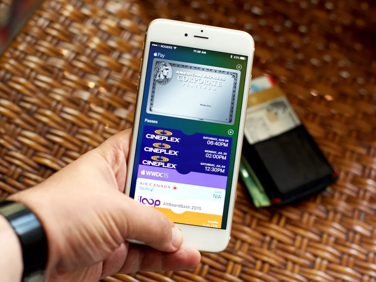
Over the last ten months, Apple has added countless new banks and retail partners, expanded to the U.K., and more. Now Apple is adding new card types and, in recognition of its growing role and functionality, renaming Passbook to Wallet. It may not be as distinct a name, but it's a far more appropriate one.
To go along with its new name is some new functionality. Taking a cue from Apple Watch, you can now double-click the Home button with the screen off to bring up Apple Pay. It's a great idea, though it can collide with Touch ID unlocking if you don't nail the timing.
Then there are the new card types: store credit and loyalty/reward cards. Store cards are like credit or debit cards but issued through large retailers. They typically offer you store-specific rewards and benefits when you use them. Apple has mentioned Kohl's Charge, JCPenney Credit Card, and BJ's Wholesale Club as launch partners, with more to come.

Reward cards, sometimes called loyalty cards, don't offer credit or debit, but are used in conjunction with credit or debit cards as a way to get discounts, accumulate points, or enjoy other perks and incentives. All this to encourage you to shop at the retailer more often and give them access to more information.
If you have a supported reward card, Apple Pay will automatically present it to you when you're at check out. Apple has already listed Dunkin' Donuts DD Perks, Walgreens Balance Rewards, MyPanera, Kohl's Yes2You Reward, Coca-Cola's mycokerewards, and Wegmans Food Markets as launch partners and more will be added over time.
Both store and reward cards are important to help increase Apple Pay adoption at retail. Because Apple won't share credit or debit card information with retailers, some of them have resisted implementing it.
Store and reward cards are different. We choose to get them and use them, and to share our information in exchange for whatever privileges they offer. With them, Apple still gets to keep our transactional information private, and the store gets our opted-in reward information. It's a win for everyone and should go a long way towards encouraging the remaining retail holdouts to consider adding Apple Pay.
Now, if we could just get it in even more regions...
iOS 9 Notes
Apple says Notes is used by more than half the company's hundreds of millions of customers. So, in iOS 9 and OS X El Capitan, Notes is getting some long-overdue attention. It's not just an interface tweak or a feature graft either—it's a whole new app

It lets you apply styles, including lists, embed data and documents, and even sketch right on the screen. In other words, the new Notes app takes what was barely more than a text pad and makes it a much fuller-featured memory pad.
Styling and checking
Formatting in the old Notes consisted of the barest minimum of options: bold, italic, and underline. The new Notes contains actual style support: title, heading, body, bulleted list, dashed list, and numbered lists. Oh, and checklists.
Tools appear top and bottom right on iPad and bottom on iPhone. When the keyboard comes up, the buttons become part of the new shortcut set on iPad. On iPhone, you need to tap the + icon on the right to make an additional keyboard layer containing the options appear, and tap the X icon to hide it again.
There's a persistent new note button as well. So, if you have a moment of unrelated revelation or inspiration, you can start a separate note immediately without having to back out of the current one first.

In Settings > Notes you can choose for a new note to begin with Title, Heading, or Body, but you can apply any style at any time. You can also tap to start a checklist, or go to any existing text and tap the checklist icon to transform it at any time.
Checklists in Notes might sound like task lists in Reminders, but they're different and are meant to be used differently. Reminders lets you set time- or location-based alerts for your list items and integrates with Calendar and Siri. It's best used for tasks like "pick up the dry cleaning when you leave the office" or "remind me of this at 5 pm".

Checklists, on the other hand, let you keep track of items within the context of your note, but with no functionality beyond the note. It's best for things like a packing lists alongside places you want to go on your trip, or a party list alongside theme ideas.
In other words, if you want to be alerted about something, use Reminders. If you simply want to jot down a list, use Notes.
Sketches and embeds
The biggest advancement in the new Notes app is all the new content types that can be embedded in it. Previously, if you could find the option in the popup menu, you could add a picture. Now, you can add sketches, photos, PDF files, videos, audio clips, web links, map locations, Pages documents, Keynote presentations, Numbers spreadsheets, and more.

On a traditional computer, you might drag and drop a file or snippet of text or data to get it into a note. Since that's not yet possible on iOS, Share Sheets does all the heavy lifting.
From Safari, Maps, Photos, Pages, Numbers, Keynote, etc. choose what you want to embed, go to the Share Sheet, and send it straight to Notes. You can add text to accompany the embed and choose to create a new note or to add it to an existing note.

You can tap the camera icon to add a single photo or video directly to a note but, unfortunately, there's no attachment button to fetch a file from iCloud Drive (or any other data provider) like there is in Mail. Since pull can be much more convenient at times than push, hopefully attaching will come to Notes at some point as well.
Sharing from the Photos app is also the only way to add multiple pictures or videos at the same time. It would be great if the camera button worked the same way as it does in Messages, which does a good job of enabling multi-selection.
Once something is embedded, you can access it easily from the note at any time. Tap on a location or URL embed and it sends you to Maps or Safari respectively. (And thanks to back links in iOS 9, it's now effortless to return.) Video and audio files play inline, and Photos show inline, but you can tap them to get an embedded photo viewer as well. iWork and PDF files open in preview mode but, from there, you can copy them to Keynote, Pages, Numbers, or iBooks. (There, again, is why iCloud Drive attachments would be cleaner.)
Sketches are new and different.
Not to be confused with the Apple Watch communications system of the same name, Sketches are quick illustrations you can scribble out with your finger right on your iPhone or iPad. They can include diagrams, floor plans, flow charts, doodles, even an impromptu game of tic-tac-toe. As the name implies, they add a sketchpad to the writing pad, and a way to capture visual ideas alongside text-based ones.

Available tools include a pen, marker, pencil, ruler, and eraser. The pen is thin but puts out a steady, uniform flow of ink. The marker is thick and puts down wide swathes of color that can be layered. The pencil is lighter and has more grain. You can change the color for them using the swatches in the palette. There are three sets of eight colors, ranging from bright basics to deeper, darker hues, to shades of gray.
The ruler persists until you dismiss it and lets you both measure and draw straight lines. The eraser removes anything the undo buffer can't. There's also a rotate button, and you can save sketches to the Photos app using the Share Sheet. (Sketches are saved as 2048x1536, iPad Retina resolution, PNG files.)
Sketches show up inline, like photos, and you can edit them at any time by tapping on them. The tools aren't anywhere nearly as sophisticated as a drawing app, but they work, and they make the Notes closer to an actual note book.
Sync and search
Notes is still synced using your iCloud account, so if you have an iPhone and an iPad or Mac, anything you note down on one will show up on the other or others. The new versions are different enough, however, that you can only sync iOS 9 with OS X El Capitan and vice versa. So, if you want to use Notes, you'll need to go all in on all your devices. This presents a temporary dilemma for Notes users: OS X El Capitan isn't due out until 2 weeks after iOS 9.
The sole exception to complete, synced bliss is Apple Watch. There's still no sign of Notes for the wrist. Being able to use Siri to briefly dictate something into Notes, or being able to quickly reference something in a note, would be magnificently useful. Hopefully, we'll get that eventually.

If you delete a note, like Photos with iCloud Photo Library, it goes into a Recently Deleted folder where you have around 30 days to restore it before it's purged.
If you want to find a note, Apple has bolstered the built-in search with an attachment browser. That means, if you remember adding something to a note, even if you don't remember the exact note, you can scroll through and pick it out images, sketches, maps, web pages, documents, and more.
With Notes I'm now collecting everything I want to remember, and making them available everywhere I need to remember them.
The main attachment view shows you the most recent embeds. You can tap to preview or open an embed or long press to get a popup and go straight to the note that contains it. In case the one you're looking for isn't recent, you can also tap to show all files of a certain type.
Notes still isn't EverNote or OneNote, but it's far more than ever before, and it'll be enough for many people.
I used the old Notes as a live, iCloud-synced clipboard to move text between my Mac, iPhone, and iPad. With the new Notes, I'm doing a lot more. I'm collecting everything I want to remember, and making them available everywhere I need to remember them.
iOS 9 Maps
The original iPhone Maps app had an interface built by Apple but used data supplied by Google. In iOS 6 Apple began forging their own map-data destiny and, as of June 2015, Apple now handles over 5 billion map requests a day. That's a lot of incentive not only to make Maps better, but to make it great.

iOS 9 improves on indoor updates for big venues, like stadiums and shopping centers, and simplifies CoreLocation's background capabilities, so it's more robust and reliable. All of that translates into a smoother app experience.
More dramatically, iOS 9 resurrects something that was lost in the transition from Google to Apple-sourced data: transit directions.
Yes, really.
Transit directions
Maps now includes bus, train, ferry, and subway directions. They're presented on new clean, color-coded and coordinated cartography meant specifically for transit. That makes it easier to find all the stops and stations along your route. And when you do, you can tap on one an get all the information you need about that station, including all other connecting routes.
If you're worried about accuracy, don't be. Apple claims they've carefully surveyed stations so Maps will be able to provide precise directions from where you are to exactly where you need to be, including the exact entrances to the stations.

Enter a location and tap to get directions, and Maps will provide you with one or more routes or combinations of routes to get you there. Since not all trips are imminent, you can also set the time for later in the day and see what routes are available then. Since not all stops and stations are connected by transit, Maps intersperses walking directions where and as needed.

The bad news is that transit isn't supported in a lot of places, at least not yet. Launch cities include:
- Baltimore
- Chicago
- New York
- Philadelphia
- San Francisco Bay Area
- Washington, DC
- Toronto
- Mexico City
- London
- Berlin
- Beijing
- Shanghai
- Guangzhou
- Shenzen
- Around 300 other Chinese cities
Because transit data is typically controlled by municipal fiefdoms, and because there's no standard format or organization, and no incentives for local authorities to play nicely with others, it takes a lot of time and effort to source all the necessary information. (China is centralized and unified, which is why far more of it is available at launch.)
The reality is, though, Apple's competitors started earlier and are much further ahead. Apple will need to work hard—and smart—to catch up.
My city, Montreal, didn't make the shortlist, but I tried out transit in San Francisco while I was there. I don't know the routes like a local, and so can't judge how well Maps navigated them, but the directions were clearly marked and easy to understand, and worked well enough that I didn't feel stressed just looking at them.
Nearby
Search in Maps has gotten easier to use. Tap the search field and you get a list containing your favorite, home, and recent locations and directions, as well as color-coded category icons:
- Food (orange)
- Drinks (orange)
- Shopping (yellow)
- Travel (green)
- Services (purple
- Fun (pink)
- Health (red)
- Transport (blue).
Tap an icon and you get... more icons. They're more specific icons that let you filter down and further refine the Yelp-powered list that's also presented.

Every category contains a popular places icon as well as a giant X icon to get back to the main category. Category specific icons include:
- Food: Restaurants, groceries, fast food, cafes, bakeries, and deserts.
- Shopping: Shopping centers, apparel, department (stores), home and office, convenience, and sporting goods.
- Drinks: Coffee shops, tea and juice, stores, bars, breweries, and wine bars.
- Travel: Airports, travel stations, transit stations, hotels, banks and ATMs, museums, and landmarks.
- Services: Beauty, laundry, banks and ATMs, pet services, and post.
- Fun: Nightlife, music and drama, parks and recreation, movies, fun and games, and sports.
- Health: Fitness, swimming, doctors, dentists, drug stores, and hospitals.
- Transport: Transit stations, bus stops, parking, auto services, ca rental, and gas stations.
Choosing a category places it in the search bar, drops pins in every applicable location, and provides an optional list of all the places as well. If an establishment isn't open, a helpful "Closed Now" label appears next to it in the list.
Tapping a place still gives you its results card but now, if it's a retailer, the card also tells you whether or not it accepts Apple Pay.
Tap the search field again to can change the category. Tap the X icon to clear it.
Nearby makes it easier to find the places around where you are or where you're going.
Simply put, Nearby makes it easier to find the places around where you are or where you're going, and that makes Maps much more useful.
There are still issues with the service, to be sure, but there are issues with every service. Google still has the edge when it comes to data granularity but, increasingly, Apple is winning experience. That's not unusual, of course, but iOS 9 is the first time it can be said about Maps.
iOS 9 News
Newsstand is no more; it's folder smote and its apps strewn across the Home screen. In its place is News, which doesn't collect apps but articles from major publications and indie web sites alike, and organizes and displays them in a consistent, considered manner.
Also unlike Newsstand or even Apple Music, there's no subscription or cost for News. Instead, it's free for readers and ad-supported for publishers. Unfortunately, it's only available in the U.S., U.K., and Australia at launch. Other countries will become available over time.
News gathering
News works by pulling in publicly available RSS feeds. Publishers can sign up to make sure they're included, or manually opt-out if they think it will adversely affect their brand or revenue.
While Apple could simply have made a directory of publications and articles, like they do podcasts in the iTunes Store, they're going beyond that. They're providing something closer akin to the discovery and engagement potential of Apple Music.

Beyond channels (publications), Apple is tracking over a million topics (categories), which are used to provide article recommendations and the opportunity to browse related content.
Getting started with News is, not surprisingly, similar to getting started with Apple Music. Instead of choosing some of your favorite artists, you choose some of your favorite publications like iMore, Daring Fireball, or The Loop. Okay, maybe also Time, ESPN, Vanity Fair, USA Today, New York Times, Wired, The New Yorker... you get the idea. You can also choose by topic, like science, finance, food, or travel, if you prefer.
News, again like Apple Music, uses your choices to start a personalized front page called "For You". For You contains a range of articles from the publications you chose as well as some suggestions News thinks you'll enjoy. On iPhone, you get a list of headlines with blurbs and thumbnails, and the occasional full-width feature. On the iPad, thanks to the bigger display, you get pictures and headlines arranged in tiles of varying size, more like a traditional newspaper.
If any new articles have been added since the last time you checked, News will add a badge to the top indicating the number.
If For You isn't for you, you can choose to read something from a specific news source you've added in the Favorites tab, browse channels (publications) and topics (categories) in the Explore tab, search for content in the Search tab, or return to any article you've bookmarked or previously read in the Saved tab.
Unfortunately, there's no way to search within For You or within a channel or topic for specific articles. For example, if you tap iMore, you can only browse through the articles in reverse chronological order. There's no search field for you to enter "iPhone 6s" or "Pac Mac 256" or anything else you might be interested in. You can go to the Search tab, enter the terms there, get topic results, and open them, but then you can't search for "iMore" to narrow it by publisher.
That makes it impossible, at least for now, to go to News and immediately find a specific article you may have heard about. All you can do is browse around and hope you find it. Indexing and surfacing all the articles for search would no doubt be non-trivial, and this is News version one, but hopefully that's on the list for the future.
Also, because News is pulling RSS, it really needs to be online to work. There is some limited cache for some limited content locally, but it's not predictable or voluminous enough that you can count on it.
News layout
One of the many problems with Newsstand was that apps could—and did—do anything an everything they liked. So, the experience of reading magazines and newspapers could—and did—vary wildly from one to the next. That meant you had to learn and remember new and different—and sometimes not very good—navigation schemes from app to app.
News, by contrast, is blissfully consistent. Like iBooks, it's built on Apple's open-source WebKit rendering engine (and may, in part, be based on Prss, a digital magazine publishing platform Apple acquired in 2014). Because the content in News was created for the web, using web technologies like HTML5 and CSS3 makes a lot of sense.

At the top of a channel is the publication's logo. If a publication has added sections like features, reviews, help, apps, etc., News will surface a section bar to make them selectable. Each section requires a separate and specific RSS feed, all of which is managed on iCloud News Publisher.
In-article navigation is simple. There's a Share button that not only lets you send apple.news links to Messages, Mail, Reminders, Notes, or any other share extensions you have enabled, but also add them to Reading List, open them in Safari, or report any concerns you might have about their content to Apple's News team.
There's also a heart-shaped Like button to bias News' recommendations. It's consistent with Music, which is great, but not with Photos.
Photos uses the heart button to add items to the Favorites album that syncs across all your iCloud-enabled devices. News uses a bookmark-shaped Save button and the Saved tab for that. That's broadly consistent with how the heart-shaped button works in Music. Music uses a More sheet action to save songs to My Music.
Each usage makes some sense within it's own context but are confusing when taken as a whole: I often find myself hitting the heart in News only to be left wondering, later, why something hasn't been added to the Saved tab. Hopefully, Apple can reconcile this at some point.
For articles, News takes the text and images from the RSS feed and displays them as simply and elegantly as possible. Basic HTML tags like bold, italic, block quote, etc. are all be preserved. Video and audio embeds can show up as well, provided they're in standard formats. More complex or custom containers might be stripped out.
Between the hero image or video at the top of an article and the body below, Apple repeats the publisher logo and adds a time stamp in hours (for the current day) or days (for the current week). Tap on the logo and News takes you to the publisher's channel page where hitting the + button will let you add it to Favorites. Alas, there's no + button on articles, which would speed up the process for when you stumble across something you like enough to make you want to add it immediately.
Apple also assigns an topic category to each article, which tends towards the narrow and specific. Tap the category and you'll get more articles on the same topic from a variety of sources. At the bottom of an article, Apple adds a "Read Full Story" link that you can either tap or just scroll past to bring up the original web page in a custom (i.e., non-Safari View Controller) browser. Swipe back up, and you return to the News version of the story.
If a publication only offers partial RSS, you'll have to tap the link and go to the browser for more. Likewise links to other sites and stories.
That's the barest minimum of Apple News, though. The maximum is Apple News Format.
Apple News Format
With Apple News Format, publishers can wield far more advanced styling. They can add callouts, photo mosaics (galleries), HTML5 videos, and interactive infographics, all of which are fluidly animated to make for a more interesting, more dynamic reading experience. Publishers can also add a custom tint color to better match their branding and use a wider range of typography and formatting to really bring the layout to life.

If publishers take the time and expend the resources to apply it, Apple News Format is gorgeous. But that's a big if.
Right now only a few launch partners have access to Apple News Format and, frankly, many aren't bothering to put it to much use. How fast Apple News Format will propagate post-launch, and how many publishers will be willing to invest in it consistently remains to be seen.
The News biz
The way Apple intends for publishers to get paid by News is through the company's iAd platform. Publishers can find out more by contacting iAd{.nofollow} and then use iAD producer and iAd Workbench to create ads and manage campaigns.
Publishers can either try and sell iAds themselves and keep 100% of the revenue or let Apple broker the ads and keep an agency-model standard 70% of the revenue.
For now, News is a free, fluid reader app for iPhone and iPad that aspires to be much more.
Having Apple do the work will be easier, but it remains to be seen how well Apple can sell iAds in News. If publishers do it themselves, though, it means time and resources need to be invested into News-only sales, and that means News will have to offer a return on that investment for publishers to stick with it. Likewise, iAds will also have to provide a good enough experience—especially given the weariness with web ads—for readers to stick with it.
There are, in other words, a lot of questions. So, for now, it's best to think of News as a free, fluid reader app for iPhone and iPad that aspires to be much more. By trading the apps and subscriptions of Newsstand for articles and iAds, News hopes to finally, fully bring the best of traditional publishing and digital media together and create something truly enjoyable and sustainable for everyone.
It's an incredibly hard problem to solve, and I don't know whether or not Apple will succeed in solving it, but I like that they keep trying.
iOS 9 QuickType
QuickType is the name of the predictive keyboard Apple introduced in iOS 8. It added word suggestion to the spelling suggestions of the existing autocorrect system to, as the name implies, make writing faster. It was also designed to make the built-in keyboard more competitive with the then-new custom keyboard extensions as well. That's something Apple is continuing in iOS 9.

Some of the changes and additions span both iPhone and iPad. Others are—at least currently—iPad only.
Lowercase and preview-less
For reasons unknowable by either science or scrying, the iOS 7.1 keyboard made the state of the shift key inscrutable to humans. Lowercase or uppercase, it simply could not be scruted. iOS 9 fixes it at last, but in a way far wider-reaching than many expected.
Yes, Apple has made the keys themselves change state from lower to uppercase. While this does end, once and for all, absolutely annihilate any confusion about case state, it does introduce a different form of mental overhead. Now, instead of a consistent visual representation as you type, the letters all change every time the selected case does, and that can cause your eyes and brain to have to reacquire them as you type. It probably won't affect most people, at least not consciously. To be fair, case-shifting has been the norm on Android software keyboards for over six years with minimal complaints — our brains are typically agile enough to handle the pattern recognition requirements.
What many more will likely notice, even if they don't initially notice what they're noticing, is that Apple has also eliminated the character preview popups that have been around since the very first iPhone—the ones that provide a way to visually reassure yourself you've hit the right key before releasing and committing to it. You still get the long press popups for alternate characters, when available, but that's it.

If you don't like either of these changes, you have the option to revert back to the old ways. Show lowercase keys can be turned off in Settings > General > Accessibility > Keyboard and character previews can be turned on in Settings > General > Keyboards. (It'd be great if both settings were available in both places.)
The new defaults reflect the transition from a visual representation that was more old school typewriter to one that's much more digitally native. My guess is, in a few months, it'll just feel normal.
Shortcuts and trackpads
Because the iPad has a bigger display, and hence more room on the row above the keyboard that shows predictive suggestions, Apple is adding shortcuts to it on either side. They're meant to provide fast and easy access to common editing commands. In the case of Mail, that includes undo, redo, and paste to the left side, and bold, italic, underline, and attach to the right.

The exact shortcuts can change depending on context and vary between apps. For example, if there's text selected, Mail swaps undo and redo for cut and copy. Because Notes has different needs, it can simply replace them with styles, checklists, images, and sketches. Developers can also customize shortcuts to suit the tasks available in their apps.
The idea is, no matter what you're doing, it should take you fewer taps and swipes to do it.

Apple is also adding "trackpad mode" to the iPad. Place two fingers down on the keyboard and the keys fade away to provide a trackpad-like surface for cursor manipulation. Move those fingers and the cursor point moves with you. Select some text and then place two fingers down and move them, and the text selector moves with you.
Trackpad mode is also available on the iPhone... but only the iPhones 6s. (Instead of two fingers you 3D Touch to access it.)
Bluetooth bonus
If you use a Bluetooth keyboard with your iPad, iOS 9 is making is making it easier for you as well. Hold down a modifier key like command or option in any app and you can see a list of available keyboard shortcuts for that modifier. Also, press Command + Tab to switch tasks as quickly as you do on the Mac.

It's yet another step forward for those who use their iPad as an ultralight laptop.
iOS 9 Multi-app multitasking for iPad
iOS is built on the same foundation as OS X and while Apple has always used that to great affect for system processes, for reasons of security and power efficiency, they've greatly restricted the amount of multitasking surfaced for App Store apps and customers. So, you could talk on FaceTime audio while browsing the web and quick replying to a text as email and a podcast downloaded, but you couldn't run two apps side by side. Until now.

Multi-app multitasking in iOS 9 for iPad can be broken down into three specific features:
- Slide Over lets you quickly access a secondary app as a sidebar-style overlay so you can respond to messages or mail, add to notes or check the web, or do another brief task without having to switch completely away from the primary app.
- Split View lets you pin a secondary app so it shares the screen, side by side, with the primary app so you can reference, copy and paste, or otherwise use them both at the same time.
- Picture-in-Picture, which has been available on TVs for decades, lets you float a video on top of whatever other app you're using at the time, or even two apps if you're in Slide Over or Split View modes.
Because Slide Over only keeps one app active at a time, and picture-in-picture is restricted to video playback, they're compatible with any 64-bit iPad, including iPad Air, iPad Air 2, iPad mini 2, iPad mini 3, and later.
Because Split View does have to keep two apps active at the same time, it requires the more capable iPad Air 2 or later.
Auto Layout and Size Classes
Multiple app windows works for the same reason bigger displays work on the iPhone 6 Plus: Apple has spent a couple years setting it all up. With iOS 6 they ported Auto Layout{.nofollow} over from OS X. It allows for constraint-based design that defines the relationships between elements and can then reset frames, centers, and other attributes automatically as and when needed.
With iOS 7, Apple added Type Kit and the concept of dynamic type, and with iOS 8, Size Classes. They replaced of "iPhone" or "iPad" specific interface idioms with the more generalized and flexible concept of "compact" or "regular" classes in horizontal or vertical dimensions.
It's a complicated way of saying Apple broke iOS free from pixel precision and gave apps the ability to flow into whatever screen shapes and sizes presented themselves. In other words, as responsive web design but for native apps.
Last year, we saw the results in the iPhone 6 Plus. In portrait mode, it treats apps like any other iPhone. In landscape mode, however, it treats them like an iPad.
This year, multi-app multitasking is similar. If a split-screen app is wide enough, it treats it like any other iPad. If and when it gets narrow, however, it treats them like an iPhone.
What's more, for the first time, it can transform one to the other and back again as the window width changes. In other words, it no longer matters what size device you're using, only what size window is available.

Multi-app multitasking: Explained
If the details of Auto Layout, Size Classes, and multi-app multitasking interest you, you can find more detailed explainers below:
Slide Over
Slide Over lets you briefly access a secondary app to jot down a few notes, reply to a few references, or check a few bits of information, without having to switch away from what you're doing on the primary app. To bring in a Slide Over, you swipe in from the right bezel. That locks out and dims the primary app and launches the secondary app.

The primary app sticks with a regular horizontal size class and stays full width, but the secondary app comes in as a compact horizontal class on top of it, covering about 30% of the screen in landscape and 40% in portrait.
In essence, Slide Over keeps the primary, iPad-style app locking in place and the layers a secondary, iPhone-style app on top of it.

If you haven't used Slide Over in a while, and the system isn't sure which app you want to bring in, it shows you a series of icon tiles for each and every app on the iPad that supports multi-app multitasking. (Developers have to specifically add support; App Store apps won't appear unless and until they do.)
You can return to that interface, and switch secondary apps at any time, by swiping down from the top bezel and onto the Slide Over sidebar. Select a different icon and that icon's app zooms in to become the new secondary app.
If you don't like the idea of Slide Over, you can disable it in Settings > General > Multitasking.
In practice, Slide Over is terrific. Notifications, especially interactive notifications, helped keep you working when other tasks intruded, but they were incredibly limited in scope. If you missed them or needed to do anything beyond what they allowed, you had to switch out and back again. With Slide Over, you just swipe in, interact, and swipe back out.
It's not just about the convenience of the moment, however. Slide Over is also about giving basic multi-app functionality to older, more resource-constrained iPads. After using it for a while, you'll wonder how you ever did without it.
Split View
Split View lets you keep two apps visible and active, side by side, at the same time. To enable Split View, you begin by swiping in Slide Over, and then you tap the grabber icon to the left of the secondary app. That reactivates the primary app and also resizes it to fit the part of the screen not covered by the secondary app—roughly 70% in landscape and 60% in portrait. The secondary app stays where it is but pins itself down and gets a thick, black border to better separate it.
If you touch the border between Split View apps and drag to the right, the primary app returns to full-screen and the secondary app disappears. If you drag it to the left, the primary app disappears, and the secondary app becomes the new primary app, transforming to regular size class and going full screen. (And then you can swipe to bring Slide Over back in; rinse and repeat.)

There is one difference between landscape and portrait orientation when it comes to Split View. If you drag the border to the left in landscape mode, before you get to full screen, you can snap it to the middle of the screen and work 50/50. In 50/50 Split View, both apps take on the form and function of their iPhone interfaces, but are wider horizontally.
Since 50/50 exists only in landscape and not in portrait, if you're in 50/50 and you rotate, the Split View will change to the only portrait option, roughly 60/40. If and when you rotate back, iOS will remember where you were and return you to 50/50.

To change the primary app, you use the typical iPad app-switching methods. Click the Home button to return to the Home screen and select another app, double-click the Home button to bring up the fast app switcher and select another app, use the four-finger gesture navigation to swipe back or forth between apps, or tap on a link that opens another app. Whatever the method, the newly launched app will replace the primary app in the Split Screen setup.
As you can imagine, all of this takes up a lot of resources, which is why Split View requires the 2 GB of memory and Apple A8 processing power found in the iPad Air 2 or later.
iOS is famous for its rock-solid 60 frames-per-second (fps) performance. 60 fps correlates to about 16 milliseconds (ms) of response time when. In a world where only one app can run on the CPU at a time, any app that responds in 9 ms or less is more than good enough. In a world where two apps (primary and secondary) can run at the same time, though, 2 x 9 ms is no longer good enough. Add a third app (picture-in-picture) and another 9 ms and frame rate drops and apps can appear to lag.
Tougher still, memory needs to be managed between two foreground apps at the same time. If and when the system runs out of headroom, it will jettison the primary and secondary apps and drop back to the Home screen. That's not a great experience.
So, iPad Air 2 or later only.
iOS 9 is obviously not the first system to do app-pinning or split-view multi-windowing. But the implementation is flexible and fluid, and the result shows a lot of care and consideration. I'd love it if, in the future, items could be dragged and dropped between Split View windows, but even in its nascent form it elevates the iPad into not only something different, but something better.
Picture-in-picture (PiP)
Picture-in-Picture lets a video float on top of whatever other app or apps you're using at the time. To enter Picture-in-Picture mode, tap the new PiP button on the standard media player. That'll cause video frames to stop being directed to the player layer and start being directed to the PiP layer. The transition is seamless.

The video is then decoupled from the player app and keeps playing even if you switch apps or go back to the Home screen. It keeps playing while you do almost anything else, including a Slide Over app or Split View app.
The only major exception is if you try to play a video in another app at the same time. At that point the PiP video pauses and let the other video play. So, for example, if you have Videos.app playing in PiP, and then you start a YouTube video in Safari, the PiP video will pause as soon as the YouTube video begins.
PiP will engage automatically when you leave an app. For example, if you start a video and then hit the Home button or tap on a Mail notification, the video will transfer to the PiP player as you exit. If the idea of a persistent video overlay doesn't appeal to you, you can turn it off in Settings > General > Multitasking.
The PiP layer presents with three buttons and a decorative progress bar. The first button lets you leave PiP and go back to the in-app player layer. The second lets you pause or play the video. The third lets you close the PiP and stop watching the video.
The PiP defaults to quarter-width (with ample transparent border) in the bottom left corner, but you can reposition it by touching and swiping it into another corner. It'll always snap to one of the four corners, however, so you can't just position it anywhere. iOS will also nudge the PiP above or below important interface elements, like navigation and tab bars, and even the Dock on the Home screen, so it doesn't obstruct anything.
You can also pinch-to-zoom the video from quarter-width to up to half-width (again with ample transparent borders) and back. There's no snapping here. You can adjust it to pretty much any size you like within that range.

Because the iPad has a 4:3 aspect ratio and video is 16:9 or greater, even in quarter-width mode the PiP only takes up a sixth or less of the display, which makes it eminently workable.
If the PiP does get in your way, but you don't want to kill it completely, you can tuck it off to the side of the screen for a while. The audio keeps playing, so you can keep listening, and the edge of the video remains visible as a tab at the side of the screen, so you can pull it back out whenever you're ready.

In addition to the standard media player (AVKit), Apple has also made PiP work for HTML5 video (WebKit), and for custom media players (AVFoundation). PiP is also only for video, however, so nothing like streaming tweets or static app shots will be allowed.
FaceTime can use PiP, however, so you can engage in a video conference calls while switching between or using other apps, like checking your calendar or taking notes. You can also resize and hide it, like any PiP. It's a great way to provide tech support as well, since you can look things up while chatting.
Like AirPlay, some apps may choose not to include PiP functionality for licensing or other reasons. I hope that doesn't happen, though. The functionality is so great it would be a silly to sacrifice any of it.

On the iPad Air 2, you can have Picture-in-Picture running on top of Split View, for a total of three apps all live, all at the same time. For it to work, all apps have to play nicely and otherwise do their part to make sure everything runs swiftly and stably.
Like any transition, it'll take time for apps to get up to speed. But sitting here, Safari on one side, Notes on the other, Continuum season four playing on top, I can't imagine ever going back.
Safari
Unlike Safari for OS X El Capitan and its pinned tabs and muting, Safari for iOS 9 didn't make the keynote headlines this year. But, as the post-keynote coverage has shown, that doesn't mean it didn't get some big new features.
The biggest—in terms of attention its received — might well be the content blocking extensions, but there are several others as well that make not only Safari better, but potentially any app that loads a website better.
Safari View Controller
In the beginning, there was a user interface framework for viewing the web inside apps (UIWebView). A blank slate, it could be filled with anything from a website to a custom HTML5, CSS3, and JavaScript front end. For security reasons it wasn't allowed to do just-in-time (JIT) compiling for JavaScript. That made it safe but slow.
With iOS 8, Apple introduced a modern WebKit framework (WKWebView) that was not only secure enough to allow for JIT but, thanks to a matching framework for OS X that debuted in Yosemite, was consistent across Apple's platforms. That made it better but still a blank slate.
If you want to render a front end using web technologies, a blank slate is great. If you want to browse the web, however, you need to build all the basic controls yourself. Even then, even if you do an amazing job, you still can't provide access to everything Safari has to offer—iCloud Keychain, AutoFill, state cookies, Reader mode, Private Browsing mode, or the new content blocking extensions (see below). So, more often than not, you
You could always send someone to Safari to view a link, but if you wanted them to stay in the app, there wasn't a great option. Until now.
New to iOS 9 is Safari View Controller (SFSafariViewController{.nofollow}), which lets an almost full-on Safari experience be embedded into other apps.
While the original web view (Chrome, far left) and WebKit web view (Tweetbot, middle left) can look and act like anything, the Safari web view (middle right), not surprisingly, looks and acts like Safari (far right).

There are a few differences, though. The address bar is grayed out. Safari View Controller is meant to show a web page, not to let you start navigating arbitrarily around the web. That's what the full-on Safari app is for, and there's a button in the bottom tab bar that'll shunt you right into Safari proper any time you want.
There are also back and forward arrows, in case in-page links move you around, and a Done button to close the view. There's a Safari Reader button to put you into content-cleaner mode and a Share button. The Share Sheet has all the default options as well as any share or action options provided by the app. Apps can even tint the controller to match their overall design, making the experience almost seamless.
'Almost' because there are still some limitations. Third party share extensions show up in the share sheet but third party action extensions, content blockers aside, aren't yet supported. Likewise back links, so if you do tap to switch to Safari, you're on your own coming back. Also, if you want Private Browsing mode, you have to turn it on in Safari, and then it'll be reflected in Safari View Controller.
What's more, Safari WebView animates up from the bottom, not in from the side. That's not cosmetic. It's a visual indication that Safari WebView is modal and that you need to hit the Done button to close it. You can't just use the system-wide back gesture to slide it away again, because that's what you'll use to swipe between pages, just like in the full-on Safari.

Where Safari View Controller gets it absolutely right is security. Because it works like an extension—it's made available inside an app but runs as a separate process that provides absolutely no access to any of your personal information—everything from iCloud Keychain credentials to AutoFill data is all kept private and secure. Likewise OAuth for third-party logins. No longer do you have to worry about a bad app snooping for your credentials as you send them. They're never seen.
This makes Safari View Controller one of those rare but essential improvements that increase both convenience and security. And even in its first generation form, it's a phenomenal addition for developers and customers both.
Content blocker extensions
Content blockers aren't ad blockers. They don't automagically identify ads and eradicate them from your web world. Instead, they identify elements and resources on a web page and can, optionally, hide those elements and prevent those resources from loading. The goal is to show how fast the modern web—read: Safari—really is when you remove all the extraneous code that's been dumped on top of it, and to give end-users ultimate control over what gets rendered in their browser.
The vast majority of the time the elements and resources blocked will be those used to serve ads, but other times they'll be things like social networking buttons, performance and audience analytics, tracking scripts, article comments, navigation headers, inline frames, "hamburger and basement" sidebars, and more.

Blocking content, especially ads, has been possible on desktop browsers for a while, including OS X and Safari. Traditional blockers, however, were services that the browser consulted at load time. That meant the act of blocking content itself could reduce performance, and information about the page being visited could be collected by the service doing the blocking. In some cases, the blockers themselves could theoretically be worse than the content. Even malicious.
Apple doesn't want that. They don't want to replace heavy CSS and JavaScript with just-as-heavy plug-ins, especially on mobile, and they don't want to replace ad trackers with blockers that track. They want something that's genuinely fast, light, and performance-focused. And they want something that's private and secure.
That's one of the big difference between content blockers and content cleaners, like Safari Reader. With Reader, which debuted in iOS 5, ads, scripts, and other resources are loaded and then the page is re-rendered for maximum legibility. So, those resources still get to run, no matter how briefly, ads get to register and hits still get tracked. With blockers, resources are never loaded. And because the filter has to provided ahead of time, nothing gets consulted on load, and so nothing about the page content gets shared with the blocker. Private and secure.
The other big difference is that Reader is built-in while content blockers, like the vast majority of extensions, have to be downloaded from the App Store and aren't enabled by default. To enable them you have to go to Settings > Safari > Content Blockers and switch them on.

Content blocking extensions work through a set of rules defined in a JSON file. The rules contain triggers and actions. Triggers determine when the rules get run and actions determine what happens when they run. For page elements like divisions (div), the trigger can be as simple as encountering CSS class. The action, setting its display property to "none". For scripts, it can be as simple as blocking them from loading. Filtering is handled by regular expression (regex). Rules can even be created that, if the proper conditions are met, negate other rules.
So, for example, a content blocking extension for travelers on data roaming might block images, custom fonts, video and audio containers, and other "heavy" content to keep bandwidth usage as low as possible. A content blocker for film lovers might prevent any image that contains "episode-i" from loading... unless it's "episode-iv".

Once the content blocking extension is downloaded and enabled, Safari or compiles the extension's rules into bytecode and applies them whenever it—or the Safari View Controller—loads a web page.
Since developers can provide ways to change rules in the app that contains the extension, in action extensions, and in Settings, developers can notify Safari about updates and have the rules recompiled.
If you decide you want to see the current page without any content blocked, for example if a social network site isn't loading properly because JavaScript is being blocked, you can long press the reload button to the right of the address bar and then tap to reload without content blockers button.
Because of the processing required and the focus on performance, Apple is limiting content blocking extensions{.nofollow} to 64-bit devices. That includes devices released in 2013 or later, with an Apple A7 processor or later. Namely:
- iPhone 6s Plus
- iPhone 6s
- iPhone 6 Plus
- iPhone 6
- iPhone 5s
- iPad Air 2
- iPad Air
- iPad mini 3
- iPad mini 2
- iPod touch 6
When content blockers are running, Safari flies. If Apple succeeds at nothing else, they'll succeed at making it wicked-obvious who's really to blame for poor mobile performance.
The speed difference, especially on large media sites, is ludicrous. It's like unhitching a trailer filled with lead and watching a truck, no longer burdened, take off like a rocket.
What this means for websites that rely on ads to pay the bills and to keep food on the table, including iMore, is unclear. Optimists hope that providers like Google Ad Exchange will clean up their act or sites like iMore will be able to make a go of ethical native advertising and sponsorship models. Pessimists fear that advertorials and supercookies from providers like Verizon and Facebook-optimized "one neat trick!" content will fill the void.
Beyond ad blocking there are entire realms of other content types ripe for blocking. That includes security-related extensions for preventing malware scripts embedded in iframes from known bad actors, privacy-related extensions that prevent social network tracking, accessibility-related extensions that could remove difficult to read web fonts and more. Like with any new technology, we won't really know what developers can do with it until they show us.
Shared Links app extensions
Shared Links debuted in iOS 7 as a way for Safari to surface content that appears in your Twitter, LinkedIn, and Weibo timelines. They live in a tab next to traditional bookmarks and Safari's read-it-later service, Reading List. Tap a link and you don't go to the social network, however, you go straight to the article, video, or whatever else was shared.
In iOS 8, Apple added the ability to subscribe to RSS feeds in Shared Links, effectively removing the bullet Don Melton had put into Safari RSS a few years before. Now, with iOS 9, Apple is adding Shared Links app extensions, so apps can add content directly to Shared Links as well.
Shared Links app extensions work on both iOS and OS X. When the extension is called, the app returns a list of items, including a unique identifier (so items don't get repeated or mixed up), the URL, the publication date (for reverse-chronological sequencing), an optional display name, the title, and the body.
The app's icon gets displayed on the right, and an optional custom graphic can also be specified for the item itself. That way, it's both easy to identify where the link came from and visually differentiate it from other items from the same source.
That's what makes Shared Links app extensions different from something like Reading Lists. It isn't a passive, generalized service that lets you arbitrarily save cleaned up content to read later. It's a proactive service that lets apps suggest specific links to add to your feed in their original form.
While all these options make sense separately and in their own context, I'm not sure we need them all. Perhaps something unified will eventually rise from them—a hybrid of bookmarks, read-in-later, and shared links that gives us a simplified place to keep all the web content that matters to us.
Files, feeds, fonts, and more

The Safari address bar gets some of the new Siri-powered search intelligence as well. For example, if you're already browsing, and you don't want to switch to Siri or the Home screen, you can type and get weather results right in Safari.
Safari Reader also has several new options, including white, sepia, gray, and black themes, and typefaces including Athelas, Chartier, Georgia, Iowan, Palatino, San Francisco (Apple's new system font), Seravek, and Times New Roman. It's great for night time reading and for accessibility.

With iOS 6, Safari on iOS gained the ability to upload photos or videos from the camera roll. Now, with iOS 9, you get more options. You can take a photo or video, pull a file directly from iCloud Drive, or call on any storage provider extension you have enabled, including Dropbox, Google Drive, OneDrive, etc.
There are also new—and newly relocated—options in the Share Sheet:
- Save to iBooks that, while not called Print to PDF, will still render the current page into exactly that and send you to iBooks to view it.
- A new home for Find in Page that, when you tap the icon, gives you a keyboard with a search field and previous and next buttons to the left.
- A new home for Request Desktop Site (though you can also get it by long-pressing the reload button.
- Add to Shared Links.
- Add to News.
Save to iBooks (print to PDF) especially is great to see ship.
iOS 9 Performance + Battery life
Apple received a lot of criticism about platform stability last year. That happens every year, of course, but iOS 7 and iOS 8 brought fundamental changes to the way the iPhone and iPad looked and worked, and more than a little pain was brought with them. It wasn't that system crashed more—it actually seemed to crash less than previous years—but that it didn't always work as expected, and in many small and frustrating ways. And for humans, unpredictable "frustrators" over sufficient time and volume can be worse than crashers. iOS 9 aims to address a lot of this.
Famously, discoveryd, the daemon introduced in iOS 8 (and OS X Yosemite) to handle unicast DNS resolution, multicast DNS resolution, and Service Discovery, has been replaced. After months of connection eccentricity, Apple recently returned to a version of the venerable mDNSResponder updated to support Continuity and other modern features.
If that's a sign of a sea change—of major secondary (P2) bugs, when sufficiently aggravating, getting assigned the resources needed to fix them, even under the crunch of a yearly release cycle—then it's good news indeed.
While a lot of the performance and stability improvements are under the covers or in the workflow, there are several major ones worth calling out.
Metal
Apple is greatly increasing the scope of Metal, the graphics framework the company introduced last year as a thinner, faster more direct alternative to OpenGL. This year, Apple has folded in OpenCL, its general computing framework, and moved CoreGraphics and CoreAnimation frameworks to sit on top of it.
That means any app already using any of those frameworks should see an instant boost to performance—Apple claims 1.6x in animation and scrolling and 50% reduction in CPU usage for drawing.
Battery optimization
You can now monitor battery life right in Notification Center. If it were only for the iPhone or iPad itself, it wouldn't be valuable to anyone who turns battery percentage on in the status bar. But it will also show you the charge level of any connected Bluetooth devices, including Apple Watch. And that can be extremely useful.
To maximize iPhone and iPad battery life, Apple is also making iOS 9 smarter.
- Built-in apps have been made more energy efficient.
- System functions like backlight algorithm have been made more efficient as well.
- Facedown detection has been implemented to prevent the screen from being lit up by notifications when you can't actually see them.
- Sleep delays are now adaptive and idle states have been improved to maximize power efficiency.
All told, Apple claims the new smarts alone can add up to an hour of extra battery life. For more, there's Low Power mode.
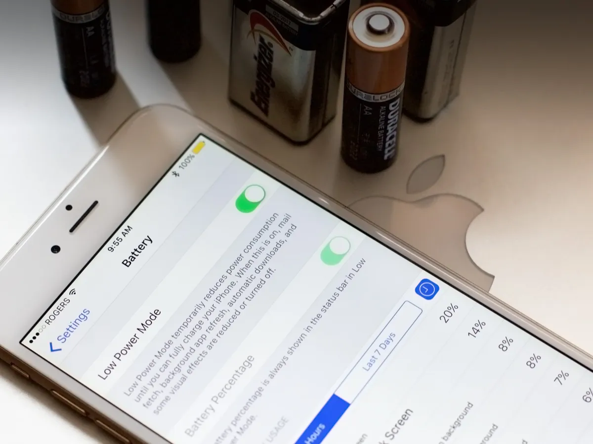
Low Power mode for iPhone
If you reach 20% power, iOS 9 will offer to put your iPhone in Low Power Mode. You can cancel or continue. If you continue, the battery icon in the status bar will turn yellow and:
- Mail fetch is turned off. (You'll have to open Mail to get new messages.)
- Background refresh is paused. (You'll have to open apps to get new content.)
- Non-urgent networking is put on hold.
- Motion effects are dialed way back.
- CPU and GPU are prevented from ramping up to their fastest, most power-hungry speeds.
With Low Power mode, Apple claims you'll get up to an additional three hours of battery life on your iPhone.

Low Power mode will automatically turn off when you reach 80% charge. You can also turn it on manually at any time through the new top-level Settings tab called Battery. There, you not only get the stats that used to be buried under Usage, but you also get a toggle for Low Power Mode. What's more, usage stats now include specific on-screen and in-background breakdowns so you can better tell which apps and processes have been using power and how.
I've tested Low Power on my iPhone extensively while on roaming data at conferences, which is always tremendously hard on battery life, and it works brilliantly.
iOS 9 Security + Privacy
iOS 9 continues Apple's focus on security and privacy, including the many ways already detailed above for things like proactive suggestions and app search. We'll likely have to wait until Apple updates the company's always outstanding iOS Security White Paper to find out all the details, but a few other things have already been announced.
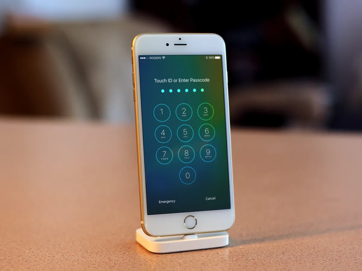
They include stronger passcodes, more robust trust mechanisms, system-wide 2-factor authentication for iCloud, better security for apps connecting to the internet, and more.
6-digit passcodes

With iOS 9, the old 4-digit passcode is becoming the new 6-digit passcode. That's still nowhere nearly as strong as the alphanumeric password option, but it takes possible combinations from 10,000 to 1,000,000, which is an improvement. And, thanks to TouchID, it's one that won't significantly impact convenience for people who use the pin.
If you'd prefer to use Touch ID as well as a passcode for even better security, well, you're still out of luck. Hopefully Apple will add that as an option at some point.
If you prefer a less secure but more convenient 4-digit passcode, you can still configure it up that way in Settings > Touch ID & Passcode > Change Passcode. Tap Change Passcode, enter your passcode, then tap the small Passcode Options text just above the keyboard.
2-factor authentication
Apple has built full 2-factor authentication for iCloud accounts into both iOS 9 and OS X El Capitan. It's separate from, and will eventually replace, the old 2-step authentication system Apple previously used for some iCloud services. Notably, it doesn't include a recovery key but a recovery process.
That's rattled some information security people but will probably prove more practical for the mainstream customer base where data loss, not data compromise, is the more frequent and damaging concern.
2-factor will be offered as part of setup on new devices and new installations. On older devices and installations, you can go to Settings > iCloud, tap on your account at the top, then tap on Password & Security.
When 2-factor is enabled, and you try to set up a device or log into iCloud from a new browser, a verification code is sent to one of your existing, trusted device. You'll only be asked to verify a new device once, and you can choose to trust a new browser when you sign in.
Verification codes are displayed automatically on any trusted device. If a trusted device isn't available, a verification code can also be sent to a trusted phone number over SMS or by automated call. At least one trusted phone number is required when you opt-in to 2-factor.
Because there's no recovery, if all else is lost you need to contact Apple to begin the account recovery process. That process can take a few days or more, as Apple wants to help you regain control of an account but not let anyone else hijack your account. No human can help expedite it, which should make it more resilient to social engineering attacks.
Since 2-factor is a great technology often poorly implemented, we'll have to wait and see how Apple does ramping it up, and how well it works over time.
Trust
Apple provides Enterprise Distribution as a way for companies to create and share internal apps without having to go through the App Store. Unfortunately, bad actors have been using the associated process as a way to try and trick people into installing malicious apps.
Previously, all that was required was that you tapped the Trust button on the popup and the app could launch. It was convenient, but too convenient.
iOS 9 changes that. Now there is no Trust button on the popup. There are no buttons at all. Or instructions of any kind. So, unless you know what to do, you can't install an enterprise app either accidentally or obliviously.

If you really need to install a legitimate app you have to manually go to Settings > General > Profiles, look under the Enterprise Apps header, and then tap the name of the appropriate distributor. From there you have to tap to initiate trust and tap again on the popup to confirm it. Only then, when it's made super-damn sure you really want to trust an app, will iOS set it as trusted.
No security system that includes humans in ever truly safe but by making it require concerted effort to trust apps in iOS 9, Apple is making it harder for malware and other bad apps to run.
And that's absolutely worth a little inconvenience.
App Transport Security
App Transport Security (ATS) aims to enforce best practices for connections between apps and web services. Currently, that's TLS 1.2, SHA256 hashed signatures, and optional forward secrecy. Since best practices is a moving target, though, Apple will keep them updated as technology evolves.
ATS is enabled by default for connections (NSURLSession, NSURLConnection, and CFURL) in iOS 9 and OS X El Capitan but developers can opt-out either completely or selectively (using NSAllowsArbitraryLoads and NSExceptionDomains).
In other words, websites can still secure local content that supports ATS, and leave out third-party content, like Google ads, that doesn't. And it can be done by opting everything in except for a specific domains, or opting everything out except for specific domains.
This is another great addition to iOS security and something I hope is adopted as quickly as possible, as widely as possible.
Device-centric, discrete data operations
Even though Apple is taking steps towards proactivity and intelligence, the company is taking a fundamentally different approach to data operations than many of its web-centric competitors. Instead of taking your data up to the cloud and operating on it there, the way an Internet company like Google or Facebook might, Apple is operating on Internet data in the cloud and then bringing it down to your device and operating on it there.
That may not allow for all the functionality of full-on cloud-based services, but it allows for far more privacy and security than those services.
What's more, Apple isn't sharing data from one service with another, so Proactive doesn't touch News which doesn't touch Music, and so on. That way, if you only use a few Apple services, you don't have to worry about your data being available to other services either.
Whether or not that matters to you will depend on how you feel about online privacy to begin with. Either way, it's good for everyone to have options and alternatives.
iOS 9 Efficiency
Most systems start efficiently. They're small, simple, and easy to manage because that's all they have time to be. Over the months and years that follow, however, the systems grow and become large, complicated, and error-prone.

Last year a lot of people ran into problems updating to iOS 8. More specifically, they ran out of storage space and couldn't download the update. As a result, Apple's been working to not only re-architect the way they handle over-the-air updates, but the way they handle everything from services to apps as well.
Over-the air updates
iOS 8 was more than 4.5 GB in size. iOS 9 will just 1.3 GB. That means you'll need less free space to download and stage the update. There are also new options to offload and reload content to free up space and to update later when you're asleep or otherwise not using your device. It's all designed to make the process as stress-free as possible.
One thing that I'd still like to see addressed, though, is what happens post-install: library updates, Spotlight re-indexing, and everything else that spins up the radios and processors to maximum and makes everyone think battery life has taken a hit.
It stops after a few hours or days, but if update also took advantage of down time, charge time, and other opportunistic widows to do its thing, it could have less of a perceptible impact and cause less up-front confusion.
App thinning
Over the last year, Apple has introduced new services like iCloud Photo Library and iCloud Music Library that keep recent and frequently accessed data on the device but offload older and infrequently accessed data to Apple's servers. That nearline strategy helps ensure more space is available for updates to begin with.
With iOS 9, Apple is introducing App thinning, which includes asset slicing, on-demand resources, and bitcode.
Asset slicing recognizes that apps have also been getting bigger over the years. They've added support for all sorts of device traits, including iPhone and iPad idioms, @2x and @3x resources, 32-bit and 64-bit chipsets, OpenGL ES and Metal in high and low quality, 1 GB and 2GB of memory, different audio sampling rates, and more. All of that overhead slows downloads and takes up storage. Since no single device needs all those resources, though, asset slicing aims to pare them back down.
Developers still upload the full universal app to the App Store but then the App Store takes it and delivers only a variant app tailored specifically for the device that's downloading it.
Standard resources are automatically sliced but, for custom data, developers are encouraged to add asset catalogs, including the new named data and sprite atlases options, and declare which data is needed for which device traits. The better organized and catalogued the assets are, the better the slicing will be.
So, if you have an iPhone 5s, for example, and you tap to download an app, the App Store will give you the iPhone 5s variant. That means you won't get the interface elements for an iPad, the @3x graphics resources for the iPhone 6 Plus, the 32-bit code for iPhone 5 or earlier, or the shader code for an iPhone 4s or iPad 2 graphics processor. You'll only get what your iPhone 5s needs, and you'll get it in a smaller package that takes less time to download.
Apple claims storage savings in the range of 20-40%, even for social networking and video streaming apps.

On-demand resources (ODR) takes things a step further by only downloading content you might need when you first start using an app. That can included game levels, video tutorials and other media, document templates, instrument packs, and more.
For example, when you download a new game, the App Store could only include the first five levels and keep the rest ready and waiting on Apple's servers. As you complete level three, the App Store could download level six and remove level one. Then download level seven and remove level two, and so on.
In other words, as new content comes in, old content goes out. So, an app or game may vary slightly in size over time as you use it, but you never have to store all of it at once.
Using asset slicing and ODR makes it easier for apps and games to stay beneath the current 100 MB cellular networking download limit. A game that was previously 150 MB for its full universal binary, for example, may be only 90 or 100 MB for any individual device variant and resource payload, and so be able to be downloaded anywhere, at any time.
What's more, very large apps like triple-A games won't have to worry as much about Apple's Wi-Fi download limit of 4 GB either. That's because, even if the complete universal binary package is 4 GB, as long as no individual device slice variant and resource payload exceeds 4 GB, it'll be under the limit.
Depending on the type of app, space savings can exceed 50%, which across all apps on a device can result in a significant return on storage space. It will most benefit legacy 8 GB devices and current 16 GB devices, which compromise storage for entry-level price points.
Shifting from the present to the future, the App Store will also be delivering apps in bitcode, a forward-looking LLVM intermediary representation of the binary. That will let Apple optimize and re-optimize an app binary for the specific device architecture that's downloading it without requiring the developer to manually update and resubmit the app.
It's not a way to abstract out processor platforms so Apple can switch architectures on the fly at some point. It's a way to make sure customers get the benefits of the latest architectures, instructions, and optimizations as soon as they're available.
Although mandatory for watchOS apps, bitcode is still optional for iOS, though Apple believes it's important enough to opt projects in by default.
Lastly, for developers who no longer want to support older devices, Apple will now let them release apps that are 64-bit only. That way they only have to concern themselves with iPhone 5s, iPad Air, iPad mini 2, iPod touch 6, and later devices.
Compression
Historically, compression algorithms have includes lz4, which is optimized for speed, lzma, which is optimized for space-savings, and zlib, which tries to balance the two.
zlib, however, is from a bygone era, and so Apple is replacing it with something more modern: lzfse. That's short of Lempel Ziv Finite State Entropy, which Apple swears isn't an indie band straight out of Gatineau.
lzfse provides for higher compression than zlib but is also up to three times faster. What's more, it uses 60% less power and, Apple has added it to all of their frameworks, so it should be easy to adopt.
iOS 9 Miscellany
There's a lot more to iOS 9 than what makes it onto the keynote stage. Apple has made small but welcome changes throughout the system, and several major changes to the system itself.
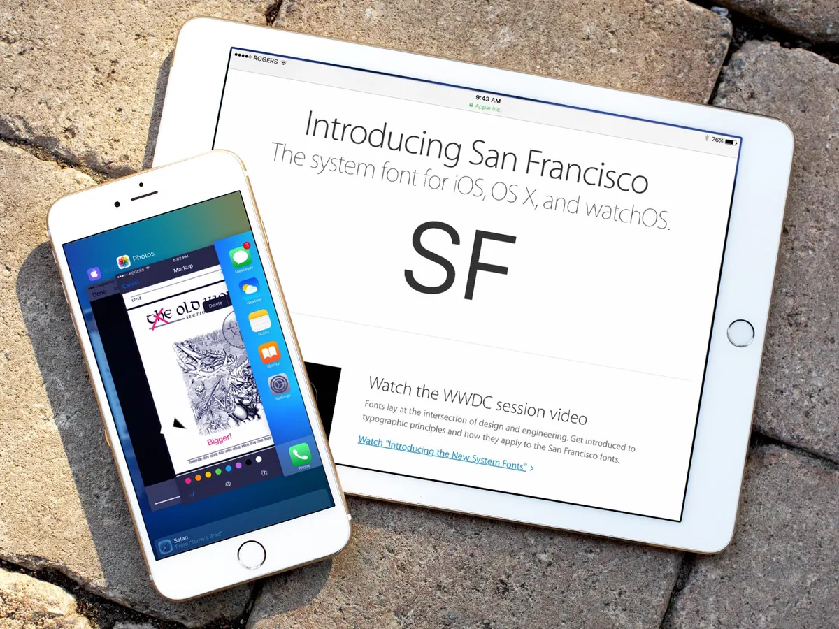
Built-in apps have gotten new features and App Store apps new frameworks that should make the iPhone and iPad not only more accessible and productive, but more enjoyable to use.
Fast app switcher
There's a new fast app switcher interface for iPhone and iPad that replaces the previous, flat card view with a view that stacks and shuffles the cards. You can still clearly see three sets of apps and icons—previous, current, and next—but now you also get the blurry hint of a fourth in the background.

Visually, it's more interesting and allows for much larger, more glance-able thumbnails. There's currently no setting to flatten it back down, however, so it can adversely affect those with motion sensitivity.
You can still flick away one or multiple cards to close their apps. Continuity apps are no longer a card but a tab now at the bottom. You can access it from anywhere in the fast app switching interface with a single swipe. That makes it much more convenient as well.
Notifications
Notification Center no longer organizes alerts by app but rather in reverse chronological order. That means the most recent notification is on top, with older notifications following down the list. Sections breaks are now by day: today, yesterday, and previous days.

iOS 8 introduced interactive notifications. For most apps that meant providing one to four predefined buttons that you could use to trigger typical actions. Messages and Messages alone, however, got text reply—the ability to quickly respond to a text message from right inside the notification. In iOS 9, everyone gets text reply. User Notification Text Input allows for quick replies from Twitter apps, IM clients, and more, as long as developers add the functionality.
In terms of implementation, they work the same as other actions, but take in text input and send the response back to the messaging app. They can even be presented along with other options, which makes them potentially even more useful that text reply in Messages.
Push payload has also increased again, going from 2 KB to 4 KB, and there's also a new request/response provider for the Apple Push Notification (APN) service designed to improve reliability while maintaining speed and efficiency. It uses HTTP/2, the second generation hypertext transport protocol for the worldwide web, and includes benefits like instant feedback in the response, and simplified certificate handling.
It's text input—quick replies—that really shine, though. With them, everything from social networking apps like Tweebot and Twitterrific to secure messaging apps like Signal will be more convenient.
Audio and network extensions
In addition to all the new extensions detailed above and below, including app indexes, content blockers, shared links, and ReplayKit recordings, iOS 9 includes a few others worth noting as well.
Audio unit extensions create an modern architecture for audio plugins not just for iOS but for OS X as well. It means audio plugins can now be packaged into apps and made available on the App Store just like image effects and filters in photo extensions.
Network extensions includes Wi-Fi hotspot helpers, personal VPN managers, custom Enterprise VPN servers, and content filters for education. With them, instead of having to manually launch an app to manage networking, extensions can be called by the system when and as needed.
For example, hotspot helper extensions (NEHotspotHelper) can claim a hotspot with varying levels of confidence, from high to low. If high, call it to initiate and periodically maintain authentication. They can also annotate Wi-Fi networks to make the association clear.
The VPN Manage (NEVPNManager) isn't new to iOS 9 but has been expanded and also brought over to OS X El Capitan. It can create connections, be setup to connect on demand, and can now also configure HTTP proxies and be used in conjunction with enterprise VPNs. It supports IKEv1 and IKEv2, IKE fragmentation, IKE redirect, as well as MOBIKE so it can seamlessly transition tunnels from Wi-Fi to cellular or vice versa.
Custom Enterprise VPN (NETunnelProvider) can be used to create a packet tunnel provider (NEPacketTunnelProvider) for IP layer tunneling, or an app proxy provider for app layer tunneling.
Content filters for education (NEFilterProvider) allows for on-device content filtering on managed devices. That means, for example, if a student leaves the school network with an iPad owned and maintained by the school, the content filters can still keep working. It also allows for dynamic evaluation, on-the fly updates, and customizable block page.
Accessibility
With iOS 9, Apple is adding Touch Accommodations for those with tremors or other issues with motor control. You can set customizable hold duration so that brief, unintentional touches are ignored. When enabled, a timer is displayed on screen to make the duration easy to measure. You can also set a customizable time to ignore repeats, so unintentionally touching the same interface element multiple times doesn't trigged multiple events.
Tap assistance lets you set the initial or final touch location as the trigger point for actions. So, for example, if you set it to initial and then tap Calendar but unintentionally drag to Clock, Calendar will still launch. If you set it to final, Clock would launch instead.
There are new keyboard settings for accessibility that not only lets you turn off the new lowercase virtual keyboard, but also let you adjust timing for key repeat, sticky keys, and slow keys for paired Bluetooth keyboards.
Apple recently won the Hellen Keller award for VoiceOver, the screen reader technology that speaks interface for anyone with low or no vision. It's great to see interactive accessibility getting the same level of attention.
Right-to-left localization

Impressively, Apple has added full, system-wide support for right-to-left languages (RTL) like Arabic and Hebrew. That includes every bit of every standard interface, from icon and button placement to transitions and animation. Even interactions get mirrored, so you swipe to unlock from right to left, scroll Home pages from left to right, and gesture in the appropriate direction for the language being used.
If an app uses standard interface schemes (like UITableView and UICollectionView) and best-practices like Auto Layout (including leading and trailer constraints), a lot of the support comes "for free". Custom layouts, of course, require customized support.
There's even a way to format the components of names for people in regions where it's not given name first and family name last, but the inverse.
It's a different kind of accessibility, but it's every bit as important. And likely good business as well.
Typography
After years of Helvetica on iOS, a decade of Lucida Grande on the Mac, and a brief flirtation with Helvetica Neue on both, Apple has released its own system font: San Francisco{.nofollow}. Specifically for iOS 9 and OS X El Capitan: SF. (Though there's at least one instance of iOS 9 using the Apple Watch version, SF Compact, and to great effect.)
San Francisco is a neo-grotesque sans-serif, like Helvetica and FF Din. SF has two optical sizes: Text and Display. Text is for anything under 20 pt, Display for anything over 20 pt.
Most times you won't have to worry about the difference—the system handles it automatically. If you're doing work in an image editor, however, and want to match the way SF looks on the screen, you'll need to manually change from Text to Display when you go above 20 pt.
There are six weights for Text, both regular and italic:
- Light
- Regular
- Medium
- Semibold
- Bold
- Heavy
Display has nine weights total, adding:
- Ultralight
- Thin
- Black
San Francisco scales beautifully from the tiny 38mm Apple Watch to the enormous 27-inch Retina 5K iMac. And in so doing, it manages to be both familiar and distinct, interesting but not distracting, legible and enjoyable.
On iPhone, iPad, and iPod touch, it gives the entire interface a fresh new look. Despite persistent rumors of an Apple Sans typeface having been in the works for years, it's been decades since the company released their own custom font. It'd be hyperbolic to say San Francisco was worth the wait, but it's certainly about time.
Photos
In addition to Live Photos and Siri search (see above), Photos in iOS 9 is getting its scrubber back. It's a welcome return. When you're in single photo view, even without scrubbing you can see the next and previous photos in the sequence. That not only provides more context, but it also makes finding the right photo much more efficient—no more swiping blindly or jumping back to moments or albums just to see what else is around.
Also faster now is photo and video selection. Instead of having to tap on each thumbnail independently to check it, you can simply touch the first one, hold your finger down, and slide to the last one, and the checks will follow you.

There are also new built-in albums for screenshots and selfies. The screenshots album includes not only screenshots captured on the same device but also screenshots captured on other devices and synced via iCloud Photo Library. Take a screenshot on your iPhone and it'll show up on your iPad or vice versa. This is really convenient for reviewers like me, but also for anyone who just wants an easy way to find and potentially bulk delete all the screenshots from everywhere.
The selfie album doesn't do any fancy facial recognition to filter in photos of you and yours. It simply collects together any photos you've taken with the front FaceTime camera, regardless if it's a selfie or not. If all you do with the front camera is take selfies, then this album will serve you well. If not, consider it less of a selfie and more of a FaceTime-ie album.
If there's a photo or video you don't want to have appear in Moments, Collections, and Years, you can use the new Hide button in the Share Sheet to suppress it. It'll still appear in Albums, however, so if you really want it gone gone, you'll still have to delete it. To un-banish a photo or video you need to go find it in its album, tap the Share button, and tap Unhide (which takes the place of Hide for any already hidden photos).
Mail now lets you insert not just photos or videos but file attachments as well. On the iPhone you use the same popup menu as you do for editing, but select the new Add Attachment option. On the iPad there's an add attachment option included right in the new shortcut section above the keyboard. Tap it and you go to iCloud Drive. There's a Locations button at the top left that you can also tap to switch document providers to Dropbox, Google Drive, One Drive, or whatever you have installed and enabled.
If an email contains an attachment, like a PDF file, you can long press the attachment to bring up the Share Sheet. New options include Save Attachment, which lets you put it into iCloud Drive, and if you have document provider extensions installed and active, to save it to Dropbox, Google Drive, One Drive, etc.
It's great that Apple's finally added these options but it would be even better if they were consistent and more discoverable. Choosing document providers isn't as obvious when adding attachments as it is when saving them. It would be nice to see the attachment button in the iPhone interface as well, and the method used for saving carried over to inserting.

There's also Markup and Reply, which creates a new message and then opens the attachment for annotation. Markup launched on OS X last year with Yosemite and it lets you quickly add lines in a variety of colors, callouts, text boxes, and signatures. The annotations are treated like objects so you can long press to select them and then delete or duplicate them, or move them around as needed.
Sadly, there's no persistent Markup without the reply, so you can't just annotate and save. Also, when you hit Done, you're done. You can't recall the Share Sheet and re-enter Markup from the reply sheet. It's a great start, though, so hopefully there's more to come.
Music
The all new Music app that debuted as part of iOS 8.4 has an impossible job. It needs to bridge the past and the future. It needs to serve those from the infancy of digital music who ripped and bought massive collections of painstakingly curated songs and playlists, and those growing into the digital age of on-demand streaming. In other words, Apple Music is in its awkward teenage years and it shows most prominently in the Music app.

Here's an example of the content states Music has to manage and provide instant access to:
- Synced from a Mac or Windows PC.
- Bought on iTunes but not download.
- Bought and downloaded.
- Synced over iTunes Match but not downloaded.
- Synced and downloaded.
- Streaming on Apple Music but not added (bookmarked) or downloaded (cached).
- Streaming and added.
- Streaming and added and cached.
- On Beats 1 or another radio station
- Shared through Connect.
Music needs to help you change those states, if and when possible, without you really having to worry about which is what unless and until you choose to.
Activity similarly complex. You can add songs to a playlist, Up Next queue, or custom station. You can Like them to bias recommendations, add them to Apple Music, and download them for offline playback. Music needs to surface all of that as well.
iOS 9 takes some much-needed steps forward to refine the interface in an attempt to make it just a little bit cleaner. More specifically, it makes the More Sheets cleaner. It rounds them off, moves features like Like, Radio and Share to icons at the top, and better spaces out the remaining options.
It also brings back Home Sharing, which disappeared in iOS 8.4, and adds the ability to stream at high quality over cellular. Both those options are available in Settings > Music.
Unless and until Apple is willing to start shedding legacy functionality and reducing features—until the company is willing to be as opinionated about Music design as they are about most of their other products, Music is going to continue to be a collision of new and old. It's going to continue to have an impossible job.
Find my iPhone and Find my Friends
Find my iPhone, which lets you use your iPhone, iPod touch, or iPad to locate any other iPhone, iPod touch, iPad, or Mac logged into your Apple ID, is now built into iOS. Likewise Find my Friends, which lets you locate anyone on a different Apple ID who has chosen to share their position with you temporarily or on an ongoing basis.

It follows last year's addition of Podcasts and iBooks to the list of apps Apple includes by default. It's also the opposite of what some people keep clamoring for—apps decoupled from iOS and moved to the App Store where they could be updated independently from iOS and downloaded only when and if wanted. It's what Google has been doing with Android apps and Google Play, after all.
But iOS isn't Android. Apple doesn't have to worry about manufacturers and carriers intermediating the system or interfering with system updates. Apple can push out new versions of iOS any time they like, as often as they like. Theoretically, they could do it as often as Google could push a Play Store app update. They could possibly even deploy a non-obtrusive update mechanism for less consequential updates.
But by moving first-party apps into the system install, Apple makes sure everyone has them—even if some people never use them and choose to hide them in a folder. So, if Siri gets asked for a podcast, the Podcast app is there to provide it. If an alert gets sent out using the Find my iPhone system, Find my iPhone is there to display it.
With a system as deeply integrated as iOS and iOS apps, when each needs to depend on the other for features that require both, there's little advantage to it being unbundled anyway.
As to update frequency, Podcasts, while it was still on the App Store, was updated 16 times. During the same period, iOS was updated 20 times. iBooks, while still on the App Store, was updated 24 times. iOS, 40 times. So, even if Calculator and Stocks were moved to the App Store, it's tough to believe they'd get updated any more frequently than they do now.
The truth is, apps being bundled or unbundled doesn't make updates any slower or faster. Apple is in sole control of the company's update pace. They've pushed out urgent updates in days when they've needed to, and gone months without an update when they didn't.
For most people, most of the time, built-in apps for iOS still make the most sense.
Podcasts
Speaking of the Podcasts app, it's gotten a redesign in iOS 9 to bring it in line with the new Music app. The first tab is now Unplayed, which shows you all the podcasts you have ready and waiting. I'm not sure it's as useful as For You in Music or News, but Podcasts might simply not have that kind of recommendation engine built out yet.
My Podcasts, which shows your custom stations, subscribed podcasts, and individual downloads, is still here as well. Tap an episode and you get the new-look show page complete with color matched to the album art. That look hasn't been carried over to the store show pages yet, but it can only be a matter of time.

Podcasts now has the mini player and it works just like in Music. Tap to switch to Now Playing, where you can access more controls, the Up Next queue, AirPlay, the sleep timer, and the Share button. You can also view your history in Up Next, as well a drag around podcasts to put them in your preferred order. If Up Next is empty, Podcasts will resume its default Unplayed list.
Featured and Top Charts, the "store" sections that access the iTunes Podcast Directory, also remain but they're no longer separated into audio and video, and they've gotten a major makeover to better resemble the current App Store look and feel.

The iPad version gets picture-in-picture multi-app multitasking as well. Video podcast playback, however, took a huge hit: You can no longer play back full size, full screen video. The Now Playing screen simple remains pillarboxed with no way to remove the interface and simply enjoy the video. It feels like this must be a bug, because it's a horrible experience as is.

Otherwise, Podcasts has gotten a dramatic improvement. It might not have the audio engine of Overcast or the cross-platform chops of Pocket Casts, but combine its newfound consistency with Music with its existing Siri integration and it's an even better entry point to podcasts for everyone.
iCloud Drive
Finally.
For years, in an effort not to condemn iOS users to the horrors of the traditional file system, Apple provided no way to access documents outside of the app that created them. All that did, however, was trade complexity for opacity. Instead of having to navigate a hierarchical folder structure, users were forced to remember and maintain apps that created a file if they wanted to have any hope of ever finding that file again.

What made it all the more frustrating was that Apple had already solved this problem for one set of file type — images and videos — with the Photos app and ImagePicker. Yet they resisted an equivalent Files app, and resisted an equivalent DocumentPicker for years. They resisted and resisted and resisted even as Yosemite brought iCloud Drive to OS X and iOS 8 only provided the DocumentPicker to iOS. They resisted... until now.
We iOS 9, at long last, we have both iCloud Drive as a file app and DocumentPicker as a storage provider. What's more, instead of the cumbersome copying process established in iOS 8, iCloud Drive documents can now be opened in place.
The result is that everything is simple and better surfaced on iOS. Well, almost.
iCloud Drive is hidden by default and you have to go into Settings > iCloud to reveal it. Perhaps this was done to appease the last vestiges of resistance to a files app on iOS. Mainstream customers who don't need it will never even see it while power users will find out about it and, flip it on, and never look book.
Either way it fixes the last major content accessibility issue with iOS, and it's about time.
Game Center and Game Replay
Game Center, Apple's social gaming network, is getting guest players in iOS 9. Previously, you could only have one local player per device (who had to be authenticated with Game Center) as well as friends participating in real-time or turn-based matches over wireless.
It worked okay if you were by yourself or playing with online friends but it didn't work at all if you had real-world friends you wanted to play with.
That's where guest players come in.
Guest players don't have to be authenticated, which means you don't have to log out of Game Center so they can log in, but they enjoy all the same benefits of playing as you do. You can have up to three guests on a real time game and up to fifteen on a turn-based game.
So, if you're having a party in your living room, everyone can pass-and-play. With some caveats. Guests can't earn achievements or post scores—there's no way to identify or record them—and if guests are involved, you can only play against other iOS 9 devices during that game. (Auto-match will take that into account for you.)
iOS 9 also brings ReplayKit, a way for games to let you record what you're playing, add voice-over commentary, edit and share it with your friends. It's in high-definition but it's been built to minimize any impact on performance, maximize battery life, and respect privacy.
A game has to ask you to allow permission to record the screen and microphone—or to record the screen only—and also has to give you the option not to allow it. That's handled by a standard iOS permission requester like you'd get to enable push notifications or camera access. If you choose to allow screen recording you won't be asked again until eight minutes has passed. That's to make sure you're not asked repeatedly all at once but are still conscious of when you're being recoded.
Screen recording can also be disabled completely in parental controls, and under no circumstances will it ever record notifications—which can include personal and sensitive communications—or keyboard entry.
It does this by separating out screen recording and previewing from the app. A replay daemon handles communication between the app (RPScreenRecoder) and the video and audio services in iOS and other hardware, and then generates the movie. Once the movie is generated it uses the extensibility system to present a preview and enable sharing back to the app (RPPreviewViewController). The app can't record directly and never has ownership of the movie.
Games do have some control over how recording is handled. For example, after they ask permission, they can automatically start recording when the level starts and stop it when the level ends, and then present editing and sharing options after any post-level wrap up has played. For longer games, a recording button can be added so you can start and stop whenever you like.
Games can show icons to remind you that video and audio recording is on, and can hide elements of the usual interface that might clutter up the recording.
So, you could be playing Kwazy Cupcakes, recording it with added trash talking, not worried at all about the romantic iMessage banners you're ignoring while you play, and then sending your masterpiece to your friends.
ReplayKit requires a 64-bit processor, so Apple A7 and iPhone 5s, iPad Air, iPad mini 2, and iPod touch 6 or later.
Apple has also introduced GamePlayKit as a way for developers to add a rules engine, agent behaviors, a state machine, and a randomization engine to help make complex logic simpler to deploy. Also, Model I/O, which is a way to create and manage 3D models, including materials and lighting, for SceneKit and Metal-based games.
Taken together, iOS 9 provides more and better ways for developers to make games, and for players to enjoy games, that are specific to Apple's platform.
Health + HealthKit
The Health app in iOS 9 adds reproductive tracking. It includes basal body temperature, cervical mucus quality, menstruation, ovulation test result, sexual activity, and spotting. It also allows Health and the HealthKit framework to interface with fertility trackers and other reproductive health apps.

Given limited resources, Apple tends to add data types based on the existence of hardware accessories or apps that can collect, quantify, and share information, and feedback from the developer and customer communities. Reproductive health fell into the latter. It was the number one request, according to Apple, which perhaps means it should have been identified and elevated to the top sooner
Apple has also added data types for water intake and ultraviolet (UV) exposure. Water intake can interface with apps that record and motivate direct water intake as well as water intake through food, and with accessories like Bluetooth water bottles.
UV exposure tries to help you determine when you've had a beneficial amount to stimulate production of vitamin D and enhance mood, and when you're in danger of skin or eye damage. It can also interface with apps and accessories that record and measure UV levels. Apple has also added a new characteristic to Health, the Fitzpatrick Skin Type, to help make UV assessments more personal and relevant.
Now they just need to add the standard search field at the top so we can quickly find data types without having to tap or scroll through. Yes, like animals.
HomeKit
HomeKit is Apple's standard protocol for home automation. It was announced as part of iOS 8 but due to manufacturer ramp up times and the secure requirements, products using it are only now beginning to come onto the market. As someone who only ever expects to see anything the holiday season after it's first shown off at CES, the former didn't surprise me. As someone who never not ever wants anyone hacking automated devices on their home network, the latter delights me.
iOS 9 includes support for new categories like:
- Window coverings.
- Doors.
- Alarm systems.
- Sensors.
- Switches.
You can use the camera on your iPhone to set them up as well, scanning the accessory number just like you scan a barcode. That makes it even easier. Accessories can also be defined by primary category during setup, so HomeKit can do things like displaying the associated icon type, making potentially confusing device names easier to understand. For example, it can show an icon for a lamp beside otherwise impenetrable names like "IluMate-67564579B".
Apple has also added four new, pre-defined scenes:
- Get up
- Leave home.
- Return home
- Go to bed.
Since accessories can rely on those scenes always being there, when you get a new accessory, it can recommend actions for all or any of them. And Siri now recognizes scene names, both pre-defined and custom, so you can simply speak to access them.
Where iOS 8 had time-based triggers, iOS 9 has "if this than that"-style event triggers as well. Previously you could have the front light go on at 7pm. Now you can have opening the door generate an event that, if it's before 6pm and if the motion sensor confirms entry, can trigger the arrive home seen. Event triggers can include the state of an accessory (HMCharacteristicEvent) or location-based (HMLocationEvent), as well as significant time-based events like sunrise or sunset.
Moving accessories from one room to another is easier now as well, with Apple providing better, more specific targeted notifications about the changes. HomeKit classes have also been given persistent identifiers so if you change a name in one app other HomeKit apps don't lose any context-specific data they've assigned to it.
Certain accessories, like doors and alarm systems, can now send notifications to alert you to a change of state as well. For example, to confirm your garage door is really closed.

There's no Home.app, but there is a HomeKit section in iOS 9 Settings that includes a complete interface for user management. Creating it did cause Apple to deprecate last year's trio of user management APIs, but they've replaced them with a new, better, single API (manageUsersWithCompletionHandler). With it, you can invite other users (other Apple IDs) to share control of the Home. They can't manage the Home, but they can turn accessories on and off and otherwise interact with them.
Best of all, HomeKit now ties directly into iCloud, so you can control everything remotely even if you don't have an Apple TV to serve as the access point.
That's another reason why the security is so important to me. We're living in an era where we've seen real live demonstrations of a car being hacked and its systems remotely controlled while driving down a busy highway. When it comes to my home, there is no hoop too narrow or bar too high for secure chipsets, end-to-end encrypted protocols, and hardened networks.
Hopefully implementations like HomeKit make the entire home automation industry better and smarter for everyone.
Enterprise and Education
Enterprise and Education have special programs and technologies available to help deploy and manage large volumes of iPhones and iPads for companies, governments, and in schools. It starts with the Device Enrollment Program (DEP), which has gone from being available in only two countries to now being available in 26 countries around the world. Apple has also shortened turn-around time for enrollment down to just four hours.
New to DEP is enrollment optimization, which lets the Mobile Device Management server keep a device in Setup Assistant mode until it's fully configured. So, no one can manually complete on-device setup and start using it until the MDM says its finished and ready to be used.
Automated enrollment allows devices to be setup without anyone having to manually tap through Setup Assistant. It's all done through Apple Configurator. You can also choose to have Android Migration suppressed during setup, like you could Touch ID, Apple Pay, and Zoom previously.
The Volume Purchasing Program (VPP), which allows organizations rather than individual account holders to buy and maintain ownership of apps distributed to devices, has similarly expanded from ten to 26 countries worldwide. Because of that, VPP is now providing for multinational app assignment. That means you can buy all your apps in one country, for example in the country where the head office is located, and still distribute them to everyone in all regional offices, regardless of country. (The app still has to be available in each region's App Store.)
Best of all, VPP apps can now be assigned directly to devices, not just users. That means no invitations, no Apple IDs, no pollution of individual purchase histories, no need for per-device installations and updates (it's all managed by the MDM). There is a downside, however, to using device assignments rather than user assignments: each app will need to be purchased for each device, even for users with multiple devices.
To facilitate this, Apple has provided ways to migrate from user to device assignments without needing to reinstall and without having to worry about data loss. Likewise to transition from unmanaged to managed states, and from App Store enabled to MDM or Configurator only.
Developers have to opt-in and update receipt checking to allow for device assignments for their apps, but the increase in sales potential will likely be a good motivator. Administrators will have to manage the new service, both on the user side and when interfacing with the App Store, and Apple has provided new APIs for doing that. (And a way to punish bad MDM implementations sending excessive or abusive numbers of requests.)
Business-to-business (B2B) apps are now first-class metadata citizens, so they can be presented as nicely as App Store apps. Also, OS X Server, in addition to caching updates, will now also cache encrypted iCloud data and on-demand app resources (see app thinning, above.)
In terms of management, iOS 9 also brings support for Exchange Active Sync (EAS) 16. There are new commands and queries for MDM, including the ability to see what software updates are available and to tell any DEP device to update to the latest version of iOS, either immediately or to stage for later.
There are new configuration profile payloads for network usage, OS X server accounts, Mail Drop, IKEv2 VPNs, and restrictions. Those restrictions include the ability to prevent trust for external enterprise certificates, to treat AirDrop as an unmanaged destination, to ban device renaming, passcode resetting, and wallpaper changing (sorry, kids!), to control Apple Watch pairing, and more.
For tools, Apple is debuting Apple Configurator 2, which prioritizes devices and their states, breaks workflows into discreet tasks, makes automation easier, enables multiple stations, and better enables Configurator to be used as a companion to DEP and MDM for specific tasks.
CarPlay
With iOS 9, CarPlay gets better support for knob control, so you can tilt, spin, and scroll through apps. There's also support for manufacturer apps so that you can control the features specific to your vehicle, as well as support for audio messages and different aspect and HiDPI displays.
Also, CarPlay is going wireless. It'll only be available for new cars, and only when manufacturers start rolling out support, but if and when you get such a miracle vehicle, your days of needing a Lightning cable in the glove box will be behind you.
Settings

In addition to all the Settings outlined throughout this review, the Settings app itself has gotten a much-needed improvement: search. It works the same as embedded search has worked in apps like Contacts and Mail has always worked. Simply pull down to reveal the search field, enter the control you want to find, and Settings will show you any and all matches.
So, for example, if you're having trouble finding the new lowercase setting for the keyboard, you can type in lowercase and it'll show up. If you want to see everything having to do with Bluetooth, you can start typing that and all the options from all the sections will appear in one convenient list.
Since Settings has gotten more and more complicated over the years, and not everything is always where you expect it to be, Search isn't just welcome. It's necessary.
Move (switch to iPhone)

According to Apple, more Android customers than ever are switching to iPhone. In order to make that process easier, Apple has created an app for Android called Move, and a step in the iPhone setup process, that helps you transfer over all your data and find equivalents on the App Store for all your Google Play apps.
Once complete, it'll even prompt you to recycle your old Android phone at the Apple Store. (Though you may do well to check values at third-party specialty services first).
I haven't had a chance to try it yet, but if it works as advertised it should greatly simplify the process of switching and reduce the stress associated with change. If you're new, you'll still need to learn all about iPhone, but you'll be able to do it from a position of comfort and familiarity.
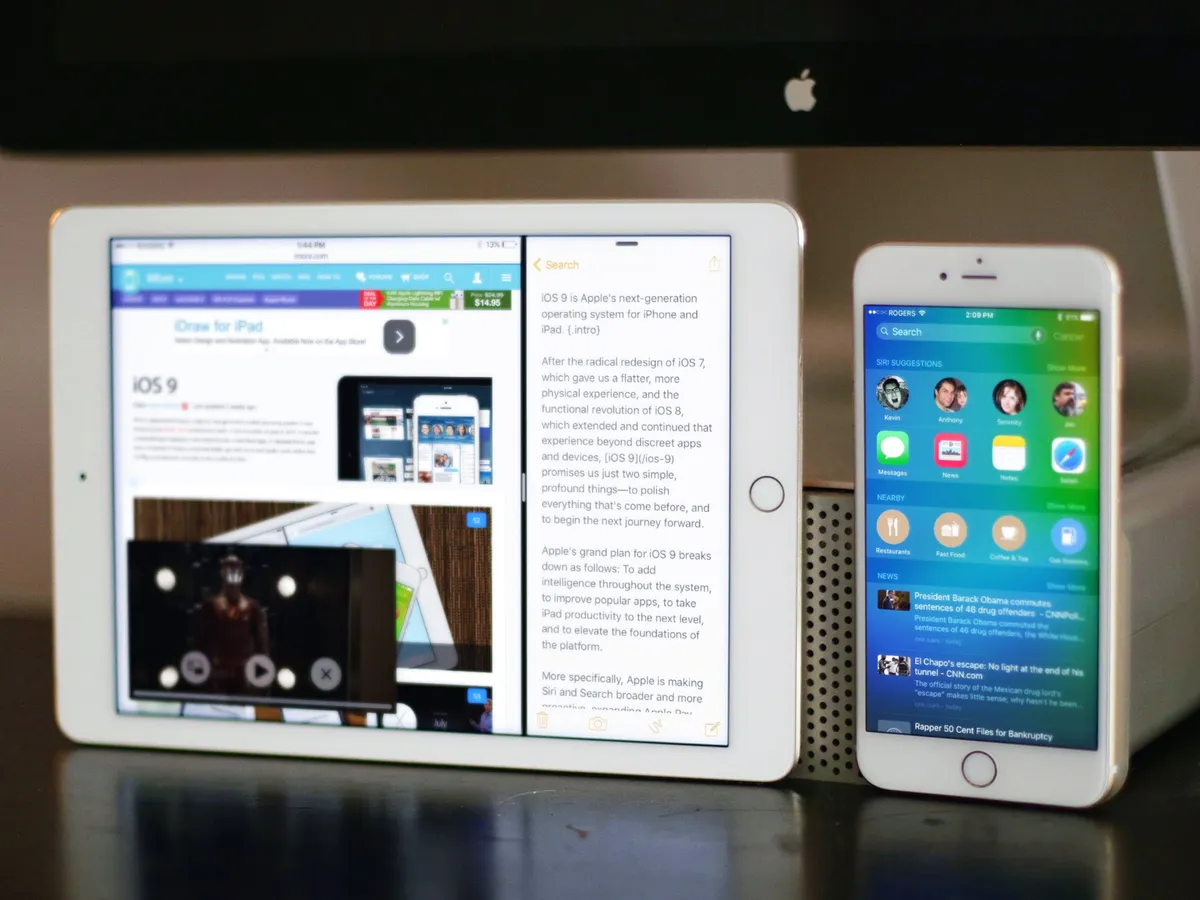
iOS 9 help
iOS 9 is jam-packed with new and updated features. To get the most of them, check out our help and how-to hub and, if you have any questions, jump into our discussion forums for more!
iOS 9 Bottom line
iOS 9 had a tough job to do. After consecutive years of major changes many were vocal about wanting a "Snow Leopard" year—a release focused not on yet more splashy new features but on stability and reliability. Except, of course, for the few new features they really wanted, and each different from the other.
And Apple has, in large part, delivered just that. They pushed some plans further off into the future and invested in solving and salving some of the biggest problems and pain points of the that last couple of years. The result is iOS 9, an update that, like Snow Leopard, has no major new features... except for all its major new features.
And many of those new features are built entirely on the work of that last few years. From Auto Layout and Size Classes we get multi-app multitasking for iPad. From Extensibility we get content blockers, game recording, audio plugins, network extenders, and more. And from Continuity we get the Search API, universal links, deep links, back links, and more. We're getting the payoff, both planned and serendipitous, of all those pieces having been moved into place, and it's only just the beginning.
We also get a new Notes and new News app, transit in Maps, proactivity in Siri, and the list goes on. Features still remain on the wish-list, to be sure: a ubiquitous dark theme, a guest mode, handoff for media, accessibility for App Store, lock screen "complications", leaderboards for activity, and that list too goes on. Yet in their place, and no doubt in the place of many features still unlisted, we got that renewed focus on reliability and performance, and the continued focus on security and privacy that, more than ever, is a vital option for those who don't want all their personal information stores on other people's servers.
From download sizes to battery life, search to multitasking, it's better in ways that make day to day use and enjoyment of the iPhone and iPad better. It's not the radical redesign of iOS 7 or the functional revolution of iOS 8, but iOS 9 has the performance and polish that makes everything that came before better, and sets the iPhone and iPad up for everything that comes next.
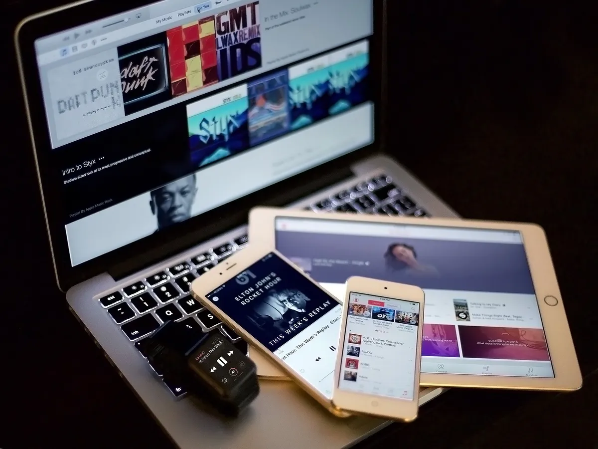
See also