Update: Apple has just released iOS 10.1, an update that brings the long-awaited portrait mode to iPhone 7 Plus, fixes issues with reduced motion and iMessage effects, cleans up the iMessage app drawer, and more. I've updated the review below to reflect the major changes.
iOS 7 was a redesign, wiping away rich textures and putting physics-based interactions in their place. iOS 8 was a re-architecture, decoupling actions from apps and letting them extend into other interfaces and continue across devices. iOS 9 was a rewiring, setting up intelligence and proactivity, but in a way that respected privacy and security.

Now, iOS 10 takes all those things and pushes them forward. The design is getting cleaner and more consistent. The architecture is becoming more open and convenient. The wiring, much smarter and even more secure. It's taken time — and pain — getting the physics, extensibility, and intelligence to this point. Now Apple gets to — and has to — pay it all off.
That starts with new app integrations for Messages, Maps, and Siri. Messages has also become much more interactive, emotive, and filled with laser slamming sticker fun. There's a new, bigger, bolder, more brilliant interface for Music and News, and for the new Home app, which, finally, collects all your connected accessories in one place. There's also a new Control Center with multiple cards, including new ones for Now Playing and Home. There's a new widget space and Notification Center look, and 3D Touch is more prevalent and powerful. Artificial intelligence and machine learning are significantly amped-up on-device and obscured by differential privacy when sent to the cloud. That includes face and object recognition for Photos.
Some of the new interactions might cause confusion or become the subjects of strongly differing options. That's nothing new. Balancing an operating system that's meant to be both convenient and secure, accessible to the mainstream yet productive enough for power users, is a problem that only gets harder every year.
So, how well does Apple solve for that in iOS 10?
iOS 10 Video review
Song by Jonathan Mann, video by Mikah Sargent, concept by Serenity Caldwell.
iOS 10 evolution
| Header Cell - Column 0 | Header Cell - Column 1 | Header Cell - Column 2 | Header Cell - Column 3 | Header Cell - Column 4 | Header Cell - Column 5 | Header Cell - Column 6 | Header Cell - Column 7 | Header Cell - Column 8 | Header Cell - Column 9 |
|---|---|---|---|---|---|---|---|---|---|
| Version | iPhone OS 2 | iPhone OS 3 | iOS 4 | iOS 5 | iOS 6 | iOS 7 | iOS 8 | iOS 9 | iOS 10 |
| Year | 2008 | 2009 | 2010 | 2011 | 2012 | 2013 | 2014 | 2015 | 2016 |
| Name | Big Bear | Kirkwood | Apex | Telluride | Sundance | Innsbruck | Okemo | Monarch | Whitetail |
| Features | App Store Enterprise enhancements iPhone SDK Microsoft Exchange | Accessories access Calendar enhancements Cut, copy, and paste Embedded Maps In app purchase Landscape MMS Peer-to-peer connectivity Push notifications (redux) Spotlight search Stocks enhancements Voice Memos | Enterprise enhancements Folders Game Center iAd iBooks for iPhone Mail enhancements Multitasking | Camera enhancements Game Center iCloud iMessage Newsstand Notification Center PC free Photo enhancements Reminders Safari enhancements Twitter integration | Accessibility enhancements Apple maps Chinese enhancements Facebook integration FaceTime over cellular Mail enhancements Passbook Phone enhancements Safari enhancements Shared Photo Streams Siri enhancements | Airdrop Camera enhancements Control Center iOS in the Car iTunes Radio iWork for iCloud Multitasking enhancements Notification Center enhancements Photos enhancements Safari enhancements Siri enhancements | Continuity Extensibility Family Sharing Health HomeKit iCloud Drive Interactive Notifications Messages enhancements Photos enhancements QuickType Spotlight enhancements | Siri intelligence Search (new) Apple Pay enhancements Notes (new) Maps (transit) News Multi-app (iPad) | New Lock/Home experience Siri enhancements Intelligence enhancements Photos enhancements Maps enhancements Music enhancements News enhancements Home app Phone enhancements iMessage enhancements |
| Extras | Contact search Languages Mail enhancements MobileMe Parental controls Quick look enhancements Scientific calculator | Open GL ES 2.0 Video Recording Voice Control | 720p FaceTime | 1080p Siri | Panorama mode | 120fps Slow motion Burst mode FaceTime Audio Open GL ES 3.0 Touch ID | 240fps Slow motion Adaptive UI Apple Pay | 3D Touch Live Photos 4K video | Camera zoom AirPods/W1 integration |
Each new version of iOS expands upon, refines, and ultimately advances all the versions that have come before. For details on existing features, please see my previous reviews:

Previously...
- iOS 9 review
- iOS 8 review
- iOS 7 review
- iOS 6 review
- iOS 5 review
- iOS 4 review
- iPhone OS 3.0 review
- iPhone OS 2.0 review
iOS 10 Compatibility
Apple didn't go so far as to exclude all 32-bit devices from iOS 10 compatibility, but they did drop several older models from the list, including all non-Retina display devices. Still, you can download and install iOS 10 on any iPhone or iPad going back to the fall of 2012.
- iPhone 7
- iPhone 7 Plus
- iPhone SE
- iPhone 6s
- iPhone 6s Plus
- iPhone 6
- iPhone 6 Plus
- iPhone 5s
- iPhone 5c
- iPhone 5
- iPad Pro 9.7-inches
- iPad Pro 12.9-inches
- iPad Air 2
- iPad Air
- iPad 4
- iPad mini 4
- iPad mini 3
- iPad mini 2
- iPod touch 6
iOS 10 Lock screen
When Steve Jobs first showed off the Lock screen in 2007, it had wallpaper, the date and time, and let you "Slide to unlock" your iPhone. Over the years, Apple added notifications and Notification Center, Control Center, fast camera access, Siri, suggested apps, fast Apple Pay access, and more.
Already a system divided against itself — designed to keep your stuff safe from others but rapidly accessible to you — it began to get, if not overloaded, then certainly fussy.
With iOS 10, Apple is cleaning things up and making them simpler and more coherent. At least in theory...
How to use Lock Screen on iOS 10: The ultimate guide
Raise to wake (iPhone only)
You can now "raise to wake" your iPhone simply by picking it up. It's identical to the raise-to-wake feature Apple Watch launched with over a year ago, using the accelerometer to switch on the screen when you lift it into the normal viewing position. It works really well, especially to glance at the date or time or to check Lock screen notifications. It's so convenient, I wish Apple had implemented it years ago.
It was done now, though, to solve the "problem" of the second generation Touch ID sensor. It's so fast people would click the home button to glance at Lock screen notifications and end up blowing right past them and onto the Home screen.
Some re-habituated themselves to only wake up the phone with the power button or with a finger not registered with Touch ID. But not everyone.
You could argue that on a device with only two main buttons, it's inefficient for them both to be used to wake the device. You could also argue that, on a device that sleeps, the first act of any button should be to wake it.
Apple's solving that knot by cutting it — it's inefficient for any button to have to wake the device, so wake it immediately on raise. And once you get used to it, any device that doesn't do it seems broken.

There's still one area where Apple Watch is ahead, though: You can also tap the screen to wake it. I wish that worked on iPhone as well. Tapping my iPhone as it sits on a table, so I can quickly glance at notifications without even having to raise it would be perfect.
Lock screen layout
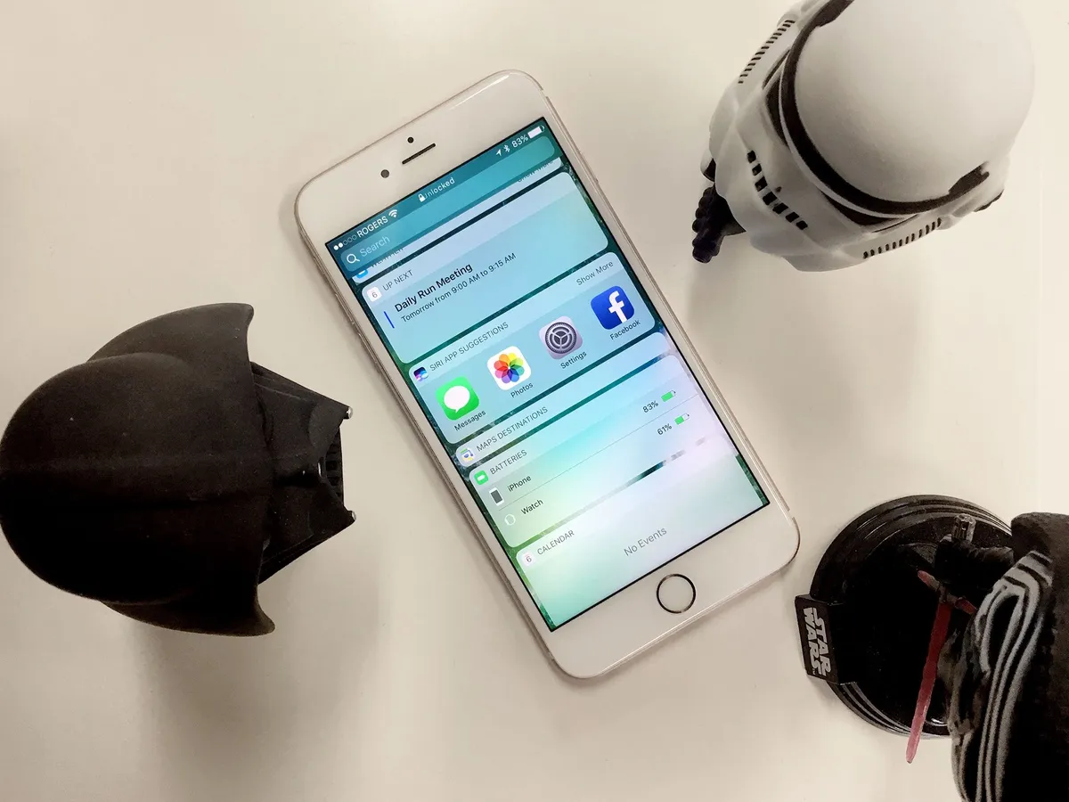
The basic layout of the Lock screen has gotten simpler in iOS 10. The main Lock screen is still front and center, and you can still swipe down Notification Center from the top and swipe up Control Center from the bottom. Gone from the left, though, is Passcode, and in its place, Today view widgets. (Passcode now takes over the main screen when and if it has to). New to the right is fast camera access. (It was previously an icon, bottom right.)

Today view replaces the "minus one" Home screen, to the left of the main Home screen as well (previously occupied by Siri suggestions). It's also still accessible to the left of Notification Center. That makes getting to it much more convenient and consistent. Well, almost. If you go to the minus one Today view, then pull down Notification Center, then try to go left into Today view again, you can't. Allowing it would be a silly loop, but since people won't always remember how they got somewhere, consistency should beat logic.
Having fast camera access take up the full right swipe is much more reliable and robust. Grabbing a tiny icon was sometimes hit and miss. This new layout is touch and shoot.
Today view
Today view hasn't just taken over the "minus one" screen; it's been redesigned. Information density has gone down, but legibility has gone up. I'm still mixed on it. I think tighter corners and a little more density would have been a better compromise.
As it is, the aggressive corner radius combined with the background no longer dimming behind the widgets and notifications makes things distracting for me when I scroll. The wallpaper ends up creating a flicker or strobe effect, and I really wish it wouldn't.
You can customize which Today view widgets you want to see, just like before. Tap one, and you go to straight to its app. Tap on "Show More", though, and you get an expanded widget view. That includes animation and even live video, right in the widget, which is outstanding.
I'm not sure why both of those things aren't handled by 3D Touch, though, given how well peek and pop are handled through the rest of the system. As it is, I find myself pressing firmly all the time anyway, expecting something to happen and getting only the silent laughter of the widget in response.

Where widgets do use 3D Touch is on the Home screen. Press an app firmly and, if it has a widget, it'll pop right up atop the Home screen shortcuts. It fits beautifully with the overall theme of 3D Touch being a time saver — if you just need a little bit of data, there's no need to pop into the app – simply peek at the widget.
Notification Center
Notification Center and notification space has gotten a similar redesign. It's also become persistent. So, now, you can carry on a short conversation without having to bounce back and forth between what you're doing and what you're saying or jump to another app and then have to jump back.

I wish I could toss notifications away when I'm done, because their card-like shape and position on top of the screen makes you feel like you should be able to, but there's an X to close them or, like watchOS, you can swipe down to dismiss.
A longstanding pain point has also been addressed in iOS 10: You can 3D Touch the clear button to delete all notifications, just like Apple Watch.

How to use 3D Touch on iOS 10: The ultimate guide
Control Center
Control Center has gotten one of the most significant redesigns in iOS 10. It too sacrifices density for legibility. In this case, though, the tradeoff takes some getting used to. Instead of a single card there are now three cards: one for control, one for now playing, and one for Home.

I'm still not settled on the new design. I love the new functionality, but I'm not yet sold on the implementation. Control Center's strength was that you could swipe it up from anywhere, do what you needed to do, then swipe it away. Now with three cards, there's often at least one additional swipe needed to get to where you want to go, maybe two. (For example, if you land in control but want home, or vice versa.
If Apple let the Control Center cards wrap around so that you could keep swiping either way and continue to cycle through the cards, it'd be perceptibly faster — and you wouldn't have to carry the cognitive load of remembering which card lived in which direction.
Also, because there are gaps between cards, switching between the cards looks slow. Notification Center, which lets you swipe between Today view and Notification view but does it in place, looks much faster, at least to my eyes.
The cards also introduce gesture collision. I can't count the number of times I've wanted to change brightness on the control card and ended up on the now playing card or wanted to change volume on the now playing card and ended up on control or home. The touch targets have gotten better over time and might get better still, but there's only so much space and so many gestures, and layering swipes is never going to be ideal.
The same goes for Control Center in the new results card in the Maps app. Swipe up hastily and you're just as likely to get one as the other, which means half the time it's not what you want. And touch interfaces need to be way, way less fussy than that.
On the positive side, the addition of 3D Touch shortcuts really expands the functionality. You still can't swap out the settings or change the tools, which would be nice, but you can get to specific and additional functions faster, like different intensities for the flashlight or common timer lengths. It's useful enough; I hope Apple builds it out further in the future.

Last year some insisted on calling 3D Touch a "gimmick". It was really an experiment. Flat, single column multitouch interfaces impose very real interface constraints. 3D Touch sought to literally add a trans-dimensional tunnel through them: press your way from one view or app into another.
Since 3D Touch isn't ubiquitous across devices, though, it can't be mandatory and so it's harder to make it a habit. That's why I'm not sure iOS 10 will change many hearts, even if the new functionality does make it even more attractive to try.
How to use Control Center on iOS 10: The ultimate guide
Press home to unlock
One of the biggest changes to the Lock screen in iOS 10 is how you open it — "Slide to unlock", a gesture that helped define the original iPhone experience, is gone.
In its place is "Press home to unlock" — or "Press home to open" if you've authenticated with Touch ID. You can actually put your finger on the sensor and not press down and see a wonderful little glyph-by-glyph animation of the lock indicator at the top of the screen opening and the words "unlocked" sliding into place.
That you touch to unlock and then press to open, instead of pressing to open and then keeping your finger in place to unlock, is a little confusing at first. If you don't nail the timing, get frustrated, and start pressing wildly, you can end up bouncing between passcode, Apple Pay, and even Siri screens. You can always switch on "rest finger to open" in Settings > General > Accessibility if you want or need to. If you give it a chance, though, once you do nail it, it makes a lot of sense.
Pressing home has always taken you home, and now it does just that from the Lock screen as well.
iOS 10 Siri
Since Siri was first introduced in 2011, developers and customers alike have been clamoring for a way to use Apple's natural language, sequential inference-driven virtual assistant to control all the apps on iPhone and iPad. Hey Siri, call me an Uber! Hey Siri, Skype Serenity! Hey Siri, send Lory $10 for dinner! It was nothing more than a beautiful dream — until now.

With iOS 10, Apple has introduced Siri apps. It's not a fully open API, at least not yet, but it will let six types of apps integrate with Siri in a fully fleshed out way:
- Ride booking
- Messaging
- Photo and video
- Payment apps
- VoIP calling
- Workouts
CarPlay will also be getting Siri integration for VoIP and Messaging apps.


So, no, Siri won't be able to catch Pokémon for you, but the reason for the limitation, according to Apple, is a desire for quality over quantity. Apple wants to make really robust integrations that don't force you to speak in a certain way, construct sentences in a specific order, or constrain yourself to highly specific words. They want you to speak the way you naturally speak.
- "Skype Georgia I'll be there in ten minutes."
- "Message Georgia via Skype that I'll be there in ten minutes."
- "Tell Georgia I'll be there in ten minutes with Skype."
To get that to work, Apple had to build out complex vocabularies — called domains — for each type of integration and cover every potential way of addressing them imaginable. Siri app integration also works with the idea of intents. Apps that fit in one of the applicable categories can describe a set of "intents", or things that they can do, and Siri takes care of the rest. So, developers neither have to re-invent the wheel nor introduce inconsistent implementations that make the system harder to use.
Because of the overhead, Apple was only able to get those six and CarPlay done and polished for iOS 10.0 but says more will be coming with future updates.


The best part? So long as you're using one of the six types of apps mentioned above, they'll reply to Siri with the same kind of information-rich cards as the built-in features enjoy. That means you can ask any question and issue any command right in the Siri interface, just like you're used to.
I didn't have access to Siri apps during the beta, so I couldn't test them for this review. I'll be doing that soon and updating this section accordingly. In the meantime, Apple provided some examples from developers who had early access to the functionality:
- Pinterest: Find specific ideas you've saved: "Hey Siri, find women's fashion Pins on Pinterest."
- Vogue Runway: Find collections from past runway debuts: "Hey Siri, ask Vogue Runway to show me photos of the Hermès 2016 collection."
- Looklive: Find a "look" you've been crushing on: "Siri, show me photos of what Drake was wearing at the MTV Music Awards in Looklive."
- Pikazo Pull up your favorite creations: "Hey Siri, show me a photo of my godson in the style of Monet on Pikazo."
- The Roll: Find photos organized by artificial intelligence into keywords: "Hey Siri, show me my best photos of idyllic sunsets taken last summer using The Roll."
- Square Cash Send money to a friend, to split the dinner bill or pay the rent: "Hey Siri, send Lauren $20 with Square Cash."
- Monzo: Send payments you can authenticate with Touch ID: "Hey Siri, send Andy $10 for lunch."
- WhatsApp Send messages to family and friends with the power of your voice: "Hey Siri, using WhatsApp, send a message to Georgia saying I'll be there in 15 minutes."
- LinkedIn: Message to anyone in your network: "Hey Siri, send a LinkedIn message to Phil that says, 'Great meeting today.'"
As with the rest of iOS, Siri apps are private and secure. That means app developers get to handle the questions you ask, but they don't get your personal data or any other data along with it. Apple does all the parsing and passes the intents on to the apps.


It's a huge step forward for Siri, especially given the competition on the market. Apple already handles multi-region and multi-language as well, if not better than anyone. Siri also goes with you everywhere; it's not bound to a single multi-mic system in your house: Oh, damn, I'm going to be late getting home but that order's coming...! I better yell really loud!
You don't really notice how important that is until you leave your home, switch from phone to tablet, travel internationally, or simply speak without having to worry about putting the right word in the right place. Then it's everything.
If Apple can nail the integrations — if they work and they work well — then the combination of ubiquity, convenience, and extensibility will be killer.
iOS 10 QuickType
Data detection and prediction have both been taken to the next level in the updated QuickType keyboard. Apple's branding it as "Siri intelligence", the way they did Spotlight last year. I equate Siri with the personality-driven assistant, not the inference engine, so it doesn't quite jibe for me, but either way it works.
In order to be able to make better predictions, in wider contexts, over longer periods of time, Apple is using an aspect of neural networking called long short-term memory (LSTM). With it, everything from location, to calendar, to contact information, to the latest buzzwords are offered right up, so you can enter them without having to hunt them down and copy them out from other apps.
For prediction, it can figure out the difference when you're typing about a movie playing and your pets playing and provide the proper suggestions for each. For responses, if you're asked for a mutual friend's phone number, it can offer it right up. All told, the current implementation supports:

- Intelligent suggestions
- Intelligent scheduling
- Calendar availability
- Current location
- Contact information
- Recent addresses
- Point of interest lookup
- Multilingual typing
The latter especially has been on a lot of wish lists.
In most cases it's sublime, but it's got one major drawback — just like with location sharing in the details screen, it's too easy to share where you are. Absent a confirmation dialog, you're always only one missed touch away from sending your location to someone you're trying to brush off, actively avoid, or are in some disagreement or distress with.
Location, and perhaps all personal information sharing, should require confirmation always. I hope Apple adds that option soon.
Where Apple continues to get it absolutely right is in keeping local information local and private. Anything that's from your device stays on your device. Anything from the cloud comes down and gets analyzed on your device. Apple's not harvesting any personal data in exchange for these conveniences.
Apple is striving to prove we don't need to make that exchange. And they're taking it a step further in iOS 10 as well. Using something called "differential privacy", Apple is adding a level of noise to any data it does want to pick up — like new words to add to the dictionary — and then filtering it out, so it's completely anonymous on the other end.
For example, if it wanted to know whether to suggest "Wars" or "Trek" more often as an auto-complete for "Star", Apple could use differential privacy to ensure no one ever found out which individual preferred which series, thus preventing family and friendship feuds.
When collecting the data, Apple could flip a virtual coin and then have a percentage of the people "lie" about their answer. That way it would be impossible to know if any individual told the truth or lied, and thus impossible to know what their real answer was. By collecting enough responses from enough people, and using statistical analysis to figure out how many lies there were, Apple could get really close to the proper answer, again, without ever knowing exactly which individuals answered which way.
Less noise could be added for areas of less popularity and frequency, more noise for areas with higher popularity and frequency, and the system could automatically opt-out anyone who was contributing too much data and overriding the privacy system.
In the same way, if millions of people started typing "shway" for "cool", Apple could quickly add it to autocomplete, without ever needing, or caring, to know whether you typed it or not.
How to use the QuickType keyboard in iOS 10: The ultimate guide
iOS 10 Photos
Photos was the app that really showed off the "wow" factor of multitouch on the original iPhone. Since then, it's had its ups and downs. Now, though, it feels like Apple is getting Photos for iPhone and iPad back on track. This year cracks "finally!" territory with the addition of Places — which feels like it's come and gone a few times over the years — and Faces, and introduces competition in the hyperbolic "artificial intelligence" and "machine learning" space with a much more advanced, object- and scene-filled search.
It's not just about finding what you want, though. Photos in iOS 10 is also about surfacing what you forgot you had. It does this through next-generation slide shows that pull from time and place for your viewing, and reminiscing, pleasure.
Advanced machine vision
Available on the Mac forever, Faces and Places helps you quickly find the locations and people that mean the most to you. Faces in specific uses "advanced machine vision" to scan your library and incoming photos and tries to figure out who's who. In keeping with Apple's stance on privacy, this is all done locally, right on your device, instead of being uploaded to some search engine or social server cloud, where the service is performed only in exchange for the data you provide.
Apple's gambling their significant lead in silicon — the chipsets inside the iPhone and iPad — will let them analyze and organize photos fast and well enough that we won't need or want to use online services anymore. And it's a big gamble.

Many people don't care about privacy. Unlike the cash you see coming out of your wallet or account, or the time you see clicking off the clock, data feels like it's free. We never have to look at the contents of our personal messages, emails, financial information, health data, and photos as leaving our control and being sucked up onto someone else's server. We just see free stuff with killer convenience, and the actual cost is abstracted away completely.
Still, Apple has to provide a compelling alternative in order to get a significant group of people to stop using the easy, powerful services of Google, Facebook, and Amazon, and use the on-device apps of iPhone and iPad instead.
In my tests so far, Faces has been okay but not outstanding. Lots of the same people have been split out into separate sets of photos, and I have to tap to merge them. And to label them. It's more work than I'd like. I feel like some of it should work better, for example, comparing Faces to profile pictures in contacts to guess who's who before I label them. I'm a writer, not a neural network or privacy architect, so I don't know the complexity, I just know how I want it to work.
Faces and Places are also surfaced right in the main photo view as well. Pick a photo, scroll down, and you see the people in it, the place it was taken, and related photo clusters. (See Memories, below.)
Apple isn't stopping with faces, either. Even without sucking up our data, they managed to figure out what rivers and mountains, coffee and steaks, cars and bicycles, and thousands of other objects look like, and Photos search can quickly pull them, and thousands of categories like them, out for you now as well.

This part has worked for me far better than Faces. Well enough that I haven't even considered switching to an online service since, even though I expect Google's especially would be better. A little less functionality for a lot more privacy is a price I'm not only willing but eager to pay.
I wanted to find a specific car I'd seen the other day, so I typed in "cars" and "Cupertino" — you can do hybrid searches, no problem — and it popped right up. That's indistinguishable from magic.
How to use Photos on iOS 10: The ultimate guide
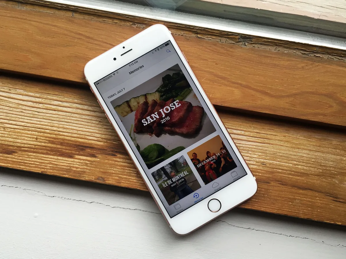
Memories
Search lets you find what you're looking for. Memories hopes to show you what you've forgotten. Using the same time of machine vision, Memories clusters together events like trips, times like last weekend or year, and other major confluences of people, places, and themes, and then edits them into slideshow-style presentations, set to music, and intended to help you relive cherished moments.

Tap the new Memories tab at the bottom of the Photos app and you'll get a set of custom-generated shows, both for today and those generated in the past. You can play the Memory immediately or scroll down to see all the photos, as well as sections on the people and places contained within them. Related Memories are at the bottom, in case you want more from where they came.
When you play a Memory, it has to download any photos that aren't already on your iPhone or iPad from iCloud, which can take a while. Once it starts, it plays through, though you can pause it and edit the photos, as well as the duration from short to medium to long, and the mood. Each one comes with its own typeface for the titles and music.
- Happy
- Uplifting
- Epic
- Club
- Extreme
- Dreamy
- Sentimental
- Gentle
- Chill
You can also tap the edit button and separately tweak the titles, music, duration, and included photos. You can save the videos that delight you and expunge any photos that bring back any pain or embarrassment.

I seldom remember to go to the Memories tab in Photos, but I stumble upon them all the time in the related content section of photos — once you can scroll, I can't help but scroll! Almost every time I'm reminded of something that brings at least a small smile to my face. Sometimes, a massive smile.
I don't know if Memories will have any longevity, but photo and video pins lost in album and storage haystacks are very real problems of the digital age. Previously, Apple offered slideshows in iPhoto, and systematically made iMovie and Final Cut Pro more intuitive for quick video cuts. But the first wasn't smart enough and the second still not fast enough.
Memories is both smarter and faster; what remains to be seen is whether it clicks with customers or gets forgotten about just like the photos it's meant to surface.
How to use Memories in Photos for iOS 10
Markup
Crossing off another wish list item, Apple has added support for their markup extension to Photos. Previously, and vexingly, only available in Mail, markup lets you quickly and easily add text, callouts, and sketches and otherwise add visualizations — or vandalization — to your Photos.

It's a great way to add quick captions to personal photos, feedback to design comps, explanations to interface bug reports, or wackiness to any image you want to send or return.
How to use Markup in Photos for iOS 10
iOS 10 Camera
Yin to the Photos app's yang, Camera is Apple's simple, elegant capture app for pictures and video. In that regard, Camera hasn't changed much from last year, but there is one welcome change, some amazing under-the-hood improvements, and a few new features... for iPhone 7.

The camera switch button — A.K.A. the selfie switch — has moved from the top to the bottom and kicked the filters button up top to make room. Since I, and I suspect most people, take selfies more often than live filtered photos, it means the more common task is now easier to reach, even on the bigger phones.
In a welcome fix, launching the Camera doesn't kill audio anymore. So, you can pause on your run to take a photo without killing your podcast or playlist. Thanks, Apple.
On iPad, the Camera app redesign is even more extensive, with controls placed where they make more sense for the bigger screen. It's iPhone 7, though, that gets most of the new magic.
How to use Camera for iOS 10: The ultimate guide
DCI-P3
Last fall Apple upgraded the iMac with 5K Retina display to DCI-P3, which is a cinematic standard for wide gamut color. It technically means more accurate, lifelike representation of magentas, reds, oranges, and the like. It effectively means photos POP more than ever before. Last spring Apple brought DCI-P3 to the 9.7-inch iPad Pro and this fall, to iPhone 7.
Bigger news, though, is that Apple has added full support for DCI-P3 — and the next-generation standard, 2020 — to iOS. That means, on devices like iPhone 7 that support it, you can capture and display wide gamut images. Better still, Apple is managing that color across their entire product line, so what you shoot on iPhone 7 will look exactly as its supposed to on iPad Pro and iMac.
It's a step towards the magnificent future of deep, high-dynamic color, but an important one.
RAW
JPG, the photo format typically captured and stored by Apple products, is "lossy". It's designed to throw away data your eye doesn't really notice in order to save massive amounts of storage space. Higher end cameras, including DLSRs, can also capture RAW, which keeps as much data off the sensor as possible, at the cost of much higher file sizes.
With iOS 10, Apple is opening up RAW support to App Store apps. Just like with manual mode a couple of years ago, Apple's own Camera app is avoiding RAW in the name of simplicity. That's their vision for everyday photography. Other apps, and photographers who want much more control in post, will be all over it.
Zoom
iPhone 7 Plus includes a dual-lens system, one 28mm wide-angle, one 56mm telephoto. Apple presents them as a single, fused, camera system, though, that allows for up to 2x optical and 10x digital zoom. The feature is controlled by a new zoom interface designed for easy one-handed use. Tap the 1x button and you jump to 2x. Hold it down and move your finger around, and you arc through the other magnifications until you hit 10.

Because it's designed to work as a single camera system, it's easy to get confused about which lens is being used at which time, and when they're being used simultaneously. For example, some people cover the telephoto lens, go to 2x, and don't understand why the camera preview isn't blocked by their finger.
The answer is the Camera app, and how it's abstracting away all the implementation details and presents a single, coherent interface. So, for example, if the light isn't good enough for the f/2.8 telephoto lens to render a great preview, you'll get a simulated preview off the f/1.4 wide-angle.
In other words, don't worry about or geek out over the mechanics — there's are App Store photography apps for that! — just take pictures and let the Camera app figure it out.
iOS 10.1 update: Portrait mode
When Apple showed off the iPhone 7 Plus, one of the big features they demonstrated was Portrait Mode. It used the two cameras to capture a both the subject and depth information about the scene, build a multi-layer depth map, then use a custom disk blur to simulate a depth-of-field, or bokeh, effect around the subject.

In beta for over a month following the launch of iPhone 7 Plus, it shipped to the public with iOS 10.1. I've been using it since the beta, and I'm really pleased with it. Though it's designed for portraits, as the names implies, and uses face detection as part of the process, the real world range is much wider.
It works great on pets, of course — my colleague, Serenity Caldwell, has dubbed it Pet-rait Mode — but also for nature photography, still life, product shots, food picks, and more. The only place where it has real trouble is highly reflective surfaces, which makes taking pictures of bottles, glasses, and — haha! — iPhone 7 in Jet Black difficult, since it'll mistake the reflections for areas that need blurring.
Apple has also made a lot of really smart choices with the software. For example, because Portrait Mode needs a lot of light to properly engage the f/2.8 telephoto lens, lower light portraits will be noisy. Instead of just leaving them noisy, Apple tweaked the software to make that noise reminiscent of old-style film grain.
The result is something almost better felt than seen. There's an emotional content to the Portrait Mode photographs that I've not experience on camera phones before.
The Camera app interface is great as well. Since getting a Portrait Mode shot requires specific distance and lighting, the app coaches you through the process. It'll tell you to get closer or further away, and when you need more light.
When you take the picture, you also get both the regular and the Portrait Mode version, just like you do with HDR, so you can pick the one your prefer. The Portrait Mode version is labeled "Depth Effect", though, which is an odd choice given Apple specifically called the feature "Portrait Mode". The latter is a better, more mainstream friendly choice, but I'd like to see it reflected in the photo labeling as well for consistency's sake.
Even though it's not what Portrait Mode was optimized for, I also like the product shots enough that I haven't shot with my Canon 5D Mark II since getting iOS 10.1. I do have to be more careful about light and angles, but I can now shoot anywhere, at any time, without lugging a DSLR with me.


And for people, pets, pictures of iPhones and coffee, and everything else, that's exactly what I wanted from Portrait Mode. About the only thing I'd love to see improved is the ability to use it in lower light one day.
Read our complete Portrait Mode review
iOS 10 Maps
Someone, somewhere in Apple's services division had the grand idea to redesign their core apps, including Maps, to be bigger, bolder, and brilliant. I liked it at first sight, but not at first use. There's a simple but profound reversal to the way Maps works that confused me for a while. I've become accustomed to it now, though. I still don't find it intuitive, but I'm slowly starting to think it's a better fit overall.
The previous version of Maps had become muscle memory for me, and I was used to tapping locations, getting popups right at the locations, and sliding between screens to get more generic or more specific information, depending on what I needed. Now, all of that has changed. You don't move between screens any more. Instead, you stay centered, and everything you need slides up to you in a brand new, all-containing card.
New Maps design
The centerpiece in the new Maps design is the card that slides up from the bottom of the screen. It holds everything, from search suggestions to nearby location information. And it manages to be both the best and most vexing part of the new Maps. The card has three states:
- A tab at the very bottom that obstructs the map as little as possible.
- A short, Control Center-like card that gives you the most pertinent options or information.
- An almost full-screen view, complete with keyboard and nearby filters.

You can swipe it up or down between those states, most of the time without triggering Control Center from the bottom or Notification Center from the top. But not always. There are, after all, only so many gestures you can layer without getting collisions.
That's my biggest gripe about the gesture overloading iOS is beginning to adopt: It forces precision where, previously, the lack of need for precision was a competitive advantage.
Proactive suggestions
The default state for the card is a search box and proactive suggestions. They include places you go to frequently, have been to recently, are on your calendar, or Apple's data detectors and machine learning algorithms otherwise think you'll find valuable.
Additional information, like traffic conditions and estimated time to destination, are also provided for your convenience.

If you want to find a place, simply type it into the search box. That used to be hit-and-miss in Maps, with little or no local prioritization, nearest neighbor, or search widening present. Now it's working well. Well enough, at least, that I can incorrectly spell the name of a Montreal bar while browsing San Francisco, and still get the correct local result. Cheers, Maps team!
Tapping into the search box will also bring up the nearby points of interest filters for your current location. If you want to see nearby points of interest for other locations, search first, get results, then clear the search box, tap into it, and you'll be good to filter.
Better still, there's now a sliding filter at the bottom as well. So, if you chose popular restaurants and want to narrow down the type of cuisine, you don't have to go back and tap the extra filter, you can simply dial it in.
Navigation
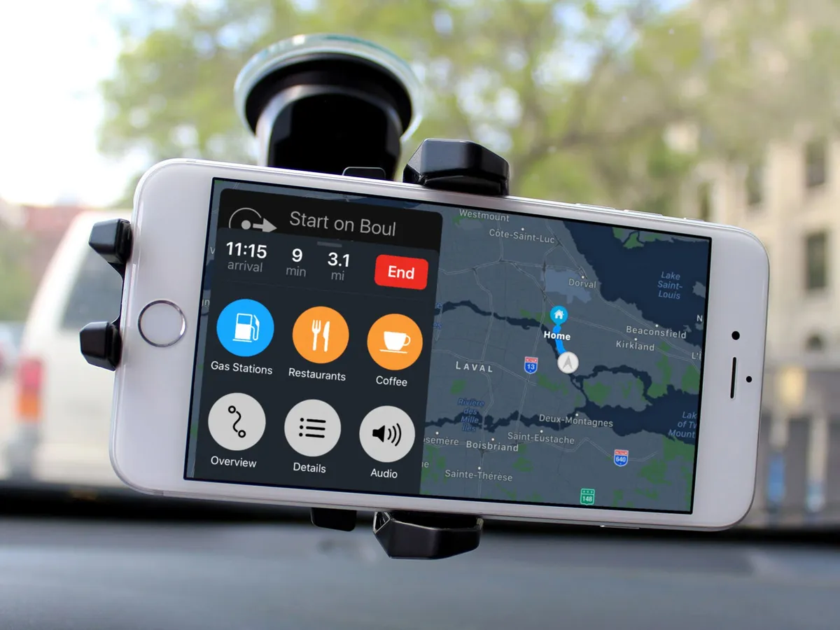
Navigation gets a similar bigger, cleaner, and easier to follow design. The most welcome change, though, is that it will not only automatically zoom in and out to fit the scale of your current route, but let you pan around as well to see whatever it is you need to see.

There's also traffic en route and, when navigating, the card fills with arrival time, remaining time and distance, and can expand to show nearby points of interest for the route, including gas stations and restaurants, as well as options for an overview, detail view, and audio controls.
It's a much better, more usable interface while driving, especially for people who mount their iPhones on their dashboards in place of a built-in navigation system or Apple's CarPlay system
Maps apps
The biggest news for Maps this year, though, is apps. Just like Siri, apps can live right within the maps app. The value of app integration in Maps might not be obvious at first. Once you book a ride or reservation from within Maps, without having to jump around between apps, it becomes absolutely clear.


The human brain is horrible at context changes. Switch apps and, more often than not, you forget why. "Oh, new tweet from @settern? Let me just—whoa, I can't believe the New York times wrote this! Wait, what was I doing? Right, @settern... I'll just launch Tweebot again and—Wow, new Star Wars trailer...!"
If you stay where you are, though, and the functionality comes to you, then you never lose context. With Maps extensions, you can be traveling, see where you are, find a nearby restaurant, book a table, arrange for a car, pay for the ride, and never switch apps once. It's more efficient, more convenient, and just plain better.
Like with Siri apps, I'll have to wait until Maps extensions hit the App Store and I get a few days and weeks use out of them to see how they really perform. At that point, I'll update this section of the review.
I'm guessing it'll be a slam dunk, though. It's the same principal that made sharing and action extensions so powerful in the Share Sheet, and editing and effects extensions so convenient in the Photos app. It's as simple and profound as the transition from pull to push interface, and I want it everywhere.
iOS 10 Music
My Apple Music workflow remains incredibly simple: I ask Siri to play me whatever I want to listen to, whenever I want to listen to it, and then I spend a moment realizing the future is now. Then, when I don't know what I want to listen to, I tune into Beats 1 and occasionally poke around For You.
All this to say I have no business reviewing Apple Music as a service. I'll leave that for my colleague, Serenity Caldwell, and her follow-up Apple Music review.
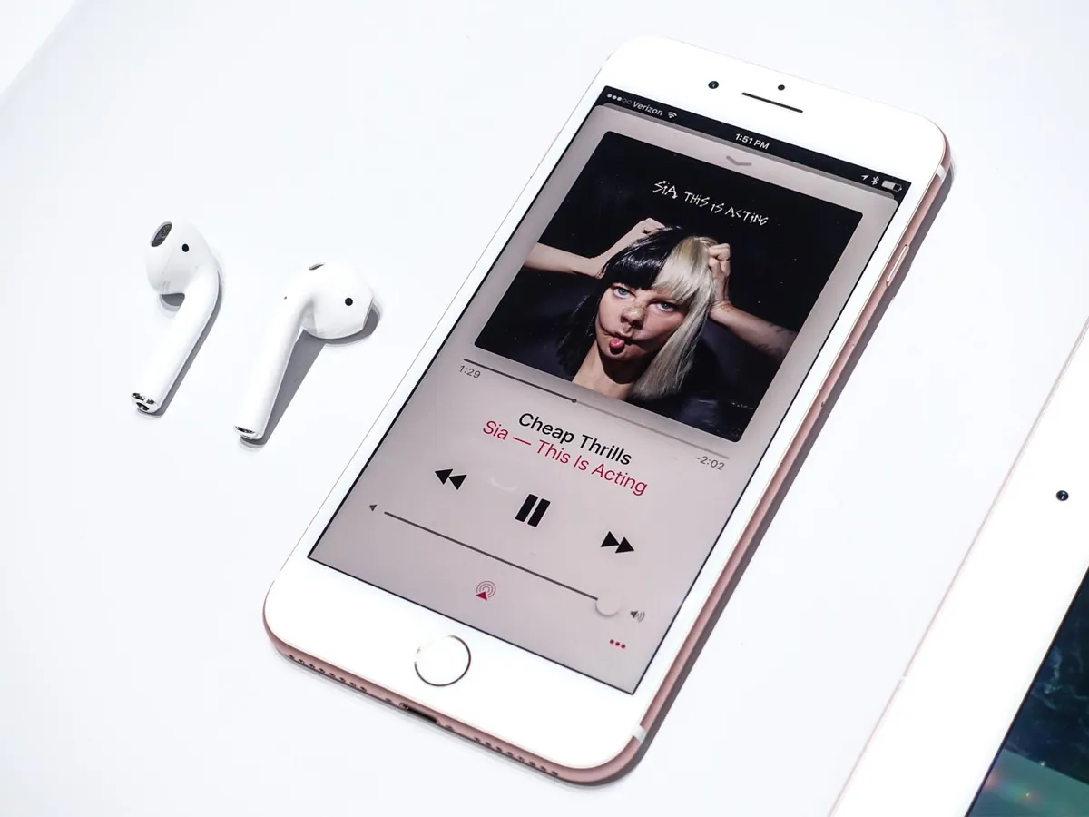
Purely from the design-side, though, the Music app in iOS 10 is lightyears head of where it was before. It's simpler now and more coherent. It's still trying to do to much and cater to too many workflows, I think, but music is the one area where Apple enjoys an almost Microsoft Windows-level of legacy debt. So, baby steps.
The language is in the same bigger, bolder, more brilliant style as the rest of the services apps, and it fits Music well. Everything is easier to see and interact with. Even the "more" buttons, which were everywhere in the previous version, have been minimized as much as possible. On recent iPhones, 3D Touch picks up the task of bringing up all the options. And it's a much better fit.
In terms of organization, Library — your library, your music — is right up front now, and makes it easy to get to all your stuff. There are big, bold sections to make specific content easier to find, and a download tab so you always no what's available on your device, should you go offline.

When you find what you want and start to listen to it, now playing comes up using a card interface almost identical to the one in Maps. It suffers from the same gesture collisions as the Maps card as well — I often pull down notification center when I mean to pull down now playing.
It's cleaner, though, and introduces Apple's new buttons for like and dislike: a heart and a slashed out heart.
Built-in is lyrics, if available, which let you sing along with what you're listening to. It feels like Apple's been toying with lyrics — and our collective emotions along with them — for years, so hopefully they stick.

For You now houses the My New Music Mix, which includes personal song recommendations just "for you" and new daily playlists to help get you going. Connect has also been relegated here.
It feels like for Connect to have ever been successful, Apple would have to have hired hundreds of marketing assistants to literally walk behind artists posting on their behalf. Absent that, the old tab was a ghost town. The new section, a partially inhabited dwelling. In either case, it's hard to see Connect going much further, even in its update form.

Browse lets you see what's hot and happening in the Apple Music world, with top songs, featured albums and events, the new music for the week, and the current chart toppers.

Radio houses Beats 1, including what's live, upcoming shows, and featured shows. As well as all of the other, genre-specific radio stations.

It's hard to frame how much of an improvement the new Music app is. Last year I wrote that the then-new Music had been given an impossible job — to support new, modern use cases without being allowed to abandon the old ones. Now the new-new Music app does the impossible by balancing out those use cases in an almost elegant way.
I still think Apple will eventually need to make some hard choices about the past and future of music, but I no longer think they have to be made today.
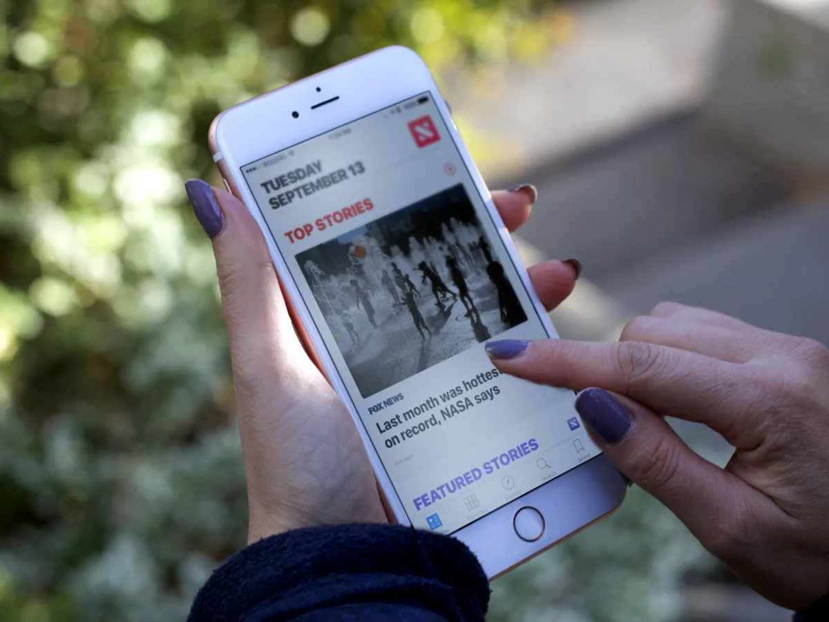
Apple News
Apple News debuted at the same time as the new Music app and now, a year later, it's getting the same big, bold, brilliant redesign. News wasn't anywhere nearly as controversial as Music at launch, nor as complex, but it still benefits greatly from the new look and structure.
How to use Apple News: The ultimate guide
The new News
Notably, For You is now broken up into clean, clear sections. There's top stories, trending, topical stories based on what you follow, and featured stories curated by the News team. Individual stories pick up the same heart/slashed-heart icons as Apple Music for like and dislike, which is great for consistency. There are also action buttons – tiny on list pages, full size on article pages – that let you access the Share Sheet from just about everywhere. Super convenient.
Sadly, News is still region-limited to the U.S., U.K., and Australia, which is an incredibly small segment of Apple's customer base, never mind the world. There are signs that this may be changing, but a year out, there's no way to spin the lack of growth as anything other than disappointing, especially when contrasted with Apple Music's 100-country launch.

On the bright side, News has gotten closer to the system-level service I've been dreaming up. Last year, internal secrecy led to News being launched as an app, but an entirely separate and nowhere nearly as personalized news feed getting included in the "minus one" Home screen's Siri suggestions.
Now that everything is all nice and public, those two hands have shaken, and the widget for News proper is properly on that page. All that's left is for Safari Reading List and Shared Links to get integrated...
Meanwhile, News has added a couple of new features. The first is notifications, so you can get alerted to breaking stories from the publications you follow. The second is...
Subscriptions
With iOS 10, Apple has given publications the ability to charge for subscriptions right inside News. It was something that was previously available to apps as part of the old Newsstand category and something that's now available to all app categories, but in News, you don't need to have or maintain an app.
It's Apple's hope that subscriptions make it viable for magazines and newspapers to fully commit to News and for customers to get all their periodicals, all in one place.
That Apple keeps trying to do for News what iTunes has done for media is noble, and I really hope this helps them succeed. I didn't have access to News subscriptions in time to test them for this review, nor do I suspect they'll be available where I live for a while still. But we'll get someone on the team to test them as soon as possible.
iOS 10 Home and HomeKit
When Apple's HomeKit home automation framework first shipped, it did so without an app. Imagine HealthKit absent the Health app, and you get the idea. It created a fragmentary experience where different accessory vendors tried to handle setup and management on their own, often less than exemplary, apps. Well, they had their chance, and now Apple is doing it the way only Apple can, with a slick interface and deep integration.

Home uses the new big, bright, and beautiful design language seen in Music and News, but in a way that's specific to where you live. You can add wallpapers to make your rooms immediately and personally identifiable. You can see all your favorite accessories in your home at a glance. You can dive into individual rooms. You can even quickly and easily set up automations based on location change, time of day, the state of other accessories changing, or sensors detecting activity of some kind.
It's not perfect, of course. What looks like the tracking button in Maps is used in Home to open in-app settings. The button is actually labeled "Show Locations", but the similarity is visually confusing (to me at least). Accessories on the Home screen also start drooped two-thirds of the way down, which is nice for showing off your wallpaper, should you choose to customize it, but requires an extra swipe before you can access most of your devices.

If you have an Apple TV or an iPad you leave around the house, you can also use Home remotely. Being able to make sure the lights are off, even when you're about to board an airplane, is terrific. So is tracking the thermostat, locks, room sensors, and more — including, new for iOS 10, air conditioners, cameras, doorbells, air purifiers, and humidifiers.
There's even a new home card in control center. So, you don't have to go to the app to get to your favorite accessories. You can swipe up, toggle them, and change things like lighting intensity and color, for example, from anywhere, at any time.

That includes from the Lock screen — with one major exception. You need to authenticate with Touch ID or Passcode before you can control any lock, garage door, or similar accessory. Again, if you drop your phone and someone can turn your fan on or off, it's annoying. If you drop your phone and someone can use it to get into your house, it's dangerous. HomeKit, no matter its many new conveniences, remains security-first.
What's next is even more exciting. Builders are starting to integrate HomeKit into new construction projects. Just like wiring the home for ethernet or fiber used to be the cutting edge of construction, now that HomeKit compatibility badge is being seen as a competitive advantage. If you're looking for a new place to buy or to rent, why not look for one that's designed to work with the phone in your pocket or the tablet on your table?
It's just part of what makes it feel like the future is here for us today.
iOS 10 iMessage
Messages, the most popular app for iOS, has been significantly updated for iOS 10. Quick selfies have moved from a touch-and-hold button to a live view in the photo picker. Digital Touch — sketches, heartbeats, and taps — has been brought over from the Apple Watch, and you can layer them on top of images and videos now as well. It makes Digital Touch available to an exponentially larger potential user base, but I'm not sure how many people will actually use it beyond some initial experimentation.
Not so with the new emoji. They're going to be big. Literally. So are bubble effects and maybe screen effects as well. Biggest of all, though, will be iMessage apps. They'll let you do everything from making payments to slapping down stickers. Yeah, stickers.
The only thing missing is iMessage Stories. For now.
Emojification
Up to three emoji will now be displayed at three-times normal size, which sounds silly but looks great. Texting is tough. Facial expressions and body language are as vital to communication as words. Absent emotional content, a quick reply can seem curt and a question can be read as a critique. Tell someone you're running late and they may be upset. Send a silly emoji indicating the same thing, and they may chuckle instead.

For longer messages, emoji will be suggested alongside words. And, if you tap the emoji button, iOS will highlight any words that can be converted into emoji — emojified — and you can tap your way through to make the conversions.
There are even "tapback" emoji reactions now as well, so if you don't need to write out a reply, you can touch-and-hold and then drop down a heart, thumbs up or down, question or exclamation marks, and even a haha.
I love all of it. It's humanizing, which is something all messaging and social networking could use more of.
How to use emoji in iMessage for iOS 10
Digital touch
Digital touch debuted as part of the friends hub in watchOS 1 and proved so popular that Apple has made it almost impossible to find in watchOS 3. Confession: I loved being able to quickly send doodles, but I seldom, if ever, got any in return. The novelty of sending heartbeats, in my experience, wore out even faster.

If Apple had made digital touch available as part of iOS 9 on iPhone and iPad, maybe it would have subsisted slightly longer. Slightly. Instead, just as Apple buried Digital touch inside the messaging app on watchOS, they also surfaced it in Messages for iOS 10.
And it's a clever implementation. Tap the show more button, tap the Digital touch button, and you have access to a canvas where you can sketch, send taps, or send heartbeats. You can expand the canvas to make it full screen, and do tricks like swiping down to break the heartbeat you send. So. Tragic.
Even better, you can take a selfie or shoot a video and add digital touch to it, sketching or dropping mad heartbeats before you send. It's snap-chatty but in a good, fun way.
How to use digital touch in iMessage for iOS 10
Handwriting

Although not strictly part of digital touch, handwriting also allows for new and more expressive messaging. It's frustrating to find if you don't know where to look — you need to rotate to landscape, invoke the keyboard, then tap the compose handwritten message key at the bottom right — but fun to use.
Write what you want to say with your finger, iOS does some magic to make it look like ink, and then you can send it as though it were an image. Unlike the new scribble feature in watchOS 3, though, you can't use it to recognize handwriting and convert it to text. I really wish you could.
There are a few handwritten snippets included when you first launch the handwriting feature, and it'll store what you write as well in case you want to reuse some of your classics.
I like that this feature exists and the concept behind it far, far more than the current, awkward implementation. It's one of those things that you just know will get better with time and updates.
How to use handwriting in iMessage for iOS 10
Bubble and screen effects
iMessage was born in the age of text and picture messaging, where grossly abridged phrasing and or sexting were about as extreme as it got. Now we're in the age of Snapchat where, sure, nudies are still a thing, but so are lenses and filters that add motion-tracked crowns to your head and geo-located labels to your shots. In other words, the attention getting has gone to 11.
To bring iMessage into this world, or at least to try to, Apple is adding message effects, both bubble and screen.
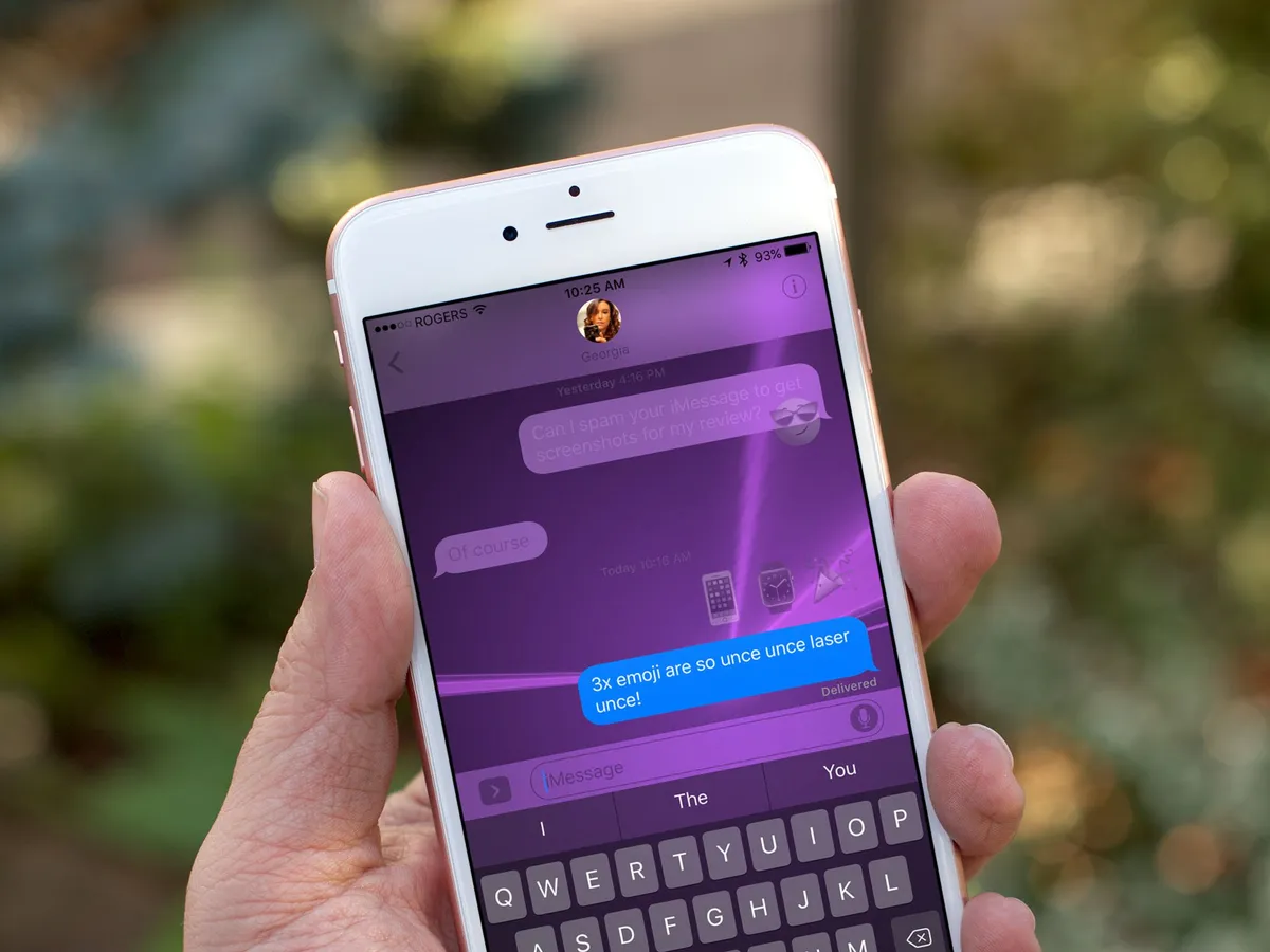
Bubble effects add a physical animation to the word bubbles containing the iMessage. Slam smashes down and ripples the screen; Loud bubbles up over everything, Gentle creeps into place, and the outlier, Invisible Ink, hides the message under noise until you wipe it clear.
Note: Since bubble effects use motion effects, turning off motion in the accessibility settings also turns off bubbles.

Screen effects fill the background with balloons, confetti, unce-unce-unce lasers, fireworks, or a the-more-you-know shooting star. Some of them are automatic: Text "happy birthday" and balloons just happen, likewise, confetti for "congratulations" and fireworks for "happy new year".

I love the bubble effects and like some of the screen effects, but like digital touch scribbles on the Apple Watch, I fear I'll be in the minority. Send someone lasers once and they laugh. Third or fourth time and, in my experience, they want to end you.
It's possible effects are meant for occasional use only, but that's not how things work in the age of Snapchat. Those effects get used a lot, but what keeps them from getting overly annoying is that they change up a lot. Weekly, at least.
I could well be proven wrong on this, but I don't think Apple will be cycling out lasers and cycling in waterfalls on a weekly basis, or giving LOUD a rest while introducing SpLaSh. And they really should.
To be fun you have to be fun. To be more like Snapchat you have to be more like Snapchat. And that includes the pace of refresh.
How to use bubble and screen effects in iOS 10
iOS 10.1 update: Replay

With iOS 10.1, if you missed a bubble or screen effect, you can get a repeat performance by hitting the tiny Replay button beneath the message with the effect.
So, if you really want to see that Luke Cage Fist Bump, or enjoy those Unce Unce Unce Lasers just one more time, you can!
iMessage apps
Like Siri and Maps, Apple is opening iMessage to apps. They're taking it even one step further, though, and embedding an App Store right inside messages. That way you can get apps without having to leave iMessage, which is not only more convenient, but more conducive to the viral way things spread in the messaging and social worlds.

To access apps, you tap the app icon next to the camera and digital touch icons, beside the text field. Then you can swipe your way through tabs containing all of the apps you have installed, or call up the app drawer to see them at a glance.
I'm not sure how well this interface will scale, though. I tested a fair number of apps over the last few weeks, and after a dozen the tabs started to get onerous. After two dozen or three dozen, I think I'll start heading straight for the app drawer. There is a recents tab that helps, but not enough — especially not with stickers (see below).
Update: iOS 10.1 cleans up the iMessage app drawer, removing the interface collisions and providing a more coherent experience.
The types of iMessage apps available include:
- Payments
- Image search and insertion
- Food ordering
- Encrypted messaging
- Games
- Stickers
And much, much more. The dynamism is amazing. You can not only customize what you do, but often collaborate with others as well. So, you can stick your friend's head on a dancing gnome, or place a group order for pizza, with everyone's favorite toppings specified and tallied.
Messaging apps have evolved enormously since the days of SMS/MMS, IRC, and ICQ. They're now platforms in their own rights, and the major players command and consume enormous amounts of our attention. Making iMessage both more fun and more flexible was imperative not just for Apple, but for the people like myself who use it day in and day out.
It's going to be huge.
How to use apps in iMessage for iOS 10
Stickers
Stickers are a special kind of iMessage app. They're also a huge deal in messaging. Line, Facebook Messenger, and other monstrously popular apps have been offering them for a long time already. That's because they're even more fun than emoji, and in some cases can be immensely profitable as well. Studios and artists can release promotional packs around hot new releases to drive viral marketing and awareness, and famous brands can charge a buck or several for famous character packs they know fans will gobble up.
For that reason, Apple could have done stickers as a partnership play, where only a carefully negotiated few got into iMessage. Instead, Apple has made stickers open to everyone. (Which, by the way, completely sidesteps the staleness problem I anticipate screen effects will suffer from.)
You still need to be a registered App Store developer to create a sticker pack but, unlike full iMessage apps, you don't need to know how to code. Instead, you create your static or animated stickers, package them in Xcode, and upload them to your iTunes Connect account along with all the promotional assets and metadata, and that's it.
Apple has had a few of their own, including the animated emoji faces, hands, and hearts that shipped with the original Apple Watch, as well as a set of classic Mac stickers, in the store since WWDC as a way to test the new features with, and they work well.

To use a sticker, you buy or download the sticker pack from the built-in iMessage App Store and it shows up in the apps section of iMessage. Then, you go to the sticker pack you want, find the sticker you want, and touch and drag it to where you want it in the iMessage timeline.
The only rough spot here is scaling. The iMessage app interface works great at first. It shows a single sample app or sticker so it's fast and structurally sound. Then you get to a half dozen sticker packs... a dozen sticker packs... two dozen... And it starts to look like maybe the interface needs to be built to scale better. Given how popular sticker packs will be, no doubt that'll happen quickly. :
You can send stickers as their own messages, or you can attach them to previous messages — yours or anyone else's in the timeline. Stickers can even be made collaborative, where everyone in the timeline can add to or change the sticker creations.

One bit of mischief I stumbled on early: Because you can slap stickers down on top of other people's iMessages, you can slap emoji stickers down on top of other people's emoji messages. That means you can effectively hijack their emotional state. It's especially true with Apple's 3x emoji and Apple's animated emoji packs because they're exactly the same size. They send you a smiley face, you slap a sad face down on top of it, or vice versa.
Depending on the person, they either laugh or become upset, which is something both the interface designers at Apple and anyone using stickers should keep in mind.
That aside, iMessage stickers are fantastic and really breathe new life into Apple's messaging system.
How to use stickers in iMessage for iOS 10
iOS 10 Miscellany
Apple calls iOS 10 the biggest update ever. Some would argue the advent of the App Store or extensibility better deserves that moniker, but there's no denying that making Siri, Maps, and Messages accessible to apps is a big deal.
There are a lot of smaller improvements in iOS 10 as well. Things that don't warrant a keynote slide or review header but combine together to make iPhone and iPad significantly more usable and enjoyable.
Home screen
You can now hide many of Apple's built-in iOS apps. You can't really delete them, because they take up very little space and are inexorably intertwined with the underpinnings of the operating system, but hiding them is the next best thing.
In order to make it easier to understand and manage, Apple uses the same dynamic to hide built-in apps as it does to delete App Store apps. Hold down until the app jiggles, then tap the X button to send it back to the bit-hell from which it came. If you decided you acted hastily and want a built-in app back, just go to the App Store and search for it. Un-hiding, you see, is disguised as re-downloading.

The Home screen has also gotten improved 3D Touch support. Now, when you press firmly on an app, you'll also get any widget that's bundled with it. Also, when you press firmly on a folder, you'll see actions associated with the apps inside, including unread message counts. Apps, meanwhile, all get a handy "Share" action so you can tell your friends about them.
Some no doubt find the Home screen boring and wish Apple would do something to make it exciting again. The Home screen has never been a destination, though. It's always been a portal. Its job is to help you find and launch apps, and with 3D Touch, actions. That's it.
My guess is Home screen will change by the process of abandonment: As iOS navigation, inter-app operability, and voice control improves, we'll need to go there less and less, until we forget it's even there.
How to use Home screen: The ultimate guide
Accessibility
New to iOS accessibility is a magnifier tool that lets you use the camera to zoom in on objects in the real world. You can alter the color profile of the magnifier, if you want to, for white/blue, yellow/blue, grayscale, yellow/black, or red/black, and invert any of those options.
You can also control the level of magnification, turn on the flashlight, lock the screen, and freeze the frame (by taking a photo).
For iPhone 7, you can also adjust the amount of feedback for the new Force Touch home button from light to medium to heavy.
Apple's commitment to accessibility remains second to none, and this is my yearly thanks for that.
Universal clipboard
New to iOS 10 and macOS Sierra is a continuity-based cut and paste feature called universal clipboard. Continuity is Apple's framework for seamlessly transitioning activities from one device to another using a combination of Bluetooth LE, peer-to-peer Wi-Fi, and iCloud authentication. With universal clipboard, it lets you copy text from your iPhone or iPad and paste it on your Mac, or vice-versa.
It's a tricky problem to solve, since iPhones, iPads, and Macs all have their own pasteboards and you don't want to override them at the wrong time. So, Apple applies — wait for it! — science!
When you copy something on one device, in very close proximity to another device, it temporarily overrides the clipboard for a few seconds so you can paste the copied text into the other device. After a few seconds, the clipboard reverts to back to the local copy.
It does take a few seconds for the data to transfer, especially if big blobs like images are included in the pasteboard, but once you get used to it, it works great.
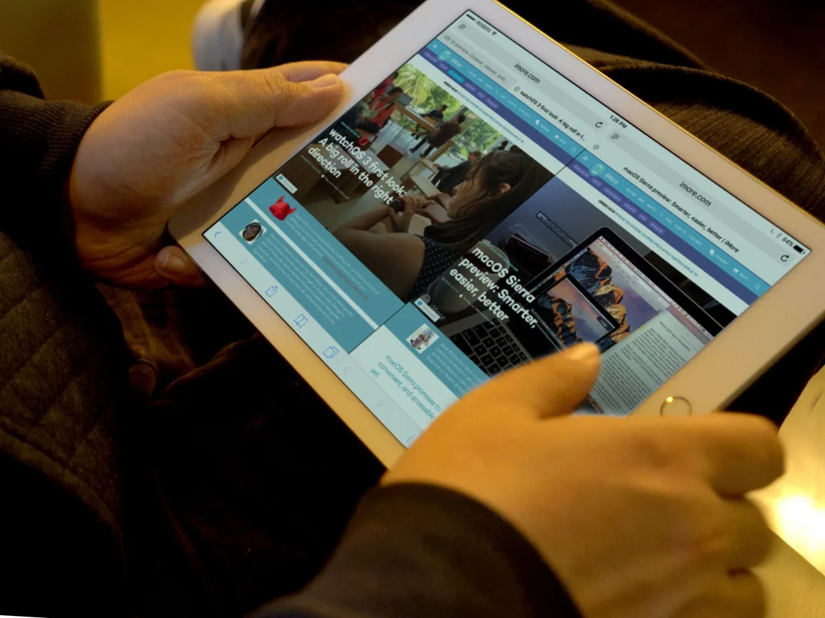
Split screen in Safari
iPad doesn't fare as well in iOS 10 as it did in iOS 9. It gets almost all the same updates as iPhone, but it doesn't get much in the way of iPad-specific updates. What we did get is Split View for Safari tabs.
You enter Split View via long press or dragging a tab to the edge of the screen. Once in split view, you can switch tabs from side to side, or merge them all back into a single window. You can still go into multi-app Split View from Safari Split View. It'll collapse Safari back down to a single window but come right back to where you left it when you return.
You can also quickly close all tabs now by long pressing on the tabs button — which is good because you can accumulate way more tabs than ever before as well.
It works great and is incredibly useful; I wrote a lot of this review in Split View on the 9.7-inch iPad Pro.
Whether the lack of new features, like the much lusted-after drag and drop between views, aren't on the current agenda, or are simply pushed out to a point release later down the line, we'll have to wait and see.
Apple has recently begun marketing iPad Pro as a computer, and while it should never lose its incredible approachability, a computer is what iPad Pro is. To worry about it becoming too much like the Mac misses the point — it needs to be the best computer it can be, as though the Mac doesn't exist.
Playgrounds
There is one other new iPad-specific feature times with the release of iOS 10 that is absolutely monumental: the new Swift Playground app, available from the App Store. The potential for both the app and the ecosystem is so tremendous, my guess is its announcement will go down as one of the most important moments in programming for the next generation.
Phone
iPhone brought computers to the pocket and demoted actual phone calls to an app. Some of us may barely, if ever, use the old-fashioned phone anymore, but for others it's still critically important. That's why Apple is not only improving the app, but opening up the phone screen to other apps.
First, visual voice mail will now offer transcriptions. The service is launching in beta, but with iOS 10 you'll not only be able to replay your missed messages, you'll be able to read them. Since the text also serves as a preview, you can use it as a way to decide if you even need to replay it. Very nice.
Apple's also adding extensions, so third party services can help flag spam voicemail. It's a huge problem in countries like China, and Tencent and others are working to help prevent it.
The biggest news, though, is the new VoIP application programming interface. With the new API, apps that offer calling services can effectively take over the iPhone's phone screen. That means Skype, Slack, WhatsApp, and a host of other services can look and act just like the native Phone app, offering a much better experience than a simple notification and custom call screens can provide.
They also get access to favorites and recents, and iOS will remember which specific apps you use to contact which specific people, so you can easily Skype mom, Slack your club-mate, or WhatsApp that new friend with just a tap. You can also use office phone systems in a fully integrated way, making iPhone even better for enterprise.
It's the kind of carrier disintermediation we haven't seen from Apple since iMessage, and hopefully one more push towards the dumb-pipe future we've all been dreaming of.
Clock
The Clock app has a new dark theme — would that that had shipped for all of iOS! It also has a new Bedtime tab.
There are several keys to a good life: Breathe, eat right, exercise, and sleep. Apple introduced Activity last year to help with exercise, and this year they're bringing Breathe to watchOS to help with centering and relaxation. Now Bedtime in Clock is here to address sleep.

With it, you answer some questions about your sleep hygiene — or lack thereof — and then Bedtime will both remind you to go to sleep consistently, and set an alarm to wake you up at the same time every day.
You might be tempted to ignore it at first, but once you build healthy sleep habits, you'll be telling everyone to use it.
How to use Bedtime in Clock for iOS 10
Mail gets a great new threaded view that makes it easier to see the context surrounding your conversation. There's also a filter button at the bottom so you can quickly switch to seeing unread messages only. Since my inbox currently contains over 12,000 unread messages — blame all the fall reviews — it doesn't help me much. I imagine it'll be a boom to those far more responsible about their email than I, though.
There are also smart suggestions for moving email between folders, so if you always file those letters from the Legion of Doom under null, that's what iOS will offer you when next you select one of their emails. Or, if you prefer to simply unsubscribe, iOS data detectors will now find and surface that option right at the top of the message. Then you can just tap your annoyances away.
The 12.9-inch iPad Pro even gets a unique, 3-column layout to better take advantage of its screen size. I run Mail on the Mac in three column mode, and I like it just as much on the Pro.
Bottom line
iOS 10 will no doubt be called iterative. Whether that's intended as a compliment or not, it should be taken as one. Iteration is important, critical even, to improving experience and functionality both. By pushing design, architecture, and intelligence forward, Apple is taking an almost decade-old operating system and making it fresh, fun, and futuristic again.
There are still silos — I yearn for universal VIP. There are still gaps — handoff for media can't come fast enough. There's still stability that has to be proven and proven again with every update.
Yet iOS 10 is a more consistent, coherent, clever experience that's making not just my day-to-day, but moment-to-moment interactions more efficient and more enjoyable. I like the direction it's going, even and especially where it's been opened up in new and surprising ways.
As new apps and updates hit, iOS 10 will evolve along with them. So, keep this review bookmarked and check back soon. The story of iOS 10 has just begun.