• What's the best iPhone?
• Set up a new iPhone
• Best apps for new owners
• The best iPhone deals
Over 1 billion iPhones are in active use making it one of the world's most popular devices — with a fascinating history. The App Store features over a million apps, helping you unlock your iPhone using your face, charge without cables, have Siri turn on the lights in your home, and so much more. Apple's most advanced iPhone range is here: the iPhone 15, iPhone 15 Pro, and iPhone 15 Pro Max. And hints about the iPhone 16, iPhone 16 Plus, iPhone 16 Pro, iPhone 16 Pro Max, and iPhone 16 Ultra are already trickling in.
iPhone 15: The current lineup
Here's what you need to know about the iPhone 15, iPhone 15 Plus, iPhone 15 Pro, and iPhone 15 Pro Max, including specs and new features:

iPhone 15 / 15 Plus The everyman iPhone, without the bells and whistles.
Screen: 6.1- or 6.7-inch
RAM: 6GB
CPU: A16 Bionic
Rear Camera: 48MP
Connectivity: USB-C
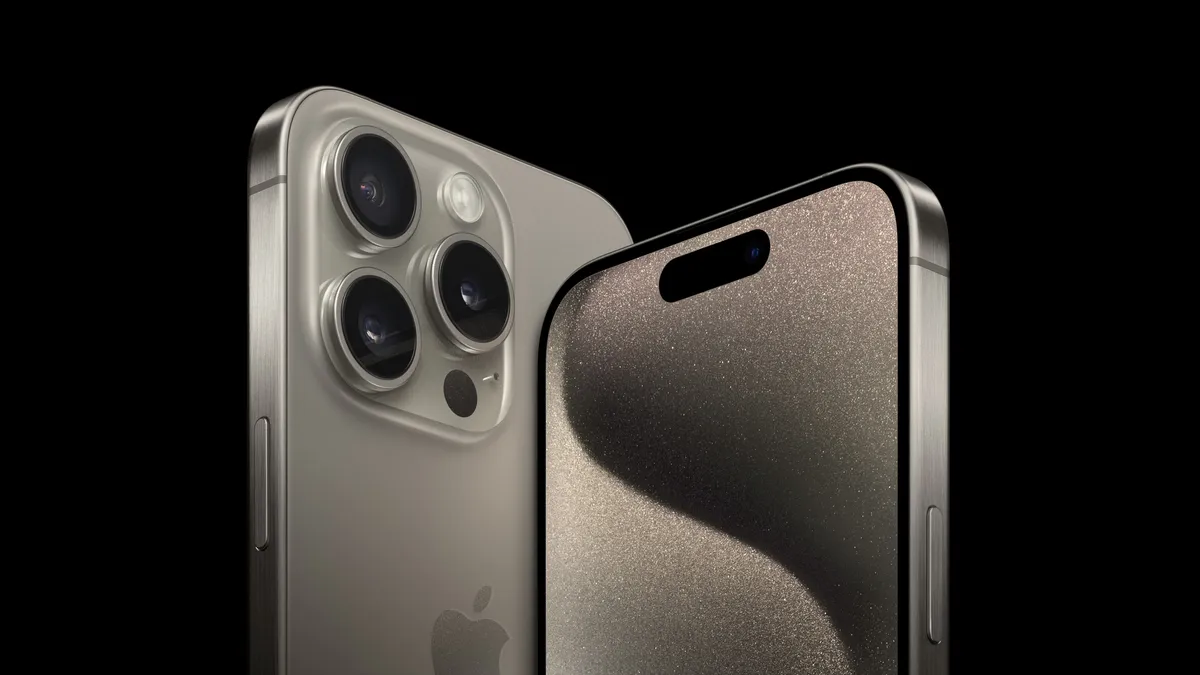
iPhone 15 Pro Adds the faster A17 Pro chip and a new design, with a titanium frame.
Screen: 6.1-inch
RAM: 8GB
CPU: A17 Pro
Rear Camera: 48MP
Connectivity: USB-C

iPhone 15 Pro Max Adds a Telephoto lens tech for enhanced zoom capabilities.
Screen: 6.7-inch
RAM: 8GB
CPU: A17 Pro
Rear Camera: 48MP w/ Telephoto lens
Connectivity: USB-C
Do more with your iPhone
The iPhone isn't just beautiful and magnificently fun -- it's practical too. It's the best camera in the world, the window to your smart home, an assistant that can maintain your schedule as easily as your health, and more. And loads of stuff came to the iPhone with iOS 17. Here's the top features and how to use them.
How to Download iOS 17 | Contact Posters | Standby | NameDrop | AirDrop
Latest about iPhone

Jony Ive’s OpenAI hardware device could be his next world-changing design
The former design lead at Apple has teamed up with Sam Altman’s artificial intelligence company.

iOS 18 and iPadOS 18 are finally available for everyone – without any Apple Intelligence features
Apple is officially rolling out iOS 18 and iPadOS 18 to all users, after months of beta releases. But, it launches without any Apple Intelligence features.

Apple has discontinued the iPhone 15 Pro, so you'll need an iPhone 16 for Apple Intelligence
Apple Intelligence is now only available on iPhone 16 and 16 Pro models, unless you buy a used iPhone 15 Pro.

Early iPhone 16 Pro benchmarks show it could be more powerful than your MacBook
Geekbench results for iPhone 16 Pro suggest it'll be a powerhouse that could outperform your MacBook.

Apple finally ditches classic stickers in the iPhone 16 box
Your new iPhone won't include Apple Stickers, reports suggest, but you can ask for them if you feel nostalgic.

Apple chip boss finally confirms how much RAM is in iPhone 16 and 16 Pro
Apple's Senior Vice President of Hardware Technologies, Johny Srouji, has confirmed all new iPhone 16 models have 8GB of RAM.

iPhone 16 and iPhone 16 Pro preorders are now live — as well as Apple Watch Series 10, AirPods 4, and more
You can now preorder iPhone 16 and iPhone 16 Pro directly from Apple's site as well as select carriers!
iPhone 16 Pro: Release date, specs, price, and more
The iPhone 16 Pro will bring with it a few changes compared to the previous model and there is plenty to enjoy, starting with a bigger screen.

Apple Store down ahead of iPhone 16 pre-orders
The Apple Store is down in advance of iPhone 16 pre-orders.

iPhone 16 has a secret charging upgrade Apple didn't even mention
Apple's iPhone 16 features up to 45W wired charging across the board.

Apple hints that the iPhone SE 4 is closer than ever
With Apple allowing apps updated for iOS 18 to be submitted to the App Store, developers have noticed one less requirement.

AT&T reveals its iPhone 16 deals — get up to $1,000 off with an eligible trade-in
AT&T has revealed its iPhone 16 and iPhone 16 Pro deals ahead of next week's launch.

Where to pre-order iPhone 16 – when and where you'll be able to buy Apple's next flagship
Apple has unveiled the iPhone 16 series at last. Here's when and where you can pre-order Apple's flagships.
Best iPhone in 2026: Tested, Reviewed and Rated
If you're in the market for a new iPhone, it can be hard to pick the right one for you. Here's some advice from us.

iPhone 16: Release date, specs, price, and more
The iPhone 16 is set to arrive on September 202, 2024 and it will be one of the biggest upgrades in some time.

iPhone 16 Plus: Release date, specs, and more
The iPhone 16 Plus is expected to be announced in 2024 and here's everything we know about it so far.

A surprising new Beats product launched at Apple's latest event: iPhone 16 cases
After the iPhone 16 event, Apple quietly revealed that Beats is now making hardshell polycarbonate iPhone 16 cases in a surprising move.
iPhone 16 battery life stats reveal that you'll get hours extra from the latest iPhones
In the iPhone 16 keynote, Apple said the new devices have bigger batteries, but didn't go into the specifics. Now, we can see the battery life stats offer hours of extra battery.

