• What's the best Mac?
• What's the best MacBook?
• Set up your new Mac
• Best apps for any Mac
• Save $$: The best Mac deals
It may not have actually started in a garage, but the Mac still put Apple on the map. With so many iconic designs and influential ad campaigns over the years, the Mac has become one of the world's most versatile computers. And the power of MacOS 14 Sonoma -- and soon, MacOS 15 -- will keep your creative energy going. Plus, with Apple now making its chips, we've only scratched the surface of how powerful and efficient the Mac can be. The 2024 MacBook Air M3 is a perfect example.
The Laptop Line-up
Portable power crossed with beauty and elegance defines the MacBook lineup. Here's the current roster from Apple:

MacBook Air (M3, 2024): A performance bump from the M3 chip makes it the perfect MacBook.

14-inch MacBook Pro (2023): The power of Apple's M2 Pro silicon, a stunning XDR display, and timeless design.

16-inch MacBook Pro (2023): With the M2 Max chip, it's Apple's most powerful MacBook ever.
The Desktop line-up
Performance, packaged up for your desktop or studio. Apple's offerings range from the all-in-one iMac to the sheer torque of the Mac Studio. What's your Mac?

24-inch iMac (2023): Spec bump from the M3 chip makes the iMac sing.

Mac Studio (2023): A best-in-class computer with the powerful M2 chip. It's in a world all its own.
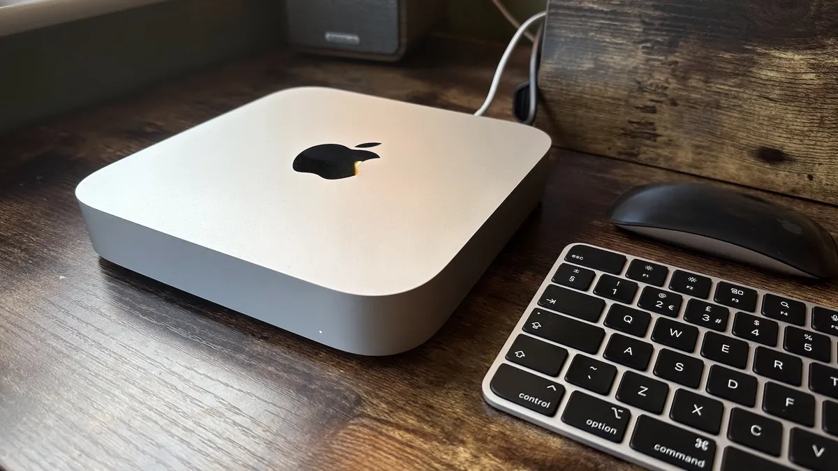
Mac mini (2023): The power of Apple's M2 silicon, with superb performance and a unique, iconic design.
Do more with your Mac
Creative professionals, designers, artists, musicians ... the Mac platform touches each of us in different ways. Whether you're just digging in or a lifelong fan -- or forgotten how to take a screenshot on a Mac -- iMore has guides, information, and perspective to help you make more of your passion.
How to set up a new Mac | Awesome keyboard shortcuts | MacOS Sonoma
Latest about Macs

Razer Huntsman V3 Pro Tenkeyless: Pro-level Mac gaming
The Razer Huntsman V3 Pro Tenkeyless is a mechanical keyboard that you can make (almost) entirely your own, even without macOS support for its Synapse customisation app.

macOS Sequoia (version 15) is now available for your Mac with some big upgrades
The latest software update for Macs is now available. You can install macOS Sequoia (version 15) on your device for some big upgrades.

Apple's new "best AI PC" Mac ads take aim at Microsoft's Copilot+ machines
Apple is taking potshots at Microsoft's new Copilot+ laptops as the battle for AI supremacy heats up.

The iPhone 16 reveal is tomorrow, but details about Apple's next event have already leaked - including M4 Macs and new iPad models
Apple's next event will reportedly showcase new Mac and iPad models.

The 15-inch M3 MacBook Air is still insanely cheap on Amazon
The larger MacBook Air model just dropped to its lowest-ever price — perfect if you need a last-minute deal on a laptop for school or college.

Here's how to use Window Tiling on macOS Sequoia
macOS is finally getting a series of Window Tiling tools with Sequoia.

M4 MacBook Pro could debut in November alongside a completely redesigned Mac mini
A new report claims Apple's M4 Mac series could debut in November.

The M4 Mac Mini could drop USB-A ports entirely according to new report
Apple could finally ditch USB-A on its Mac Mini lineup but will make up for it with more USB-C ports.

Keychron K2 HE Review: The perfect mechanical keyboard for Mac users
The Keychron K2 HE is a fantastic mechanical keyboard at a very fair price point, giving you a satisfying typing experience that fits in with your Mac's design.

These new BenQ monitors could be the best choice for MacBook users
BenQ has released some new monitors in its MA series that could be the perfect choice for MacBook users thanks to brightness and volume sync with MacBook controls.

Save a massive $200 on the Mac Studio at B&H Photo
The Mac Studio gets a massive discount in this late summer deal at B&H Photo.

Apple could debut four M4 Macs at a launch event this October, with the devices currently in testing
Apple is expected to hold a Mac launch event in October. A new report suggests we could see four M4 Macs debut there, but all with base-level chips.

Apple's next line of M4 Macs could finally ditch 8GB of RAM and start with 16GB
Apple's next Mac lineup could make big changes to its unpopular RAM options.
macOS Sequoia is set to release at the same time as iOS 18 – in the middle of September
This year, macOS Sequoia is set to release at the same time as iOS 18 in the middle of September, just after the iPhone 16 launch event.

Apple’s alleged 20-inch folding MacBook kicked further down the road – now arriving 2027 at the earliest
Apple's allegedly been working on a 20-inch folding MacBook, but it has reportedly been delayed until 2027 now, but is looking less likely to ever arrive.

These new Apple Park FaceTime backgrounds in the latest macOS Sequoia beta let you get up close and personal with Apple's HQ
In the latest beta release for macOS Sequoia, there are new FaceTime backgrounds taken at Apple Park that let you get up close and personal with Apple's HQ.

This awesome mod turns a Steam Deck into a Bondi Blue iMac G3 — well, sort of
A Reddit user has turned their Steam Deck into a Bondi Blue iMac inspired handheld and it looks awesome!

macOS Sequoia just brought back one of the worst features from the worst Windows release of all time
macOS Sequoia requires users to click on a monthly pop-up to allow screen-recording apps, reminding users of Windows Vista’s annoying prompts.


